Valentine's Day Nail Art with a Spring Twist!

Monday, January 30, 2012

11 comments
Valentine's Day is drawing near, and so is Spring! After my Valentine's Day Candy Hearts eye look, I decided to do some Valentine's Day nails! I wanted something that was Valentine's Day, but still on-trend for Spring, and not all drenched in pastel pink and flowers (shudder). And I wanted something that was me.

So I incorporated all of these elements into my Springy Valentine's Day nail art! I used a popular colour for Spring 2012, mint, as a base, and I gave it a little Valentine's lovin' with the yellow hearts. And of course, I made it me with the addition of gold glitter!


For the base, I used Nails Inc Spring Mews, a gorgeous mint green creme that was opaque in two coats. This little baby was put up for adoption by her first owner, and when I adopted her, she was in a really bad shape, all dried up and crusty. I had to nurse her back to health with some nail polish thinner, and now she's good as new. Then, I added some gold glitter near the tips, using less towards the end. And lastly, I added the cute little hearts!

valentines day spring nail art 2


I really like this nail look - it's sufficiently girly without being too much, it's sufficiently Valentine's without being nauseating, it's sufficiently Springy without being a slave to trends, and it's got bling! All my favourite things. The only thing is, I feel like I didn't do the glitter gradient as well as I would have liked. Loose glitter can be hard to work with.

valentines day spring nail art 3


That's my take on Valentine's Day nail art. Fresh, springy girliness! I'm still feeling inspired, so you'll be seeing more nail looks themed around Valentine's Day, but with a twist - you can bet, they're not going to be pastel pink flowers!

Valentine's Day Candy Hearts Inspired Eye Look

Saturday, January 28, 2012

16 comments
Valentine's Day is coming, and that's great reason to get a little more creative with an eye look! This year, I felt inspired by Sweethearts - the absolutely adorable conversation candy hearts that are a mainstay of every Valentine's Day!

After last year's hot pink and purple Valentine's Day eye look, I decided that this year, I wanted to do pastels. But I didn't want to do sweet girly, on-a-date type pastel pink eye. So, instead, this was my inspiration:

Source


And this is the look. For this look, I was trying to fit as many Sweethearts colours onto my eyelid without running out of space, LOL! I was thinking of pastels with a pop. I hope I succeeded.


For this look, I used the pink and yellow shades from my BeautyUK Day and Night Palette, the light purple shade from my Superdrug MUA Eyeshadow Trio in Passion, and the green from the Superdrug MUA eXtreme Metallics Quad in Starstruck. All done with budget beauty products - another yay in my book.

valentines day candy hearts eye look shades


I was trying to get the right type of shades so that it would be pastel but still vibrant - after all, nothing's quite as gross as overblended muddied up pastels. So I ended up with a sort of pastel rainbow, which I hope wasn't overblended or underblended. Well, when you have as little lid space as me, it's a challenge fitting more than three colours in an eye look!

valentines day candy hearts eye look 1


The BeautyUK Day and Night Palette (which I've reviewed before) had good pigmentation and texture, and so did the Superdrug MUA Eyeshadow Trio (I've reviewed a Superdrug MUA Eyeshadow Trio before too, only in a different shade). The only one with a slightly odd texture was the Superdrug MUA eXtreme Metallics Quad, which was a little more powdery. You'd have to use it foiled to get the full metallic effect. I didn't for this look though, because I wanted it to look pastel.

valentines day candy hearts eye look 2


Anyway that's my Valentine's Day inspired eye look! I don't recommend anyone actually wearing this out for a date (unless a pastel rainbow is your kind of thing), but this was just something I did for fun.

(Product was sent for review. Review is my complete and honest opinion. I am not affiliated with/compensated by the company.)

a-England King Arthur v Ciate Velvet Tuxedo: Comparison

Thursday, January 26, 2012

5 comments
It's dupe comparison time! In a previous post, I wrote about a-England King Arthur, a gorgeous gunmetal grey. I thought it looked similar to Ciate's Velvet Tuxedo, so I decided to do a comparison to see if these were dupes or not.

In the bottle, both look quite similar. Both are deep gunmemtal greys with shimmer in them. My Ciate bottle used to have a cute ribbon on it (I actually have a super old NOTD and a bottle pic of Ciate Velvet Tuxedo on the blog - it's super old, so look at your own risk). But over time the ribbon came off, so now I have a ribbon-less Ciate bottle. No cute ribbon...it actually makes me a little sad.

a england king arthur ciate velvet tuxedo comparison bottle


Here's a swatch picture of the two in natural light. You can't really see it in the photo, but Ciate Velvet Tuxedo is actually a shade darker than a-England King Arthur. It's not a big difference, so for some reason the camera didn't pick up on it. The shimmer is the same in both colours, though.


L-R: a-England King Arthur, Ciate Velvet Tuxedo, a-England King Arthur, Ciate Velvet Tuxedo

Below is another swatch picture, this time in more shaded lighting conditions. You can see the shade difference a little bit more clearly here. The Ciate shade is a shade darker than the a-England shade, but otherwise, both are quite similar.

a england king arthur ciate velvet tuxedo comparison 1 (2)


L-R: a-England King Arthur, Ciate Velvet Tuxedo, a-England King Arthur, Ciate Velvet Tuxedo

So, the final verdict - do you need both? To be honest, I feel like they are both quite similar. I'd get a-England King Arthur over Ciate Velvet Tuxedo, just because it's lighter and thus looks a little more grey and less black, especially in lowlights. But unless you wore the two side-by-side and looked closely at them, it's easy to think they're the same colour.

(a-England product was sent for review. All other products were bought. Review is my complete and honest opinion. I am not affiliated with/compensated by the company.)

Spring Pink and Green Eye Look (and a tad of Aqua)

Tuesday, January 24, 2012

5 comments
Spring isn't technically here yet, but I keep seeing all these gorgeous promo photos and ads for the upcoming Spring collections that I'm in a Springy mood - hence today's EOTD (Eye of the Day)!


I used three shades for this Spring-inspired look. The pink shade the pink from my BeautyUK Day and Night Eyeshadow Palette, the aqua shade (Blue Hawaiian) from Sleek Curacao Palette, and the deep green shade (Green Iguana) also from the Curacao Palette. The photo below shows which shades I used.

pink green eye spring shades


For this look, I was thinking of spring flowers and their leaves...pink and green. Very girly, springy, and romantic even! Like Valentine's Day came early! And I snuck in a little aqua in there because it's just such a fresh colour, you know? Also, aqua shades happen to be pretty on-trend for this spring season. I used the pink shade on my inner lid, the aqua in the middle, and the deep green on the contour and outer V area.

pink green spring eye 2


Blending and pigmentation of all the shades was good. I'm starting to think that Sleek and BeautyUK are two really value-for-money drugstore brands. I've never met a Sleek palette that sucked (then again, I don't have every single palette), and the BeautyUK palettes are pretty darn good, too.

pink green spring eye 3


I really like this look, it's really pretty and feminine, while still being really fresh looking. I'm totally thinking I could pair this eye look with China Glaze For Audrey on my nails, since both have a springy sort of aqua in them. I kind of like how the look adds a pop of colour, while still giving off an overall girly vibe. Perfect for Spring!

L'Oreal Professionel Haircare New Launches: Quick Look

Sunday, January 22, 2012

2 comments
L'Oreal Professional has launched a few exciting haircare products recently, spanning a huge range - everything from shampoo to hair masks, oils, and wax is covered. There's truly something for everyone here. Since I'm not that much of a haircare person, suffice it to say I was slightly overwhelemed at the sheer number of things you can do to make your hair better (so all that time I've been walking around with disgusting hair...Sigh).


Let's start with perhaps some of the more mundane products, shampoo and hair masks. L'Oreal Professionel has a range of haircare products, Serie Nature, which cater to users who want more natural haircare. Serie Nature boasts that 100% of its ingredients are of natural origin, with 95% being organic. Pretty cool, huh? There are two ranges within the Serie Nature brand - Riche Macadamia, and Couleur Botanique. Both Riche Macadamia and Couleur Botanique have a shampoo and hair mask each.

loreal professional serie nature


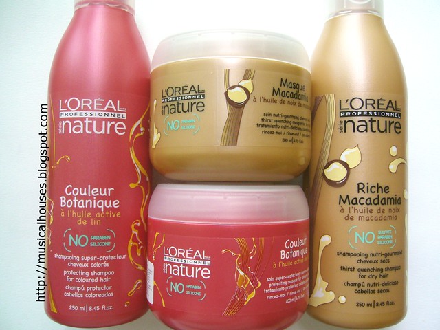
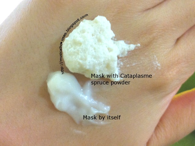
Riche Macadamia, as the name suggests, contains macadamia nut oil, and is meant to give an intense hydration to hair. The Couleur Botanique, meanwhile, is meant to hydrate coloured hair. The hair masks are really cool. They appear as normal ol' hair masks with a cream texture, but when you add the cataplasme spruce powder to the mask and whip, you get a foam-like texture that you then apply to your hair and leave on for 5 minutes. That was really cool.

loreal serie nature hair mask


Another range of products we were introduced to was the superhero-themed Techniart line of products. The hair styling wax is named Bad Mud, and the volumizing powder is named Super Dust - now, how cute is that?

loreal bad mud super powder


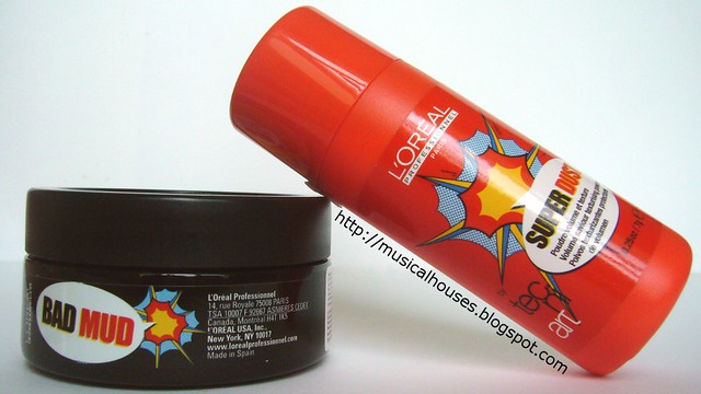
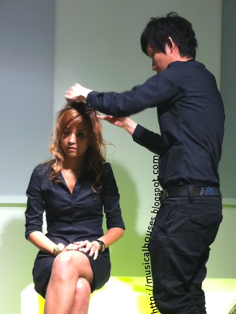
Bad Mud, dubbed by L'Oreal the "shape hero" is a styling product midway between a wax and a clay. We were also treated to a very convincing product demonstration for Bad Mud - the hairstyler present styled the hair below using Bad Mud, and everyone present was ooh-ing and aah-ing over the transformation.

loreal bad mud demonstration


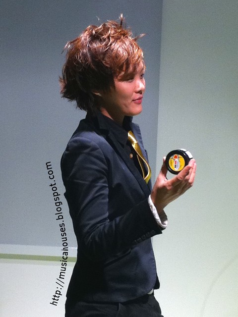
Super Dust, the "volume hero", is probably going to be a lifesaver for people like me, who have fine, limp hair that has no body. This is a white powder that reminds me of a dry shampoo, but it's meant for volumizing the hair. Like Bad Mud, Super Dust got to display its prowess with a demonstration, that was also quite convincing. Lookit all the volume! I got to try out the Super Dust later, and it did make my hair look more full. I really liked it.

loreal super dust demonstration


Last, but certainly not least, we move on to my favourite product of the entire launch - L'Oreal's Mythic Oil. I've always stayed far away from hair oils, as I've always been worried that they would weigh down my hair. However, I got to try out Mythic Oil at the event, and I have to say, I was very impressed.

loreal mythic oil


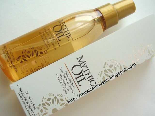
The hairstylist first applied a small amount (about the size of a 10-cent coin) to my ends, and then used a hairdryer to blow dry my hair. It wasn't a terribly complex process or anything, but after he was done, I was pleasantly surprised to find that it really did help make my hair more smooth and shiny-looking. It even helped with those pesky flyaway strands I had. It also It felt very lightweight on, and didn't weigh down my hair. The Mythic Oil can be used in a number of ways too (pre-shampoo, blow-drying, for frizz protection and so on), so I'm quite excited to see what else it can do.

loreal professional event photo


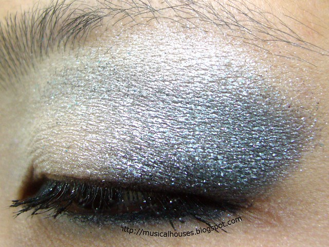
And of course, photo time! That's me, on the left (with eyes closed and no makeup - yes, no makeup! It was just one of those come-from-work, no-makeup days), and Lynn on the right, together with a gorgeous L'Oreal intern in the middle. Anyway, I'll be using these products, and I'll report back with my thoughts on them after I've tried them out!

(Product was sent for review. All views are my complete and honest opinion. I am not affiliated with/compensated by the company.)

Shiseido Spring Pink and Blue Eye On the Cheap!

Friday, January 20, 2012

8 comments
Shiseido's Spring 2012 Collection has such a gorgeous promo picture. I especially loved the eye makeup - it was just so purdy, and it was blue and pink! I never thought blue and pink would work together, but Shiseido had just used only blue and pink, and it looked great!

Source


I found myself wondering if it was possible for me to produce the same eye look, and so I did. Here are the results.


For this eye look, I used Sleek Makeup's Curacao Palette, which was launched last summer. I've reviewed the Curacao Palette before, but for this eye look, I used Singapore Sling, a shimmery pink, and Blue Lagoon, the matte blue, together. And I blended the two together. That's it.

Shiseido Spring Eye Dupe 2


I'm actually quite surprised by how quick this was to do, and how stunning the end result was. Although I have to admit, it doesn't exactly look like the promo picture (and I don't exactly look like the model - darn!), but I think it's because the Sleek colours are a bit brighter than the colours in the advertisement. Perhaps I should have chosen more muted colours to match the colours more exactly...but...the bright colours were just so pretty!

Shiseido Spring Eye Dupe 3


So there you go, my attempt at duping the Shiseido Spring 2012 eye look. I don't know how I'm feeling about it on a personal level yet (blue and pink somehow look beter in the promo picture than in real life), but it was worth a try. Would you wear pink and blue together?

Chinese New Year Nail Art: Red, Gold, and Pearls (Just a Bit!)

Wednesday, January 18, 2012

6 comments
Chinese New Year is coming round again, and you know what? This year, the first day of Chinese New Year actually coincides with my birthday? How cool is that? Anyway. Not that you wanted to hear about my birthday (I'm getting older, ugh!), but I'm sure you'll want to hear about my Chinese New Year mani.

So without further ado, here's my Chinese New Year's mani! Which, I guess, is also going to double as a birthday mani this year. I was inspired by this post which I stumbled upon, but I thought I'd make it my own by adding some bling, in the form of pearls!


For this mani, I used a Rimmel Fruities Lasting Finish Polish in Cranberry Zest. This was actually a launch from a couple of years back that featured scented polish (hence the "Fruities" name). Cranberry Zest smells kinda artificially sweet, but it's pleasant. While scented polish may be abit gimmicky, I like the little bit of fun they add to a mani. The design was done with China Glaze Hi-Tek, from the Khrome collection sometime back.

chinese new year nail art red gold 1


To make the designs, I used my Born Pretty Store nail brush set, using the longest brush to draw three lines on my nail. I don't know whether these types of lines are easier to draw or whether my skillz have improved, but the first time I did an NOTD with nail art brushes, the lines sucked a lot more. Yay for improvement!

chinese new year nail art red gold 3


Lastly, I added on some pearls from my Born Pretty Store pearl wheel for that extra bling. I used the smallest sized pearls for this one. I've recently been into pearls lately, as you can tell - my previous Winter-inspired nail art had pearls in it, and so did another deep red nail with pearls NOTD. But well, you know, I love my bling!

chinese new year nail art red gold 2


So there you have it, my Chinese New Years and how I did them. I was pleasantly surprised to find that it didn't actually take as long to do as I thought it would. If you have a steady hand, the gold lines won't take too long to do, although the placement of the pearls would take a little bit more time. Now I'm all ready for Chinese New Year!

Beauty Blog Link Love

Tuesday, January 17, 2012

Leave a comment
At Musing on Beauty, Mariella gives Japanese brand Suqqu a try with their Reset Cleansing Oil.

At long last, BB creams are (finally!) hitting it big in North America. Check out theNotice's BB cream coverage, which has only just begun.

polish insomniac shows us how to make a difficult polish look good!

The Pink Sith has FINALLY finished her quest for the elusive L'Oreal Infallible Eye Shadows! Read about the colors she got and see what she thinks!

Have old dried out nail polish strips and don't know what to do with them? Musicalhouses shows you how to save your dried out nail polish strips!

Miss Beauty Nerd loves nude colours, especially ones by Bobbi Brown. Currently, she's coveting the Bobbi Brown Nude on Nude Eye Palette!

Check out Jenn from Spiced Beauty's current obsession from Sleek makeup.

Phyrra shows you the latest lip product she's been lusting after, new Fyrinnae Lip Lustres.

Looking for a full coverage foundation that doesn't feel like a full coverage foundation? Gouldylox Reviews checks out this one from Tarte and puts it's lofty time promises to the test!

My Lips But Better learns the hard way Tweezerman's nail files aren't nearly as good as their tweezers.

Wishing for Spring like Tracy at Beauty Reflections is? Then take a look at the new Lise Watier Aquarella Spring 2012 Eyeshadow Palette.

---


Beauty Crazed is giving away a giant pile of makeup to celebrate the new year! Come enter and decide for yourself just how crazed they really are!

Get Nail Pro Magazine Free on Your iPhone!

Monday, January 16, 2012

4 comments
Apparently Nail Pro Magazine has an iPhone app that allows you to read a whole year's worth of magazines in full, just as they appear in the print version! This is by far the best iPhone app for a nail polish fanatic like me - far, far better than Angry Birds! And the best part? The app is free! Woohoo!

To download this app, just search for "Nailpro Magazine" in the App Store. Viola, a year's worth of backissues of Nail Pro Magazine, at your fingertips!


There are two main databases, the Library and the Catalogue. The issues you want to read have to be downloaded from the Catalogue to the Library. This takes a while, and is probably beset done with a broadband connection.

nailpro iphone app screen 4


The amazing thing about this app is that you can view the magazine as it appears in the print version, only that instead of flipping pages, you swipe left and right to move from one page to the next. The magazine consists of mainly the trends of the season, as well as nail art techniques.

nailpro iphone app screen 8


What struck me as interesting in the app is the articles from the nail technician's (or salon owner's ) point of view. There are articles on offering hand massages and glitter tattoos to complement the manicure service, handling customers, as well as the more financial aspects of running a business. If you're not inn the biz like me, it makes for interesting reading from the other perspective.

nailpro iphone app screen 9


Other than the one page view, you can also view the pages as icons on your screen. Tapping on the icon brings you to the full page.

nailpro iphone app screen 10


You can also browse by sections. Helpful if you just want to zoom in on a particular article or feature.

nailpro iphone app screen 11


There's also an all-text view, although I find this boring, since I really just want to look at pretty picutres. But it's useful for reading articles.

nailpro iphone app screeen 12


Anyway, I've been pretty hooked to this app lately, I've read every single back issue, and there's just so much content in there! I'm pretty excited that I discovered this app, it's my new app of the moment. Has anyone else discovered this app yet?

Winter Silver and Blue Half Moon Manicure With Nail Bling!

Saturday, January 14, 2012

6 comments
So in conjunction with my Winter white and blue eye look, I decided to do a Winter-ish silver and blue nail look! While I wanted something winter-inspired, I didn't want it to be like, snowflakes and snowmen, because here where I am in Singapore it's summer all year round, so wearing it out may be a tad odd. But I figured why not use winter colours?


So for this nail look, I did a blinged put half-moon manicure! I used Eyeko Rain Polish for the lower part, and China Glaze Millennium for the upper part. It looked good, but I was feeling decorative, so I added in some pearls and heart-shaped crystals. I got the pearls from Born Pretty Store, and if you want I've reviewed their nail art pearl set before. The heart-shaped crystals are my own.

winter blue silver nails 2


This manicure was a little more time-consuming than I usually do, but it wasn't all that hard (given my skills, if I can do it, generally it isn't that difficult). I first painted my nails with a coat of Eyeko Rain Polish (I've swatched Eyeko Rain Polish by itself before), and then painted China Glaze Millennium over it in a half-moon shape. I used those hole reinforcment things to help get a nice half-moon shape, but if you're gonna be layin' on the bling, the shape doesn't have to be perfect, really.

winter blue silver nails 3


After painting my nails, I used the smallest sized pearls from my Born Pretty Store nail art pearl set, and my crystal hearts. I actually placed the hearts in the center first, and then sort of maneuvered the placing of the pearls around the hearts. That worked out to about 3 pearls per side per nail. I used the good ol' wet toothpick trick to pick up and place the pearls and crystals on my nail. Basically, you dip a toothpick in water, touch the gem you want to place on your nail with it, and the gem will stick to the wet toothpick. You can then place the gem down on your polished nail, and the gem will un-stick itself from the toothpick and stick to your nail instead. Neat, eh? The wonders of surface tension!

winter blue silver nails 5

Anyway, one thing I noticed was that next to China Glaze Millennium, the Eyeko Rain Polish looks positively blue (it's actually more grey if worn by itself). I guess it's just a matter of relativity. But nevertheless, I'm absolutely loving this nail look, and I think it's so pretty and feminine. I just wish I had better nail skillz so pretty designs like that wouldn't take me so darn long!

(Born Pretty Store and Eyeko product was sent for review. All other items were bought by me. Review is my complete and honest opinion. I am not affiliated with/compensated by the company.)

Haul: Daiso Nail Art Glitter Set Purple: Holo Hearts!

Thursday, January 12, 2012

15 comments
The other day I went to Daiso for a little bit of budget rummaging. If you follow me on Twitter, you would have seen me laughing at their tiny nail polish holders, which are obviously not meant for nail polish-holics like me! Anyway, I did find something I ended up getting at Daiso - a set of nail art glitters!


I believe this is called the Glitter Set Purple (No 75). They also had them in other colours, I saw blue and yellow. But I picked the purple, because you know I have a thing for purple, right? It's my absolute favourite colour! The set comes with some diagrams and instructions. Basically the 3 jars in the set are stackable. You have to remove the lids, and screw the bases of one jar onto the top of the other jar.

Daiso nail art glitter set purple back


There are 3 pots of glitter. One is your averge fuschia glitter powder. Not bad. The next is a bunch of small light lilac stars. Also not too bad. Both are things i like and will use. But the thing I really bought this set for was the hearts. They're like, purple holographic hearts!

daiso nail art glitter set purple close


You know I love me some holo bling, so I'm going to just give you another close up shot of the purple hearts. When seen from different angles, they have this holographic sheen which is absolutely awesome! I love it, and I definitely can't wait to use it. This was also the key reason why I picked purple over the other sets - for some reason, only the purple set had holographic hearts. The hearts in the other coloured sets were just plain plastic hearts.

daiso nail art glitter set purple hearts


I paid a whopping S$2 for this set, and I'm happy. Yay for cheap goodies! Anyway, I don't know if your Daiso carries this, but if you do see it, remember to get it! Holo hearts aren't all that easy to come by cheap!

Winter White and Blue Eye Look: Wintery Bling!

Tuesday, January 10, 2012

6 comments
Where I am, we don't have winter. It's more or less summer 24/7, but I thought, why shouldn't I do a Winter-inspired eye anyway, since half the world is still freezing? (Haha, suckers! :P) Anyway, I decided to try a white and deep blue eye, just for the fun of it. Well, the blue kind of turned a little grey on me, but you get the general idea.


For this eye look, I used Evil Shades Ice Star - again, I know, but it's just such a great sparkly, shiny, stunning white. It's starting to become the "I-need-a-blingy-white" default shade. For the deep blue, I used the shimmery navy blue from Sleek's Storm Palette, which I won in a blog giveaway almost 2 years back, but shamefully haven't really touched til now. Oops. It's a pretty no-brainer look, which was really just "paste eyeshadow on eyes and blend". But it still doesn't look too bad, right?

winter white and blue eye 2


Evil Shades, which is run by Andrea, is a indie cosmetics brand that's been getting pretty good reviews. And Sleek Makeup - well the UK-based brand doesn't need any introduction, they're pretty well-covered on and off-line. Their i-Divine Eyeshadow Palettes are really value for money, and one of the best sellers in their line. I used Evil Shades Ice Star all over the lid, and I applied the Sleek navy blue shade in the crease and contour area. Here's a shot of the eye from the side, so you can see the placement.

winter white and blue eye 3


I don't normally blue eyeshadow, but I quite like the effect of this look. I actually like the bling, although I wouldn't wear it out everyday. Ice Star does have a lot of fallout, and as you can see I got a bunch of it on my lashes, so a sticky base is best used with these.

(Product was sent for review. Review is my complete and honest opinion. I am not affiliated with/compensated by the company.)

A-England King Arthur: Gorgeous Gunmetal Grey

Sunday, January 8, 2012

6 comments
So I finally got around to trying A-England polishes! After hearing all the hype about them, I kinda felt like I was missing out. The UK-based brand does have some gorgeous colours, and a lot of their polish names are themed around medieval England. So good colours, great names - what's not to like?


A-England King Arthur, the colour I tried, is a gunmetal grey with a shimmer finish. It's a basic colour, but still very nice to have. I think I'll have to make a comparison post to another gunmetal shade I have in my stash. But I love the name King Arthur for this polish. It kind of reminds me of the blade of his sword, or the metal of his armour. Very romantic and evocative.

A England King Arthur 2


One of the things I really liked about this polish is that even indoors, it doesn't look black. It looks grey most of the time to me, which is always a plus. I also like the shimmer inside the polish. A-England describes it as "subtle diamond shimmer" (another very romantic description I love), and although it's subtle indoors, when the sun hits it, you can really see the sparkle. I'm all for bling on my fingers, so I love it.

A England King Arthur 3


Application of King Arthur was good, and I had no issues with either the polish formula, or the brush size and shape.

A England King Arthur 4


I can see why these have been so hyped-up lately. They do have some pretty colours with great formulas. Also, perhaps equally adding to the hype are all the very evocative medieval names. The only downside is that they aren't widely available. Within Asia, you can get them from Singapore-based Mei Mei Signatures, which is an online shop selling all kinds of hard-to-get-within-Asia nail polish brands. They also carry Nubar, Nfu-Oh (two other awesome brands), and a range of others, so do check it out if you're thinking of getting some!

(Product was sent for review. Review is my complete and honest opinion. I am not affiliated with/compensated by the company.)

Linkwithin

Related Posts Plugin for WordPress, Blogger...