Barry M Lip Lacquer Crayons Swatches and Review

Saturday, January 30, 2010

8 comments
Barry M has launched a new line of lip crayons, called the Lip Lacquer Crayons, and they are 4.95GBP each. These come in 5 colours, most of them variations of red, with the exception of one pale, pastel pink.

I don't know about you, but I was so excited when these were launched - although I don't actually own any, I'm a huge sucker for lip crayons. I just don't have any because I haven't found any I liked. Stila had the best texture and colour payoff, but all their colours had too much glitter, and Bobbi Brown's lip crayons were nice, but had a very dry texture and tasted like wood mixed with mint. Eeeww.

And Barry M? Well, these had a really good texture, and had above-average decent colour payoff (particularly for the darker colours), but unfortunately, they were full of huge bits of glitter. Now this won't deter some people, but it's definitely a no-no for me. I do like the formula on these though, I hope they release some in a creme or gloss finish soon.

Here are swatches:

Barry M Lip Lacquer Crayons Swatch

L - R: No 1 Scarlet Red, No 2 Cherry Red, No 3 Mandarin, No 4 Party Pink, No 5 Ballet Pink

OK. So my camera didn't capture the glitter, but I swear it's there. And I'm sorry the swatches for No 4 Party Pink and No 5 Ballet Pink are so small - the Superdrug girl told me I was "using too much" of her testers.

No 1 Scarlet Red is like China Glaze's Ruby Pumps nail polish, but in a lip crayon form. It's got bright big bits of red glitter in a red base. This is one kickass colour, it's a true fire engine red that I really quite like (sans glitter). This one was also the most pigmented of the lot.

No 2 Cherry Red is a pretty colour, a pinky-red leaning to the cool side. This one also has glitter in it, and the gliter is actually visible by just looking at the pencil itself. You can see bits of glitter in the pencil.

No 3 Mandarin is a corally orange colour that also has orange glitter bits that you can see even in the pencil.

No 4 Party Pink is a bright lilac pink, with matching colour glitter. Still, glitter-averse girls might want to avoid this.

No 5 Ballet Pink is a pale, pastel pink that's not glittery, but quite frosty. This one required some building up to acheive the colour intensity you see. It's not that pigmented.

So all in all, I can't say I'm a huge fan of these, mainly because of the glitter. I really liked the formula on these though, they were smooth and well-pigmented, with the exception of Ballet Pink. If you don't mind the glitter, this is a good place to look for a daring red colour.

Bookmark and Share

Asos Paints by Ciate: Mary-Kate NOTD: Black Blah

Friday, January 29, 2010

8 comments
So a long time ago in this post I said I would show you guys my NOTDs of the Asos Paints by Ciate when I eventually got around to doing them. Well I did, and here you are.

The first one (because my nails are nubbins now and that's the perfect excuse for wearing black) is of course Mary-Kate, the black I was so excited about. In the bottle it was a black with gold glitter that looks a little yellow or orange in some lights, and I was hoping that it would be a jelly, for that super cool glitter-suspended-in-black-jelly effect a la ChinaGlaze's Lubu Heels. And honestly, this one had the potential to one up Lubu Heels, because the glitter is a lot more noticeable in the bottle.

Well you notice I said "had". Turns out the black base was a creme, not a jelly, so although this polish is positively LOADED with glitter, most of it got buried under the opacity of the creme. Now opacity isn't a good thing - those of you who know me know that I LOVE polishes that are opaque in one coat, as they do double duty as nail colour and Konad colour, but when it comes to glitter in a black base, I personally feel a jelly or a sheer finish is best for showing off the glitter. Anyway, this one was still cool, but didn't live up to it's full potential.

Check out this photo. Once again, this was pre-cleanup, so please forgive the mess everywhere. I was just so excited to show you guys a pic of these that cleanup couldn't wait! I know, I'm such a slob when it comes to painting neatly. I'm learning!

Asos Paints Ciate Mary Kate

Ah, Mary-Kate. I'm so sad for you. It's not that you can't see the glitter - as you can see, when the glitter catches the light it does sparkle - but why is this in a creme and not a jelly base?! It almost makes me want to cry, because that is such a waste of good gold glitter. Seriously, when you remove this thing you'll realize how glitter packed it was - it does tend to get everywhere, as is common with glitters - but you only really see the top layer of glitter when it's actually on your nail. The rest are just buried in the opaque creme base and are invisible.

Anyway, this one was a pretty awesome polish otherwise. It was opaque in one coat, although I did two, and the formula on this was smooth. I was really impressed! In fact someone mentioned on a forum that she thought these applied better than the regular Ciate, and I wouldn't be surprised, because this was really smooth and nicely pigmented. The only thing is that the brush was a bit unwieldy for me, which resulted in a greater amount of mess than usual. I personally thought that this was an awesome formula ruined by a terrible brush, but then again brushes are very much a personal preference (you know, like how some people like the OPI Pro-Wide brushes and some don't), so my word isn't final authority, of course. It doesn't dry smooth of course, like most glitters, but that isn't an issue for me, and isn't anything a couple of layers of topcoat can't fix. Wear time was good on this one - I didn't experience any major chipping or tipwear issues.

And because you know I love to mattify everything with glitter in it, here's a lousy swatch of it with RBL Matte Topcoat over. (Sorry for the one-finger and lousy swatch, I did it after I took off the polish from most of my fingers. That also explains why the polish is seeing some wear.)

Asos Paints Ciate Mary Kate

I think it's pretty cool mattified. But I also wish it had a jelly base so it'd be even more cool mattified. Still, can't complain - it's opaque enough to Konad with, and it does have a pretty good formulation. I hope Ciate polishes in general are this nicely formulated, I'm looking forward to trying out the rest of my bottles.

Bookmark and Share

Models Own 3-Day Sale!

Thursday, January 28, 2010

1 comment


Here is a deal for my UK and international ladies. Models Own It is having a 3-day sale starting tomorrow, with code FIFTYFIFTY. Shipping is free for UK ladies, butnot for international customers. I don't know much about this brand as I haven't tried anything from them, but apparently they have nice nail polishes (my friend Helen has swatches here). They also have nice eyeshadows in loose form. Has anyone tried this brand before? Thoughts? What's everyone getting?

Starting tomorrow, you can shop the sale here.

I am not being paid or compensated in anyway by Models Own It to post about this sale. I'm just posting it because I thought some of my lovely readers would like to know about the sale, and because I want to see their thoughts!


Bookmark and Share

Orly Sale on Billion Dollar Babes!

Wednesday, January 27, 2010

Leave a comment
So Orly is having a sale on Billion Dollar Babes, which should be a boon for my US ladies! Nail lacquers are $3 each, and you can get sets of 6 for $18. If you're interested, you'll have to sign up for an account for the sale as it's members only, but you can sign up HERE.

I am not paid or compensated in anyway by Billion Dollar Babes or Orly to release this information, nor do I receive any freebies from either Billion Dollar Babes or Orly to post about it here. I release it because I think it might be useful to my readers. The sign up link provided is my own members sign up link that is available to all members upon signup, and does not award me any benefit outside of their usual membership programme.

FOTD Fail: Attempt at the Christina Aguilera Golden Globes Look

6 comments
I hate celebrities. Remember when I blogged about how NARS and Christina Aguilera were ganging up against me here? Well, someone told me that she wished there was a tutorial on this look. And that sparked off an idea. I may not have the makeup skills of NARS, and I may not have the gorgeousness of Christina, but what the hey, who's to say I can't attempt to dupe her look?

And so I did. And the result was a moderate FOTD success, but an major dupe-the-look fail. And this, of course, is why I hate celebrities, because they'll always look better than us minions who don't have money, time, personal trainers, diet planners, and (in my case, at least) a willingness to sweat. And they sell tons of products promising that you'll look like them, but of course there's no way I'm going to look like them, even if I try.

Nevertheless, I'm sure you're curious to know how the results turned out.

The key to this look is the eye. I know NARS India Song and one half of Cordura was used, but India Song, although a practical duo, isn't very unique - it's actually comprised of a very dupable creamy beige, and a dark brown that has golden sparkles (however I've read reviews that when you actually wear the brown, the sparkles don't show up on your skin, so you're left with just a blah brown). Easy enough to dupe. And the side of Cordura used for her lower lash line was just a bronzey brown. So, I thought, this can't be too hard. I have billions of beiges and billions of browns, I can find something similar. And her eye makeup isn't actually very dark. It looks more like a brown with a hint of taupe, more than a dark brown. And goodness knows I have plenty of taupes and browns.

And the cheeks were also similarly dupable. I know the description uses at least 3 products, the blush being Mata Hari, but Mata Hari is a bright lilac-purply-pink, and looks nothing like what it looks like on Christina, due to the layering of blush with bronzer and highlighter. The end result just looks like a nude blush. Easy enough to dupe, too.

And of course the lips were easy. Nude pink lips? Check.

So with that in mind, I assembled my dupey look colours, and began work on the eye. Of course I had to modify placement of some colours (like crease colour) to adapt the look to my tiny, hooded near-monolided little Asian eye. It turned out like this (ignore the brows, by the way):


Eye:
Milani Snow Frost for the highlight, Bourjois Brun Nylon for the Lid, NYX Iced Mocha for the crease (just a little) and outer V, and Urban Decay Bourbon 24/7 liner for the lower lash line. And Bobbi Brown No Smudge Mascara for the lashes (I know, I know, it's drying up and I need a new tube.)

So I didn't really look like Christina. Oh well, nevermind. Maybe with the blush and the lippie?


Cheeks: Stila Peony Convertible Colour
Lips: Jane BePure Mineral Lipbalm in Amber (I thought it was nude enough, but of course my lip colour was trying to stay in the spotlight that day. I should've used a more nude nude.)

OK, fine, Christina, you win. And that's why I hate celebrities. Obviously I look nothing like her, and will probably look nothing like her even if I bought everything she used. LOL. But that's my adaptation of the look for a simple girl.

And did I say, a really nerdy simple girl? (For the record, I really love my specs. I don't know why. I've never felt a desire to get contacts.)


But anyway, that's my FOTD Fail for the day. Although it didn't quite live up to it's lofty dupe-the-look goal, I don't mind it, actually. It's probably as close as I'll ever get to looking anything like a celebrity, considering that I have to get up at 7.30am and slap on my face in half-darkness while still in snooze mode.

Bookmark and Share

Nails Inc Half Moon Street and $OPI Absinthe Makes the Heart: My Nails are Nubbins!

Monday, January 25, 2010

12 comments
The main reason why I hate travelling is because it ruins my nails. (I know, I have a problem.) This is what happened after a 12-14 hour flight:

Nails Inc Half Moon Street

Just to compare, this is how they were before the flight (they were longer, but I was waiting for them to grow out a lil more before I filed them into the right shape, hence the uneveness in length and shape):

Sephora by OPI Absinthe Makes the Heart

That NOTD was $OPI Absinthe Makes the Heart. That one I love. I don't normally like greens, because I'm a colour wimp, but I LOVE this one. It's a greyish green - or a greenish grey - with super cool foil effect, and a good amount of glitter. I really love how it looks, and I think it would look cool with a matte topcoat over it too. Somehow, my skintone seems to draw out the extreme colour possibilities in it - on me, sometimes it even looks positively emerald green, while other times it looks like a metallic gunmetal grey. I really like this one. It's like, deep, jewelled green with tons of grey. Cool. It applied a little sheer, so this is 3 coats. 2 would have covered most areas, but I wanted to cover everything.

Anyway, back to the sad state of my travel-worn nubbins. They're all short and uneven now. I'm hoping they'll grow out soon. It just makes me want to cry, because that was 3.5 weeks of growing out my nails down the drain (yes, my nails grow slower than snails move, and they break and peel, so that was my record length so far). If only there was a way to travel that wouldn't ruin my nails...I'd love travelling so much more.

But since I'm all stuck with short nails for however long they take to grow out, I'm going to wear all the bold and vampy colours I can while the nubbins last. So, you know, the next few NOTDs are going to be bold and dark! No more nudes!

So for now, my mani is Nails Inc Half Moon Street. This is an exclusive I believe, but I cant remember what exactly it was exclusive to. I believe it was one of those "Wow-you've-spent-so-much-money-on-our-stuff-so-here's-a-little-something-for-you" free gifts they give you if you place a big order on their website, which would absolutely explain how and why I have it. Its also very beautiful. It's a glowy magenta-pinky-red type of colour, with a lit-from within look, and a finish that defies description. I'd call it a shimmer with a metallic leaning. It has superfine silver shimmer that shows up as a sort of metallic glow. Very lovely. I don't really like bright pinks in general, but this one really has me staring at it all day long.

Application, as is usual for Nails Inc, was a dream. This one was very pigmented and smooth. I did two coats, although if I had better skills I could have gotten away with one coat. Love this one.

Here it is in artificial light, and you can see the shimmer in greater detail here:

Nails Inc Half Moon Street

And because I do so love this colour, here is a close-up shot of my nails. Take a look at the glowy goodness emanating from this thing!

Nails Inc Half Moon Street

I'm really starting to like Nails Inc a lot. With the exception of Elizabeth Street which was a dud (and I'm thinking it may be a dud because it was the free polish that came with Glamour Mag, and maybe they cut corners for the freebie), every Nails Inc polish I've tried has been nothing short of fabulous. The only thing is, most of their interesting colours tend to be exclusives, leaving the permanent line of colours a little dull. They've only just started coming out with mattes, months after all the big players have made their moves, and they've yet to come out with a duochrome, a flakie, or a holo. Awww come on, Nails Inc, I'm tired of waiting already!

And since we're hurrying the world along, while we're at it, let's tell my nubbins to hurry up and grow out! I'm waiting! And my polish stash is waiting!

Bookmark and Share

GIVEAWAY: Win an Illamasqua Intense Lipgloss in Petulant!

Saturday, January 23, 2010

93 comments


This giveaway is now closed. Thanks for participating!


To celebrate the fact that I have more than 50 followers (rather, 74 followers, but 50 is a nicer number), AND because it's my birthday today, OFAF (Of Faces and Fingers) is giving away a full sized Illamasqua Intense Lipgloss in Petulant! Yay! This giveaway isn't sponsored. The item was bought by yours truly for the giveaway (which also explains why this giveaway isn't too extravagant). See, I love you guys so much! Awww. (Either that, or the nail polish fumes are finally getting to my head...LOL.)

So what exactly is the dealie? That's a photograph of the lipgloss. Isn't it beautiful? I mean, I'd keep this for myself and say it's a birthday present from me to me, but hey, what better way to celebrate my birthday than by giving away something to the loyal people who have supported me all the way!


Awesome! What can I do to enter?
Easy! Do both the below steps, and you'll get one entry!
1. Follow my blog.
2. Leave a comment on this post, telling me why you want to win! Don't forget to include your email address so I can contact you if you win!
A winner will be randomly chosen from the pool of entries received, and contacted via email and on their blog/twitter (if they have one).

That was too easy! Anything I can do to give myself additional entries?
Sure!
For 1 extra entry:
1. Follow me on twitter (link HERE) and retweet this message "RT @musicalhouses Follow @musicalhouses and RT to win an Illamasqua lipgloss in Petulant! Details http://bit.ly/74Sh1w"

2. Add my blog to your blogroll. Don't forget to leave a comment with a link to your blog so I'll know to add your extra entry!

And for 2 extra entries:
Post about this giveaway on your blog with a link to this entry (link to entry HERE), and comment on this post to tell me about it, so I'll know to give you an extra entry! Don't forget to link back to your blog entry in which you talked about this giveaway!

So altogether you get 5 chances to enter this giveaway - 1) Following and commenting, 2)Following on Twitter and retweeting, 3)Adding my blog to your blogroll and 4)Posting about this giveaway with a link on your blog (for 2 chances). Not bad eh?

I'm a huge procrastinator. How long do I have to procrastinate before I start on this?
This giveaway ends 15 Feburary, 12.00am GMT. Google "Time in London" if you're not sure how that translates into your local time. And yes I picked that date as the end date because I thought it would be a nice way to end Valentine's Day! (I know, I'm such a sucker..) So you don't have all day! :)

I'm an international reader. Can I still enter?
This giveaway is open to both local and international readers! As long as you're not on the moon or somewhere Royal Mail can't reach you, or in a country where these types of things are illegal, you're in!

Bookmark and Share

Canmake Cream Cheek Gel Blush Swatches!

Friday, January 22, 2010

9 comments
Today I bring you yet another Asian brand - Canmake! I'm afraid I don't know very much about them, other than the fact that they're a Japan-based drugstore cosmetics line, and they're available in drugstores in some Asian countries. They have the cutest packaging that just makes you want to buy them!

Anyway, Canmake has just released a new line of cream blushes, called Cream Cheek. However, the selling point of these blushes is that it has a gel-type texture that dries to a powder instantly. While swatching these, I found the claims to be true, sort of. For one, I'm not sure if these are gel or cream. To me, cream means opaque, gel means transluscent or transparent (you know, like TheBalm Stainaic products, which were swatched in this post). So this opaque cream was a cream, and I'm not sure how it feels like a gel. I guess it's a light cream, and it definitely felt less heavy that the western type of cream blushes (like Bobbi Brown and Stila), but I'm not sure about the gel texture claim. And as for drying to a powder, well they sort of did that too. They didn't dry to a powder totally, but they did dry up on your skin to a half-powder-half-cream finish. Not too bad, I suppose. They don't dry up that fast, so you should have enough time to work the blushes.

The gel-textured Cream Cheek range (haha, I just had to do that, sorry) come in six shades, some of which are prettier than others. I think the colour range is eh-okay, but there are some standouts. One thing to note though, is that all the colours are quite sparkly and glittery, so this is definitely NOT for those who dislike sparkly blushes. Don't say I didn't tell you! :P

I'm sure you've had enough about me yabbering by now. So, without further ado, here we are: swatches! Thanks goes to my sister, who's knowledge of Katakana helped me to translate all the Japanese names! :D

Canmake Cream Cheek Gel Blush Swatch

L - R: Peach Dream, Cherry Pink, Strawberry Whip, Vitamin Orange, Sweet Apricot, Nut Cream

Peach Dream is a pretty, neutral light peach with a good dose of pink.
Cherry Pink is a bright cool-toned light magenta pink.
Strawberry Whip looks similar to Peach Dream, but it's not similar (stupid camera). It's most definitely pink. It's kinda barbie pink actually. Light pale pastel pink.
The oddly named Vitamin Orange is, well, orange. Bright orangey orange.
Sweet Apricot is a peachy pink colour, sort of like NARS Orgasm, but lighter, and with no gold shimmer (although it does have sparkles).
Nut Cream (haha, oh my, think of all the jokes I could put in here) is brown, and I'm not sure why Canmake would release such a colour in the Asian market, because it's not a very common colour among Asian brand blushes. It's also got a orange base, so for people who don't like orange-based browns, you might not like it.

Bookmark and Share

Francois iz a player: Christina Aguilera at the Golden Globes

Thursday, January 21, 2010

12 comments
I have a love-hate relationship with Francois Nars and his makeup line, NARS. I love the packaging, and the way it looks so sleek. I love the names, because I think they're hilarious. I love the colour combinations - seriously, when was the last time you saw an eyeshadow duo with green and purple that looked good? And I loved the concept behind the brand - makeup artistry, wild colours, self-expressionism, no annoying sheer pinks or glitter? Sign me up!

So NARS seduced me, and we officially became an item. I bought his eyeshadow duos. I bought his single eyeshadows. I bought his lipglosses. I bought his blushes. And at first, NARS was so sweet to me. The lipglosses had the most beautiful, wearable colours that weren't boring. The blushes were really pigmented, stayed on forever, and had colours that were statement-making while still wearable. The eyeshadows had the most chic pairings of colour and finish. I was in love, and at one point I actually swore that I would never buy another blush again because NARS had all I needed. (Yes, I know! I actually said that! Gosh.)

But then, gradually, the cracks in the relationship started showing, and NARS and I started arguing all the time. His lipglosses smelled funny. His eyeshadows were unpigmented for the most part, and hit-and-miss at best. His blushes insidiously had isopropyl palmitate and isopropyl myristate, two ingredients I was severely reactant to, and gave me huge cystic pimples. I was tolerant, and I was in love, and for so long I refused to see NARS' faults, but the cystic acne was the last straw. I decided to walk out on NARS. I sold off the blushes, swapped away the eyeshadows, and got rid of the lipglosses, and I swore I would never buy another NARS item again.

Now all that remains of NARS are two eyeshadow duos, a single eyeshadow, and two lipglosses, sitting somewhere in my makeup stash, unloved for the most part. I know I'm better off without NARS, but I still miss him. And I can't help it if his bad boy packaging and outrageous colour names keep drawing me in!

Anyway, what does all this have to do with Christina Aguilera at the Golden Globes? Well, NARS has done it again! Just when I thought I've finally gotten over NARS, he comes along with Christina Aguilera, and she looks so totally awesome with him! It's not my fault! Christina Aguilera is my favouritest singer in the entire world, and if she and NARS team up against me, what am I to do?

See? See?! How is a girl supposed to swear off NARS if he goes around making celebrities look like that?! Of course celebrities have the time, leisure and money to allow themselves all manner of treatments that us mere mortals with a 9-to-5 job can't even dream of, but still. The eyes, the lips, the cheeks. Apparently that's India Song on the eyes (with the lighter colour from Cordura to line the lower lashline). And I thought I'd previously killed my desire for India Song, but this picture is having me thinking that I totally NEEEEED it, RIGHT NOW. And while you're at it, can I ask, I can haz celeb airbrushingz too plz? I needz now.

So anyway, yes, if you're wondering, I kind of am itching for the India Song duo, but I probably already have 2343253687 beiges and 2342358798 browns in my stash. Maybe for today I'll just drag out whatever NARS I already have and use it for today. Chances are, I'll find that we're still incompatible, and kill my desire for India Song. Or maybe I'll find out that we're more compatible than I thought we were. But I'll be damned if I have to buy another eye shadow duo to find out.

PS if you want to see the full breakdown of Christina's look, check out Karlasugar's post here. I'm not very interested in posting all the breakdowns for all the celebs, and personally, I couldn't care less who was wearing what. I wrote this article because I LOVE Christina Aguilera, and I have strong, albeit ambivalent feelings about NARS. But of course, for those who want to know what else was used on the face, Karla will help you out.

Bookmark and Share

Mannequin Hands Nail Polish Shade: I Unwittingly Haz!

Wednesday, January 20, 2010

5 comments
One of the latest trends in nail polish (other than the is-it-over-already annoying jade green trend which looked awful on me) is the Mannequin Hands trend. That's one of my favourite trends. I think it's super cool, especially when paired with the Lace Manicure, or with painting one of your fingers on each hand a different colour from all the other hands (two of the trends I've been seeing too). I'm not a fan of jade or mint green (although I do love that ASOS Paint by Ciate, and I'll be posting an NOTD with it soon), but I do love lace, and I am ALL for painting mroe than one colour at a time!

Anyway, unlike so many people, I don't actually have any problem finding a more-or-less mannequin hands shade. (I don't believe there'll actually be a nail polish the exact shade of my skin, so I'll settle.) And, what's more, I already did an NOTD with it HERE. In fact, in another of my old posts I wrote about the different nude nail polishes I owned, RIGHT HERE. Of course, you know, that's all because I'm such a fashion forward, edgy chick...Hah. Who am I kidding. It was pure coincidence.

Anyway, what's this marvelous perfect nude polish I love so much I just have to blog about not once, but twice? Well, I raved about it then, and just for kicks, (and because not many people will have seen my previous posts as those were made when my blog had a total of like 0 followers), here is the closest I'll ever get to a Mannequin Hands Manicure:

Nails Inc Basil Street NOTD Swatch

I know! Isn't she a beauty?! That's Nails Inc Basil Street for you. :) Perfect nude beige creme with almost no pink, perfectly opaque in two coats, and so smooth that it nearly applied itself. I didn't even need to clean up on that one! That's how perfect it is. Love it to bits! Anyway, for anyone who is still searching around for their Mannequin Hands shade and find most of the popular nudes too pink, I strongly urge you to try this one.

Undertones for Asians: How to tell if your skintone is Cool, Warm, Neutral, or Olive

Monday, January 18, 2010

493 comments
So I decided to write a post on Asian skintones, or more specifically Asian undertones, because I think that as an Asian, sometimes it's harder to tell if you're warm, cool, neutral or olive than if you were Caucasian. But why write a post specifically dedicated to Asian undertones, as opposed to undertones for everyone in general? There are two reasons for this:

  1. Most literature out there right now on discerning undertones still assumes a Caucasian reader (e.g. checking to see if your veins are blue or green, checking to see if your skin is pink or yellow, or classifying yourself as a Spring/Summer/Autumn/Winter), which are not as helpful to an Asian girl. Most Asian girls I know (including me) have trouble using traditional classifying techniques, as sometimes they do not fall into any of the groups, or they fall into more than one group. In fact, for some Asian girls, these techniques tend to bring about more confusion than anything else.
  2. A large proportion of Asians have surface yellowness in their skin. Chinese people, like me, are the most obvious examples, although I've noticed some Indians have surface yellowness too. As a result, people tend to assume that you're warm just because your skin is yellow. However, this is not always the case. The reason why people often assume so stems from a conception of cool-toned skin as being 'pink', as in Caucasian-skin-pink, and this conception in turn is due to traditional literature on colour theory classifying people as either pink, or yellow. That classification is all fine and well - it's not inaccurate, but it's definitely not complete, because this literature makes the implicit assumption that the audience is Caucasian, because Asians in general don't have Caucasian-pink skintones, even if we are cool-toned. To say that all Asians are warm-toned because we have yellow skin is to confuse skintone (which is the surface colour of your skin: beige, tan, etc) with undertone (which is whether you are cool, or warm, or neutral), and not to mention a very horrible generalization.


Since Asians don't have Caucasian-pink skin, it's harder to tell what undertones we have just by looking at how pink or yellow we are - since we're mostly yellow! That has led tons of people (including people actually in the makeup business) to assume that Asians = warm undertones, when in reality, the surface yellowness of your skin does not necessarily make you warm, just like how having rosacae does not necessarily make you cool-toned just because you have a pink face. Like I said before, to do so is to confuse skintone with undertone, and there's a big difference between the two! Furthermore, I've noticed so many Asian girls wrongly categorize themselves as warm, and it really annoys me. Seriously! I can't tell you how many times I've seen a beautiful cool-toned Asian girl wearing peachy orange blush and bronzey orangey eyeshadow because some silly makeup girl at a makeup counter just took one cursory look at her skin and told her she was warm just because she was Asian (and yes, both Asian and Caucasian makeup assistants have been known to wrongly classify Asian undertones). And lastly, I'm writing this post because, after 3 years of experimenting and wrongly thinking I was warm-toned, I've come to realize that I'm really not warm, but olive, with cool-to-neutral undertones, and I want to save you guys all the time and money I wasted trying to figure things out.

That said, Asian skintones and undertones are confusing for lots of people, even makeup artists, because they were probably taught the "traditional" way of looking at skintones and undertones, which assumes Asian=yellow=warm. Unfortunately, the "traditional" method of determining skintones and undertones was developed way back in the 1970's or 1980's, and unfortunately, as a reflection of historical times then, was centered almost entirely around Caucasian skintones. If Asian skin was at all considered, it was all lumped together under one category - "Exotic" or "Ethnic", and people barely made any effort to separate coloured women from Asian women, or even the different types of Asian women from each other, when in reality, we all know a woman from India will have different colour cosmetic needs compared to say, a woman from China! Even more recent literature on this topic still tends to make the fatal errors I've described. So, this is my take on the traditional method. The principle I'm using - cool, neutral, warm, olive, is still mostly the same, but I'm tweaking it, and showing how it can be understood in the context of Asian skin.

So here we go. It's going to be a hefty post. I'm sure a lot of people are going to disagree with me, and insist that yellow = warm. And if this is confusing - well, I didn't say it wasn't going to be. After all, it took me three years to figure out all that I'm going to write!

Asos Paints by Ciate Winter Collection Bottle Pics

Saturday, January 16, 2010

4 comments
Ciate is a UK-based brand of nail polish founded by celebrity nail technican Charlotte Straughan, and is hard to find, even within the UK (or at least in Central London, where I'm at). I end up ordering most of mine online. They also aren't very well-known or popular (unlike fellow UK-based nail polish brand Nails Inc), but those who are in the know will have at least heard of them. They also have the cutest bottles ever. I don't have enough Ciate to form a good opinion of their quality in general, but I've heard raves from some, and I've also heard from others that it's a hit-and-miss brnad (like every other). In general they seem pretty good though.

Ciate also has a line of nail polish specially created for ASOS, called Asos Paints by Ciate, kind of like how Sephora has their Sephora by OPI collection. These have a similar packaging, but it's not exactly like the regular Ciate collection. The bottles are smaller, being 9ml instead of 13.5ml, and the bottles are also square instead of rectangular, and have a shorter handle. Each season, ASOS also releases a limited edition Asos Paints by Ciate. I just got the Winter 2009 Asos Paints by Ciate collection, because it was on sale at Asos, so that explains why I'm reviewing these after the fact. I'm sorry, but I'm not gettin' any swag down here, so everything I review either comes from my own pocket, or me squatting at counters and swatching their testers. What can I say, it's tough being a small-time blogger, LOL.

Anyway, the Asos Paints by Ciate Winter 2009 collection consists of 3 pretty exciting colours that are awesome all-year round. I haven't gotten around to trying them out yet, but here are bottle pictures! I know bottle pictures aren't preferred, and most people would rather see on-nail swatches, but I couldn't wait (and not just because I'm overdue). This collection's pretty cool - it's a good digression from the usual pale pinks and sheers. Without further ado, here are pictures!

Asos Paints by Ciate Winter Collection

Here's the entire collection altogether. This photo isn't very great, the individual bottle pictures are more accurate.

Pixie Asos Paints by Ciate Winter Collection

First up is Pixie, a emerald-jade green, that's NOT a Chanel Jade dupe. It's a darker, deeper and more jewel-toned green, more emerald and less pastel. I LOVE this colour, and I don't even normally like greens! This is a creme finish, very smooth looking.

Agyness Asos Paints by Ciate Winter Collection

Next up is Agyness, a medium-to-dark royal purple with multicoloured shimmer. I love purples, so this is right up my alley.

Mary-Kate Asos Paints by Ciate Winter Collection

Lastly, we have Mary-Kate, which is a really awesome black with fine glitter. I can't really discern all the glitter in this colour, but from the bottle it looks to be gold, but it also has hints of orange and green. Super cool. It's hard to tell if the black is opaque or jelly-ish, but I'm hoping it's a jelly! I totally want to try this one out. This is probably my favourite of the bunch! It kind of reminds me of $OPI 212, except that 212 has bigger chunks of glitter. The glitter in this one isn't too big.

So that's it for today, and when I do get around to trying this out (my untrieds list of nail polish is so long right now), I'll be sure to do an NOTD post!

Bookmark and Share

Shiseido to Acquire Bare Escentuals: Cystic Acne coming to Asia

Friday, January 15, 2010

5 comments
You can read all about it HERE@WSJ.

I first found out about this from JeweledThumb, and I imagine it's been all over the blogosphere since then.

I'm so ambivalent about this move. I mean, Shiseido has some really good products, but why are they buying over a brand as crappy as Bare Escentuals, the provider of statewide cystic acne?! I mean, come on, Bare Escentuals made bismuth oxychloride the ingredient of every skin-conscious girl's nightmare, as well as its mineral foundations. I know it makes good business sense - Asian company wants to break into America, so acquires American company - but my little makeup mind just can't take it. I love Shiseido, and I hate Bare Escentuals, so how dare they merge!

Which reminds me of a time when I was in college. This girl was visiting my room, and she was told by my roomate that I'm a makeup fanatic. Wanting to brag, she promptly starts talking about how she spends $200 a month on Bare Escentuals sets and makeup and foundations without fail. Every month. $200. Now I do haul, and I haul plenty, but but if I did spend $200 a month on makeup, it's definitely not going to be Bare Escentuals - you'd have to drag me away from the Dior and Chanel counters first! But anyway, she was bragging about how much she spent on her makeup, until she caught sight of my stash in my drawers. Once she saw all the makeup crammed into the drawers, she started screaming, "OH MY GOD! OH MY GOD!" over and over again until I started thinking that maybe we should call a doctor, but before I could she promptly excused herself, and never visited my room again. Yeah, I guess that's the life of a makeup addict. My stash freaks civillians out. The good thing about that incident though, is that I never had to hear her bragg about makeup again.

Anyway, I note with interest that Bare Escentuals plans to use the deal to broaden their reach in Asia. So this means, Asian girls, look out! Cystic acne, bismuth oxychloride-filled makeup that claims to be healthy, and not to mention, the etheral Star Trek glow, are all coming to a counter near you! Muahahaha...

Bookmark and Share

Majolica Majorca Single Eyeshadow Swatches!

Thursday, January 14, 2010

1 comment
Today, I bring you swatches of all the Majolica Majorca single eyeshadows that are avaliable in Singapore. Majolica Majora is a subsidiary brand of Shiseido, and is of Japanese origins. Mmmm. Yummy. That's like Shiseido for the drugstore! Anyway, they're available in most Asian drugstores in Taiwan, Hong Kong, Malaysia, Singapore, and Thailand, and of course, Japan.

Anyway, I think Singapore must be getting the short end of the stick or something, there are only 8 shades (I'm pretty sure there are more than that), and we don't have SV821, the cult favourite. However, SV821 is in my personal stash, and I'm totally planning to do a swatch and review on that, so swatches, pictures and reviews of SV821 are coming soon!

Anyway, on to the rest of the collection. As is typical of Asian brand eyeshadows, the texture is very soft, even softer than Shu Uemura. That's a good thing - swatching these, they felt gorgeous on my fingers and skin. Ooh, soft and silky. However, as is also typical of Asian brand eyeshadow, the level of pigmentation is also highly variable. In general, the lighter colours are really sheer, and as you can see from my swatches, some of them were barely visible on my arm despite my attempts to build them up. The darker colours, however, are totally gorgeous, soft, silky, pigmented, and a dream to apply. So they're a little hit-or-miss, but I still quite like these. I'd love more colours, however - a couple more taupes never hurt anyone! :P

Another thing I noticed is that the lighter colours tend to have chunkier glitter

Anyway, without further ado, here are swatches:

Majolica Majorca Single Eyeshadow Swatches

L - R: WT963, BR665, VI113, GR162, GD822, BE121, BR784, BE286

WT963 is a sheer, sparkly white with chunky glitter.

BR665 is a beautiful metallic neutral brown with golden shimmer. It's a beautiful shade, and one of my favourites.

VI113 is a very very sheer light purply lilac colour that is very glittery and did I say very sheer? I couldn't build this one up very much although I tried.

GR162 is a bright yellow green of average pigmentation and average sparkliness.

GD822 is a golden bronzey brown.

BE121 is a sheer sparkly beige, and as the swatch shows, this just wouldn't build up on me.

BR784 is a deep neutral brown with a slightly metallic quality to it. Very pretty, and very good pigmentation. This is also one of my favourites.

BE286 is a peachy pink colour with gold shimmer. It also looks to be NARS Orgasm in eyeshadow form. This one also had good pigmentation, and not much chunky glitter.

Bookmark and Share

Bobbi Brown Pot Rouge Swatches, Reviews and FOTDs!

Tuesday, January 12, 2010

7 comments
Today's swatches are from my own personal stash, instead of me lurking around makeup counters. Finally, something from my own stash! As some of you might know, I'm not a Bobbi Brown fan, but I LOVE her Pot Rouges and her Gel Liners, and over time I've amassed quite the collection of these. These are what I have now - I ued to have more, but I pared down because I just wasn't using some of them so much.

Anyway, Bobbi Brown Pot Rouges are, along with her gel liners, one of the few things in her line that are not overpriced and actually worth the prices they command. These cream blushes are definitely one of the best. Out of my many cream blushes, I've pared down to just three brands which are my personal favourites - Stila, Becca, and Bobbi Brown, and out of the three brands, I have the most Bobbi Brown. I always like to say that Stila, Becca and Bobbi Brown form the triumvirate of cream blushes. LOL.

So what do I like so much about the Bobbi Brown Pot Rouges? First of all, the colours are all lovely and wearable, and most of them could suit most skin tones. Secondly, they last forever - and by saying that, I mean the staying power of the blushes is really really awesome, and also that the pot of rouge that you get is so huge that it will literally last forever. Lastly, I like the texture of the pot rouges - most people don't like Bobbi's Pot Rouges as much as Becca, because they find the Becca softer. And I do concur - out of my triumvirate of cream blushes, Becca definitely has the softest, most blendable texture, but somehow I just personally don't really like this...It just kinda feels 'mushy' to me. I don't know why, either, I'm weird like that. Anyway, to each his own, I guess.

There's just one caveat though - although the product is sold by Bobbi Brown as being useful for cheeks and lips, I've only ever used it on my cheeks, and I don't recommend this on the lips, unless your lips are impervious to dryness. The Pot Rouges are really drying, and the few times I've tried them on my lips, it just looked bleh - matte, drying, and just unappealing. On the cheeks they're great though.

Without further ado then, here are swatches:

Bobbi Brown Pot Rouge Swatches

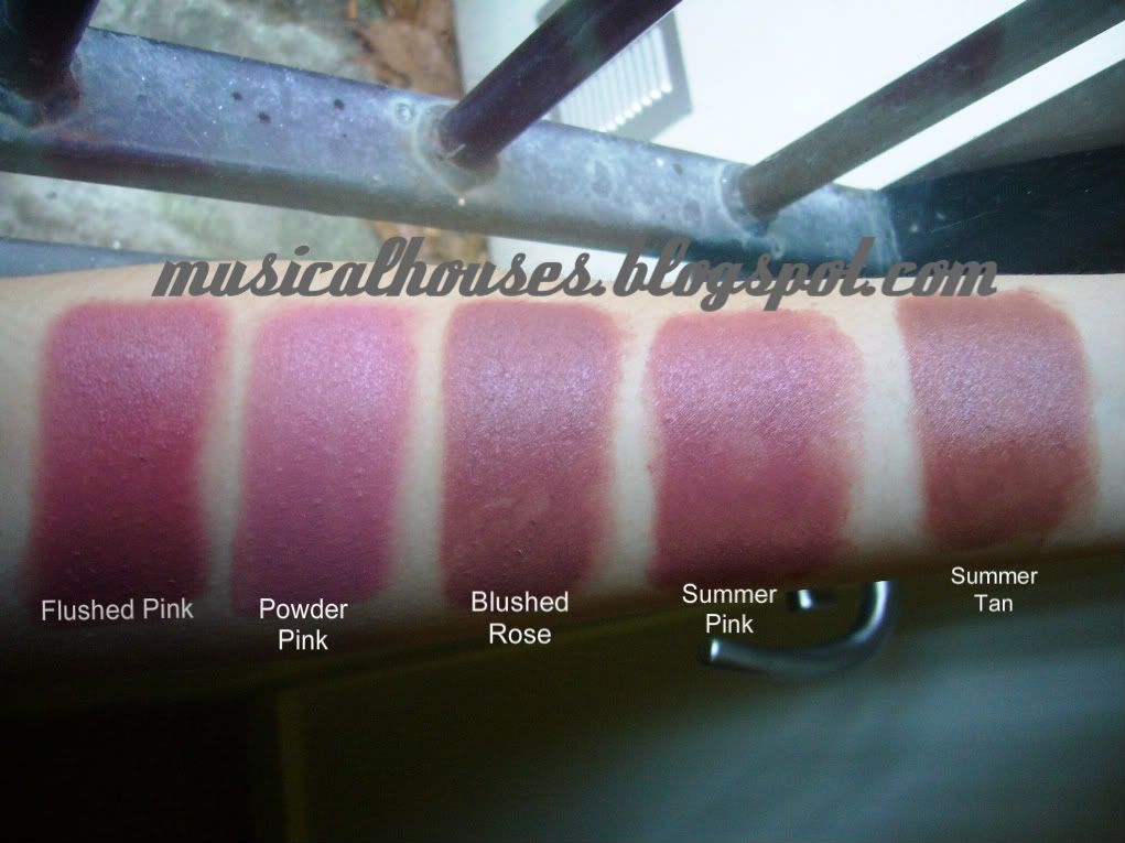
L - R: Flushed Pink, Powder Pink, Blushed Rose, Summer Pink, Summer Tan

I used to have Pink Raspberry, and Pale Pink, and possibly a couple of others, but I got rid of these two.

Flushed Pink is, as the name says, a flushed pink, and the most intense of all the colours I own. It's pink, with a hint of coral, and is a pretty and unique colour. I like this one.

Powder Pink is a light, fair, serene warm pink. This is really unusual for Bobbi Brown - a warm-toned colour! LOL, kidding. Anyway, this is a great neutral-to-warm colour. It is on the warm side, but I'm olive with cool undertones and it looks great on me too. I also like this because it's easy to apply and go - it's the lightest of the colours, so it's the easiest to put on and just go if I'm in a rush, because no matter what I do it doesn't look garish.

Blushed Rose. Ahhhh, this is one of my treasures, and Bobbi Brown's discontinued it. *Moment of silence* It was, I believe, one of the better selling colours from her line, so I've no idea why it was discontinued, but who knows. Anyway, this is a very universal neutral muted pink with a hint of brown. If you had to close your eyes and pick one blush blind, this would probably be it, because it's the most universal.

Summer Pink is my favourite out of all the colours, and this is my HOLY GRAIL CREAM BLUSH! WOOHOO! Now if only they had this in powder form...Anyway, this is the most perfect neutral pink. A lot of people have said this is almost identical to Blushed Rose, and I beg to differ. It's similar, but not identical. It's less brown than Blushed Rose, so that makes it a better colour for me overall, because it's less muddy, especially if you use it on the lips (although I don't recommend you to). This is my perfect pink - unfortunately, it just HAD to be Limited Edition. No fair!

Lastly, Summer Tan. This is similar to Blushed Rose, but a bit browner and darker. It isn't totally brown though, and when sheered out it gives a 'nude blush' kind of colour - there's still a bit of pink in it, but it's more nude than anything else. Also another limited edition colour. Stop discontinuing all your best colours already, Bobbi!

And because I love you guys, I looked through my computer to see if any of my previous FOTDs had these products, so I could put them up here for illustration purposes. Unfortunately, I only found two, but here they are!

The first one is an FOTD with Bobbi Brown's Blushed Rose Pot Rouge. Forgive the pimples in this one.

Bobbi Brown Pot Rouge Blushed Rose FOTD

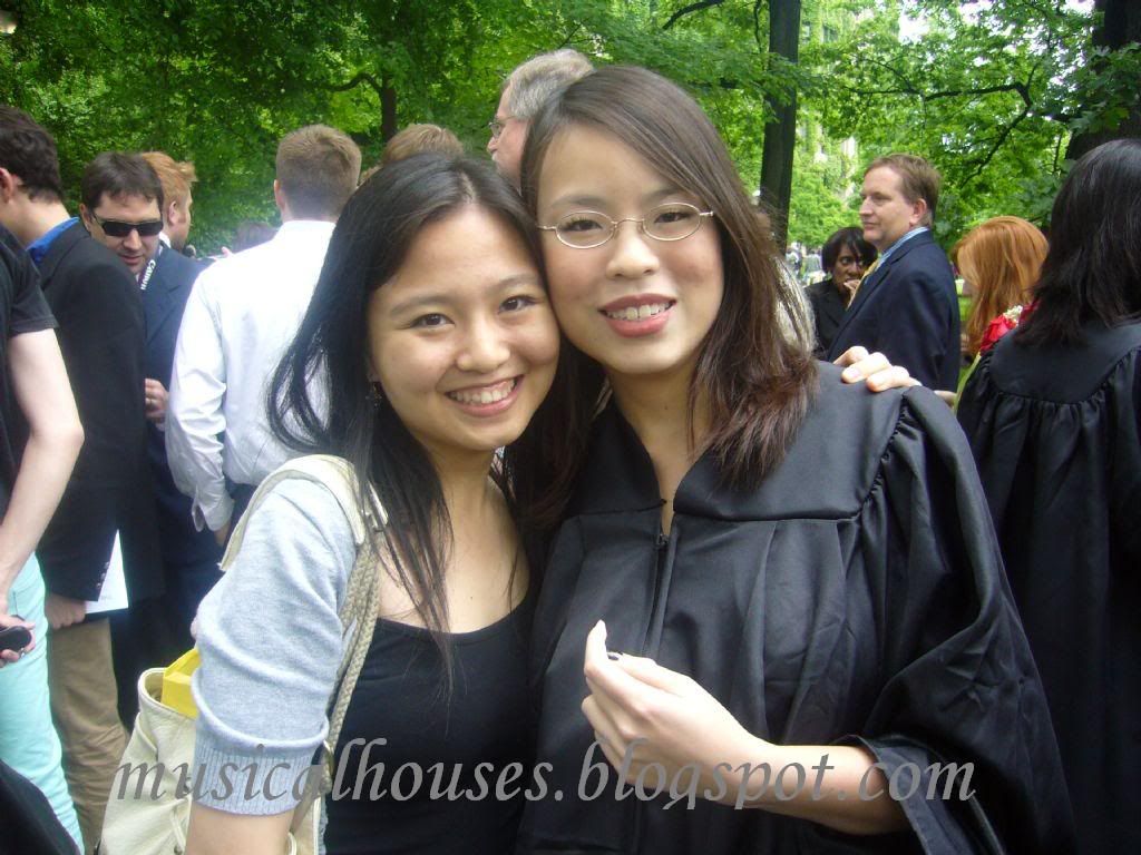
The second one is using Bobbi Brown's Pot Rouge in Summer Pink. And yes this was at my college graduation! (Ahh, college, those were the days.) It's my HG so I saved it for that special event! Unfortunately I obviously forgot to pluck my brows :X

I'm on the right, by the way. The left is my beautiful dorm mate! (And yes, she's of college-going age, but she looks really young.)

FOTD Bobbi Brown Summer Pink Pot Rouge
Bookmark and Share

New Layout!

Monday, January 11, 2010

1 comment
As you can see, since yesterday I've gotten a new layout for this blog. I like this, there's less space being wasted in the borders, it's cleaner, and it's got a better font that's easier to read. Most of all, it allows me to post bigger pictures, which is good for those who don't click on the pictures to see them full-sized. (Check out the older posts with the one coming up tomorrow. The pics are definitely bigger!) It also makes my ramblings look less lengthly, LOL.

It's also got snazzy features too. I have a contact form that emails messages direct to my email (you can try it out by clicking 'contact me' at the top right hand corner - don't do that unless you have something to say though!). Since this layout has more space I've also added more random stuff to it, like a latest tweets thing. So, you know, you can get spammed by me in more ways than one. Awesome.

Anyway, for some reason I can't seem to do the post footer right. I think we'll have to live with that, my html skills end around here, LOL. In the meantime, if anyone's experiencing any problems with this new layout, let me know!

NOTD: OPI Lincoln Park After Dark Suede

Sunday, January 10, 2010

6 comments
Today's NOTD is OPI's Lincoln Park After Dark Suede. I really love this colour, and the OPI Suede line in general - it really does matte without being flat. It's also incredibly fast drying, as in REALLY fast drying, although I guess you already knew that. It's also increibly chiptastic - I got a chip the very same day. Argh.

I really love the Suedes though. They're great for when I'm in a hurry.

These were with a basecoat underneath - I know people say you shouldn't use them, but I think as long as you let the basecoat dry completely before putting on the nail polish, there isn't a problem.

OPI Lincoln Park After Dark Suede

OPI LPAD Suede

Second Tag/Award: 7 things (Beautiful Blogger)

Saturday, January 9, 2010

3 comments


Wow, the stars must be aligned right or something, I got tagged by Yotke Beauty Blog in this post! Wow.

Edited to add: Klaudia of The Violet Rose Makeup Studio has also tagged me for this award! Thank you Klaudia!

Anyway, this time, the rules are identical to the previous award, which was just a couple of days ago in this post, which also called for 7 things, and 7 tags.

Since it was just a couple of days ago, I feel like skipping the bit about the 7 things and going straight to the 7 tags, but well, I should be a good sport. So here goes, 7 more useless facts about boring ol' me:

1. I like writing poetry. I'm not good at it unfortunately.

2. My most favourite airport in the entire world is the Hong Kong International airport, because it has fast and free wireless internet (I know, that is SO random). It's also clean.

3. I've been in the airports of Japan, Hong Kong, and Dubai without actually stepping out to see the country outside. Just breaks my heart, really, when you're in a country but can't see it. Oh well. Such is life.

4. In addition to crappy poetry, I also like to compose random songs (I play the piano, so it's not hard to throw together chords and music). Unfortunately, I'm also not good at it.

5. I prefer makeup shopping in the US than in the UK. Things are just so expensive there, and stuff doesn't go on sale as often.

6. I'm really boring and conservative when it comes to makeup and nail colours, hence the 342353 taupe eyeshadows and the 234353 nude polishes, but I'm trying to get more creative.

7. I'm worried that my non-boring makeup and nail polish colours will no longer get any love when I start work (which is soon, by the way).

And, now to tag 7 more people. As always, this isn't the easy part. I'm tagging:

1. Maquillage Obscura
2. Lacquer Laine
3. Stash Swatch
4. Jellyminx Thinks
5. Birds Decorate Branches
6. Coloruza
7. Lotus Palace

And that's it for today! :)

Majolica Majorca Cheek Customized Blusher Swatches

Friday, January 8, 2010

6 comments
Today's swatches are the Majolica Majorca line of blushes. Majolica Majorca is a brand of drugstore cosmetics hailing from Japan, under the Shiseido banner. That's really cool. It's like Shiseido for drugstore! Anyway, they're easily available at drugstores in Hong Kong, Taiwan, Malaysia, Singapore, Thailand, and Japan.They also have the cutest, girliest packaging for their products, and they've been getting raves so far.

The blushes, I'm afraid, aren't one of their standouts, although they're decent enough. The colours are a little bit odd, but they're all sheer, so they would probably look better sheered out. I just built them up to give a sense of the colours.

The line of blushes come in cute slide-out packaging, and you can buy nicer packaging in compact form separately if you wish.

I liked the blushes, sort of, I guess. I don't know. I was excited to swatch these, but they're all sheer and powdery. I guess they're OK.

Here they all are:

Majolica Majorca Blush Swatches

L - R: OR211, OR322, PK333, RD255 and 88

OR211 is a peachy orange, OR322 is a corally colour, PK333 is probably the most popular colour in their line, a boring but universally flattering neutral light pink, while RD255 is sort of like NARS Exhibit - but a lot, a lot more sheer.

88 is interesting. It wasn't released with the normal line of blushes, and was sitting in its own display, probably as something from a new, possibly limited edition, collection. It's a sheer light pink with sparkles - think Benefit Thrrrob and you've probably got it pat. It's a good highlighter, even if a bit boring. The sparkles annoy me a little, since they're a little on the chunky side, though. Still, its pretty.

First Award: 7 Things Tag (Haute Mess)

Thursday, January 7, 2010

7 comments


I got tagged by obsessedmakeupaddict in this post! Thanks ObssessedMakeupAddict, this is my first award ever, so it's pretty exciting for me! :)

The rules are: I tell you 7 random facts about me, and I tag 7 other bloggers to do the same thing. Isn't that cool? We all get to know more about each other!

Okay so for the first part. Seven random facts about me:

1. Travelling ruins my nails. Or maybe I just have weak nails. But seriously, I get all kinds of chips, cracks, and tears everytime I have to travel for more than a short trip. Maybe its all the handling heavy luggage :(

2. I love singing. I've always been in school choirs, and performances and choral competitions, and acappella groups.

3. I love animals, in particular dogs and rabbits.

4. I spend waaaaaayyy too much time on makeupalley. :X

5. My favourite makeup items are lipglosses and blushes, but I love all makeup items.

6. My favourite biscuits are HobNobs. They're like Digestive biscuits, but made of oat, so they have more texture. Yum.

7. I've only been into nails for a short while, perhaps about 6 - 9 months. That explains why my skills at painting my nails suck majorly, and why the NOTDs I post aren't too great. But I'm improving! (I hope.)


So now, part 2 - tag 7 other people!

This is difficult, because there are so many people I want to get to know more, but here goes:

1. PinkSith
2. Cafe Makeup
3. Polish Pixie
4. Catherine
5. GlitterMillie
6. Jeweled Thumb
7. KarlaSugar

That's it for today, and thanks guys!

Revlon Snow Violet and GOSH Purple Haze KOTD

Wednesday, January 6, 2010

5 comments
Today's KOTD is using my newly-arrived M57 plate, the coolest Konad Plate ever! Look Ma, Zebra stripes! Anyway, as my KOTD photo shows, I'm still struggling with the full-nail plates. Excuse the smudgi-ness, the blurry-ness, and the tipwear - I swear Sally Hansen InstaDri causes major shrinkage on me, but well, it's cheap and readily available, and it dries fast.

Revlon Snow Violet is the base of my KOTD, and I really LOVE this colour to bits. It looks like a pale pale white-lilac, but it's not (stupid camera). It's a pale cooltoned off-white with a violet flash. Yes it HAS a violet flash, I swear, I just can't get it to show up in photographs. (stupid me, and stupid camera) Also I think once I konaded over it, it lost its purple flash a tad. But it's really cool. This was one of their limited edition colours, that I bought maybe 7 or 8 years back, waaaay before I was into nail polish, and it's kept well since then. It was also one of my first 'proper' nail polishes (i.e. realy polish from a store, not kiddy-play-polish), so it has emotional value to me. Awwwww. But, this thing is a bit sheer and streaky, and what you're seeing is 3 coats. I'm imagining the possibilities over other colours...Mmmmm, purple flash.

GOSH Purple Haze is the design on the KOTD. Mmmm I know I've used it before in another KOTD here in this post, but I said that Purple Haze is a chamelon because it looks green in some konads and purple in others. Well, the last time I showed you that, it looked green, but now, it looks purple! I LOVE this colour. Unfortunately, I just use it for konading because when I do my entire nail with it, it just looks black :X

Once again, excuse the crappiness, tipwear, smudging, etc etc. I was just so excited that I finally got hold of the fabled M57 plate.

Revlon Snow Violet GOSH Purple Haze KOTD

KOTD: Sephora OPI Metro Chic, Konad Special Polish White

Monday, January 4, 2010

3 comments
Today's KOTD is $OPI's Metro Chic, and I used Konad's Special Polish in White for the design.

$OPI Metro Chic has been all over the blogosphere and back. It's a much overexposed, much over-reviewed little thing, but I do like it very much. I love these purply-grey-brown, mushroomy colours. They're probably my favourite colours for nails. Anyway, this isn't really good OPI - but then I've been told via hearsay that $OPI polishes are not actually made the same as OPI polishes, they just have the OPI label slapped on them. No idea if that is true or not though. This was 2 coats, although 3 would have been optimal. It's a litle sheer and streaky, although 2 - 3 coats covers nicely.

This was plate M36, I believe. Once again, sorry for the lousy lack of skills, as well as the raggedy cuticles - I'm very much a noob in the nail department, and I swear, I'm chronically plagued by terribe cuticles.

Sephora OPI Metro Chic and Konad White

TheBalm Read My Lips Lipstick Swatches!

Saturday, January 2, 2010

3 comments
Happy New Year everyone! What was your new year's resolution? Mine was to actually use up more things in my stash, hah. Today's swatches are theBalm's line of lipsticks, cutely named Read My Lips Lipsticks, and athough they have a limited number of colours - I'm not sure if I got the entire range down, but it seems that their colours are only limited to 6 - they cover most bases for lip colours. And most of their lip colours are very pretty and wearable too. They also come in cute paper packaging that looks like newspaper print - unless of course you don't like paper packaging, since these can get wet and spoil quickly. Personally, I only like the look of paper packaging, but it's not very practical for me.

Overall, I think these lipsticks are not bad. They have nice textures, and apply relatively evenly. And they don't have any weird smell - I think they just smell of unscented lipsticks - slightly chemically, but very faint. They're also all on the sheer side, although they build up nicely. They're not as superpigmented as the Barry M Lip Paints (which I'm so swatching, by the way), but they're wearable. Overall I think these are one of their better products, although they are a tad underrated.

Here are swatches, as always:

thebalm lipstick swatches

L - R: Wanted, Scoop, Gossip, Letter to the Editor, Classified, Smut

Wanted is a very pretty pinky-plummy rose, Scoop is a warmer rose that's less dark than Wanted and has more brown, Gossip is a pale pink with silver shimmer. Letter to the Editor is a shimmery bronzey brown colour with a hint of rose, while Classified is less shimmery, and less rosey. Smut is a deep purply-plum with some pink, and silver shimmer.

Although these colours are boring, I quite like them, particularly Wanted. They're good for work (unless you don't like shimmer), and these are pretty much safe, pretty colours.

Happy New Year!

Friday, January 1, 2010

2 comments
Happy New Year everyone! May all your dreams and wishes for the year ahead come true! :)

Linkwithin

Related Posts Plugin for WordPress, Blogger...