Bellabox April: Small, but Awesome

Monday, April 30, 2012

4 comments
Bellabox is another beauty box subscription service - finally, we get these in Singapore too! I have April's Bellabox to show you, and I'm glad to say, you'll like it - it's full of things that are plesant and perform well.

Bellabox comes in a tiny, pink box with a "BB" logo on the frnot. It's very pretty, and looks very tiny and dainty.

bella box april wrapping


Once opened however, you get a box that's chock full of goodies! It's all very nicely packed and nicely wrapped, too.


I liked what was in this month's Bellabox - I know it can vary quite a lot from month to month, and even within the same month's box options, so I guess I was fortunate this time. Without further ado, let's take a look at this month's box.

First up, the things that smell nice! I have a small sample size of Maison Francis Kurkdjian APOM Pour Femme. It's got orange flower inside (a favourite scent of mine), but layered with much darker, muskier notes, which makes it very interesting as a fragrance. The sample is a tiny little bottle (the kind department stores give out for free), but it will allow you to try out the fragrance at least a few times. I also have a small sample of Lemongrass House Shower Gel, which is in a convenient size for a short weekend travel. It's branded as a natural shower gel, and smells great, too. Very rose-y and floral.

bellabox lemongrass house shower gel perfume


Next up, makeup and skincare. Here we have a small Benefit Hello Flawless foundation sample. I haven't tried this yet, but I've been hearing good reviews about it. This is a very recently-launched foundation too (just last month, if I'm not wrong), so you are indeed trying out Benefit's latest product. Also, we have a decent-sized tube of Enavose Black Tea Quench Mask, which I've actually reviewed before. In my review, I said I liked the mask, and thought it worked well, so I know I'll like this, too.

bellabox benefit hello flawless enavose black tea mask


Lastly, stuff you can eat! Collagen drinks (basically flavoured beverages infused with collagen molecules) are really popular over here in Asia, and every beauty box company seems to have one. This month's Bellabox contains the Kinohimitsu BB drink, which contains collagen, vitamin C, and other nutrients vital for skin.

bellabox kinohimitsu beauty drink


So that's it for April's Bellabox! A good mix of skincare, bodycare, makeup, and edibles. If you're interested visit the Bellabox website to find out more. The Bellabox site also lets you purchase full sizes of any of the samples in your box, so that's another plus if you do like something in your Bellabox.

(Product was sent for review. Review is my complete and honest opinion. I am not affiliated with/compensated by the company.)

MUFE Aqua Cream Swatches: Part 1 of 2

Saturday, April 28, 2012

6 comments
MUFE is one of those makeup brands that seem to do no wrong - everything the brand puts out seems to be a winner, from foundation, to blushes (both liquid and powder), to eyeshadows, to eyeliners, and the list goes on. Seriously, is there a product in the line that is horrible?

Anyway, one of their much-raved-about products is their Aqua Creams. Basically, the MUFE Aqua Creams are little plastic pots of cream colour, and you can use them on eyes, lips, face, or however else you want (do note, some shades are only eye or lip safe - best to check before use). Most people use them as cream eyeshadows or blushes.

I have to say, these are massively pigmented - I only need a few swipes for each strip of colour. And, these also really, really, stay on. I had to end up doing a proper cleaning with makeup remover to remove these, wiping, even with a wet tissue, just wasn't doing the trick.


21 Turquoise is a bright, jewelled turquoise blue. Very pretty, if you like bright, tropical shades.
02 Steel isn't actually steel (which to me would be a gunmetal grey type shade), but a lovely, gorgeous taupe with hints of purple and brown. If you're a taupe fan, you need this already.
04 Snow is a shimmery white. Simple and basic.
01 Anthracite is a shimmer black.
15 Taupe isn't really taupe (to me that would really be 02 Steel), but it is a very pretty shade of medium neutral brown. I like it, I just don't think it's taupe.
05 Peach is a pinky-peach shade. I think this is one of those shades that would be really pretty as a blush.
12 Golden Copper is a orangey copper shade. Very warm-toned, and very metallic looking.

These aren't cheap, but a pot is generously-sized, and would probably last for quite awhile. If you see a colour you like, they're worth checking out.

Liz Earle Orange Flower Botanical Body Wash Review

Thursday, April 26, 2012

Leave a comment
I haven't done a bodycare product review in awhile, so I thought maybe I'd start again with one of my favourite bodycare brands - Liz Earle. Orange flower is one of my favourite all-time scents (almost all the perfumes I like have some derivative of the orange flower scent inside, like Annick Goutal's Neroli), so I was pretty excited to be able to take it one step further and not just spray the orange flower scent on myself, but bathe in it too!

The Liz Earle Orange Flower Botanical Body Wash is a body wash that toutes itself as being naturally-formulated and free of sodium lauryl/laureth sulphates, and gets a lot of raves from people with sensitive body skin who can't stand SLS. While I myself don't personally have sensitive body skin (facial skin? Oh yeah. But not body.), I appreciate that this is a viable alternative for those who want an alternative. It comes in the standard Liz Earle packaging - fuss-free blue bottle with a flip cap.


The Orange Flower Body Wash seriously smells heavenly, and is very aromatic. The moment you pour it out of the bottle, you are met with a very intense, heady orange flower fragrance - and I mean that in a good way. This isn't your average drugstore artificial-flowers-and-fruits type of scent, this is a little bit more special than that - there are a number of essential oils in the product, and they contribute to the scent. For those who don't like strong scents, it may be a turn-off, but for me personally, I love the scent, and it makes me feel like I'm being treated to a spa experience rather than just a shower, you know?

liz earle orange flower body wash


One of the things I really liked about the Liz Earle Orange Flower Body Wash is the ability to lather. Of course, being free of SLS, it doesn't lather as much as your average drugstore body wash. However, even with me just using my hands and some water, you can see soapy bubbles. I imagine that if you really want a greater lather, a washing mitt or glove would help greatly.

liz earle orange flower body wash foam


All in all, I really like the Orange Flower Botanical Body Wash. It isn't the cheapest body wash around, but I can see why someone would want to buy it over cheaper alternatives. If you generally like Liz Earle products, then this is pretty much in the same vein, so you'd probably like it too. If you are looking for a SLS-free body wash, or a body wash with a gorgeous, aromatherapeutic fragrance, or if you like essential oils in your skincare, then this is just the body wash for you.

(Product was sent for review. Review is my complete and honest opinion. I am not affiliated with/compensated by the company.)

Chanel Peridot Inspired Eye Look: Gold/Green/Blue/Purple!

Tuesday, April 24, 2012

14 comments
After all the Chanel Peridot (along with its two dupes, OPI Just Spotted the Lizard and Sephora Diving in Malaysia) hype, I thought to myself, since I liked the Chanel Peridot colour so much, why should I limit myself to just wearing it on nails? I wanted to see if I could recreate the look or feel of Chanel Peridot on my eyes!

sephora diving in malaysia bottle close


I was looking at my own bottle of Sephora Diving in Malaysia (one of the Peridot dupes - I'm cheap like that, but hey, my spending money comes out of my salary, aka money I actually have to earn), and I paid attention to the colours at the edge of the bottle, where you see the duochrome. To me, it looked as though the gold colour was ringed by concentric circles of green, blue, and purple, each blending into each other. Well, it's quite complex, but that was my oversimplified way of breaking it down.


So, in order to recreate this look, I used a bunch of colours. I used Urban Decay Maui Wowie for the gold part, mixed with the tiniest bit of Sleek Screwdriver, from the Sleek Curacao Palette, to make it a little bit more yellow for colour accuracy. For the blue and the green I used two shades from an el cheapo Love Alpha Palette I got sometime back (middle two shades on the bottom row, if you really want to know). For the purple shade, I used the purple shade in my BeautyUK Day and Night Eyeshadow Palette. I don't know how much of each of the individual colours you can see (other than the gold), because I was trying to blend them one into the other - sort of like the nail polish.

chanel peridot eye look 2


Anyway, I used the gold shade on the lid, and then added on the blue, green, and purple respectively nearer the contour area. And then I blended everything together. And that's it, really. I had to adjust some of the blending a little bit here and there to match my bottle of Diving in Malaysia a little more. It's not a perfect match, but it sort of looks like Peridot, right? Sort of?

chanel peridot eye look 3


While this isn't normally a look I'd wear (or a colour combination I'd even think of making up), I think I quite like it. I wouldn't wear it out or anything, but I did have fun doing this look!

OPI Just Spotted the Lizard/Chanel Peridot Dupe: Sephora Diving in Malaysia

Sunday, April 22, 2012

9 comments
It all started when Chanel released Peridot sometime at the end of last year. That immediately sparked the frenzy of nail polish aficianados everywhere, and people were going crazy paying crazy prices for it on Ebay. Then, as inevitably happens, dupes were found, such as Sephora's Diving in Malaysia, thus releasing some of the crazy, and the nail polish world moved on to other colours, and newer seasons.

Fast forward to now. OPI is going to release Just Spotted the Lizard with its Spiderman collection, and it's apparently a dupe for Chanel Peridot, too. So now, we have three polishes that more or less are perfect dupes of each other - Chanel Peridot, OPI Just Spotte the Lizard, and Sephora Diving in Malaysia.

sephora diving in malaysia bottle


The one I have is, naturally, the cheapest of the lot, but unfortunately also the smallest. Sephora's Diving in Malaysia is just S$9 at our local Sephora, but unfortunately you also only get a teeny 5ml of nail polish (OPI bottles are 15ml for comparison). I guess given that I'd never ever use up even half of 5ml of nail polish from that bottle, it's a good idea for me to pay less for less, I suppose. I do have this horrible tendency to wear each colour I have once or twice before chucking it to one side...

Anyway, I don't need to go into the gorgeous colour that is Chanel Peridot/OPI Just Spotted the Lizard/Sephora Diving in Malaysia. It's a yellow-gold frosty polish, that has a very pretty duochrome finish that's hard to describe. Usually it looks green at the edges, but in the bottle (and on occasion, the nails), you see hints of blue and purple too. Very pretty, indeed. No wonder it took the world by storm.

sephora diving in malaysia bottle close


I wasn't all that keen on this polish at first, but I fell in love with it once it was applied. It's a gorgeously neutral shade that would look great on both warm and cool skintones, and the greenish duochrome at the sides gives it a lot more interest than your typical neutral yellow gold shade. It's a perfect neutral with a kick!


I also really liked the application of Sephora Diving in Malaysia. It applied quite nicely and was opaque in two coats, which is what you see on my nails. The only drawback was that due to the small size of the bottle, the cap and the brush to apply the nail polish were also rather tiny. Fortunately, it was still easy to apply, and I also like the curved brush edges, which fit to the shape of my nail quite nicely.

sephora diving in malaysia 2


This is the first time I've tried a Sephora brand polish. Usually I just ignore them as the colours aren't all that interesting, but I specifically bought Diving in Malaysia because of it's dupe status. If all Sephora polishes were like this, I think they're actually not too bad. If there are any unique colours in the range, I'd consider them.

sephora diving in malaysia 3


So, do you need this? Well, if you already have Chanel Peridot, or OPI Just Spotted the Lizard, then you probably don't. But if you don't, and you want a cheap alternative (with a corresponding tiny amount), then this is the perfect solution.

Beauty Blog Link Love

Saturday, April 21, 2012

1 comment
Check out these "Lust, Caution" inspired custom OCC Lip Tar mixes on My Funny Valentine, packaged with a lip brush applicator!

Phyrra does a wearable bright pink video tutorial with BftE Cosmetics.

A product that applies like a gloss, wears like a stain, and pH-adjusts like a grade school chemistry experiment is too good to be true - right? Find out if it is (or isn't) on theNotice.

With spring in the air, it's time to invest in a gorgeous coral lipstick! Amy Antoinette reviews the beautiful new Clarins Joli Rouge Pink Coral Lipstick.

Is OPI Just Spotted the Lizard really a dupe fore Chanel Peridot? Read polish insomniac's post to find out!

Prime Beauty tests out Laura Mercier's Limited Edition Belle Nouveau, a "new beautiful" diversion from the neons so popular this spring.

How do the Sleek Eau La La Eyeliners hold up against other famous brands, like Urban Decay and MUFE? Musicalhouses puts them to the test, and pits them against each other!

Ever undertaken a seemingly hopeless hunt for that elusive limited edition product that you just had to have? Lydia proves that good things come to those who wait after finding Guerlain's Cruel Gardenia Meteorites Illuminator.

Tracy at Beauty Reflections finally has Mediterranean light every day thanks to Guerlain Meteorites Perles d'Azur by Emilio Pucci!

Take a look at BUXOM's new Color Choreography Eye Shadow in Tango over at Makeup, Beauty and More.

If there's anything better than new Dior lipstick, it would be new Dior lipstick and nail polish! Join Lisamarie from Beauty Crazed in admiring the beauty of the new Dior Addict Extreme Lipsticks and Colour Blocked polishes!
---

Want to update your hair colour this spring? Miss Beauty Nerd is giving away two Nutrisse Mousse Nourishing Colour Foams for wannabe redheads and blondes!

Sunscreen: 5 Overlooked Tips You Need To Know

Thursday, April 19, 2012

86 comments
Summer is round the corner, and all the drugstores in the West are stocking up their aisles with rows and rows of sunblock of various kinds. In Asia, sunscreen is an ever-popular item, so we always have lots of it all year round. As a skincare fanatic, I thought I'd share some useful tips I've learned regarding sunscreen, especially since there is a lot of misinformation about sunscreen.


(Image by Ling)

Most of us already know about the basic sunscreen tips, e.g. reapply every two hours, etc. This blogpost intends to discuss deeper issues that are equally important. Some of these issues can be really, really technical (if you read published literature on it, you'll know what I mean). Since this is meant to be an introductory post for the average, non-skincare-fanatic girl, I've done a lot of oversimplification, in order to get the points across. And to make it more entertaining (a long block of text is boring after all), I've even thrown in cute pin up girls with lame captions. So without further ado, here are my 5 tips:

1. Just Looking at the SPF Number is Not Enough

It always surprises me how most people think that as long as a sunscreen's SPF (Sun Protection Factor) is high enough, they're covered. Not quite - there are two types of ultraviolet rays produced by the sun that hit the skin - UVA, and UVB (there's also UVC, but that's absorbed by our ozone layer, so you don't have to worry about it). Both UVA and UVB damage the skin - they can damage collagen fibres in the skin, as well as cause free radical damage. UVA however, doesn't cause sunburn, whereas UVB does. It's a lot more complex than that, but I'm oversimplifying here.

sunscreen tip 1
(Image source. Text and editing by me.)

Now, the SPF number in a sunscreen is only the measure of protection against UVB rays. Basically, the higher the SPF, the greater the protection you get against UVB rays. Of course, this leaves out half the story - you don't know anything about whether the sunscreen can offer protection against UVA rays. So even if you slather sunscreen all over your body, if it doesn't have much UVA protection, you will still subject yourself to sun damage. In fact, you may be worse off, because you won't burn as quickly despite exposure to UVA rays, thus you may end up staying out in the sun for longer.

So how do you determine whether a sunscreen has good UVA protection or not? This is where it gets tricky. Unlike SPF, which is pretty much well-defined the world over, there is no universal standard for UVA protection. In some countries, typically in Asian countries, you see a PA value, e.g. PA+, PA++, PA+++ and so on. This is an indication of UVA protection, and the more ++'s after the PA, the higher the UVA protection. You see this a lot on Japanese sunscreens. In my experience, I rarely see any sunscreens beyond PA+++. In other countries, such as some European ones, they use PPD (Persistent Pigmentation Darkening) as a measure, followed by a number, e.g. PPD 4, PPD 8, PPD 12 and so on (I don't often see sunscreens with more than PPD 12). Like SPF, the higher the PPD value, the greater the UVA protection. In the USA and other countries (see Edited to add note a few paragraphs down for US FDA sunscreen guidelines changes), there isn't any standard way to label UVA protection, so most sunscreens will mention something like "broad spectrum protection" on the packaging. If, in the absence of PA or PPD information, you see this, it's generally a good indication that it has some protection against UVA rays too. So the bottom line is - don't just look at the SPF number. Check to see that it offers UVA protection too.

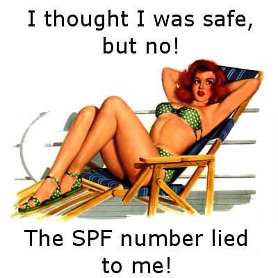
1a. A side note: SPF Numbers Can be Misleading

So now that you're aware about choosing a sunscreen with broad spectrum protection, I'd like to clear up one last misconception about SPF. In Asia especially, girls like to go for crazy high SPF numbers in their sunscreen (here you see SPF 130 sunscreens and SPF 100 sunscreens quite commonly). They somehow feel like it's the strongest type of sun protection they can get. However, a higher SPF doesn't really mean a higher level of protection - past a certain point, the additional protection offered is less and less, as sun protection protection doesn't increase linearly with SPF number. So a SPF 30 sunscreen will have a greater incremental effect when compared to a SPF 20 sunscreen, but an SPF 80 sunscreen may not be all that much different from a SPF 70 sunscreen. And, a SPF 100 sunscreen does not actually offer twice the amount of protection that an SPF 50 sunscreen does. Case in point - an SPF 15 sunscreen absorbs 93% of UVB rays. An SPF 30 sunscrreen absorbs 97% of UVB rays. An SPF 50 sunscreen? 98%. That's why some countries (mainly European ones, and most recently the USA) have regulations demanding that you can't label your sunscreen with a number above, say, SPF 50, becuase the SPF number can be misleading for the average consumer. In these countries, anything above SPF 50 will just be labelled SPF 50+. But where I live, companies go crazy advertising uselessly high SPF numbers, and ignorant consumers snap these up like candy.

Updated to Add: Here's a handy chart. As you can see, the sky-high SPF value really confers only incremental benefits when it comes to sun protection, once you hit SPF 30 (which provides 97% protection). So, if you're thinking of spending top dollar on that SPF 20000 sunscreen, just opt for an SPF 30. I personally use SPF 50 for my daily use, but then again I'm an Asian girl aspiring to Twilight-vampire-like pale skin. So there.

(Image source, which uses data from EPA & FDA.)

But anyway, enough about my rant. Let's move on to the next point.

(Edited to add: I must have a sixth sense or something, because a couple of months after I wrote this article, the FDA unveiled some changes to sunscreen guidelines, which would affect the claims manufacturers can place on their packaging. This includes making it mandatory for sunscreens to offer effective UVA and UVB protection in order to claim being "broad spectrum", and requiring any sunscreen with SPF values of more than 50 to be marked SPF 50+. That's better, isn't it? You can read more here.)

(More Edited to add: This isn't really in the scope of an introductory blogspot, but this really interesting blogpost has further info on why SPF numbers can be misleading - basically he argues that other ingredients (namely antioxidants and anti-inflammatory ingredients) can skew the SPF measurements by making them seem higher than they really are. The bottom line is to look not just at SPF number, but also at the level of UVA protection offered.)

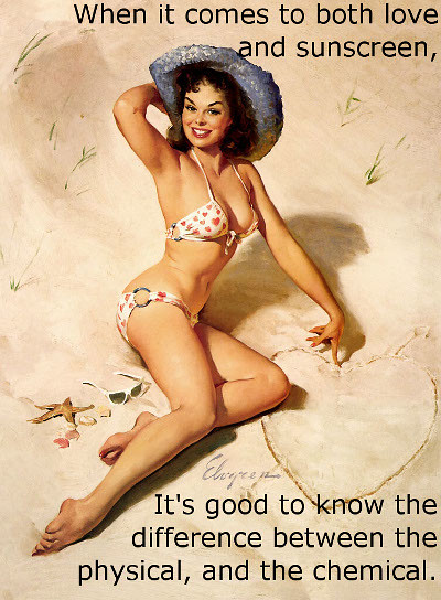
2. Know Whether Your Sunscreen is Physical or Chemical

Sunscreens offer protection in two ways - physical, and/or chemical. A sunscreen can be purely physical, purely chemical, or both. Physical filters utilize ingredients (there are really only two, titanium dioxide and zinc oxide) to reflect and scatter the sun's rays. So basically, these ingredients sit on top of your skin, and deflect the sun's rays away from your skin (I oversimplified, but you get the idea). So they physically block the sun's rays. Chemical filters (avobenzone, octocrylene etc) work differently. These absorb the incoming UV rays, and then "convert" them to heat (another oversimplification, but I hope it makes things clear).

sunscreen tip 2
(Image source. Text and editing by me.)


So, you may ask, what's the difference between the two? Well, physical sunscreens are less cosmetically elegant - so if you get that white cast on your face, it's usually due to the physical filters in your sunscreen. In addition, physical sunscreens tend to be thicker, and more opaque, and thus tend to have a heavier texture, which some people don't like. On the bright side, they are generally more photostable, and they are generally agreed to be less likely to aggravate sensitive skin. Chemical sunscreens tend to have a better texture, as they tend to be colourless and more watery in texture (a lot of Japanese sunscreens are like this), and don't give you "white sunscreen face", but on the other hand, they tend to aggravate some types of sensitive skin more. Some badly formulated ones can sting and burn sensitive skin. (There's also a concern about chemical sunscreens being xenoestrogenic, but I won't go into that, as I don't have much expertise in the area.)

Thus, if you do have sensitive skin, it is a good idea to look out for a physical sunscreen. Often I get feedback from my female acquaintances telling me about how this or that sunscreen cause them skin sensitivities, and when I check, they're invariably using a sunscreen that's heavy on the chemical filters. Of course, this is an over-generalization because everyone's skin is different, and there are lots of ways to formulate sunscreen (the base, in addition to the active ingredients, could contain irritating compounds). But if you have sensitive skin, it's worth bearing in mind. The bottom line - there's a tradeoff between cosmetic elegance and skin aggravation. You have to find the balance, and it starts by knowing the difference between physical and chemical filters.

Updated to add: So as far as choosing sunscreen goes, a good idea is to look out for two things: a sunscreen with both UVA and UVB protection, as well as a sunscreen whose filters, whether chemical or physical, are less likely to aggravate your skin. Here's a neat chart that summarizes some of the commonly used sunscreen filters, whether they are chemical or physical (like I said, there are only two physical filters), as well as the level of UVA and UVB protection they provide.

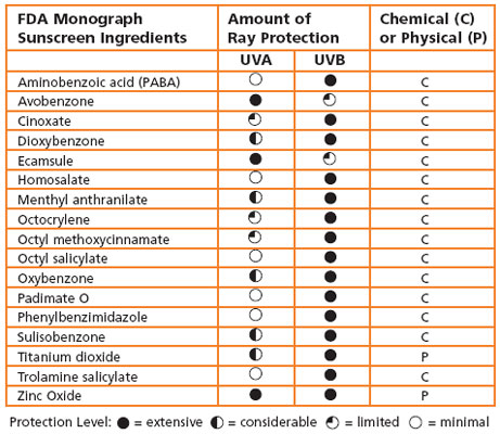
(Image source, using data from EPA & FDA.)

If the above list sounds very short, it's because the FDA only lists down the INCI names, not the brand or trade names these are sold or marketed under. For example, Helioplex (you may have seen it on Neutrogena sunscreens) is actually a combination of avobenzone and oxybenzone, not an entirely new sunscreen filter altogether. Also, as this is a chart from the FDA, it doesn't include filters approved elsewhere (e.g. Europe) that have not yet been approved by the FDA. For a list of some of these, you can see here (or scroll down to the end of this post, where I have the table in a picture form in the annex).

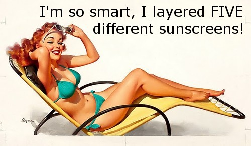
3. Layering SPF Products Does Not Work

Another common question I get is, "If I use an SPF 15 moisturizer, and an SPF 20 sunscreen, will I get SPF 35 on my face?" I hate to break it to these girls, since I see so many people doing this, but the answer is no. Then said girl will invariably ask, "Or is it just SPF 20, since that's the higher of the two?" Once again, no.

sunscreen tip 3
(Image source. Text and editing by me.)


The reason why SPF 15 + SPF 15 doesn't = SPF 30 is because some SPF ingredients can interfere with each other, or stabilize each other. This has to do with issues of photostability in the sunscreen. Some ingredients degrade other ingredients, thus offering less protection overall. A commonly-cited example is uncoated titanium dioxide or zinc oxide degrading avobenzene. In other words, if you have a sunscreen containing zinc oxide, and another sunscreen containing avobenzene, it is not a good idea to use them together or layer them on top of the other. Other ingredients, on the other hand, stabilize each other - for example, avobenzene is stabilized by specific amounts of octocrylene, so they are often used together in sunscreen formulations.

The reality is, it's hard to tell how a sunscreen will react with another sunscreen, unless you know specifically what the active ingredients are, and how they would react with each other. But we aren't all PhD holders. So the easiest way is to just have only ONE product with SPF in your routine (that is, the sunscreen) and apply that properly. That way, you can be sure it won't have any other sunscreen ingredients to interfere with its effaciacy. Don't get a moisturizer with SPF, a foundation with SPF, and try to layer them both with a sunscreen. That's just a waste of all that sun protection in the product.

(On a side note, this is why I absolutely HATE moisturizers and foundations with SPF protection. They get in the way of my sunscreen. Unfortunately, every other new moisturizer or foundation has SPF inside, thanks to the laws of supply and demand. Stupid uninformed consumers demanding SPF-infused products which shouldn't have SPF stuff inside. Grr.)

Which brings me to my next point.


4. Apply Your Sunscreen Properly

I'm always amazed by girls who spend a pretty penny on their sunscreen, but can't be bothered to apply it properly. I mean, if you're going to apply it at all, make sure you do so properly, if not you won't get the full protection of your sunscreen. There are two major issues with application that I will go into: not applying enough, and excessive rubbing.

4a. Not applying enough

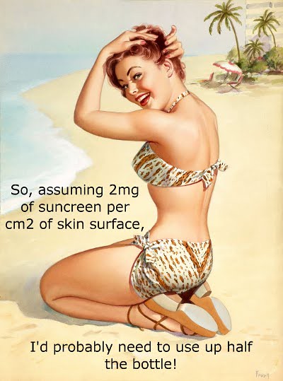
Do you know how SPF is calculated? It's calculated by measuring the amount of UV protection afforded by the sunscreen, using 2mg of sunscreen per cm2 of skin area. Yes, 2mg/cm2. Use any less, and you'll be getting less than the stated SPF on the bottle.

So, what does 2mg/cm2 of sunscreen look like on your face? This should translate into half a teaspoon for your face and neck, and half a teaspoon for each arm (this is an approximate measurement, and would vary with the surface area of your face/neck/arms). Most people I know don't use anywhere near to the correct amount of sunscreen, even though they buy really expensive sunscreen products. That's a pity. Remember, always use at least half a teaspoon. If in doubt, use more rather than less. How much you use determines how much protection you get.

sunscreen tip 4
(Image source. Text and editing by me.)


Now, on to the next mistake when it comes to sunscreen application.

4b. Rubbing Your Sunscreen

Sunscreen is supposed to sit in an even, unbroken layer across the surface of your face. That's how it reflects/scatters/absorbs the UV rays before they hit your skin. So when applying your sunscreen, that should be your aim. Rubbing or buffing in your sunscreen will break the even layer across your face, and affect its effectivenss. I know the temptation to rub it into your skin can be strong, but yes, it is supposed to sit on top of your skin to work properly. It's sunscreen, not skincare.

As a corollary, it also irritates me when people put on sunscreen, and then buff or rub their foundation on top of the sunscreen. By doing so, the sunscreen's efficacy has been lessened. I guess for people who use makeup on top of their sunscreen, rubbing and buffing will be inevitable - the only tip then would be to keep the rubbing to a minimum.

Both points 3 and 4 above bring me to my last point which is...


5. Sunscreen in Non-Sunscreen Products is Useless

Well, not quite useless. But generally, unless these products are used and applied like sunscreen, you aren't likely to get much UV protection from these products. And by "used and applied like sunscreen", I mean 1. applying as much of the product as you would sunscreen (remember, 2mg/cm2), and 2. Not rubbing or buffing it into your skin, and 3. not layering products.

sunscreen tip 5
(Image source. Text and editing by me.)


Now you see why sunscreen in non-sunscreen products, like moisturizers, foundations, and powders, is so useless. First of all, noone applies 2mg/cm2 of foundation to their face. You'd end up with a very cakey makeup look - not great. Same for moisturizer and powder. So in reality, although SPF 15 in that foundation may sound great, unless you apply half a teaspoon of foundation for face and neck, you're not getting anywhere close to SPF 15. In fact, this post on Futurederm (written by Nicki who is herself a med student) estimates that "your average SPF 15 powder is giving you a true SPF of 1.1, and your SPF 15 moisturizer is giving you actual protection of SPF 8 to 10 with average application".

(Edited to Add: If half a teaspoon seems hard to visualize, here's a really good post on FutureDerm written since the time this blogpost went live, where John pours out the requisite amount of sunscreen into his palm (he's using approx a quarter of a teaspoon, calculated on the surface area of just his face only, not including the neck). Now imagine that you want to get your full SPF20 from your foundation. Are you really going to apply that much foundation? I definitely wouldn't want to use that much foundation on my face - it would be too much makeup.)

The second issue is to do with buffing and rubbing. When you use moisturizer, foundation, or powder, or other makeup product, you're supposed to buff and rub. I mean, a skilful makeup application means lots of blending, right? Unfortunately, it also makes for very lousy SPF coverage. This means to get SPF 15 of coverage listed on your foundation, you'd have to use half a teaspoon of foundation, and try not to blend it in. Eeks.

Lastly, of course, you can't layer SPF products (or you can, but the active ingredients may interfere with each other). I've already written about this, so I won't go into details again. So now you can see why I hate foundations, powders, moisturizers, etc with sunscreen in them. They're really more a marketing gimmick than anything else, since most people would use these products in a manner which would render very little, if any, UV protection at all.

sunscreen 2
(Image source. Text and editing by me.)


So there you have it, the five most useful sunscreen tips I've ever encountered. I know I've oversimplified here and there, sometimes a lot, but I hope that it makes some of these very technical issues a little easier to understand, so if anyone wants to chime in with their two cents worth, please do so and leave a comment! There's lots of scientific literature out there, so if anyone wishes to delve deeper into any of the abovementioned points, there's a lot of reading (the Skincare board on Makeupalley is a great place to start). Good luck, and happy sunscreen-ing yourself!

Annex: Full List of Sunscreen Filters

This super long list of sunscreen filters, as well as details about them, are from Skinacea. I'm keeping a copy on my site because things on the internet aren't very permanent, and we absolutely need this valuable resource!

sunscreen

Sleek Eau La La Eyeliner: Swatches, Reviews, and Comparisons

Tuesday, April 17, 2012

12 comments
Sleek Makeup has just released their Eau La La Eyeliners, which are pencil eyeliners that promise vibrant, well-pigmented colour, and are touted to be long-lasting as well. I'm always on the lookout for a good and cheap eyeliner, so I was all over this like white on rice. Sign me up, already, will ya?

The Sleek Eau La La Eyeliners come with a really sleek (ha, ha) black casings, and look quite nice. These also have a cap that's really tight - when I opened the caps, I could literally hear a "pop" sound. I guess it's got some sort of airtight seal in the cap? That's usually a good thing, as higher end eyeliners tend to have more airtight caps, to prevent emollient ingredients from evaporating.


This is a wooden pencil, so you'll have to sharpen it. Here's a close up shot of one of the eyeliners (Tonic), to give you a better idea of what the eyeliner nib looks like.

Sleek Eau La La Eyeliner Tonic


The Eau La La Eyeliners come in a large variety of colours. I have three to show you - Canary Yellow, which is a bright happy sunshine yellow, Tonic, which is a gorgeous shimmery forest green with a metallic finish, and Noir, which is a matte black, pure and simple. You can see the swatches here:

Sleek Eau La La Eyeliner Swatches


As you might guess, Tonic is my favourite, since it has that gorgeous metallic, bejeweled quality to it. How pretty is that? All three eyeliners were very nicely pigmented, and felt smooth and creamy going on. In terms of pigementation and texture, these actually rival high-end brands with really good eyeliners, such as Urban Decay and MUFE.

So, we know they swatch well. But how do they hold up against other more famous brands when it comes to long-lasting-ness (if there's such a word)? Well, I knew that would be a question you guys would want to know, so I took the trouble to compare these with some of my other favourite eyeliners.

Skee Eau La La Eyeliner Comparison Swatches


In the photo above, you see the Sleek Eau La La Eyeliners swatched. Next to them, there is Urban Decay's 24/7 Eyeliner in Stash, MUFE's Aqua Eyes Eyeliner in 3L, and GOSH Velvet Touch Eyeliner in Golden Moss. These are three of my favourite eyeliner brands, as I've found them to have the best colour range and quality, both in terms of pigmentation and lasting quality.

In order to test these eyeliners out, I drew the lines on my arm, and let the eyeliners "set" for 5 minutes (although I know in real life wee don't always wait 5 minutes before rubbing our eyes and so on). I then subjected them to three tests: 1. Frantic rubbing with my finger test (you know, like when you rub your eyes really hard), 2. Putting them under a running tap (so like when you wear them to swim), and 3. Rubbing them frantically while putting them under a running tap (so if you rub your eyes underwater, I guess).

So after these three crucial tests, how did all these eyeliners hold up? See for yourself below:

Sleek Eau La La Eyeliner Comparisons


Wow. I have to say, I'm impressed! I'm already familiar with the Urban Decay, MUFE, and GOSH eyeliners, so I knew they would be good (that's why I tested the Sleek ones against these), but the Eau La La Eyeliners really performed just as well too! I think actually the MUFE one did the best, and some of the Sleek ones smudged a little more, but the difference is pretty marginal. I was expecting them to be all wiped off, but they're still there. I guess the only key differernce, thebn, would be how fast these set - so maybe I should repeat the experiment with a shorter waiting time, eh?

Anyway, I love these, and I'd definitely recommend them if you liked the Urban Decay, MUFE, or GOSH eyeliners, since the Sleek Eau La La Eyeliners are pretty similar. For me, I think I've just found another brand of eyeliners I love.

(Sleek product was sent for review. Review is my complete and honest opinion. I am not affiliated with/compensated by the company.)

Caviar, oops, Fish Egg Manicure, aka Bad PR 101: How NOT to Handle Bloggers

Sunday, April 15, 2012

16 comments
Here is my Caviar, oops, I mean, Fish Egg Manicure! I'm sure by now, you would have heard of how Ciate stupidly unleashed a backlash against its own brand. Well, that's a large part of the reason why I'm writing today's post, too.


It all started so well. One of the more unique trends that was coming up this season for nails was Ciate's Caviar Manicure. This basically a nail surface that is polished, and then covered with beads. It lends a texture and look that resembles caviar, hence the name. (I guess maybe "bubble manicure" didn't sound as good.)

A lot of nail bloggers were inspired by the look, and began doing their own DIY versions. Most brands consider it a good thing, even if these bloggers aren't using their own products (Ciate's manicure sets aren't avaialble til June). The reason is simple - more publicity leads to increased sales, or at least, increased general brand awareness. This was a virtuous cycle - bloggers love a product, readers know about it, brand gets good publicity, and sales.

(Source)


So far, so good. Then Ciate began sending Cease and Desist letters to bloggers (an example here), on the grounds that they are infringing on their intellectual property. Ciate claims that because they are in the process of trademarking the terms "caviar manicure" and "caviar nails", all nail bloggers using either terms are liable for IP infringement.

Of course, nail bloggers, being a tight-knit bunch, were unhappy. The outrage culminated in "Fish Egg Friday", where bloggers all did their own DIY caviar manicures (now re-named "Fish Egg manicures") to express solidarity and unhappiness with Ciate regarding the situation. (One of my favourite posts regarding the entire situation is here.)

As it turns out, Ciate didn't even invent the caviar manicure. It was first done by Dashing Diva more than a year before Ciate, for the Cushnie et Ochs show in 2011. And back then, it was called a caviar manicure too, not as a trademarked term, but more as a general description (like shatter polish doesn't specificaly refer to OPI's shatter range). And yet, if you read the Ciate website, it says, "The inspiration behind the Caviar Manicure™ came about when Charlotte, Ciaté’s Creative Director, was looking to create 3-dimensional nails for a front cover magazine shoot and wanted to develop something feminine, indulgent yet delicately extravagant."

ciate claims

(Screen-capped from Ciate website. Snarky text and red circle added by me.)


So in essence, Ciate is claiming that they invented the cavair manicure, which was invented over a year ago by someone else under the same (non-trademarked) name, and now they are going to trademark it so that noone else (including the original creator, Dashing Diva), can use the words "caviar manicure" or "caviar nails". That's just total and utter crap to me.

Ethical issues aside, this has to do with dealing with bloggers. If it was some skeevy Ebay seller selling fake Ciate beads, then by all means, excercise your IP and slap them with a C&D. But for bloggers, who are individuals acting in a non-commercial manner, and who could be your customers, this is overkill. Even if you have the legal right to do so, a savvy company would not use that as the first step. As I wrote in my previous post the last time something like this happened, it's not a good idea, and I quote:

"However, sending a lawyer's letter right off the bat is a very heavy-handed response given that they are just dealing with one individual, and is one that is too harsh, and bound to give the company a bad reputation. Instead, a much better thing to do would have been to get a PR person to send out a more friendly-sounding email clarifying the situation - that would have gotten the same effect, and have avoided the drama. Justified or not, this is still really bad publicity for [Ciate], which could have been avoided. A lawyer's letter should be the last line of resort, not the first thing you think of, especially when dealing with harmless individuals who are your customers!"

Ciate has since then softened its stance against bloggers, but it does seem like too little, too late.

Anyway, I'm sure you had enough of my ranting (well, what is my blog good for if not ranting I guess!). Let's move on to the actual good stuff - more photos of my very own Caviar Fish Egg Manicure! I'm too late to the party to add in my blog for the link list that's been going round since I was at work all week, so this is not for any type of publicity I could get from the outrage, but more to just express solidarity in my own way.

ciate caviar manicure inspired look 2


For this Caviar Fish Egg Manicure, I used OPI's Barefoot in Barcelona as the base. It's been sitting around in my untrieds for over a year, and I can't believe it took me all this time to use this baby. It's a gorgeous pinky-brown sandy neutral, and would look good on almost anyone, I think. Heck, I think this would even make a great lip colour too!

ciate caviar manicure inspired look 4


For the beads, I used some random beads I got from Born Pretty Store. Mine were only one colour, but you can get a few colours and mix them together, if you're more artsy than me. In order to get the beads onto the nails, I painted two coats of Barefoot in Barcelona, then basically poured beads over my nail while it was still wet. Some areas are harder to reach than others, so if you want you can dip your nails too. Once I was satisfied with how the beads looked, I added some topcoat to seal everything.

ciate caviar manicure inspired look 3


All in all, this was a really easy manicure to do. I mean, pouring stuff over your nail - doesn't get much simpler than that! The downside though, is that some of the the beads came loose, and I felt like my manicure was going to drop off eventually, bead by bead. I suppose it's great for a night out, but I don't expect these to last more than a couple of days. Besides, I also have this really horrible habit of picking at my nails, and a rough and bumpy texture like that of the Caviar Fish Eggs manicure would really tempt me to pick at them soo much.

ciate caviar manicure inspired look 5


The bottom line? I'd probably wear this for a glamorous night out, but not for everyday. And although it's easy to do, you'd have to be quite patient to work with tiny little beads that may be prone to spilling and rolling all over the floor. But otherwise, I think it doesn't look that bad - it's really a hate or love kinda thing, but I am actually starting to get to like it. I just don't think I'll be getting Ciate's version of the beads.

Spring/Summer Pink Nail Art: Neon and Neutrals Colourblocking!

Saturday, April 14, 2012

7 comments
One of the trends this Spring/Summer season has been the contrast of nudes and brights! On the runways this has translated into colourblocked outfits juxtaposing neutrals and bright shades, but there wasn't really any parallel for nail art.

I saw a couple of nail bloggers bringing this juxtaposition to nail art, so I decided to give this a go too! I colourblocked a light neutral pink with a neon pink, and decided to make it my own by adding - of course - some bling!


For the light pink base, I used RBL (Rescue Beauty Lounge, for those who don't use acronyms) Lulu, which is a pretty neutral pastel pink. For the neon pink, I used one of my favourites, Eyeko Punk Polish, and painted it in a reverse-Chevron shape. Eyeko Punk Polish is a retina-searing, neoner-than-neon hot pink, which I love. For old-time readers of the blog, if this looks familiar it's because I've actually used Punk Polish before for a Valentine's Day manicure. I then used some white striping tape to outline the V-shape, and topped it off with a pink gem!

spring colour contrast mani rbl eyeko 2


The great thing about this manicure is that even if you aren't great at nail art (like me, for instance), this is still easy to look good. When you're painting the Chevron shape, you don't have to worry about the edges looking neat, because the striping tape will cover that. And when you're sticking on the striping tape, you don't have to worry whether the two pieces of tape will meet nicely exactly in the middle, because the pink gem will cover that. So each step covers the mistakes made in the previous step, leaving you with a pretty good-looking manicure, if I do say so myself. Seriously, aren't I awesome? LOL. (And yes, I totally plan out my nail art to cover up my noob skillz as much as possible. It's how I make my non-existent nail skillz look good).

spring colour contrast mani rbl eyeko 3


Anyway, other than hiding my non-existent nail skillz and making them look awesome, I really like this manicure. I went for an all-pink look, of course, but I feel like I should repeat this look with different colours, and perhaps with contrasting colours, even! I mean, the all-pink look is nice, but it can get a little dull.

spring colour contrast mani rbl eyeko 4


Anyway, I love this - it's pretty, girly, and Spring-y. And it's actually pretty easy to do, although you'll need to set aside some time to do all the nail polish layering and striping and sticking on the gem. But at least you know it'll turn out looking good!

Antique Gold Brown Eyeshadow Swatches and Comparisons

Thursday, April 12, 2012

6 comments
As a neutrals kinda girl, I have a pretty big stash of neutral eyeshadows. Yes, I am one of those girls who insists that she needs at least 5 browns in her stash. So I decided to pull out a few similar shades in my stash to swatch them for you guys! I decided to do a compare-and-contrast swatch post with my favourite colour - antique golden brown! I'm not too sure if I'm describing the colours right, but antique gold brown has always been one of my favourite eyeshadow colours. It's neutral without being boring, looks good on almost any undertone, and there's a shade for everyone.

Here's a selection of a few of my antique gold brown shades. Apologies about the crappy lighting in this photo.


Now, here they are all swatched side by side. Fortunately, for the swatches, where colour really matters, the lighting is much better. Yay! There were more, of course, but I thought that it may be best to keep the swatches to colours I felt were more similar to each other.

We have here:
1. MAC Patina
2. Stila Wheat
3. Superdrug MUA Eyeshadow Trio in Innocence (Middle colour)
4. Mimididi Eyeshadow 05
5. Stila Sparkle
6. Stila Golightly

gold taupe eyeshadow swatches


MAC Patina needs no introduction. It's a great gorgeous neutral antique gold brown, and has a slight pink shift to it that makes it really pretty. The pink shift is slight, and doesn't really show up in my swatch, but it's there.

Stila Wheat is a light, frosty golden brown with shimmer. This is a great neutral barely-there lid colour for most skintones.

I've actually blogged about the Superdrug MUA Eyeshadow Trio in Innocence before, and I liked the eyeshadow. I did note in my previous post that it was similar to Patina and Wheat, so it's great to have it swatched here.

Mimididi Eyeshadow 05 has also been reviewed on my blog before. I liked it then, and I still like it now. It has a very frosty finish,
Stila Sparkle is in the same vein as Steila Wheat, but a bit darker and more brown.

Stila Golightly is similar in finish to Stila Sparkle and Stila Wheat, but it's the darkest of all the shades. It's also leaning a little bit more bronze in colour.

There you are, a swatch of some of my favourite gold brown shades. I should have swatched Urban Decay's Ruthless too, but I forgot about it until after the photos (oops). Just goes to show, you can find great colours at any price point!

Nail Art with China Glaze Full Spectrum, Essie Foot Loose, and Striping Tape!

Tuesday, April 10, 2012

7 comments
Ever I bought my China Glaze Prismatic Collection polishes, I've been experimenting with these babies, and boy, are they awesome! Even if you don't like how they look on their own (and how can you not?), I love how they really add that extra zing to any mani.

As proof, here's my NOTD (Nail of the day)!


This was a base of Essie Footloose, and then jazzed up with China Glaze Full Spectrum. Essie Footloose is a creme pinky-purple shade that's just perfect for Spring/Summer (which I've featured before), while China Glaze Full Spectrum, as one of the much-hyped Prismatic Collection polishes, needs no introduction. I've swatched Full Spectrum before (together with other Prismatic polishes), but I thought it would still be cool to share my mani with you guys!

nail art china glaze full spectrum essie footloose 3


This look was actually really easy to acheive. I first painted Essie Foot Loose as the base, then added on China Glaze Full Spectrum. After that, then I added on the white striping tape, which I got from Born Pretty Store. The good thing about adding on the striping tape is that the tape actually hides my messy edges when I painted out the shapes with Full Spectrum. In these photos, you can see the striping tape sticking out at some of the edges of my nail, as I wasn't very good at estimating lengths. I ended up using a nail clipper to clip off the extra striping tape sticking out! (Please don't laugh at me, it was my first time using striping tape!)

nail art china glaze full spectrum essie footloose 2


I really like this mani - it's girly, but still fun and eye catching, and has just the right bit of glitter for those who are glitter shy. And I have to say, I think the Prismatic polishes look fantastic layered - the different sizes and colours of glitter really add a bit more dimension to the nail. I'm definitely glad I got these, and I'm still looking for more ways to experiment with them!

Vanity Trove: Astalift Special for the Skincare Addict

Sunday, April 8, 2012

2 comments
If you haven't yet heard of Vanity Trove, it's one of the beauty box companies that operate in Asia. As such they have a unique take on beauty boxes, with novel products from Asian brands. This mont's Vanity Trove does just that, with a special box full of products from Astalift. Astalift is one of the high-end skincare brands from Japan that have recently launched in Singapore (I blogged about the Astalift skincare products previously), so this box will interest those who would like to try out a range of products from this new brand. It's a great way to dip your toes into the brand, without splurging on every full-sized item, especially since the brand isn't cheap (a full sized item can cost over SGD$100).


This month's Vanity Trove comes beautifully packed, as usual, with the signature white and pink box. I really like the presentation of the boxes, they are very beautiful. And I only just found out today that when you stack the boxes up, you get cute little drawers! But of course, we're all more concerned with what's inside the box, so without further ado, let's check it out.

vanity trove box 1


First up we have the Astalift Moisture Foam. This is a facial cleanser, and is one of the highlights of the entire Astalift range, because the foam, when lathered, becomes a thick, rich foam (apparently foam in your facial wash is very popular in Japan). So this will definitely appeal to those girls who want that luxurious foamy feel when you wash your face.

vanitytrove astalift moisture foam


Secondly, we have Astalift's Jelly Aquarysta. This isn't just one of the star products in Astalift's line, it's THE star product in Astalift's line. It's a gorgous clear red gel, and if you stick your fingers into your jar, the jelly will resurface and re-form back into its original shape, which is pretty cool. It's supposed to deeply hydrate the skin, and help the skin maintain its shape over time.

vanitytrove astalift jelly aquarysta


In the March Vanity Trove, we also have a small bottle of Astalift Whitening Lotion. This lotion can also be spread out on a paper mask sheet and used as a whitening mask, which I thought was pretty cool. It's a good addition to your skincare regime if you like whitening products, and doesn't feel sticky or thick at all.

vanitytrove astalift whitening lotion


We also have small tubes and tubs of other Astalift products, including the Day Protector, which basically is a SPF 35 PA++ sunscreen, Whitening Essence, and Whitening Cream. The Day Protector is actually very decent as skincare goes - it has both UVA and UVB protection, thus offering protection against most of the sun's rays. And of course, there's no point using all these whitening products if you're not even using sunscreen right?

vanitytrove astalift whitening cream day protector whitening essence


Lastly, we also have two full-sized bottles of the Astalift White Shield Drink! I was really impressed when I saw these, because we were given not one but two full-sized drinks. Anyway, these drinks contain Vitamin C, hyaluronic acid, as well as other ingredients, and is supposed to help your body repair UV damage (as well as prevent UV damage). Although they aren't a replacement for sunscreen, the idea is that if you feed your body anti-oxidants, it will repair some of the UV damage.

vanitytrove astalift white shield drink


So that's it for March's Vanity Trove! If you want to try out some of the star products in the Astalift range without splurging three figure sums on each item, or if you love whitening products, or if you're a big fan of skincare from Japan, then this will definitely be your cup of tea. Do visit the Vanity Trove website to check it out!

If skincare isn't your thing, however, don't despair - I've just had a sneak preview of April's Vanity Trove (yes, already, I know) and it's going to be awesome! I can't reveal all the details yet, so stay tuned, and you'll find out more! (Hint: If you followed me on Twitter, you would have seen this tweeted Instagram photo which gave a little hint!)

(Product was sent for review. Review is my complete and honest opinion. I am not affiliated with/compensated by the company.)

Linkwithin

Related Posts Plugin for WordPress, Blogger...