Inque Nails: My Customized Snakeskin Print Nails!

Friday, December 31, 2010

11 comments
So we've just had Christmas, and now we're all moving into the new year! This period of time is so suited for reflection as well as looking ahead. And speaking of looking ahead, I seriously think Inque Nails is going to be one of the up-and-coming trends in the future - if not in the near future, then somewhere down the road in the next few years. The arrival of Inque Nails is going to make Minx so passe (and seem so expensive by comparison).

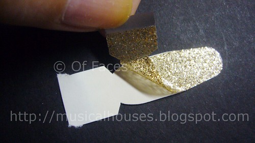
Inque Nails is like nail art - but better. For one, you don't have to spend time labouring over your nails (although I know some people like to!), and for another, the designs come out perfect, everytime (good for klutzes like me). Inque Nails comes in the form of stickers the size of your entire nail plate with designs on them, that you stick onto your nails.

But the unique selling point of Inque Nails is not just that they're nail stickers, but that they're custom-sized down to each individual nail, and that you can pick from over 180 designs, or even create your own. Cool right? The moment I heard about these, I absolutely HAD to try them.

Inque Nails Snake

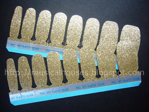
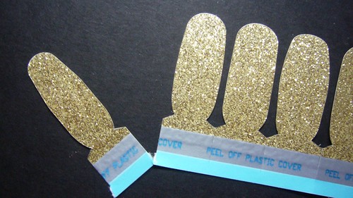
Here's what a sheet of Inque Nails looks like. In order to size the vinyl nail stickers to your nails, you have to upload a photo of your nails according to their specifications. If you don't want to do that, they have standard-sized nail stickers available as well.


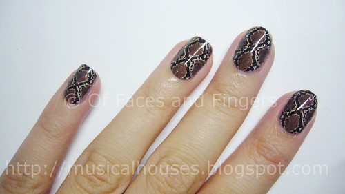
Inque nails have the coolest designs ever - I believe mine was Snake 4, a really awesome snakeskin print. Some of my favourites are Cheetah (cheetah print woo!) Freaky Zoo (giraffe print now), as well as Stars (literally stars in a night sky - very cool). They also print out whatever design you want - you could even upload Justin Bieber and Miley Cyrus and have your nails decorated with them, if you wanted to. *Starts puking*.

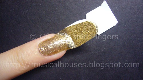
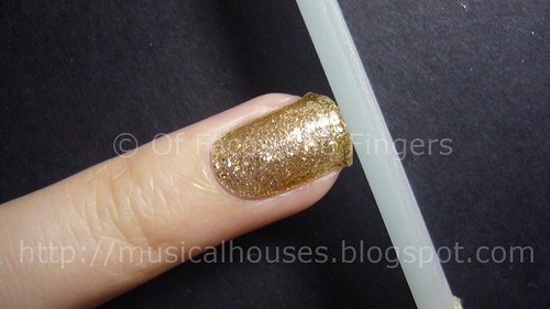
Anyway, before I get stoned by the Miley/Justin fanclub, I'd better mention that these nails are actually easier to apply than they look. They are in sticker form, so you have to peel and stick, and then set the stickers by passing them under a heat source (a hairdryer in this case) so that the stickers adhere better. Cool right? These actually stay on for pretty long - your nails will likely grow out before they fall off.

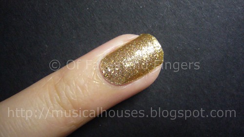
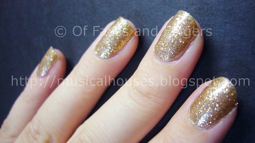
Here's how my nails looked with the nail stickers on. Look ma, cool nails!

inque nails snake)


If you can't already tell, I'm absolutely hyped up about this, because it's just so friggin cool. If you want customized nails (you know, like Justin Bieber or your dog on every single one of them), or if you want nail art that will stay on for a few weeks and not fall off, or if you just want to try the next big thing, this is it. And you can thank me for tipping you off later. Inque Nails are available from the Inque Nails Website, they ship internationally (YAY!) and cost USD$20 to size your nails, and US$15 for a set (which is cheaper than Minx, or even going to your nail salon to get them to paint your nails a boring pink).

(Product was provided for review. Review is my complete and honest opinion. I am not affiliated with or compensated by the company.)

Benefit Boi-ing Concealer/Shadow Base Swatches

Wednesday, December 29, 2010

4 comments
Benefit's Boi-ing is one of the most popular products in their entire lineup. These are billed as concealers that double as shadow bases, but empirical anecdotes from users seems to provide the opinion that while these are great as concealers, their use as shadow bases is much more limited. Still, these are quite popular, so there is something to them.

As is usual in most parts of Europe and Asia, Benefit didn't bring in the darker shades, so 03 Deep is missing. But here are swatches of 01 Light and 02 Medium:

Benefit Boi-ing swatches

01 Light would probably be my shade if I had to pick a colour from the range, and I'm about NC20. 02 Medium looks to my eye to be around NC30-35, maybe.

One of the reasons why Boi-ing is so popular is because it's very pigmented. So it's probably useful for concealment of blemishes and undereye circles. These swatches were probably a couple of swipes, and you can see that the coverage is excellent. The consistency and texture of the concealers was also good - they strike a nice balance between pigmentation and a texture that glides.

So do you need this? Well, for one, 3 shades out of a gazillion human skintones means that not everyone will be able to find a match, which would make the question moot. But if you do have a match, and want something pigmented, then these are worth looking into. But of course, weartime would vary from person to person, so that may be the deciding factor in the end.

Cheap and Awesome: Jordana Lip Shine Natural Glaze in Watermelon Punch

Monday, December 27, 2010

14 comments
Jordana is one of those US drugstore brands which is much overlooked at ol' Walgreens, that establishment of value-seekers like myself. I believe a selected range of Jordana products can also be found in some parts of Asia (I know Singapore carries some of them), but they're not worth buying in Asia as they're way overpriced. But in the US, they're a cheap and cheery brand, and they actually have some very good items.


Case in point - the Jordana Lip Shine Natural Glaze in 02 Watermelon Punch. These come in little click-pen dispensers with a brush at the end, a la the Stila lipglazes. These are also half the size of your typical Stila Lipglaze, but they're also definitely less than half the price, so I'm guessing value-wise they're still better. Jordana has two ranges of Lip Shines, Natural Glaze and Shimmer Glaze, and from what I hear, the Natural Glazes are way better than the Shimmer Glazes, which tend to be too frosty for most people's preferences.

Here's a swatch of the lipgloss:

jordana lip shine natural glaze 2


02 Watermelon Punch happens to be a gorgeous coral colour. It's a pretty universal shade, so I do think that anyone could wear it. There isn't any shimmer or glitter in this one, which suits my preferences just fine. I also like the semi-sheer, jelly-like texture of the lipgloss - it's not as pigmented as I usually like my glosses to be, but it shows up enough for me. It probably wouldn't overwhelm girls who don't like too much pigment either, since it's semi-sheer - I guess it's a happy in-between.

Here's a swatch of Watermelon Punch on my lips:

jordana lip shine natural glaze 3


As you can see on my lips, it also replicates that jelly-like, semi-sheer texture, producing a very glossy finish. I quite like this, really. I just wish it was a bit more pigmented, but at least it's not totally sheer. The Jordana Natural Glaze range actually reminds me a little bit of the Rimmel Vinyl Glosses.

So do you need this? If you do happen to be passing by a Walgreens and see this lying around, I think it'll be worth grabbing a couple. It's cheap, cheery, and actually pretty good.

Incoco Nail Polish Strips Review/Tutorial: 24 Karats: Gold Bling

Saturday, December 25, 2010

10 comments
Merry Christmas everyone! In the spirit of Christmas, I'm going to talk about one of the most gorgeous gold nail polishes I've ever seen - but it doesn't even come in a bottle! Incoco Nail Polish Strips in 24 Karats is a gold glitter that blings and shines under both low light as well as strong light, and it's absolutely gorgeous to look at. It's also perfect for the festive Christmas season just upon us!

Incoco nail strips 24 karat

Incoco calls their products dry nail appliques, but they're strips of nail polish that you peel off from a backing and stick onto your nail. Pretty cool, right? I've tried a couple of them, and while they do have a slight learning curve, once you get them right, they're very easy to use, and produce a very professional effect.

incoco nail strips 24 karat


However, it can get a bit used to applying nail polish strips instead of liquid nail polish, so here's a step by step guide of how to apply them:

1. Find the size of nail strip that most closely matches the size of your nail, and tear off the relevant nail strip. In this case below, I'm using the last strip for my little finger.

incoco nail strips 24 karat


2. Peel off the plastic covering on top of the strip. Then peel off the nail polish strip from the paper backing. Be careful not to tear the strip when doing this!

incoco nail strips 24 karat


3. Gently smooth the strip over the nail. I personally find the easiest way to do this is to start with center of the nail, and smooth out towards the sides to avoid any wrinkles in the strip.

incoco nail strips 24 karat


4. File off any excess nail polish strip. I think the best way is to file downwards, isntead of from side to side. This way, the strip isn't disturbed by any filing motion.

incoco nail strips 24 karat


5. And viola! All done.

incoco nail strips 24 karat


I guess the fit of the appliques for the nails would vary from person to person, but for me, I found that I was able to find a match for all my nails. I thought the strips were nicely sized, and they also matched the natural curvature of my nails and cuticles. I also liked that these strips were very thin, unlike some other nail appliques I've tried, and thus easier to place on the nail. As far as nail strips go, I think these are one of the best.

Here's 24 Karat, in it's full glory. I don't think I ever got such a neat gap by painting manually, LOL.

incoco nail strips 24 karat


I've also discovered that if your nails are short, you can further save money by cutting each nail strip into half - so that instead of wasting the free end (shown in the image in Step 3), you could use it for another nail - perhaps the same nail on your opposite hand. I've managed to do this successfully, but your nails have to be pretty short in order for this tip to work.

These strips lasted about 3 days on me - a bit shorter than if I had painted my nails myself, but given that they were very little trouble to put them on, I thought it was still worth it.

One thing makes me wonder though - these strips so happen to fit the curvature of my cuticles perfectly, but I'm wondering how they would work for other women with more square-shaped cuticles. Also, I'mm wondering how the strips would work for girls whose nails are differently-sized compared to mine. My sister is tiny, and I think most of the strips would probably be too large for her teensy nails. But on me, they fit perfectly, so I'm not complaining, and I imagine they'd be fine for most women. But I could imagine on very petite girls (I'm talking about having to get your clothes from the kids' department petite, not size 2 petite here), the strips might be too small.

These strips would probably appeal to women who want to wear nail polish for special events, but who don't wish to paint their own nails or hop into a salon. I don't foresee these replacing the traditional method of painting nails due to the higher cost, but I do think that Incoco products are a beautifully executed concept, and might be worth it for that special occasion.

(Product was sent to me for review. This is my honest and complete opinion of the product. I am not compensated by/affiliated with the company.)

Kawaii Budget Beauty: Daiso Shiny Powder in Brown

Thursday, December 23, 2010

6 comments
Isn't this cute? It's so round and bulbous and just generally kawaii. It's Daiso's Shiny Powder in Brown, and it was a little cheapie I came across while trawling through Daiso.

Daiso Shiny Powder Brown

For the uninitiated, Daiso is the Asian equivalent of Poundland or the Dollar Store. It originated in Japan, but its stores can be found elsewhere throughout Asia. Much like Poundland or the Dollar Store, it sells a mishmash of random products - everything from stationary to household items - but for a beauty addict like me, it also carries a line of super-cheap makeup and nail polish. And when I say super-cheap, I mean it - the items are just a couple of dollars. And I'm talking about Singapore dollars here, not pounds or USD. Awesome!

The Daiso Shiny Powder is a loose powder that's billed as being multipurpose, but in this colour, Brown, it's really more of a loose eyeshadow. The packaging is cute - there is a round twist-off cap, and under that there's another flip-top lid. Its sturdy and powder doesn't fall out of the packaging (unlike the Superdrug MUA line - the powder leaks like nobody's business).

daiso shiny powder brown


So cheap it is, and kawaii it is. But is the Daiso Shiny Powder really worth it? This is the part where I have to confess - not really, but I wouldn't complain for the price. And, I've seen makeup of similar quality go for higher prices.

Here's a swatch of the Shiny Powder in Brown.

daiso shiny powder brown swatch


The brown colour itself is a pretty nice colour - it's a light fawn brown that leans warm, with a medium amount of shimmer. But while I like the colour, I have to say pigmentation wasn't that great. And I thought it would improve if I foiled the colour, but for some reason there wasn't that much of a difference. But then again, in my laziness, I simply foiled the eyeshadow with water, which might not have been sufficient for foiling. Still, you'd think that for purposes of a swatch, even water would have helped more.

Here's a shot of the Brown Shiny Powder on my eye:

daiso shiny powder brown eye1


As evidenced by the swatches, pigmentation is rather light. To be fair, it's not so sheer that it doesn't show up, because you can definitely see the colour on my eyes. But it's a very light shade. On my eye, it also pulls a little bronze, although not in a bad way. It's a nice shade, really. Pity about the pigmentation.

Here's a shot with my eyes closed:

daiso shiny powder brown


So, do you need this? You probably don't, but if you happen to be in Asia and are looking for cheap makeup, this is definitely something worth checking out. And as I've mentioned before, makeup lousier than this has gone for higher prices, so it's not like it's that awful. I personally wouldn't complain given the price, but I'm just pointing out that if you're willing to spend, there is better out there. But if nothing else, there's always the adorable, kawaii packaging to induce your buying tendencies.

And the Winner Is...

Wednesday, December 22, 2010

5 comments


Thanks everyone for taking part in my Karmin Flat Iron giveaway! We have a winner!


Random.Org has spoken, our winner is Michelle Xo aka MichelleKast, from National Vixen! Congrats to Michelle, and thanks everyone else for taking part!

(This giveaway was sponsored. I am not affiliated with the company. I did not receive any compensation for hosting this giveaway.)

Stargazer 232: Mirror-like Nails with Nailene Stickers!

Tuesday, December 21, 2010

7 comments
Stargazer is an European brand of cosmetics, and they have a pretty awesome range of metallic nail polishes. The one that is most popular is 232, which is a silver metallic polish like China Glaze Millenium, but they also have the metallic polish in other colours, like gold and pink. They are all awesome colours, but I have an enduring love for Stargazer 232, just because it's silver.

I combined the Stargazer nail polish with some Nailene nail stickers, to disguise the fact that my nails aren't looking very good today. Today's NOTD is inspired by Lady Gaga's "Lovegame" song. In partiular, it's inspired by the lyrics of the chorus:

Let's play a love game, play a love game...Do you want love?...

Stargazer 232 Nailene Nail Stickers

...Or do you want fame? Are you in the game?

stargazer chrome 232 nailene nail stickers


See, see? Is that awesome or what? I guess you know someone's officially become a pop culture phenomenon when they influence your nails!

I absolutely love this colour - it's not Minx, but it's the closet nail polish equivalent of getting a mirror-like finish to your nails. When I was wearing Stargazer 232, I couldn't stop looking at my nails - it was like someone had plated them with metal!

Unfortunately, weartime wasn't as good as your average polish, and it chipped and peeled pretty fast. I suspect that this has to do with the smooth, metallic finish of the polish, and I have noticed that other polishes with such a finish also suffer from a similar lack of staying power.

If you want a mirror-like polish, this is definitely one to check out. You'll just have to be prepared for the chipiness of this if you do end up wearing it. If you can't stand polish that chips or peels easily, you're probably better off giving this a pass.

Urban Decay Going for $2 on Hautelook Now!

Monday, December 20, 2010

4 comments


My American friends are so in luck - Urban Decay is going for $2 on Hautelook RIGHT NOW! The sale has literally just started, so head on over to the Urban Decay sale to check it out now!

(I am not compensated for providing this information. The link is a signup link provided to all Hautelook members.)

Dupes or Not: Bobbi Brown Galaxy vs Prescriptives Smoking Gun

Sunday, December 19, 2010

2 comments
Ahh, discontinued and limited edition products. Aren't they the bane of every makeup fanatic's existence (other than overpriced shipping)? Just when you think you've fallen in love with something, you inevitably find it's been discontinued, or limited edition, or both, and unavailable. And then you have to scour Ebay for it and pay exorbitant prices. I don't know about you, but it happens to me pretty often. Darn Murphy's Law.

So in honour of "Nyah-here's-a-taupe-you-can't-have" day (okay, I just made that up), here's a comparison of two discontinued taupe cream eyeshadows. They pretty much appear to be dupes.

The two taupes in question are Bobbi Brown Long Wear Cream Shadow in Galaxy, which was a hot favourite when it first came out, and Prescriptives Colorscope Eyeshadow in Smoking Gun, which was discontinued because Prescriptives shut down. And Prescriptives just shut down just as I was getting into its line of concealers and foundations. Murphy's Law, I tell ya.

Bobbi Brown Galaxy Prescriptives Smoking Gun

L-R: Prescriptives Colorscope Eyeshadow in Smoking Gun, Bobbi Brown Long Lasting Cream Shadow in Galaxy

From my swatches, you can see they're obviously dupes, colour-wise. They both are gorgeous. They have the same steel grey base infused with brown, and then overlaid with dense gold shimmer to form the most beautiful, shade-shifting, duochrome taupe the world ever saw. Oh yes, you know I love this baby.

But other than the colour, the pigmentation is what separates the two. Galaxy is a lot sheerer than Smoking Gun. I did a couple of swipes for each swatch, and you can see that while Smoking Gun is opaque in two swipes or so, Galaxy is still rather wimpy on my skin. I definitely prefer Prescriptives when it comes to pigmentation, although I'm sure some others will prefer Bobbi Brown's more muted version.

In terms of staying power, both are excellent. Neither the Prescriptives nor the Bobbi Brown cream eyeshadows budge. They pretty much stay on the entire day for me, without smudging or fading. Both also have the same texture, although I think Galaxy had a slightly more slippery, emollient feel, probably due to the addition of silicones.

So if you're a discontinued taupe-hunter, and you only want one, which one should you get? I guess since staying power and colour are the same, the only determining factor would be pigmentation level. While I'd personally prefer Smoking Gun, if you're one of those people who prefer sheerer shadows, Galaxy might work better for you.

Hello Kitty Beauty Comes to Sephora: The Kawaii Has Landed

10 comments


Looks like the USA is getting kawaii-fied! Hello Kitty Beauty is coming to Sephora, and they are currently having a 2-day online preview for Sephora members only. Indeed, the kawaii has landed. For everyone else, the entire range will come in mid-January. I never got the idea of online previews - you mean I get to buy something for full price ahead of everyone else? I don't know about you, but I'd rather wait til Sephora has their annual 20% off sale. But I'm sure they must be working for at least some of us, since Sephora seems to be having such events with increasing regularity.

Anyway, the range consists of items that veer from the cute and afforadable, to the utterly ridiculously overpriced, to the WTF-was-that. Typical prices are around US$15, so it's not cheap, but not ridiculously overpriced. Since noone's sampled the items yet, the jury is still out with regards to quality. But looking at specific items, I don't think it's that worth it. Nail polishes are going for US$10 - and for those prices, I'd rather get OPI. A lip quad is going for US$35 - also a no-go for me. And a cheek tint is going for $22. But I imagine thousands of women will plonk down money for these items, so I'm not going to say no to them just yet.

Here are some items I'd definitely buy, though - Hello Kitty Nail Stickers! At US$5, they're actually affordable. And who doesn't love Hello Kitty nail stickers, huh? Huh?


And here's things I'd consider buying, depending on the quality:

Hello Kitty nail polish - at $10, it's not cheap. Freaking OPI is cheaper, as is a whole host of other brands. But cute is cute - I love the bottle design, although it kind of also looks like cheap kiddy makeup. I guess we can only tell what it really looks like if we get around to seeing the actual bottle.


Say Hello Palette - consists of a lip quad, and an eyeshadow quad, packed into one kawaii-overdosing case. Cute, but at $35, it's not cheap. But I guess if the quad is decently sized, it can be quite a deal. I mean, 4 eyeshadows and 4 lip shades for $35. If they're not the size of dimes, it's not too bad, right?


Charmmy Kohl Eyeliner Kit. A nice range of shades, very wearable with the occasional bright. At $25, it could potentially be a good buy depending on the quality. Smudgy pencil liners are a pet peeve of mine.


Hello Kitty Fragrance, $18-$55, depending on bottle size. What, Hello Kitty now has a perfume! Honestly, unless you like the bottle, or a die-hard Kitty fan, I'd pass. The description of this one (another gourmand floral, yawn), makes it sound like another one of those generic perfumes targeting the tweeny-bopper set. (Not that there's anything wrong about being a tweeny-bopper, but for some reason 99% of perfumes targeting young women all seem to smell vaguely alike.) Still, I'd love to be proven wrong, though - the bottle is too cute for words.


Apple Cheek cream blush. Hello Kitty meets NARS Multiples, with a NARS-ish price of $22. From what I can see, it seems to be one of the more popular things in the Hello Kitty line too. I hope the quality is just as good, since these aren't exactly that cheap.


Now that we're done ooh-ing and aah-ing over the whole range, here's a product I definitely WON'T buy - this WTF-moment-inducing Hello Kitty mirror. Yes, it's a mirror, and it's bling, but it's not worth $49. It's a mirror.


So what do you think of the range? Kawaii, or just puke-inducing? Anything catching your eye in particular?

Beauty Blog Link Love

Saturday, December 18, 2010

1 comment
Dare to wear red lips this holiday season? Check out these three options on Katie of My Lips But Better.

Amy Antoinette reviews Estee Lauder's Double Wear Foundation and Concealer.

See a sneak peak at the Nicole by OPI liquid metals collection, and a nail of the day!

Dare to wear red lips this holiday season? Check out Katie's picks ranging from sheer to bold on My Lips But Better.

Do you love rock n' roll? Find out what product Cindy at Prime Beauty uses to channel her inner Rocker Chick. Soft Rockers, don't fret; there's a look for you as well!

Shela at Confessions of a Beauty Guru is going cuckoo for Korean lip products!

Curious about more unconventional skin products? Rachel tells all about Witch Hazel Wonders at Queen of Turquoise.

Retrodiva experiments with the Estee Lauder Holiday Collection and likes what she sees.

Emma compares two similarly packaged mascaras to see if they really are the same.

Got a sticky compact and don't know what to do? Musicalhouses shows you how to clean up a sticky NARS, Smashbox, or Becca casing!

Need holiday makeup look ideas? Check out Audrey Dao's Holiday Look Book for ideas and tutorials!

At theNotice, Rae checks out a Benefit cult favourite -- but doesn't like what she sees.

Red lips are hot for Christmas! Lipglossiping trawls through her collection and uses a Red Lip Series as a great excuse to buy more!

Daily Polish falls head over heels (but manages not to lose her head!) for Rescue Beauty Lounge's 'Catherine H' from the new Tudor collection.

At Pink Sith, Joeybunny introduces you to the Wet n' Wild Night Elf Palette. See why she's swooning!

Chanukah may be over, but that doesn't mean you still can't enjoy this LUSH Fizztival of Lights gift set!

Beautywoome has published its Christmas gift guide, because you know you haven't done your shopping yet.

Hellcandy stumbles across her first dupe! Find out which drugstore brand matches the gorgeous fucshia of Nars Funny Face lipstick here.

Acquaintance gifting causing you stress? Jeweled Thumb shares her coworker holiday gift guide to put your mind (and wallet) at ease!

L from Beautifully Addicted To rediscovers Erase Paste.

Kim Porter shares some skincare tips for the cold weather.

Take a sneak peak at Dior’s Cannage eyeshadow palette from the upcoming Spring collection over at Pleasureflush!

***


Jenn over at Spiced Beauty is celebrating her 2 year bloggerversary with a Huge Annabelle Cosmetics giveaway!

Phyrra is giving away 5 eye shadows from the Aromaleigh Wonderstruck Collection!

Over at The Glamorous Gleam, Mz. More loves Revlon's Perplex Nail Enamel so much that she is giving away four bottles to her readers!

Beauty Crazed loves Burberry Beauty and wants to give you a chance to love them too!

UBS Dress Code: Someone up there has Control Issues

Friday, December 17, 2010

4 comments
It looks like if your boss has control issues, he gets to decide when you should apply perfume as well. According to the WSJ, UBS has issued a very draconian set of regulations on what you can and cannot wear. I work in a client-facing organization, and my work involves managing company accounts and attending meetings with my client's management, so I am totally sympathetic to having some sort of a dress code at work, and I believe in projecting a professional image through your dressing. But when a company decides to tell you when the ideal time to spray perfume is (after a hot shower, apparently), that's overstepping the boundaries and going a little too far. And apparently the entire dress code is 44 pages long. Micromanaging much?

Here are some gems, as highlighted by the WSJ, the Vancouver Sun, and the Huffington Post.

Let's start with the ladies:


"The ideal time to wear perfume is directly after taking a hot shower when your pores are still open."

"You will extend the life of your stockings and your tights if your toe nails are well-trimmed and filed."

"In general, a blouse is worn with a jacket. When it very hot, and after validation of your superior, you can wear the shirt without a jacket."


Now the guys:

"At the neck, the shirt must be of sufficient magnitude to leave a space of at least one finger... The neck shirts must exceed approximately about 1 to 1.5 centimeter above the jacket collar.."

"Do not wash, nor ever iron your ties yourself."

"Schedule barber appointments every four weeks to maintain your haircut shape."


And for both:

"Hands - do not have:
• Dirty and badly maintained nails
• False nails and fancy colored nails
• rough or cracked skin"


"Not adpated to the morphology of the face" - what on earth is that supposed to mean? And now I have to seek my bosses' permission to not wear a jacket with a blouse on a hot day. And when I buy my shirts, obviously I need to bring a ruler with me so I can measure the 1 to 1.5cm spacing my collar is supposed to have. Geez, obviously someone up there in UBS has control issues.

Thank goodness I don't work for UBS, because it would make me miserable to know that my boss is scrutinizing my nails and hands to ensure that I don't have rough skin or coloured nails.

Hey UBS - if you're losing money and want to earn back some of those millions, why not think about actually improving your business strategy and reviewing loss-making operations? I'm sure that's easy for me to say because I'm not a banker, but you know, it seems to me that getting better business sense might just earn you more money than micromanaging what your employees can and can't wear (while you're at it - don't forget to bring a ruler the next time you go shopping for clothes).

Gold Foil Dupes? Orly Luxe, Etude House Lucidarling Sparkling Royal Gold, Collection 2000 Aztec Gold

10 comments
With Christmas coming up, you absolutely know you have to have a gold foil in your nail colour arsenal. After all, gold is one of the colours of Christmas, and the foil finish, with its metallic-like surface, is so festive. Even if it isn't Christmas, a gold foil is a gorgeous colour to have anyway. And the good thing about gold foils is that there's a shade of gold foil to flatter every skintone, from cool to warm, from dark to light.

So here are a couple of gold foil comparisons. Up for swatching are Orly Luxe, Collection 2000 Aztec Gold, and Etude House Lucidarling Fantastic Nails 01 Sparkling Royal Gold. As always, it's a source of slight amusement that the product names of Asian brand cosmetics are always so much longer than Western brands - it can't just be nail polish, it has to be Lucidarling (whatever that means) Fantastic Nails :P

Orly Luxe, Etude House Lucidarling, Collection 2000

L-R: Orly Luxe, Collection 2000 Aztec Gold, Etude House Lucidarling Fantastic Nails 01 Sparkling Royal Gold

Well, I guess they're not dupes. And they may not all be gold foils. But let's see how they hold up to swatching, shall we?

Here are the 3 polishes swatched on my nails:

orly luxe etude house lucidarling collection 2000 swatch

L-R (Index to pinky): Orly Luxe, Collection 2000 Aztec Gold, Etude House Lucidarling Fantastic Nails 01 Sparkling Royal Gold, Orly Luxe

As you can see, Collection 2000 Aztec Gold isn't really a foil. But it's a pretty gold polish, nonetheless. It does have a metallic finish, but not the fine-grained finish of a foil. It's a good option for those who don't like foils, but want something gold and metallic.

Orly Luxe is a cult favourite among foil finish fans, and I absolutely see why. It's a bright gold that isn't so warm-toned that it's unwearable for cooler-toned people. There's just something about it that catches your eye.

Etude House Sparkling Royal Gold (I'm not going to type out the entire name) is also a foil, but it's a bit more muted, and slightly warmer than Orly Luxe. I also like it a lot, and I think this would be a great substitue for anyone who felt Luxe was too OTT with the bling, and wanted a more subdued version of Luxe.

Here's what Luxe looks like in the context of my fingers, just so you can see the contrast of nail polish against skin:

orly luxe collection 2000 etude house swatch2


L-R (Pinky to Index): Orly Luxe, Etude House Lucidarling Fantastic Nails 01 Sparkling Royal Gold, Collection 2000 Aztec Gold, Orly Luxe

In terms of application, all were good. I had no trouble with any of the three. But Orly Luxe and Aztec Gold were a lot more pigmented than the Etude House version. Both Luxe and Aztec Gold were opaque in one coat, but you'll need 2-3 coats with Sparkling Royal Gold before you don't see any VNL (visible nail line).

I'm glad they're all different - it totally justifies having them all :P But for anyone who wants just one, my personal favourite would be Orly Luxe. However if you can't get your hands on it (since Orly is one of those hard-to-find-outside-the-US brands), then it's great to know that Collection 2000 in the UK has a viable replacement, and that Etude House also has something similar for us Asians.

X'mas Giveaway: Win a Bottle of Flora by Gucci Perfume!

Wednesday, December 15, 2010

7 comments


Christmas is fast approaching, and in light of that, here is a festive holiday giveaway! Three, yes three, lucky people stand a chance to each win a 30ml bottle of the new Flora by Gucci Eau de Parfume spray!

These prizes have kindly been provided by Argos, who provide a wide range of beauty products including who provide a wide range of beauty products including perfume, skin care and make up products. I've always known Argos as the place to buy furniture, but I never knew they sold so many other things. Now I can pick up some perfume the next time I need to buy a desk!

To enter this giveaway, you have to:
1. Be a follower of this blog
2. Fill out the form below

For extra entries, you can:
1. Follow @musicalhouses on Twitter and RT about this giveaway! Don't forget to include a link to this post and @musicalhouses in your tweet!
2. Add this blog to your blogroll
3. Blog about this giveaway

Because Argos only ships within the UK, this giveaway is only open to UK residents. Prizes will be delivered within 28 days of competition closing.

This giveaway ends on 15 January, 2011, so hurry up and enter before then!

Benefit Lemonaid vs Benefit You're Bluffing Swatches

Tuesday, December 14, 2010

10 comments
Benefit has a whole array of concealers. The enormously popular Lemonaid, and the lesser-known You're Bluffing, are just two out of the lineup they have, but these are the only ones (I think) that are yellow. So for anyone wondering why on earth does Benefit have not one but two yellow concealers, here are swatches to show you the differences between the two.

Benefit Lemonaid Youre Bluffing

L-R: Lemonaid (applied heavily and lightly), You're Bluffing (applied heavily and lightly)

Lemonaid is a much more pale lemony yellow. You're Bluffing is what I'd call primary canary yellow. Lemonaid also has a much more solid texture, while You're Bluffing is not as tacky, and a bit more blendable due to it's smoother texture. Lastly, Lemonaid is more pigmented, partly because of it's tacky, thick texture, while You're Bluffing has less pigment.

Both have their uses. Lemonaid is probably better for people who wish for more coverage, and who don't mind working with the tacky texture of the concealer. On the other hand, if you prefer something easier to work with and don't need much coverage, You're Bluffing would do.

Chic and Classy NOTD: Ciate Sharp Tailoring

Sunday, December 12, 2010

14 comments
Ciate is one of those brands that are underrated and little-known about, but their quality actually pretty good. Some colours are a mixed bag, but some are excellent.

Sharp Tailoring is classified as a "greige", and is one of the colours that has been all the rage lately, although it isn't brown like other greiges. Instead, it's a cross between a grey and a beige, with gold shimmer for good effect. And the result is pretty awesome - chic, understated, modern and classic all at the same time. It's a take on the "it" colour, with a slight twist.

Ciate sharp Tailoring

The gold shimmer is relatively fine, and not always discernable once on the nail. But it is there, and can definitely be seen under some lights. Application on this was pretty good. The polish was thin, and of a very fluid consistency, and the first coat applied sheerly, but two coats rendered it nicely opaque. Sharp Tailoring has decent lasting power. It stayed on about 3-4 days before chipping, which is about average for me.

ciate sharp tailoring


I've been told that Ciate nail polishes are actually produced by the same factory that also produces Chanel nail polishes, although that's just pure hearsay, and I can't confirm if any of it is true - it's just one of the things fellow nail polish enthusiasts have told me, although noone knows for certain. But it's an interesting nugget for sure.

Nevertheless, one of the draws of Ciate's polishes is definitely that cute little bottle. It isn't your usual round bottle - this one comes with a little ribbon on!

ciate sharp tailoring bottle


If you like pretty bottles, and pretty polish of good quality, Sharp Tailoring is definitely one to check out. Sharp Tailoring is one of my favourites right now, because it's one of those colours that's entirely work-appropriate while still being a little on-trend and edgy.

EOTD: Everyday Purple-Brown and Beige Eye Look

Friday, December 10, 2010

11 comments
Today's eye look is a simple one with a slightly darker crease. I know this isn't the best look I could put out, but I just thought I'd show how some of the colours from the recent Gabrielle Faust for Overall Beauty collection looked on my eyelid.

For this look, I decided to make it neutral, so I used Aftermath and the lighter colours, Sanctified Snow and Hourglass Sand. I'm really liking these colours so far.

Here's the look I produced. Don't laugh - I swear it's more blended in real life (the second picture with my eye closed will also prove it later!):

Everyday Neutral eye look

Here's the breakdown for anyone interested. All the eyeshadows were from the Gabrielle Faust for Overall Beauty line:

Hourglass Sand on lid (matte warm beige)
Sanctified Snow on browbone (shimmery vanilla)
Afemath on crease (grey-brown matte)
Covergirl Lash Blast mascara
Urban Decay Bourbon 24/7 Eyeliner Pencil

The thing I noticed is that although Aftermath looked like a brown-grey in the pot and in my previous swatches, it actually pulls a little purple on. This isn't necessarily a bad thing, and I suspect this is due more to my weird olive undertones than anything else.

Here's a picture of the same eyeshadow look with my eyes closed. See, I told you the blending wasn't that bad, right? :P

purple beige look gabrielle faust overall beauty


The Gabrielle Faust by Overall Beauty shadows were nice and pigmented, and very smooth in texture. I have no complaints about these. I think they could blend better, but I think they're fine the way they are.

Lancome Teint Miracle Foundation Swatches

Wednesday, December 8, 2010

14 comments
Lancome has released a new foundation that claims to reproduce the look of real skin. I'm skeptical, since my personal belief is that nothing ever looks quite like real skin, but Lancome ascribes these skin-lookalike properties to what it calls Aura-inside technology. While I personally view the whole thing as marketing hype, the line of foundations is actually quite good.

The foundations come in a pump bottle, which make them quite hygenic and easy to use, and have a very fluid, light texture, not unlike water. Coverage is decent, but still relatively light - if you want serious coverage, this isn't going to provide it.

In Singapore, as with the rest of Asia, Lancome seems to think that we have a limited gene pool, so we only have a few colours. So swatched here are the "Asian colours" as determined by Lancome. There are 6 shades in total, so hopefully there is enough choice within the limited range. I'm not too sure what shades these match up to, since it appears that Lancome has named the shades slightly differently in Asia (using BO, O, PO) as compared to the US (where they use Bisque, Buff, etc).

Lancome Teint Miracle Foundation

L-R: BO-01, BO-02, O-04, PO-03, PO-045, O-03

I know the swatch photograph isn't that great - I actually took it in very dim indoors lighting at an event, and even after image editing for colour accuracy, this was the best I could do. Hopefully the descriptions below will help a little more.

BO-01 is a very pale beige that leans a little yellow. I'm NC20, and I think this would be too pale for me.

BO-02 might possibly be my shade. It's darker than BO-01, and a little more yellow. Maybe with some careful blending this might be around NC20.

O-04 is quite dark and orange. It's possibly NC35 or so (I'm not that familiar with MAC's darker shades). I kind of wonder who would need a foundation shade that orange though, but there are a gazillion skintones out there, so this one will be someone's shade.

PO-03 is quite close to BO-02. I think BO-02 is a little bit less yellow than PO-03, but to the casual eye they look quite close. Also another shade that's around the NC20 range - the difference here is not how dark or light the shade is, but how much yellow there is.

PO-045 is possibly NC25 or NC30. It's not as orange as O-04 and not as dark.

O-03 is also very close to BO-02 and PO-03. O-03 has more yellow than either BO-02 and PO-03, however. Once again, although this is potentially an NC20 shade in terms of depth, the shades are subtly different from each other in terms of how much yellow is in each shade.

Out of all the shades, it seems to my eye that the O series is the most yellow, followed by PO, and then BO. So for girls deciding between O-03, PO-03 and BO-02, the determining factor could possibly be the amount of yellow in their skin. Girls with more yellow would prefer O-03, and PO-03. I personally think BO-02, being beigey-yellow but not too yellow, could be a shade for Asian girls who find most foundations to be too yellow for them, especially cooler-toned Asian girls who have trouble finding a match.

Happy BlogaBirthday: The Evolution of my Nail Skills

Tuesday, December 7, 2010

12 comments
A year ago, I was a student in London, cold, soaking wet, and bored out of my mind merely studying for exams. I remembered that Sleek palettes were all the rage then, and that some of my American friends would want to view swatches of them. So I swatched a couple of palettes, and posted them on my blog, and OFAF was born. Fast forward to a year later - 12 months, 300 posts and 1000 followers later, OFAF is still the same, albeit with better photography and writing (I hope!).

I don't have a blogivesary giveaway, because I am already running a giveaway for a Karmin G3 Salon Pro Flat Iron, and there's another giveaway that I'm excited about (hint: it's perfume!). But in the spirit of things, here's a look back at how my skills have evolved over the year.

Here is my first ever post on the blog - it was an NOTD (Nail of the Day), the awfully chic Nails Inc Jermyn Street. OMG, my nails were awful. They were just mere nubbins back then, and they weren't even all the same length or shape. The fact that the polish wasn't splattered all over my fingers is a testament to the awesome Nails Inc quality.


Here's another really ugly NOTD. The colour is gorgeous, however, it's Sally Hansen's Opulent Cloud, still one of my favourites.


Over time, I tried out Konading. Here is my first ever Konad (and it sucked):


And then I started experimenting with flakies, and more adventurous colour (previously my stash was ALL exclusively pinks and purples - WTF was I thinking at that time?!) Such a waste...all those months spent painting on boring pinks and purples when I could have worn something cool. Like a duochrome. Or a flakie. Or something.

This was one of my first flakie manicures.

Rimmel Blue Me Away Nails Inc Trafalgar Square

And then I had dry skin. As you can see in the previous photo, it was REALLY BAD DRY SKIN. I didn't know what to do about it! Fortunately you girls clued me in, and I got myself some Burts Bees Cuticle Cream, and some CND Cuticle Remover. I also just got in Lush Lemony Flutter, and I hearts it!

Also, back then I didn't know a thing about shaping my nails. They were long enough, but I didn't shape them, because I didn't realize how important shape was to the look of the nail. But after seeing a few more pictures, I wanted square tips. I really like the look of square tips, although my nails seem to naturally grow out in a squoval shape.

Sephora by OPI Absinthe Makes the Heart

So I started shaping my nails, and slowly my skills started improving:


And eventually, slowly, my nails started looking a little better, and my skills improved a little too. This is the latest nail post I did, and I do think it's come a way from my first post on the blog, although it's nowhere near the awesome skills of some other bloggers I know of.

nails inc fitzharding xmas nails


Isn't it awesome how, if you put a little effort, your nails can improve? It just goes to show that no matter how terrible your nails are, there is always hope!

Linkwithin

Related Posts Plugin for WordPress, Blogger...