Sparitual Strength: My Gorgeous (Nearly) Belated BCA Mani

Sunday, October 30, 2011

8 comments
I know it's Halloween and all, but I figure before October ends I'd better get in my BCA (Breast Cancer Awareness) mani. So here it is, just in the nick of time! And despite my almost-lateness in posting a BCA mani, this is one heck of a gorgeous pink shade!

Behold Sparitual Strength, one of three shades released for Sparitual's BCA collection. Most BCA shades aren't all that interesting, and tend to gravitate towards light, pastel pinks, but Strength is unlike your usual pink. It's a medium pinky-purple with gold glitter. Even in the bottle, it looks super interesting. I have a mini bottle of Strength, which I bought some time back but never got around to trying until now. You can see the glitter dancing around in the bottle.

sparitual strength bottle


Okay, so much for the bottle. Now here's Sparitual Strength on my nails. Be prepared for awesomesauce! I love how blingy the glitter is on my nails, and I love the pinky-purple shade, too.


SQUEE! Isn't it gorgeous! I love how the glitter is densely packed in the base shade. It's definitely eye-catching, but the pinky-purple base tames makes it look pretty and feminine at the same time. Sparitual Strength is really a good combination of glitter fun and girlyness! Here's Strength from an angle, so you can see how the glitter catcheses the light, and how the polish is really infused with this glitter.

sparitual strength notd 2


Application was very smooth, even for my mini bottle. I've been told that the brand is discontinuing their mini bottles, so I guess for us, that's an excuse to buy the bigger 15ml bottles, LOL. But I did like the minis - they're cute, and they let me collect a colour without feeling as bad as if I bought the full-sized bottles. Being a glitter, you'll need one coat of topcoat to make the polish smooth to the touch. But that's a small price to pay for such a great colour. I love how the glitter even looks kind of glass-flecked. It's not quite a true glass fleck finish but it sort of looks like it, as you can see in the photo below. It looks so pretty and glassy. And this is without topcoat!

sparitual strength notd 3


Anyway, if you haven't gotten around to buying Strength yet, and this seems like it would be your kind of colour, it's really worth checking out. I have nothing bad to say about the Strength - I like the colour, the glitter, the application, and the wear. And for a BCA mani, this sure is beautiful.

Sleek Molten Metal in Steel and Ash: Review, Swatch, EOTD

Friday, October 28, 2011

9 comments
Ooh, hello there metallic eyes, thanks to Sleek's Molten Metal eyeshadow, I officially haz you! Sleek Makeup has done it again, with their latest Molten Metal cream eyeshadow duo in Steel and Ash. May I have your attention, ladies and gents, and direct your attention to just how gorgeous this is?


Isn't it a beauty? Good things come in small packages, and the Sleek Molten Metals is no exception. You get a small box with a tiny plastic case inside.

sleek molten metal steel ash packaging


Don't be fooled by the packaging, however. Inside this plastic case are two nicely-sized pans of cream eyeshadow. Don't they look so gorgeous and metallic and futuristic? Steel is on the left, and as the name suggests, is a very pretty metallic silver grey shade that does really look like steel, while Ash on the left is a deep metallic black base with silver glitter.

sleek molten metal steel ash pan


Both Steel and Ash are very nicely pigmented, but can also be sheered out if so desired. But when used at full strength, the Molten Metal really looks shiny and metallic, just like liquid metal. The swatches below illustrate this.

sleek molten metal steel ash swatch


The texture of the Molten Metal eyeshadows is soft and creamy, and very blendable. When you blend both Steel and Ash together, you get a very pretty deep gunmetal grey. The eye look below uses the Molten Metal. I really love this look. I feel like my eyes are all metallic and futuristic and spaceship-y!

sleek molten metal steel ash eotd 1


Steel is used on the lid area, while Ash is used in the outer corner and contour area. I didn't have any trouble with the blending or the layering of the eyeshadows. However, I did find that if you are going to layer several layers of the cream on top of each other, it can get tricky as the shadows will shift around and start caking up a little. I started off using my fingers, but I found that my fingers tended to shift the product around too much, and so I ended up using a synthetic brush instead, to much better effect. I was using my Stila Concealer Brush #26, but really, any appropriately-sized synthetic brush will do.

sleek molten metal steel ash eotd 2


Because the shadows are very creamy in texture, you do need a base, or else you have to set the cream with a powder on top to prevent the shadow from moving. Here, I just took a little bit of translucent powder and used it to set the cream. It did dull the metallic finish somewhat, but only by a little. Which is a little bit of a pity, since it really looks so metallic!

sleek molten metal steel ash eotd 3


Another great use of the Molten Metal would be as a base for other shadows. This would be doing double duty - the powder eyeshadow on top would add some extra oomph to the eye look, as well as prevent the cream shadows from creasing or moving. I think glittery shades would especially be super kickass...I mean, can you imagine glitter bits on top of a metallic foil base? Oh, the possibilities! Here's a swatch of a brown eyeshadow over the two shades. The circled part indicates where I swiped the eyeshadow over the Molten Metal.

sleek molten metal steel ash base


Since the Molten Metals are pretty pigmented, lighter colours don't really have that layering effect, as the cream eyeshadow is still visible through the powder on top of it. With darker eyeshadows, the effect is better. You do get a tint of the darker colour, but as you can see, the underlying colours of the Molten Metals still show through.

Here's a quick demonstration where I layered a purple shade over the cream eyeshadows. This seemed to work pretty well. I couldn't quite capture this look very effectively as the grey in the cream eyeshadows kept showing through, so this shot below is the best I could get. You can see the purple most obviously in the middle of the lid. I feel like it gives the entire look a little more dimension, with the purple going into the light grey and blending out into the dark grey...Very pretty! I kinda wished I'd used a more exciting colour to show this colour shift (like gold or red or something), but I really just used whatever eyeshadow was lying around, so deep purple it was.

sleek molten metal steel ash base (2)


Although the Molten Metal eyeshadows may be slightly more fussy to use (for me powder is general easier), but their gorgeous metallic finish makes it all worth the trouble. I also like the idea of using the Molten Metals as a base for other eye looks, and I imagine the possibilities could be endless when used this way. If you want an affordable cream eyeshadow that gives that really gives you look of a liquid metal, this is definitely worth checking out.

(Product was sent for review. Review is my complete and honest opinion. I am not affiliated with/compensated by the company.)

Anastasia Hydrafull Lipgloss in Flamingo: Swatch, Review, LOTD

Wednesday, October 26, 2011

7 comments
Anastasia of Beverly Hills is a brand that is virtually synonymous with brow care (who can forget those brow stencils), but the brand also actually has a whole lineup of makeup items other than their brow products, some of which are also pretty popular. In particular, the Hydrafull Lipgloss has also been reviewed by bloggers lately, and has gotten pretty good reviews.

I'm sure you've probably seen the colour I have, Flamingo, before on a couple of other blogs. But I thought, well, no harm in adding to the pool of swatches out there. After all, swatches are always good, right?


Flamingo is a light warm pink, with a little bit of coral thrown in. Light warm coral-pink - yup, I think that just about describes it. It comes in a luxe-looking tube. The interesting thing about this product is the plastic spatula applicator - for some reason, I tend to see these types of applicators more commonly Asian-brand lipglosses, as compared to Western-brand ones. Perhaps the West hasn't caught on yet, or perhaps these are just less popular in the West. Nevertheless, I don't mind these plastic applicators - to me they're functional and fuss-free.

anastasia hydrafull lipgloss flamingo 1


Flamingo itself is a sheer-ish gloss. It's not devoid of colour, but it leans more to the sheer side. I'd call it a jelly finish, as it really has that transluscence and shine of a jelly, and it sort of looks a little wet from far. The finish is actually a little like the Canmake Candy Wrap Lipglosses, which I also really liked. So without a doubt, this is right up my alley.

anastasia hydrafull lipgloss flamingo swatch


There aren't any sparkles or annoying bits of glitter in this lipgloss, which is also a plus, for me anyway. You can really see how shiny and "wet" it looks on the lip. If you love super-shiny glosses, this is for you!

Another thing I liked about the Hydrafull Lipgloss is that it didn't dry out my lips. I do have pretty dry lips right now, and the lipgloss didn't aggravate my condition further. It did feel slightly sticky and tacky on the lips, but nothing that can't be dealt with.

anastasia hydrafull lip gloss flamingo lip swatch


I really liked this lipgloss, and I love the Flamingo shade, too. It's very pretty, girly, and has a very summery feel to it, thanks to the coral lean of the colour. I also really liked the application and the feel of this lipgloss, as well as the shiny, jelly-like finish that the gloss imparts. If you're looking for a pretty coral-pink with loads of shine, this gloss is for you.

(Product was sent for review. Review is my complete and honest opinion. I am not affiliated with/compensated by the company.)

Amethystory Aqua Gel, Whitening Enhancer, and Mineral Bubble Facial Wash

Monday, October 24, 2011

5 comments
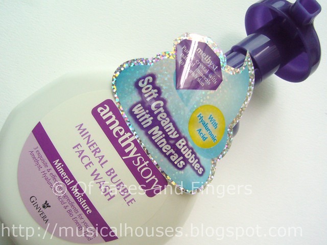
Amethystory is the latest skincare brand to hit town, and they have a range that consists of a few types of products, including those that are really trendy at the moment. This includes the Mineral Bubble Facial Wash, the Mineral Aqua Gel, and the Mineral Whitening Enhancer. I can see the line being popular already. The products claim to be infused with amethyst, that semi-precious gemstone, hence the brand name, Amethystory.

The products claim to be "mineral" - by which they refer to the amethyst-based ingredient inside. The liberal use of the word "mineral" doesn't imply that the products are natural, organic, or even that there aren't any preservatives. To me, the ingredients list looks much like any other Asian drugstore generic brand product - but that doesn't mean that the products aren't any good. Just don't be fooled by the self-declared mineral tagline into believing the products are something that they're not - they're not natural, organic, and they certainly have preservatives and so on.


Let's start with the Amethystory Mineral Bubble Facial Wash. This wash is one of those foam-out-of-the-pump type of facial wash, and it claims to give your skin a smoother clean, without leaving it feeling tight or dry. It actually really reminds me of the Biore Marshmallow Whip Facial Wash I've previously tried. The packaging looks like it, and even the copywriting on the ads sound like it - foam claims to cushion your skin, clean deeper, moisturize your skin, and so on. To be honest, when I first took a look at this product, my reaction was, "Meh." After all, who likes an imitater?

amethystory mineral bubble face wash


Even the facial wash itself also looks quite like the Biore version. Nice, soft, fluffy, white foam. If you liked the Biore Marshmallow Whip wash, you'll probably like this one too. It also has a pleasant smell.

amethystory mineral bubble face wash foam 1


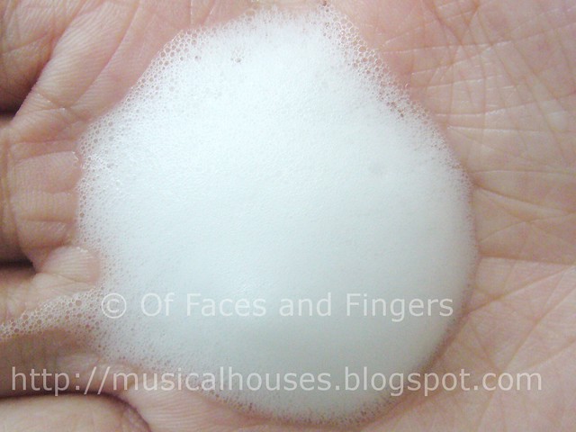
When you wash your face with the foam, it quickly lathers into a bubbly watery solution. This is also pretty much like the Biore version. However, between the two, I actually preferred the Amethystory one, because it didn't leave my skin feeling as dry after use. My skin was still slightly tight, but not as tight-feeling as the Biore Marshmallow wash.

amethystory mineral bubble face wash foam 2


Chances are, if your skin is very oily, the Biore Marshmallow Whip may work better, and if your skin is more on the dry side, you may like the Amethystory one better. Perhaps one of these days I should do a comparison between the two, just to be sure. Both of them are so similar to me, I'm really splitting hairs for the sake of comparison here. But whether the Biore or Amethystory version, both are bound to be a hit.

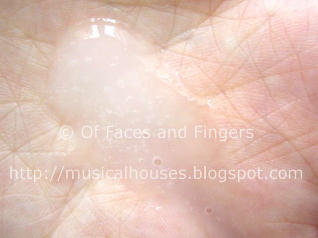
The Amethystory Mineral Aqua Gel is also another product I predict will experience lots of success. I also personally really like this product. The Mineral Aqua Gel is a facial exfoliant, but in gel form. Basically, you pump out the gel into your face, massage it on the surface of your skin, and you will get these little balls of dead skin forming as you rub the gel in. If you're familiar with another popular Asian product, the Cure Natural Aqua Gel (also another product which isn't actually natural), this is pretty much its relative.

amethystory mineral aqua gel


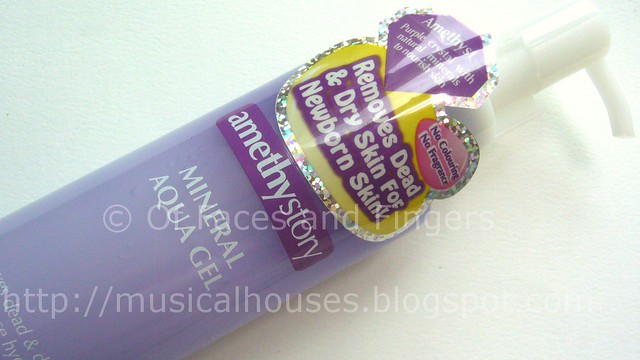
The gel is also similar to the Cure Aqua Gel, only that this one is a little more milky and cloudy, instead of being totally clear. The gel also has a more watery texture that makes it more like a water and less like a gel.

amethystory mineral aqua gel 1


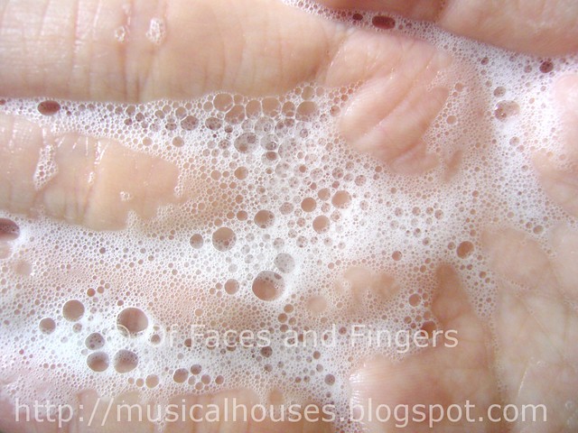
Okay, now here's the really gross part. You might want to skip over this photo if you're easily disgusted. When you rub the Mineral Aqua Gel onto your face, you immediately get tiny little white balls of skin (I think it's dead skin anyway, not too sure what it is) peeling off your face. It feels and looks disgusting, to be sure, but it makes me feel like the product is working somehow...like my skin is really being exfoliated. And the really gross photo below shows what the little balls look like.

amethystory mineral aqua gel 2


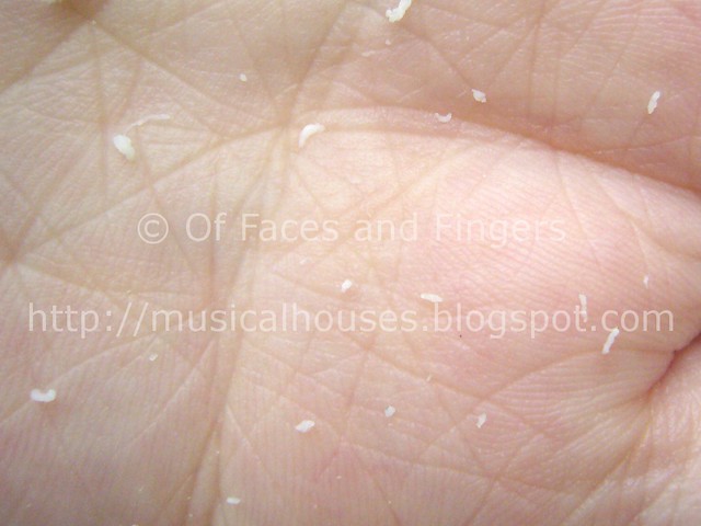
I'm still not sure if all that is really dead skin, or whether there's some combination of ingredients in the Amethystory Mineral Aqua Gel that rolls into a ball or peels off in sheets when rubbed...my guess is probably a little of both. After all most exfoliants, both physical and chemical, don't actually result in little balls of white gunk rolling off your face, right? But still, it's the cosmetic effect for me...even though I know it's not all dead skin, it's strangely satisfying to think that that is all the gunk coming out.

Okay, gross bit over! Let's move on to nicer stuff.

The Amethystory Mineral Whitening Enhancer is also another product I like. This is an essence-type of product, on top of which you can further layer moisturizers and other skincare steps you may have. However, I quite like using this product on its own. I think it works well as a light moisturizer by itself.

amethystory mineral whitening enhancer


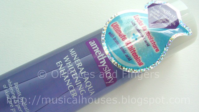
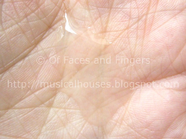
You pour out a little bit of the liquid, and it looks and feels like water. But when you apply it on your skin, it feels a little sticky, although the stickiness is gone after a few minutes. The look and feel of this product actually reminds me a little bit of the Hada Labo's trademark Hyaluronic Acid moisturizer, although this is a little bit different in nature and purpose. Still, I quite liked this product, and I did feel like it helped to moisturize my skin somewhat.

amethystory mineral whitening enhancer 1


I'd say Amethystory's range is a safe bet on products that are already well-known and well-liked by the general populace - after all, their lineup features a Biore lookalike, a Cure lookalike, and a Hada Labo lookalike. The plus is that these products are pretty solid and function well, and if you're looking for generally good products at decent prices, you can turn to the Amethystory line. My personal picks out of the three I've tried are the Mineral Aqua Gel and the Mineral Whitening Enhancer. Also, the Amethystory Facebook allows you to redeem a small sample size of the Mineral Aqua Gel right now, so do check it out if you're interested.

(Product was sent for review. Review is my complete and honest opinion. I am not affiliated with/compensated by the company.)

MUA Pro Eyeshadow Trio in Innocence Review/Swatch/EOTD

Friday, October 21, 2011

9 comments
As an avid bargain hunter, I love when I discover a gorgeously cheap little gem. And the MUA Superdrug line has done it again!

MUA has launched a MUA Profesional line, and I gotta say, this line is great value for money. And they have some gorgeous shades! I especially love the Eyeshadow Trio in Innocence, shown below. You can kinda tell that I'm in love with this right now, simply because I'm going to spam you with photos of this Eyeshadow Trio!


The MUA Pro Eyeshadow Trios come packaged in a plastic container that's cheap and light, if a little flimsy-looking. But it's the inside that counts, right?

mua pro eyeshadow trio innocence 2


Inside, you get a three small domed eyeshadows, as well as a tiny sponge tip applicator. Personally, I prefer using my brushes, but that tiny applicator is good in a pinch, too.

mua pro eyeshadow trio innocence 4


Innocence, as the name suggests, consists of a lovely set of three neutral shades, all of which have some shimmer. There's a light beige, an antique golden brown, and a deep chocolate brown with a little bit of green flash.

mua pro eyeshadow trio innocence 3


Here are swatches of the Innocence Eyeshadow Trio. These are actually well-pigmented, and worth it for the price. The beige shade is the least pigmented of the lot, but even that can be built up. The two brown shades have great pigmentation.

mua pro eyeshadow trio swatches


My favourite shade is the golden brown shade in the middle - it's absolutely gorgeous and neutral without being boring or looking muddy. It kind of reminds me of Stila's Wheat and MAC Patina eyeshadow. The base colour actually reminds me of the Mimididi Diamond Powder Eyeshadow I reviewed recently. I love these type of golden antique brown shades! I also like the deep brown shade, which has a green flash that makes it so much more interesting.

But enough with my raving, here's an EOTD (Eye of the Day) with the MUA Innocence Eyeshadow Trio.

mua pro eyeshadow trio innocence eotd 1


I really love these shades, they go on nicely, have a pretty decent texture, and are very blendable. I half-expected them to be all rock hard with lousy pigmentation, but the quality is much better than I expected from the price tag. You can see the blending in the photo below, with my eye closed:

mua pro eyeshadow trio innocence eotd 2


The shades in the MUA Innocence Eyeshadow Trio also go together very well. Initially when I swatched the colours, I thought the pairing of the warm chocolate with the cool-ish antique gold was a little bit of an odd combination, as they looked like they may be clashing colours. However, upon application, the colours worked together quite well. I'd be absolutely willing to use these shades altogether, just the way they are presented in the palette.

mua pro eyeshadow trio innocence eotd 3


All in all, I'm pretty impressed by this, and there isn't much I don't like. The Innocence MUA Pro Eyeshadow Trio has a bunch of pretty shades, is super cheap, is well-pigmented and blendable, and can easily be anyone's go-to trio of neutral shades. The only thing I felt could be done to make the palette better was to coordinate the shades a little more - perhaps by making the warm chocolate brown less ruddy. But for £2.50, I really can't complain!

(Product was sent for review. Review is my complete and honest opinion. I am not affiliated with/compensated by the company.)

Kate Lasting Color Eyeshadow Swatches

Wednesday, October 19, 2011

3 comments
Kate is a Japanese drugstore cosmetics brand that is a subsidiary of Kanebo, the Japanese cosmetics giant that also owns other well-known brands, including Lunasol, Coffret D'or, and Sensai. Kate has been very well-received in Asia partly due to the perception that it is the drugstore dupe for its more expensive sister brands. I have to say though, Kate does have a pretty good range of products and colour choices.

The Lasting Color Eyeshadow was actually launched way back in Summer 2009, but it is still being carried in various parts of Asia-Pacific. Here in Singapore, we actually have pretty much the full range of colours, which is pretty cool. The Lasting Color Eyeshadows come in the form of a chubby stick pencil, much like the Urban Decay 24/7 Glide-On Shadow Pencils. Most of thee colours have some form of shimmer or glitter, although the camera didn't quite pick up the shimmer.


L - R: BK-1, BR-2, PK-1, GN-1, GD-1, WT-1, GY-1

BK-1 is a black with small silver glitter.
BR-2 is a brown, and this is the only colour without glitter.
PK-1 is a light pastel pink with pretty big pieces of glitter. This is the colour that has the largest glitter bits, as you can see in the photo.
GN-1 is a grass green shade with also sizable pieces of glitter.
GD-1 is a yellow gold with pretty large-sized glitter.
WT-1 is a shimmery, silvery white.
GY-1 is a deep, soft grey with small glitter bits.

In general, the pigmentation of these Lasting Color Eyeshadows is variable, with the darker colours having the most pigmentation and the lightest colours having the least. BK-1, BR-2, and GY-1 are the most pigmented shades, while PK-1, GN-1 and GD-1 are the sheerest shades. Also, in general the lighter colours tend to have more glitter than the deeper colours. These also felt pretty smooth going on and had a nice texture.

Orly Fantasea NOTD: Multi-chromal, Multidimensional Shimmer

Monday, October 17, 2011

11 comments
Orly is one of the most underrated nail polish brands to me. There's something about the Orlys I have that just makes them that little bit more special. Maybe it's the range of colours, or maybe it's that the application and the wear time of Orlys works very nicely on me. In fact, their Foil FX Collection sometime back was the only nail polish collection of which I bought every single colour, and I would totally guard Orly Luxe with my life.

Today I present Orly Fantasea, another guard-with-my-life shade. I love, love, love this shade so much, and truly, I have never seen another shade quite like it (if you know of anything similar, let me know!). I bought it after reading one of the older entries on Scrangie's blog, and I'm so glad I did! It's absolutely, gorgeously multi-chromal and multi-dimensional, and the base colour is purple, my favourite colour! What's not to like? Behold the beauty!


Orly Fantasea is hard to describe, just because it's so complex. It's a purple multi-chrome that looks pink and bronze in different lights. I also love the shimmer - you have that smooth duochrome due to the pink/purple base colour, but there's also some bronze-ish shimmer thrown in, that just takes that shade to the next level. In the photo above, you see how it looks purple. In the photo below, Fantasea is showing off it's pink size, with a little bit of bronze.

orly fantasea 2


And here's Fantasea, in indoors light. With this light, you can really see that there are bronze/copper/gold-ish shimmer bits in the polish. They contribute to that bronze/copper flash that sometimes appears at certain angles in the polish. Apologies for my fingers being in the same pose for all 3 photos - this NOTD was actually taken a year ago (that long, yes!), and I happened to stumble upon it when I was looking through some of my older photos in my laptop.

orly fantasea 3


The only downside there is to Orly Fantasea is that it's very sheer. What you see on my nails is 3-4 coats, and you'd need at least 3 coats to prevent VNL (Visible Nail Line). Thus, when I use Fantasea, I tend to layer it over another polish, as in this previous NOTD where I layered Orly Fantasea over Barry M Vivid Purple. If I were to wear it alone all the time, I'd probably run out of my bottle of Fantasea, so I try to save it by layering (purple and black make great options)! But I thought, why shouldn't I wear such a great colour on its own, for once?

Orly Fantasea, how I love you so much! There's nothing I don't like about this shade - the duochrome effect is gorgeous, the shimmer adds depth to the shade, and I love that everytime I move my fingers, my nails display a different flash of colour, whether I'm indoors or outdoors. And I don't even have anything that's remotely close to Fantasea in my collection! What can I say, despite the sheerness, this shade is just such a beauty.

GOSH Glamorous Eyeshadow Swatches

Saturday, October 15, 2011

3 comments
GOSH is one of my favourite UK drugstore brands, and so far, I've pretty much liked everything I tried from them, which to this point includes their nail polishes, lipsticks, eyeliners, eyeshadows, and probably a few more items that have slipped my mind. They're a tad more expensive than some of their competitors, but I do feel that the quality is worth the little bit extra.

I actually found these swatches of the GOSH Glamorous Eyeshadow sitting around in my hard drive, and I couldn't believe I hadn't posted them yet! I think these swatches have been lying around for a year, and I had just forgotten about them. Come to think of it, I really need to start looking through my photos and seeing what else I haven't posted yet...there's probably more where that came from.


L - R: 10 Gold, 11 Silver, 16 Copper, 13 Beige, 14 Grey Brown, 17 Purple, 12 Aqua, 15 Bottle Green

10 Gold is a shimmery yellow gold.
11 Silver is a white-silver. More white than silver, if you ask me.
16 Copper is a orangey coppery shade. Also has shimmer.
13 Beige is a shimmery light beige. This is slightly sheerer than some of the other shades.
14 Grey Brown is OMG TAUPE OMG TAUPE! *Calms down* Okay, it's a shimmery brownish-grey taupe. Unlike some other taupes, which also pull purple, this one doesn't have any purple in it. Very pretty, very neutral, and so work appropriate, too. Oh, by the way, the photo is mislabelled - the proper name is Grey Brown, not Brown Grey. D'oh!
17 Purple is a violet purple. This one has less shimmer than the rest - I can't remember if it's matte or not.
12 Aqua is a shimmery light sky blue shade.
15 Bottle Green is very pretty, too. It's an emerald green with glitter.

These are powder eyeshadows that come in a little dome, like the baked mineralized eyeshadows. They're meant to be used both dry as well as wet for more intensity. These swatches are all on dry skin. My favourites are Grey Brown (I've previously swatched Grey Brown together with other taupes) , as well as Bottle Green.

My HG Lipgloss: Sally Hansen Luminous Lipgloss

Thursday, October 13, 2011

7 comments
Behold, my Holy Grail of lipglosses. This is the ultimate HG (Holy Grail, if you haven't figured yet), and no other lipgloss inspires such rabid love from me. It's not drying, it's gorgeously pigmented, just the right finish, and cheap to boot! It's my go-to when I don't know what to use, and it's also the one gloss I reach for when I'm having one of those no-brainer days. This has been my favourite lipgloss, because it goes with every look I can come up with. Want to know what it is?


Ta-da! None other than the humble Sally Hansen Smile Brightening Lip Treatment in the shade Luminous. Although it claims to be a lip treatment, it's really more of a lipgloss than anything else. And it also claims to make your teeth look whiter, but I'm kind of meh on that claim (my thoughts are it sort-of-does, but only because the colour range consists of of cool-toned, blue-leaning shades to visually make your teeth look whiter). But despite all the marketing schtick, and despite the humble packaging and doe-foot applicator, it's the most perfect lipgloss I've ever come across in my entire life. I first bought it on a whim on a Walgreens trip for groceries (funny how I go in for greens and come out with makeup), and since then I've never strayed.

Oh Sally Hansen Luminous, how do I love thee, let me count the ways! Well first, the pigmentation is excellent. Although it's a gloss, it's possibly one of the most opaque glosses I've seen in my years of makeup lovin'. One other reviewer called it almost like a liquid lipstick, and I think I agree. Just take a look at that pigment!

sally hansen luminous lipgloss swatch


Secondly, the colour of Luminous is excellent. It's the perfect shade of neutral-pinky-brown, which is pretty much a very universal colour. And it's also not too dark or too light, making it suitable for most skin depths. Also, being a neutral-toned shade, it would suit both warm and cool-toned girls. This really is a shade that would look good on anyone, and could go with any outfit or any makeup look, serious!

Thirdly, the finish of Luminous is just perfect for me. I personally hate lipglosses with big annoying bits of glitter, or are too sticky, or are too drying on my lips. Fortunately, Sally Hansen Luminous is all of these things. The only complaint I have is that the Smile Brightening Lip Treatment range has a minty feel and smell which stings my lips when they are peeling and sensitive. And I'm not a fan of the smell, either. But I'm more than willing to put up with it because it's just so perfect otherwise.

sally hansen luminous lipgloss lip swatch


Now that I've raved on and on about the Sally Hansen lipgloss in Luminous, what's the other side of the coin? Well, other than the minty smell and tingling feel, I have one HUGE complaint to make about this lipgloss - it's DISCONTINUED. *Cue wailing and screaming* Yes, Sally, why on earth did you do this to me? What have I ever done to you to make you hate me so much? I've bought your nail polishes, I used your lipgloss, I even tried your nail polish remover - why? Why? Of all the products to discontinue, why my HG lipgloss?

Anyway, yes, I believe the Sally Hansen Smile Brightening Lip Treatment range has been discontinued for awhile now (possibly a year or two?). Back then, when I was still living in Chicago, when I found out it was going to be discontinued, I systematically went from one Walgreens to another, and one QVC to another, hunting down all the unopened tubes of Luminous still lying around. Unfortunately others must have caught on, because I only have two - *gasp* ONLY two backups.

sally hansen luminous lipgloss 2


To be honest, I have no idea what is going to happen when my last tube of Sally Hansen Luminous runs out. I think I'm going to cry for days, LOL! I haven't found any shade that's quite like it (I think Bobbi Brown's Brown lipgloss is a similar colour, but it's just so much more pricey), and I haven't found a replacement for it. Of course, I have a gazillion other lipglosses and life will go on, but oh, how I will miss Luminous when it's gone.

First Ever Reader Feedback Survey!

Tuesday, October 11, 2011

Leave a comment
I can't tell you how excited I am to show you my first ever reader survey for this blog! Believe it or not, the idea for having such a survey actually came to me at work! I recently completed my first year of work, and part of the procedure is that you get assessed by your bosses.

I found the feedback I got from my bosses very helpful in terms of helping me to pinpoint ways to improve, as well as understanding my own strengths and weaknesses. And then, an idea struck me - wouldn't it be great if I could do something like that for my blog too?

And thus, the first ever reader feedback survey! I know it's kinda long, but I figured if I was serious about getting your feedback, I may as well do it properly. All entries are anonymous, so please feel free to rant, rave, and speak your mind! I hope to get a large enough sample size to draw meaningful conclusions, and if enough of you fill it out, I'll be reporting back with the results!

Chanel Graphite Dupe Search: Comparisons with OPI and Face Shop

Sunday, October 9, 2011

13 comments
Chanel's Graphite nail polish, one of their Fall releases, has been making the waves, with its stunning shade and foil finish. I suspect part of the hype is just that it's Chanel - few brands just have that je ne sais quoi that cause such a frenzy everytime something new is released.

As usual, I ooh-ed and aah-ed over the new Chanels, but was less keen on the price point. So I swatched Chanel Graphite next to other existing polishes I already had, just to see whether I really needed it or not. *Sighs* Oh well, what's a girl on a limited budget to do?

The first polish is OPI Brand New Skates. Now this has been established by other bloggers to NOT be a dupe, but I thought I'd just swatch them side by side for anyone who was still curious about the differences between the two.

Chanel Graphite OPI Brand New Skates Comparison 1


L - R: Chanel Graphite, OPI Brand New Skates, Chanel Graphite, OPI Brand New Skates

Both OPI Brand New Skates and Chanel Graphite have the same greyish, slightly green leaning base, but the shimmer in both polishes is totally different, despite the same base colour. Chanel Graphite is obviously a lot more blingy - the foil finish is very strong, and the foil glitter is very dense, while Brand New Skates isn't a foil - it's more of a grey-green base with dispersed gold/bronze/silver glitter. Also very pretty, but not a dupe.

Another difference is that OPI Brand New Skates is really sheer. What you see applied is 3 coats of medium thickness. Graphite, on the other hand, is fully opaque in 2 coats.

Chanel Graphite OPI Brand New Skates Comparison 2


L - R: Chanel Graphite, OPI Brand New Skates, Chanel Graphite, OPI Brand New Skates

Brand New Skates is a gorgeous colour, to be sure, it isn't a dupe. Perhaps for someone who liked the base colour of Graphite but not the foil finish, Brand New Skates may be a better pick. For me, the best part of Brand New Skates is that I got it for a cool S$8 from my friend Luna in a blogsale, so to me, that's a total steal!

The next polish that I thought looked similar to Chanel Graphite in the bottle was a really random Face Shop polish I had purchased sometime back. This is The Face Shop's Face It! nail polish range, and the colour is GR502. It's absolutely gorgeous, and I'm ashamed to say I've only worn it once! Here's a comparison with Graphite:


L - R: Chanel Graphite, Face Shop GR502, Chanel Graphite, Face Shop GR502

Since I wasn't really expecting the Face Shop one to be a dupe, I was surprised to see that it was actually quite similar to Graphite! Granted, they aren't exact dupes, but they are pretty close. Both Graphite and GR502 have the same green-grey base that looks a little olive in certain lights, and both have that intense gold foil.

The only difference is that Chanel has a more intense foil finish than Face Shop. This difference in foil finish is more obvious in some lights than in others - in stronger lights, GR502 looks quite convincingly similar to Graphite, but in low lights, it doesn't. The photo above shows the two in sunlight, where they look similar. The photo below shows a shot of both in lower lights, where you can see the difference in foil finish.

Chanel Graphite Dupe Face Shop GR502 (2)


L - R: Chanel Graphite, Face Shop GR502, Chanel Graphite, Face Shop GR502

So although Face Shop GR502 isn't a dupe for Chanel's Graphite, I do think they are close enough to kill my very expensive Chanel lemming. And for our ladies in Asia, this is so much cheaper, and more accessible too. If I remember correctly, in Singapore the Face Shop Face It! polishes are around S$8 or so, making them less than a third of the price of Graphite.

If all three of them were the same price, though, I'd spring for Graphite in a heartbeat, just because it's the bling-iest of the lot, and you know I love me some bling on my nails! But I guess since I'm not willing to pay exorbitant prices for bling, I'll have to settle for the lesser blinged out alternatives, and just wait until the drugstore brands put out their dupe versions. Are you a dupe-lover? Or would you prefer to spring for the original?

Steamcream Review: Rich, Yet Light Moisture

Saturday, October 8, 2011

4 comments
Steamcream is a UK-based brand that makes just one product, the eponymous handmade multi-purpose moisturizer that comes in its signature aluminium tins. Despite Steamcream only having one product, it has garnered a pretty huge following, both in the West as well as in key Asian markets, such as Japan, where Steamcream was first launched. Steamcream has finally launched in Singapore a few months back, so I just had to try it.


Steamcream comes in this absolutely adorable aluminimum tub (75g per tub). Okay, so it's not the most sanitary or convenient packaging, since you have to continually dip your fingers into the pot to reapply, and my preference is really more for a packaging with a pump dispenser, or in tube form, but I can't stop being impressed by how simply cute the tin is. It also helps that the tin comes in a myriad of designs, with seasonal limited editions out every now and then. I mean, it just makes you want to collect them all, doesn't it? Just like Pokemon!

Anyway, this particular design I have is called Yume, and is from a set of Japanese-themed designs that will be in Singapore soon. The Yume Steamcream design features pretty stylized cherry blossoms on a light pink background - very pretty, very cute, and very girly! It was so hard to decide which tin design was my favourite - they have loads of tins, including other girly motifs (hearts, flowers and so on), pets and animals (ducks, pigs, dogs, cats) and even a cars-themed one for the guys and less-girly girls.

steamcream yume tin


The cream itself is not a disappointment. It touts itself as being the only cream that is made with a special steam-infused manufacturing process. Steamcream claims that this manufacturing process produces an emulsion that is lightly bound together, and that breaks down upon contact with skin. The net effect is that the cream is supposed to be light and fast-absorbing, starting to sink into the skin upon first contact.

The cream has a light off-white colour, and a very fragrant smell, due to the inclusion of lavender and other essential oils. It smells mainly of lavender, which I personally love, although I can imagine others may not like the smell as much - fragrance is a personal thing, after all.

steamcream 2


As promised, Steamcream is indeed very light, and almost watery in texture, and when applied to the body it does indeed absorb very fast. However, it still feels rich on the skin, in that it doesn't feel like one of those watery lotions that seem to disappear - with Steamcream, while it is light, it doesn't quite "disappear" into the skin, and you do feel the cream on your skin. The lavender smell dissipates pretty quickly upon application, which would be a good or bad thing depending on your preference for scent. I was definitely impressed with the light feel and fast absorption.

Steamcream encourages their product to be used all over the body - hands, legs, and also face, but I personally don't like it on my face so much due to my skin's sensitivity to essential oils. It also feels a little bit too oily for my face, but then again I do have oily, sensitive skin. However, as a body moisturizer, this is good for hot, humid weather, where you need some hydration but don't want to feel sticky after applying the moisturizer.

steamcream 3


All in all, would I recommend this? Sure, why not, if you want a rich yet light moisturizer, and don't mind the finicky tin packaging. I'm honestly quite curious to see what else Steamcream will put out, if anything - what about a lipbalm, or even an eye cream? I'd love a Steamcream lipbalm!

Steamcream is priced at S$25.90, and is available from various retail outlets, such as BHG, Watsons and Nishino Pharmacy, as well as online at Beauty Carousel. The Steamcream Facebook Page is currently running a giveaway for an exclusive Disney-themed Steamcream, so do check that out if you're interested too.

(Product was sent for review. Review is my complete and honest opinion. I am not affiliated with/compensated by the company.)

Linkwithin

Related Posts Plugin for WordPress, Blogger...