Slider

Showing posts with label Brown. Show all posts

Gold and Brown Autumn Leaves Konad

Tuesday, October 9, 2012

3 comments
Since we're leaving the summer season, I figure I might as well start getting my Fall on. Thus, this konad of autumn leaves! Seriously, it's been a looong time since I last konaded, so I was all like, "OMG I hope I still haz my konading skillz" when I did this. Fortunately it wasn't too bad at all, considering the last time I konaded was this holographic zebra stripes konad with GOSH Holographic, a few month's back.


For the base I used Nails Inc Belgravia. It's a nice brown shade with the slightest shimmer, and very chic and understated. You gotta love browns like these - some browns look like crap on me (pun totally intended), but this one doesn't. Look ma, no poopy hands! Just a very classic shade. I think I did have a previous NOTD up on my blog from waaay back when, and I loved it then and still love it now, so I guess it has stood the test of time.

autumn leaf konad 1

For the leaves I used Orly Luxe and the konad plate I used was M77. It isn't strictly a falling-leaves kind of design (in fact, it kinda looks like palm leaves? more than anything else), I know, but I felt like when paired with the colour scheme, it worked for me.

I don't know about you, but a mani like this just makes me want to sing, "The falling leeaavessss, Drift by my windooooowww"! Wait, some of you don't know the song? Aw shucks...I can't be that old now, can I? *Crickets chirp*

autumn leaf konad 2

Okay. Anyway, I guess I'd better end this post before I make myself sound any older than I already am. While this look doesn't really break any major boundaries, I still feel like its something I could wear for a discreet konad, since it's not too flashy.

Elianto Burnt Umber: Rich Autumn in a Nail Polish!

Monday, September 24, 2012

3 comments
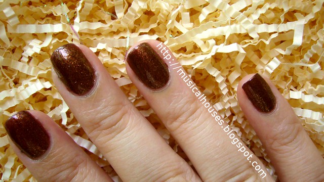
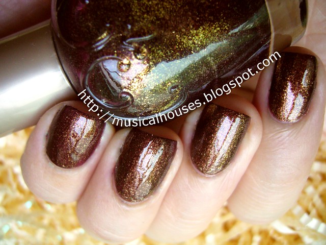
So I have on my nails Elianto Burnt Umber, and all I have to say is, OMG this is one gorgeous polish. Yeah sure it's brown, but it's not an ugly, poopy kinda brown. This one is so beautiful and wearable it just pops out at you! I previously blogged about this polish (and a few other things) in my haul post from a super long time ago, and I'm only starting to wear it now!


See what I mean? Unfortunately it was already late afternoon when I painted my nails, so you guys won't get to see this baby sparkling in all it's glory. But this is good too - its pretty from any angle! I bought this like eons ago in the polish fanatic's world (in the real world it's more like one year, but the polish world moves quickly), and I only just got around to trying it.

elianto burnt umber nail polish 2

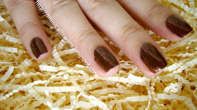
Burnt Umber is a rusty browned-burgundy base, with loads of gold and (I think) orange shimmer. This mix of colours is what makes it amazing. In most lights it looks like a rusty brown with rich gold shimmer, but sometimes I feel like it looks slightly more burgundy instead. From some angles, I even see some sort of green tinge to the glitter, although it doesn't translate as well on the nail.

And the best thing is, because Burnt Umber isn't like, brown brown, but reddish brown, it's incredibly flattering on my hands and fingers. I imagine the fact that it leans red makes it more wearable (I mean, red is a classic colour for nail polish, right?). And the shimmer really makes the shade look so luxe. It even looks good in indoor lights because the shimmer reflects the light and catches the eye.

elianto burnt umber nail polish 1

Application was also a breeze. I didn't have any major application issues, and two coats gave full opacity. The polish pretty much applied itself. I have to say, if all of Elianto's polishes apply this way, I need to get them alllll. What's not to like? I tried this with my PVA glue base coat (Elmer's glue), and it stayed on pretty well! At the end of the 4th day, I wa starting to get a few chips at the corners of my nails - which is pretty good for me, since I usually get chips into my 3rd or 4th day. It could have lasted longer, but I got impatient and peeled it off.

eilanto burnt umber nail polish 3

The autumnal look of the polish, as well as its fantastic shimmer, was what made me try it on (albeit one year later!), and I find I'm really loving it! It kinda looks like the colour of falling leaves to me. Anyone else loving rich colours like this one?

Fall/Winter 2012 Nails: Classic Nude, Brown and Pearls

Wednesday, September 12, 2012

1 comment
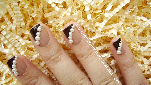
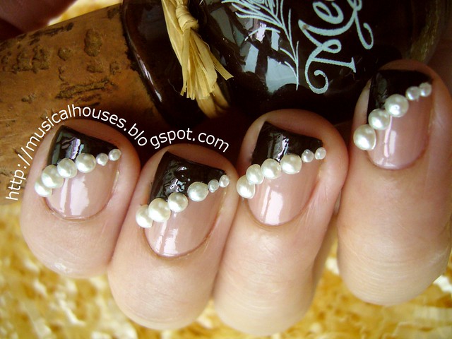
In my last post, I commented that this season's Fall/Winter 2012 nail trends were kinda boring, especially where colours were concerned, since this season's shades were mostly all dark vampies and fleshtone neutrals. So, I set out to jazz it up with a little bling, while still retaining some element of its classic, timeless feel. And here is the result - classic bling, in the form of pearls!


For inspiration, I actualaly looked at this modified french manicure, with a nude base and a vampy tip. It was making the rounds on the runway as part of the Fall/Winter 2012 trends this year. When I saw the look, I thought to myself, "That's a classic colour scheme, but I wonder if I could do something to it - it looks like it could use a teeny bit of bling."

(Source: Vogue)

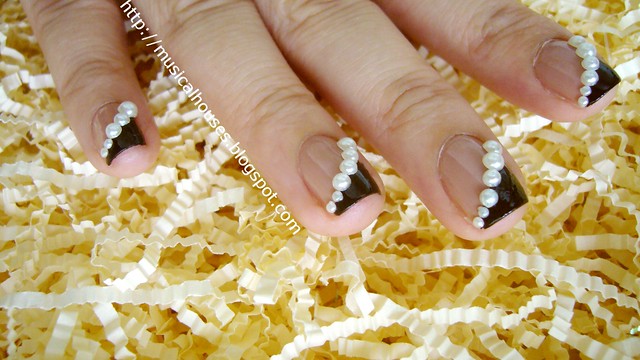
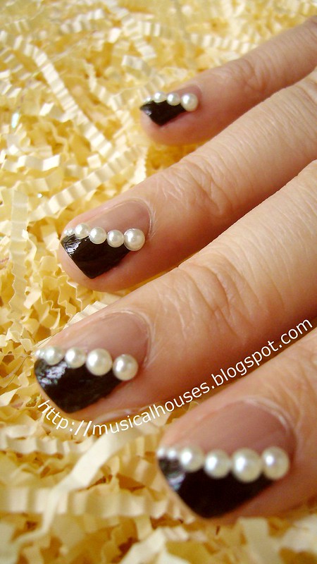
So, I did just that! I retained the colour scheme - don't wanna mess with a good thing too much - but added the pearls, and changed the shape of the painted tip.

fall winter nail art pearls rimmel beige style megan miller ganache 3

For the base, I used Rimmel Beige Style, which is seriously one of the most underrated polishes out there. It's cheap, available, and a classic shade that would probably look good on most people. Beige Style is a fleshtone nude creme (I think it's a creme anyway - it has the slightest of shimmer in the bottle that doesn't show up on the nail). For the nail tip, I used Megan Miller Ganache, which is a rich chocolate brown creme. I basically free-handed the curved tip using Ganache. It doesn't have to be THAT neat because the smile line will be covered by the pearls.

fall winter nail art pearls rimmel beige style megan miller ganache 2

Can I digress a little at this point? I love Megan Miller polishes - the two I have are fantastic in terms of colour payoff, texture, and brush shape/size, but man, I really hate the bottles. The cork cap really annoys me to no end, because fluff and dirt and dust get onto the cap really badly. I have to like, do some dust removal every now and then. I think my cork cap is eventually going to get all moldy and gross (I live in a very hot and very humid climate near the equator), and I'm not looking forward to it. But anyway, moving on.

fall winter nail art pearls rimmel beige style megan miller ganache 5

For the pearls, I used three different sizes of pearls and aligned them along the smile line from large to small. For handling of the pearls, I used the ever-helpful wet toothpick tip - basically you dip the tip of a toothpick in water, and the wet toothpick will pick up the pearls due to the surface tension of the water. When the pearl touches the wet nail polish, the pearl will stick to the polish. Much easier than using tweezers!

fall winter nail art pearls rimmel beige style megan miller ganache 4

Anyway, this is my slightly-more-blinged-up-but-still-classic take on this Fall/Winter's French manicure. I'm really liking it, as it's easy to do, and looks great, even if you aren't into crazy nail art. In fact, my non-nail-polishaholic sister commented that she actually liked this look! I think it would be great to try this with other colour schemes too.

How To Save Dried Out Nail Polish Strips Tutorial!

Friday, December 30, 2011

31 comments
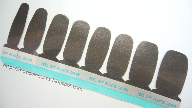
Over the past year, I've been seeing more and more companies putting out nail polish strips. It started with Incoco, and then before you could say "trend", Sally Hansen, Sephora, OPI for Sephora, Nailene and a bunch of others all started putting them out too.

Unlike most nail appliquƩs, which tend to be made of a plastic material, I much prefer nail polish strips because the removal process is much kinder to your nails. Most plastic-based appliques involve soaking the entire nail in acetone for proper removal, but because these are essentially semi-dried polish strips, you can just remove them like normal nail polish, with cotton wool and nail polish remover. I've reviewed nail polish strips before in a previous post, and found them to be pretty good for a fuss-free application.

incoco soho chic strip


So, what happens when those nail polish strips - like real nail polish in bottles - dry out? I stumbled upon a solution the other day, when a months-old Incoco nail polish strip set I wanted to use had dried out. Fortunately, the answer is simple. All you need is this:

orly smudge fixer


Yep, that's all. Just a bottle of Orly Smudge Fixer. When I realized my nail polish strips had dried out, I was sad, and thought I'd have to throw the entire set out. And then a thought struck me: since these strips were made of nail polish, couldn't I rehydrate them with thinner, just like real nail polish? And isn't my handy bottle of Orly Smudge Fixer mostly made out of thinner anyway?

So began the experiment. The strip I'm using here is Incoco Soho Chic, a gorgeous deep brown with flecks of gold/red shimmer. It's absolutely gorgeous, which is why I was so loathe to just let it die like that.

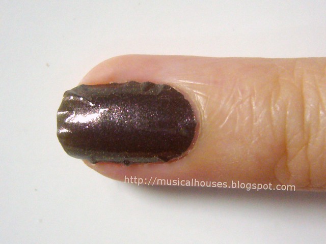
First, I placed a strip on my nail (if you've never done this before, here's a nail polish strip tutorial to help you out). As you can see, because the nail polish strip is dried out, it doesn't stick nicely to the nail. It's all bunched up and uneven at the sides. Normally I don't have this problem with the nail polish strips - they usually just stick quite flat to the nail.

saving dried nail polish strips 1


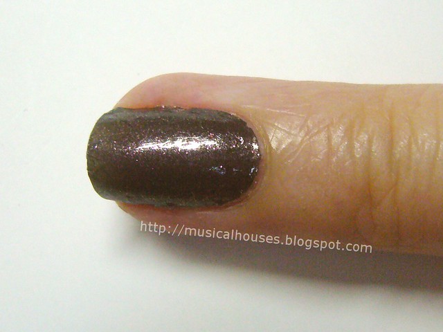
Next, we add a little of our secret sauce - Orly Smudge Fixer. I just painted the smudge Fixer over the unsticky parts of the strip, and the bulges. You can also just paint over the entire nail with Smudge Fixer if the strip is really dried out, but the general idea is to wet the strip enough for it to adhere properly to the nail.

saving dried nail polish strips 2


And you're done! Look, no more weird bulges! Wasn't that simple? Just wait for the strips to dry, and you're good to go! Well, there is a small catch, though. Because the strips have been wet with Smudge Fixer, they will take a little while to dry. If you are impatient, a layer of quick-dry topcoat would help to speed things up.


And there you have it! Good as new! Other than Orly Smudge Fixer, I think you could use any other brand of nail polish solvent or thinner. The general idea is just to put back the solvent which had evaporated and thus caused the strip to dry out. I'm pretty excited about this method, it's simple and it works! Now I have an awesome manicure, and saved myself bunch of money!

NOTD: Barry M Mushroom: I haz it!

Friday, June 4, 2010

12 comments
Today's NOTD is Barry M Mushroom, and I have it thanks to Jellyminx, who writes the blog Jellyminx Thinks. Remember how a few posts back HERE I was whining about how I couldn't find it? Jellyminx had one, and she offered to send it to me! She's like the nicest person ever!

So anyway, here is Barry M Mushroom. I know some people will be wondering if this is a dupe for Chanel Particuliere. Unfortunately I don't have any comparison swatches, but by sheer fortune I was able to compare to my friend, who was wearing Particuliere on the exact same day I was wearing Mushroom. By comparing our fingers, we were able to do a quick visual comparison, and while I don't have photos, I can say that it isn't a dupe, although it is a similar shade. Mushroom is a tad darker than Particuliere, but otherwise they're both close, being brown-grey based shades with comparatively little purple (as compared to other mushroom shades).

Anyway, here is the NOTD:


And here's another picture of my crabby-looking hands with the bottle:

Barry M Mushroom Nail Paint

Gorgeous isn't it? How do you guys like this taupe trend? Still hot, or dying out?

Chanel Particuliere Dupes: Do They Exist? Comparison Swatches

Friday, April 23, 2010

12 comments
I never bought Chanel's famed nail polish, Particuliere. I just couldn't imagine spending 16GBP on a polish, especially when Orlys, Nubars, OPI, and China Glazes go for less. But I was curious to know if there was a dupe, and to see for myself if any of the other taupe-brown-purple polishes were close enough. So I borrowed my friend's bottle of Particuliere, and made a few swatches. Mind you, these are very messy swatches, because I wanted to return Particuliere to her immediately (I'd feel bad hogging a 16GBP bottle of polish!), so I didn't really have time to be as neat as I wanted to be, and we all know haste makes a mess of nails!

First up of course, are bottle pictures.
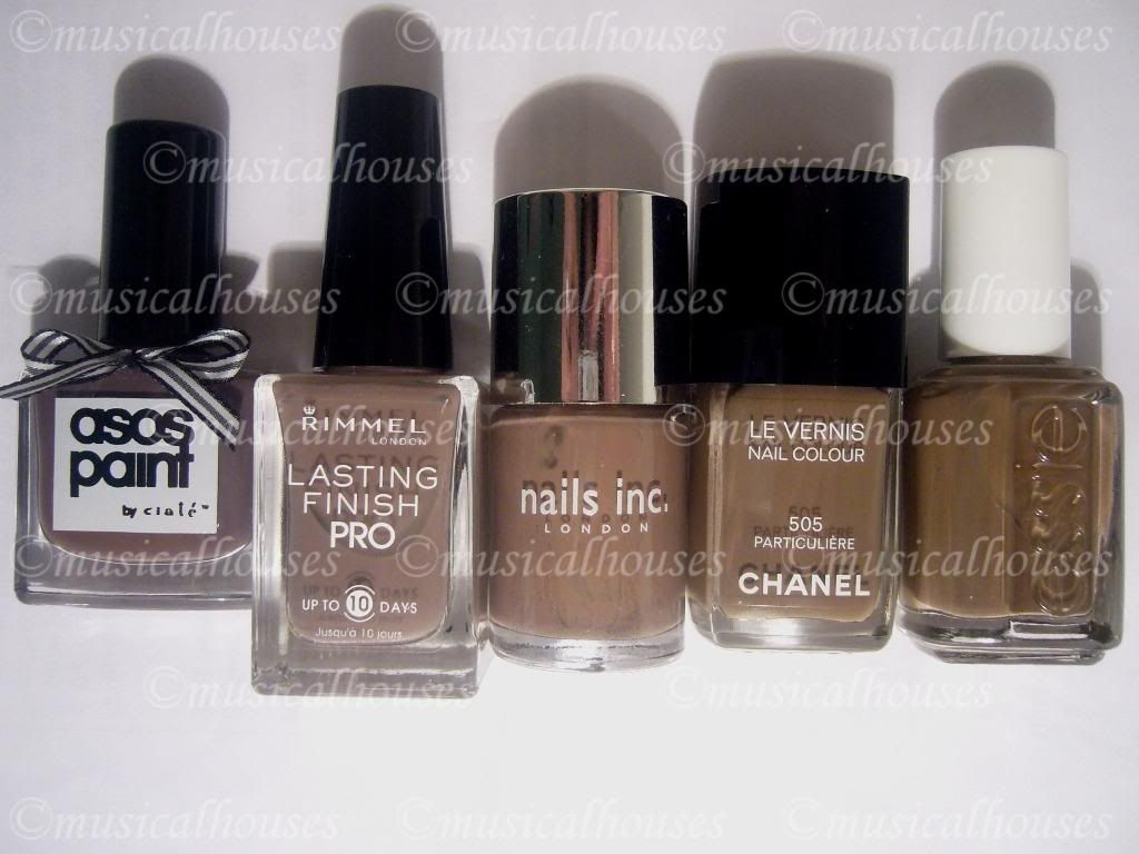
Asos Paints by Ciate Sienna, Rimmel Steel Grey, Nails Inc Jermyn Street, Chanel Particuliere, Essie Mink Muffs

L-R: Asos Paints by Ciate Sienna, Rimmel Steel Grey, Nails Inc Jermyn Street, Chanel Particuliere, Essie Mink Muffs.

Nothing seems to be an outright dupe for Particuliere. Essie Mink Muffs does look similar, although deeper, in the bottle.

And here's how they fared in swatches. Once again, please excuse the terrible state of cuticles and my messy swatches. Like I said, they were done in a hurry because I wanted to return Particuliere ASAP. The swatches show two coats of each:
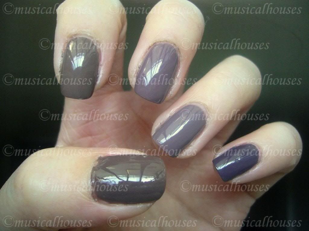
Essie Mink Muffs, Chanel Particuliere, Nails Inc Jermyn Street, Rimmel Steel Grey, Asos Paints by Ciate Sienna

L-R (Thumb to Pinky): Essie Mink Muffs, Chanel Particuliere, Nails Inc Jermyn Street, Rimmel Steel Grey, Asos Paints by Ciate Sienna

Application-wise, I had no complaints about any of the colours. They all applied like butter, although the Nails Inc, Essie, and Chanel were better than the other two. And as you can see, nothing is quite a dupe for anything else.

I know Essie Mink Muffs and Chanel Particuliere look like dupes for each other in this photo, but in reality they aren't that close. The Essie is a little darker, and a little more brown than the Chanel. I don't think most people would notice, but if you're a nail fanatic like me, if it's not an exact dupe, it isn't a dupe! :P

Here's a photo that exaggerates the differences between the two. Essie Mink Muffs is on my thumb, while Chanel Particuliere is on my pointer finger. The differences aren't as massive as they are in this photo (stupid camera), but you get the idea:
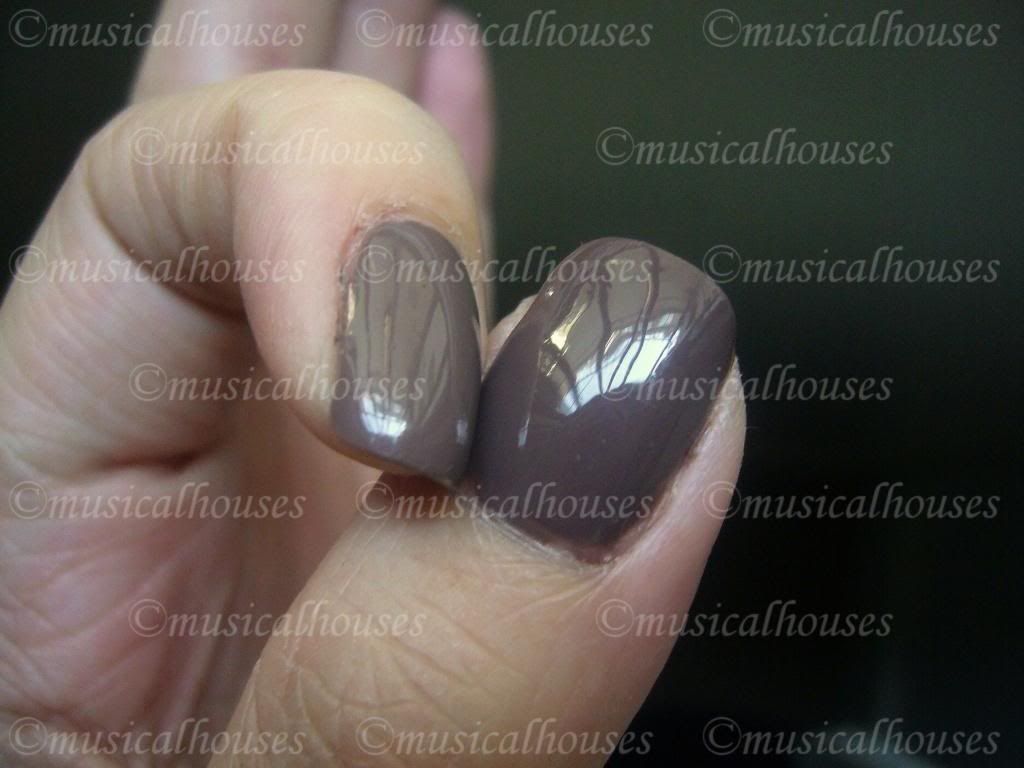
Essie Mink Muffs, Chanel Particuliere

L-R: Chanel Particuliere, Essie Mink Muffs

And I remembered reading somewhere that Essie Mink Muffs is a dupe for Chanel Particuliere, if you lighten it by wearing it over white. So of course I HAD to try that. So I applied Essie Mink Muffs over GOSH Snow (a sheer white), and here are the results:
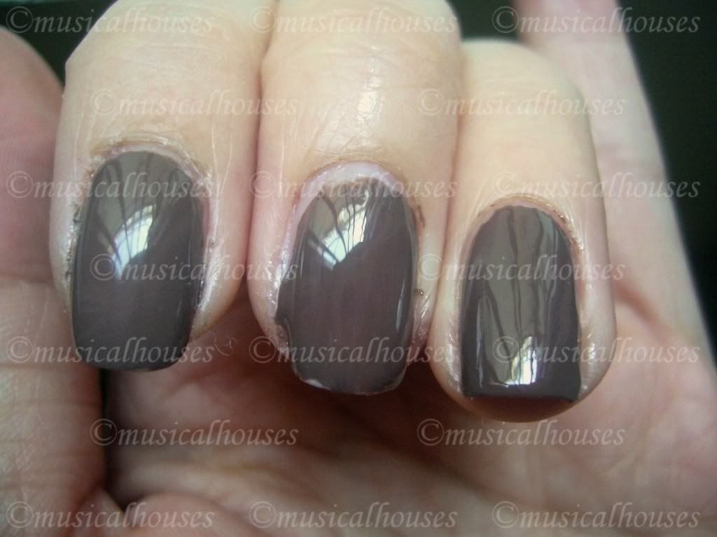
Chanel Particuliere Essie Mink Muffs

L-R: Chanel Particuliere, 1 Coat Essie Mink Muffs over 1 Coat GOSH Snow, Essie Mink Muffs

Similar, but no dice. It's a tad lighter than Particuliere. The purple in Mink Muffs really shows up when you layer it over white. It's really cool.

So, I added on another thin coat of Mink Muffs on top of GOSH Snow, and the results were better:
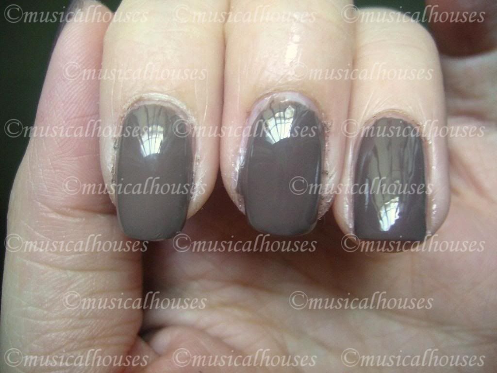
Chanel Particuliere Essie Mink Muffs

L-R: Chanel Particuliere, 2 Coats Essie Mink Muffs over 1 Coat GOSH Snow, Essie Mink Muffs

As you can see, it's close, but not identical. Mink Muffs is now the same depth of colour, but just a tad browner than Chanel Particuliere, while Particuliere is a hair more grey than it's Essie counterpart. I think someone might be able to franken a dupe of Particuliere using Mink Muffs, white, and something to make it more grey.

So, which of these should you choose, if you only had to go for one of them? All the colours applied well, so your choice would depend on your colour preferences, and your skin undertones. Although all these colours are pretty neutral, in general, colours with a stronger purple/grey tinge to them look better on cooler skintones, while colours with more brown tend to look better on warmer skintones. And it also depends on your preference - do you want more grey, brown or purple in your colour? If you want more brown, Essie Mink Muffs or Chanel Particuliere are good choices. If you want something that's more grey, Rimmel Steel Grey is a good choice. And if you want something that leans more purple, Nails Inc Jermyn Street and Asos by Ciate Sienna are your best bets.

Nails Inc Belgravia: NOTD

Thursday, April 8, 2010

4 comments
I know brown isn't the conventionl choice of nail colour, and if it's badly done it can look like poop, but colours like Nails Inc Belgravia and Essie Mink Muffs really appeal to me for some reason. Maybe it's because they're incredibly chic, yet understated enough for work in some areas, and they aren't your "usual" colours. But whatever the reason is, I like brown. Not all browns, some browns. It's hard to describe. Some browns are just "off", but some are chic.

Nails Inc Belgravia is one of the "chic" ones, that doesn't look like you stuck your fingers into a soiled baby's diaper. It's a brown that looks slightly grey in some lights, although it's always definitely brown. It also has a subtle shimmer that I quite like - I feel like it's the shimmer that gives it a dimension that keeps it from looking like poop. And as proof that it's a "chic" brown and not a poopy brown, I actually got a compliment wearing this! And as you can tell from the crappy paint work, this is also an older NOTD.

Nails Inc Belgravia NOTD Swatch

Application was smooth as butter, as is usual for Nails Inc. It was also very nicely opaque in 2 coats. I know I've raved so much about Nails Inc in my previous posts that you're just expecting me to do the same for this one, and rave about how the application is the best, the formula is the best, and the wear time is the best...And you're almost right. Almost. Application was the best, formula was good, but wear time was disappointing. I've no idea why though, because all my previous Nails Inc polishes lasted an average of 3-4 days on me, which is usual. But this one chipped in 1-2 days. I've no idea if this was because I was particularly rough with my nails or not, but I was surprised that it chipped so easily. Otherwise, I would be raving. Still, great colour. Pity about the lasting power, though.

TheBalm Read My Lips Lipstick Swatches!

Saturday, January 2, 2010

3 comments
Happy New Year everyone! What was your new year's resolution? Mine was to actually use up more things in my stash, hah. Today's swatches are theBalm's line of lipsticks, cutely named Read My Lips Lipsticks, and athough they have a limited number of colours - I'm not sure if I got the entire range down, but it seems that their colours are only limited to 6 - they cover most bases for lip colours. And most of their lip colours are very pretty and wearable too. They also come in cute paper packaging that looks like newspaper print - unless of course you don't like paper packaging, since these can get wet and spoil quickly. Personally, I only like the look of paper packaging, but it's not very practical for me.

Overall, I think these lipsticks are not bad. They have nice textures, and apply relatively evenly. And they don't have any weird smell - I think they just smell of unscented lipsticks - slightly chemically, but very faint. They're also all on the sheer side, although they build up nicely. They're not as superpigmented as the Barry M Lip Paints (which I'm so swatching, by the way), but they're wearable. Overall I think these are one of their better products, although they are a tad underrated.

Here are swatches, as always:

thebalm lipstick swatches

L - R: Wanted, Scoop, Gossip, Letter to the Editor, Classified, Smut

Wanted is a very pretty pinky-plummy rose, Scoop is a warmer rose that's less dark than Wanted and has more brown, Gossip is a pale pink with silver shimmer. Letter to the Editor is a shimmery bronzey brown colour with a hint of rose, while Classified is less shimmery, and less rosey. Smut is a deep purply-plum with some pink, and silver shimmer.

Although these colours are boring, I quite like them, particularly Wanted. They're good for work (unless you don't like shimmer), and these are pretty much safe, pretty colours.

Complete Sleek Blush Swatches

Tuesday, December 22, 2009

6 comments
Today, we will be swatching and reviewing Sleek's entire line of blushes. That isn't very hard, because there are only 5 of them. Nevertheless, there are, as usual, some hits and misses.

First off, here are the swatches:


L - R: Pixie Pink, Flamingo, Sahara, Flushed, Coral

Pixie Pink is a matte pale baby pink, this one took a bit of building up to get the color intensity seen in the swatch. It's pretty much a very neutral pink, although I'm tempted to say it leans to the cool side just a tad. I'm guessing this one will be popular with the paler girls, who might find the other colours too intense for them. I'd say this is pretty much your universal pink, although I do imagine that it could potentially look chalky on darker skins. I like this colour, but it doesn't excite me for some reason - I mean, doesn't every other brand have their universal matte light pink? It's boring, but I guess it's a basic colour you have to have in your stash.

Flamingo is probably easily my favourite of the bunch. This one had good pigmentation, and I really like the colour. It's a peachy-pinky colour with a bit of red to give it that extra oomph, setting it apart from it's fellow peachy-pinks like NARS Orgasm. This one had a bit of gold shimmer in it, but I really like the dimension that gives. And the fact that this is my favourite says a lot, because I didn't even like NARS Orgasm. Anyway, I have a hard time deciding whether this is cool or warm, so I'm just going to say it's neutral. I do imagine Flamingo could be used on everyone, and I really really like it a lot.

Sahara is a rather orangey bronzed browned colour, and I'm having trouble picturing who would wear it, because it really leans very orangey on me (maybe it's just my colouring that pulls out the orange or something). It's very heavily orange and brown, even in the pan. This one is matte. Obviously, this isn't my favourite colour-wise, but someone else might like it.

Flushed is a red-berry colour, with just a bit of brown, and it sort of reminds me of a sort-of NARS Outlaw or Exhibit A, as it is sort of in the same colour family. I also really like this one, and with careful use it could probably work on most people, the emphasis being on 'with careful use'. I'd say this colour is a neutral, although it does lean a little to the warm side.

Coral isn't really coral at all, but a browned orangey red colour. I know the swatches make Flushed and Coral look similar but they really aren't (@#%@#% camera). Coral is a good bit browner, and a good bit warmer, and a good bit more orange, Once again, this isn't really one of my favourites, because of the inordinate amount of orange in it, although it has less orange than Sahara. This is definitely warm toned.

In general Sleek blushes had a pretty decent quality - they weren't fantastic and rivalling the high end brands, but they were certainly good for drugsore quality. In general, the lighter colours tended to be weaker in pigmentation than the darker colours, and Pixie Pink in particular was a bit weaker in pigmentation than the rest of the colours. Texture-wise, these felt alright. A couple of the testers were on the hard side, but most of them felt pretty decent. The packaging of these is quite cute, especially if you like NARS. These are packed in NARs-esque packaging, complete with black rubber case and little mirror inside, and rectangular pan of blush with no brush. I probably wouldn't rush out to collect these, but I do like the look of Flamingo.

On another note, Christmas is coming! Merry Christmas everyone!

Taupe of the Day: Bourjois Ombre Stretch Brun Nylon Swatch

Friday, December 11, 2009

4 comments
As you know, from my stash pics here in this post, I have more taupes than I could ever use up. In fact, I suspect that there will be enough for me, my children, and my grandchildren - future generations will always have enough taupe!

So today I wil show you a taupe from my collection, but wasn't in my stash pics (horror!) - Bourjois Ombre Stretch Eyeshadow in Brun Nylon. Now I'm not that huge a fan of Bourjois - I mean, I don't hate the brand, but it's just never been one of those that caught my eye, although I've heard people rave about their blushes. But I think this shadow isn't shabby at all - in fact, I quite like it. As usual, feel free to click on all the pics for the full-sized picture.

Bourjois Ombre Stretch Brun Nylon

That's the outside packaging. Please ignore that purple residue from the huge tag Superdrug likes to put on all its products.

Bourjois Ombre Stretch Brun Nylon

And that's a closeup of the baby.

Bourjois Ombre Stretch Brun Nylon

Oh yes. Hey there, gorgeous.
And of course, no review is complete without a swatch!

Bourjois Ombre Stretch Brun Nylon Swatch

That swatch is in shaded natural light (in other words, me pressing my arm against my basement bedroom window, hoping enough light flows in to take a picture...) so there shouldn't be too much color distortion.

Anyway, here it is. It might surprise some people, since this isn't your expected 'taupe', like Satin Taupe or ME850, but it's a good bit lighter, and a tad browner. I kind of like it this way though, it's actually pretty unique in my stash, and that's saying something :P It's not a dark taupey, purply taupe, like MAC's Satin Taupe, but it's a good medium-to-light taupey color, with a good shot of silver, beige-ish-ness (I think that's what makes it medium-to-light, instead of a dark plummy taupe), and just a hint of purple. But it's still taupe. It reminds me of a more purple, less beige and brown Stila Wheat, since it's of a similar color depth. It's a little on the frosty side, but not so frosty that it's unwearable. Because of the mix of beige and purple in the color, I'd say this color is pretty neutral, maybe leaning a tad to the cool side. I think for most people, this would work as a lid color for most people, and would probably have to be paired with a darker colour for the crease - for my NC20 self, this shows up well enough on my skin. I personally really love this color, because for me a lot of the cult taupes out there tend to be on the dark side, and it's hard finding a nice light taupe. This for me is perfect - not too dark and not too light.

Pigmentation starts off sheer at first, but color is very buildable. I think that's what the 'Ombre Stretch' selling point means - the idea is that they have these nylon micro-spheres that allow the shadows to be 'stretched' out - i.e. stretched out sheer, or packed on opaque. I don't believe nylon particles are going to make an eyeshadow fantastic, but at least they got the description right on this one - it is buildable, and very nicely buildable, even if it starts off sheer. Just the whole thing about nylon-microspheres is such a terrible way to put it across to the consumer - I'm not sure if the average consumer is going to understand the mix of nylon and eyeshadow. Bu at least there's no false advertising here - it does start off sheer, and builds nicely. The texture of Brun Nylon is also pretty smooth, which is good, and it applies well.

I wore Brun Nylon for one entire day to try out how it wore as the day went on, and I'm pleased to say this is decent. It doesn't fade, but it does crease a little by the end of the day, but I wasn't wearing any primer or base (I don't have major eyeshadow issues so I've never found it necessary), so I think with a little primer this will be much better.

If you don't mind frosty eyeshadows, or the fact that you have to build up the pigment, and if you've been wanting a light taupe, not a deep, dark, taupe, this is worth a shot. It's harder to find a light taupe than a dark taupe, and good ones are hard to come by, so if you feel that alot of the taupey colors out there are too dark for you, this is worth a try. Brun Nylon isn't a flashy colour, and it isn't going to start any periods of obssessing on MUA, nor is it going to garner a whole host of cult followers, but it's a good workhorse basic.

Yay, a new blog! And NOTD: Nails Inc Jermyn Street

Monday, December 7, 2009

4 comments
Ok, so right now I'm busy with work and all, but holidays are coming up soon, and soon I will have time to post. For now this is going to be limited to makeup posts (no FOTDs, sorry), and NOTD posts, because I'm a huge slacker, and there are plenty of blogs doing the let's-swatch-every-new-collection-that-comes-out thing. This is going to be my online reference place - for things I like or hate - basically things I have something to say about.

I'll probably start with some NOTD posts, because that's what I'm into right now. With any luck I'll document my swatches (dupes, personal stash) at some point. I could post everything on MUA, and I will, but it's just nice to have my own personal space for reference, where everything I have is in one place.

Anyway, without further ado, here's my first constructive post ever: an NOTD from awhile back - Nails Inc Jermyn Street, which I bought sometime in the not-too-distant past, when I went on a total Nails Inc haulage! (Yes this is the disclosure bit - I bought this myself! Not paid to write this or affiliated to any company blah blah blah...Dude, duh. My blog, just born, is not famous enough to get freebies. And with how slack I am it's never going to reach the pinnacle of blog famedom.)Of course, I just HAD to get this, it's one of the standouts of their line, and purply-taupey-brown? Mmmmmm...that's my favourite eyeshadow color, and it would make a good nail colour too!

I really love Nails Inc polishes, every single one I've used has had the bestest application ever - smooth, even, just the right balance between thin and thick, and some of the colours (especially the darker ones in my experience) are so awesomely pigmented that you could probably Konad with them. Now I'm a nail noob, and I'm nowhere near the gods of the nail board on MUA, but I've spent enough of my dough on nail polishes to know an awesome one when I see it. And this, ladies and gents, is totally AWESOME.


Click to see full-sized pic.

This is 2 coats, no topcoat, under crappy lamplight. And yes, it's a crappy pre-clean-up pic, so sorry about the frazzles et al. The colour is pretty close, though, despite the lamplight, if I do say so myself. It's even got a hint of purple too, a slight one.

Applying it was effortless, although I do have one teensy gripe - the CAP!! Why does such a beautifully formulated nail polish have to have a sucky cap? The cap is big, so maneuvering it requires a bit of work - I don't know why, but somehow having to handle a cap this bag kind of reduces my dexterity, so I get more polish on my cuticles etc than I normally would. Well I did say I was a nail noob! Otherwise, Nails Inc is awesome, and I totally want to buy more of these to add to my already-growing stash of them.

And the color? I really love this one - it's in the same color family as OPI's YDJK, and $OPI's Metro Chic. It's more brown than Metro Chic though, and much lighter, browner, and less grey than YDJK. It's yet another addition to my taupey-mushroomey-brown-with-a-hint-of-purple color family, and I'm loving it to bits. It's a gorgeous creme finish, smooth and opaque in 2 coats, and basically just 10ml of creme awesomeness. It takes 2 coats to be totally opaque though, so I'm not sure if I'd want to Konad with this. Maaayyyybe one day I might try. But for now I can say that my eyeshadow matches my nail color! Haw haw!

Linkwithin

Related Posts Plugin for WordPress, Blogger...