MAC Coco Pigment and Urban Decay Eyeshadow: Dupes or Not?

Wednesday, June 30, 2010

7 comments
If you love makeup as much as I do, you will probably have heard of the legendary MAC Coco pigment. It was released once as a limited edition shade in May 2005 (that's five whopping years ago!), promptly sold out, and was never released again. Right now, if you can find any, it goes for handsome amounts on Ebay and other scalper sites. It was hailed as the perfect complex taupey neutral, that looks good on almost every skintone. And it's runaway popularity and success was all the more impressive because it happened in the days when beauty blogging was still wearing pampers, so there weren't any bloggers to toot its horn and post photos (there were online forums, though).

Anyway, awhile back, I managed to get my hands on a small sample of the notorious Coco pigment. And while I cradled my precious in my hands, I couldn't help buy notice one thing: beautiful as it was (hello complex taupe!), it looked familiar. Eerily familiar. Like, don't-I-already-have-a-similar-colour-in-my-stash familiar.

Excited at this awesome possibility that Coco pigment might have a dupe, I went to my stash to dig out all my eyeshadows, and found the potential dupe - the humble and totally underrated Urban Decay eyeshadow in YDK.

Here they are in their containers. Similar, no?

MAC Coco vs Urban Decay YDK

L-R: Mac Coco Pigment (in sample jar), Urban Decay YDK

But of course, the million-dollar question is, how are they swatched? So here you go:

MAC Coco Urban Decay YDK

L-R: Urban Decay YDK, Mac Coco

There you go! I do think they are dupes, or at least on my skin they are. I think one might be a tad browner than the other, but I honestly think that if you already have YDK, and you pay insane amounts for MAC's Coco, you're going to be disappointed that you paid for something you already have a dupe for.

On me, they're virtually identical. It may vary on other people, as to some extent what passes for a dupe is partly dependent on your skintone. Not so much for nail polish, but more so for makeup products. Still, I think UD's (Urban Decay) YDK is going to satisfy a lot of lemmings for MAC's Coco.

Which might make some of us wonder - if MAC's Coco pigment was all that and a bag of chips, why isn't UD's YDK taking over the world and being sold out at Sephoras and other makeup stores all across the world? It could be that MAC has that hardcore fanatic fanbase that makes every LE item a must-have while UD doesn't, or it could be that Coco was such a long time ago that people forget they ever wanted it and have moved on to other things. I guess this just shows that some makeup products are just totally underrated. And UD YDK is one of them.

Anyway, to sum up my post - both colours are TEH AWESOMEZ, like SRSLY. LOL. No seriously - it's hard to fine such a complex taupe. It's taupe, sure but they have hints of other colours - bronze, plum, champagne, purple, brown - that make it so unique, and so universally flattering. And also, that if you missed the boat on Coco pigment, you can still catch the YDK one.

Reader Question: do you know if storing nail polish in the fridge keeps it in better conditon?

Tuesday, June 29, 2010

4 comments
(Normally I don't put my formspring answers up on my blog - instead they're usually up on my Twitter, Facebook, and of course my Formspring page, and I don't want to duplicate content too much. But I thought this question was interesting, so I just put it on my blog too, in case anyone else was wondering.)

I don't think it helps anything, because nail polish isn't like other cosmetics. Other cosmetics, especially creams or liquids, tend to go bad or go "off" after awhile because bacteria get into them and start multiplying there over time. This is why some people suggest putting some of your makeup in the fridge, because the cooler temperatures slow down bacterial activity (although it doesn't stop it complete, and it doesn't kill the bacteria inside). However, nail polish is different. The chemical composition of nail polish is such that it's a very unfriendly place for bacteria to live - in general, they just don't survive in the sea of chemicals found in our polish. So nail polish has very little bacteria compared to other cosmetics. So since there isn't much bacteria surviving in your nail polish, there really isn't any point putting it in the fridge, because nail polish doesn't go bad the way other cosmetics do. However, over long periods of time, the solvents in the polish will evaporate naturally, and the polish will thicken or dry up. This can be fixed by adding thinner to the polish. (A side note - it's thinner you want to add, NOT nail polish remover, which will mess up your polish!) I hope this helps you!

Ask me anything

Barry M Fine Glitter Dust Swatches Part 2!

Monday, June 28, 2010

4 comments
I always want to laugh at the name of Barry M's Fine Glitter Dust - as I've mentioned before, the glitter is chunky, and not exactly fine! But still, if you aren't glitter-averse like me, you will probably like some of these shades. I know if they didn't have the glitter I'd be all over a couple of them. I don't know what it is with me and glitter, really. I hate glitter in my foundations, powders, eyeshadows, lip products, blushes, eyeliners...I think I just hate glitter. I mean, I'm fine with shimmer, but big glitter bits are a no-no. Seriously, what's wrong with me?

Anyway, fortunately for non-glitter-loving people like me, there are a few shades that don't actually have the chunky glitter - they have a finish that's more akin to the Dazzle Dusts instead. I believe they still have glitter, it's just not chunky.

Here are the swatches:

Barry M Fine Glitter Dust Swatches

Silver 4 was swatched before as well, and this is one of those chunky-glitter colours.

Denim 20 is a bright colbalt blue.

Opal 21 is supposedly one of the newer colours, or so says the display. This one had a cool irisdescence in the packaging that my camera couldn't capture, and that didn't seem to show up as much during swatching.

Black Purple 23 is one of those colours I'd love if I liked glitter. This one is a blackened purple base with purple-blue glitter. Very cool. Like stars in a night sky!

Black Gold 22 is also another colour I'd admire and love from far but daren't wear. It's a blackened base with gold glitter. The glitter really stands out on this one.

Toffee 24 is a shade that doesn't have the chunky glitter. I actually really like this neutral antique gold. It sort of reminds me of MAC's Patina, without the pink irisdescence, and with more glitter. The base shade is in the same colour family.

Forest Green 25 is a green with gold flash. Very pretty. Also one of the colours where the glitter isn't that chunky.

Aqua Frost 26 is also really pretty! It's a aqua blue with gold flash.

As you can see, the glitter on the last three colours is finer than the glitter in the other shades. I'd be wary of fallout, especially when using colours like Silver, but if you have a good base that holds all the glitter in place, some of the colours are really pretty. For the rest of us, there's always the Dazzle Dusts!

Barry M Fine Glitter Dust Swatches Part 1!

Saturday, June 26, 2010

5 comments
Remember the last time I swatched the Barry M Dazzle Dusts, a looong time ago? (Roundup post with links to each of the six parts - yes six! They have that many colours! - is HERE.) And remember at some point in the series of swatches I said I had also swatched the Fine Glitter Dusts and would be uploading them soon? Ummmm, turns out I forgot about them when real life got in the way, and soon means a month later. Yeah, I can't believe I let my real life get in the way of blogging, LOL. :P

Anyway, Here are the Fine Glitter Dust swatches! Fortunately for me this is in just two parts (as compared to the six of the Dazzle Dusts) because they have fewer colours. One thing to note though - the feel and pigmentation of the Fine Glitter Dusts is largely similar to the Dazzle Dusts, BUT - and this is one big but - the Fine Glitter Dusts have holey-moley huge chunky glitter - not fine at all! While most of the Dazzle Dusts had a shimmery or frosty finish, the Glitter Dusts tend to have huge chunks of glitter. I'd beware fallout with these ones.

Here's the first set of swatches. See what I said about big chunky glitter? I'm sorry the photo is a bit blurry - it was the best out of the bunch. I know it isn't my usual swatching standard, I promise Part 2 is clearer.

Barry M Fine Glitter Dusts

Yellow Gold 10 is a primary yellow gold with glitter.

Crimson 7 isn't really crimson, it's more of a pale pink with glitter.

Purple 18 is a blue-based purple, also with glitter.

Bright Blue 5 isn't neon bright blue as you might think. It's a slightly muted blue. Goes without saying that it also has glitter.

Aqua 6 is a greenish aqua.

Blue Silver 13 is silver with hints of blue, that just swatched up as silver on me. Bah.

Gold Irisdescent 15 is really pretty. Me likey! It's a gold colour that would be suitable for even the cool-toned ladies, as it doesn't veer too orange.

Silver 1 is chunky silver glitter.

For some reason, the Fine Glitter Dusts seem to have this glitter. There are a few colours that don't have huge chunky glitter, but the ones that are swatched for today are all glittery. This automatically makes them unwearable for me, but they do have some pretty colours and might be better over a sticky base like UDPP (Urban Decay Primer Potion, if you don't already know), and would probably appeal to someone who doesn't mind the glitter.

Random POTD Holiday Pic: Eyeko Coral

Friday, June 25, 2010

4 comments
Over the weekend, I was with some friends in Cornwall, UK, and it was fun. We were so fortunate that the weather was relatively warm, and that it didn't rain, so we got to take lots of pictures, eat awesome seafood, and play by the beach.

Of course, you guys probably know that I hate a tan and have this kooky Asian idea that the-fairer-your-skin-the-better, so of course I was suntanning Asian style (or more accurately, my style, since I don't even think my Asian friends do what I did). I was lying down on the beach, sunning myself, while covering myself with my jacket to prevent the UV rays from hitting me. LOL! I know I could have used a sunscreen, but on that day it so happened that I had only applied it on my face and not my arms and legs, hence the jacket. (Who am I kidding, even if I had applied sunscreen everywhere I would have still used the jacket. I'm weird like that.) I think everyone else on the beach thought I was a total nutcase, but I wanted to lie on the sand, feel the warmth and smell the sea - without the UV rays. I know, I'm too demanding even for Mother Nature. And somehow while sunning myself (under my jacket), I fell asleep with my head resting on my bag, and when I woke up I had bag-fabric prints on one side of my face. As you can tell, I'm the paradigm of effortless glamour, NOT.

Anyway, on to the more important question - what pedi was I wearing on my tootsies for the holiday? Unfortunately, it was the rather conventional beach colour choice of a coral, which I've already swatched on my fingers HERE. But, I just thought I'd show you guys a couple of pictures of it on my feet anyway.

Here we are, POTD (Pedi Of The Day) pictures! And now we all know I have duck feet:

Eyeko Coral Polish

Very summery and beachy, no? Anyway, application was good, and it was opaque in one coat, although I think I used two, simply to even it out. But if you're careful, one will do. Lasting power was a bit problematic though - by the end of the weekend, the polish had chipped off on one toe, which surprised me. I mean, polish on my toes normally doesn't chip until WEEKS later. Maybe I ran around bumping into too many rocks at the beach.

Anyway, apologies for this boring post. Being back from holiday means I have to catch up with my real life (yes I actually have a real life, LOL!) which in turn translates into less time to blog. I promise I'll post with something more interesting tomorrow. :)

$100 Giveaway Closing in 24hrs! Last Chance to Enter!

Thursday, June 24, 2010

3 comments


Ok girls and guys, you know the drill! In approximately 24 hours, my awesome giveaway for a $100 SkincareRx voucher closes, so you better act quick! Enter HERE!

Barry M Shimmering Lip and Eye Crayon Swatches

4 comments
Barry M's Shimmering Lip and Eye Crayons are supposed to be highlighters for the eyes and lips, although looking at the colour range that is available at my local Superdrug, you'd probably end up using them more on the eyes than on the lips (unless you wanted an unusual lip colour). The colour palette for this is very pastel with some shimmer.

Barry M Shimmering Lip and Eye Crayons

Gold 1 is a light pastel gold with shimmer.

Turquoise 4 is a light pastel blue with shimmer. It looks a little more blue than Turquoise to me, but it could just be the pastel-ness of the colour.

Marshmallow 5 is a shimmery light pink.

Violet 6 is a cool-toned pastel violet shade. I quite like this one, it's a colour that's right up my alley.

Bronze 7 is one of the colours that pops a little bit more, being less pastel. This one is a very gold-orange bronze with shimmer.

Green 8 is also one of the less pastel colours that stands out a bit more. This one is a muted pastel-ized forest green with shimmer.

The only thing I have to mention is that while I was swatching, these don't seem to "set" on their own very well, and are a little bit smudgy. They would probaby work best as an underlay or overlay for other eyeshadow colours. If you wanted a sheer wash of colour these are perfectly fine worn alone too.

Collection 2000 Powder Blush Swatches

Tuesday, June 22, 2010

Leave a comment
Collection 2000 is a UK-based drugstore brand, and it's like the Wet n' Wild of the UK - it's probably the cheapest drugstore makeup in the UK. And like any line, their items consist of hits, misses and maybes. The last time I featured this brand, I swatched the Angelic and Poptastic Eye Palettes. Today I'm swatching their Powder Blushes.

There are only four colours, all of which are lightly pigmented:

Collection 2000 powder blush

L-R: So Pretty 01, Bashful 02, Breathless 03, Trouble 04

So Pretty is a light, light pink with shimmer.

Bashful is a pinky-peach with a bit of red, leaning warm. It looks darker in the pan than it applies.

Breathless is an orangey peach with gold shimmer.

Trouble is a pinky peach with shimmer. It's the requisite NARS Orgasm-like shade every brand seems to have nowadays, only a lot more sheer.

I was actually drawn to the blushes initially because of their really cute packaging - they're in small round pans with a swirly floral design etched onto them - but they're not my cup of tea. Like I said before, these are sheer, which can be a good or a bad thing depending on your preferences (for me, it's not that great). And they also have shimmer. In general the lighter colours are more sheer than the darker ones, but none of them are super pigmented - what you see is as much as I could build up. The colour range was also a little bit boring, but I suppose since the brand only has 4 shades, they had to cover their bases with all the basic colours. If you like sheer blushes with shimmer, this would probably suit you better. I think it's just alright - it's clearly not the brand's standout product. I think that in general for Collection 2000, their powder products aren't their forte, but some of items previously swatched, such as their glitter and metallic eyeliners, were much better.

Beauty Blog Link Love

Monday, June 21, 2010

1 comment
Over at theNotice, Rae talks about a new Burt's Bees lip balm... and how it reminds her of an old Lip Smacker!

Maggie shares this Foxy dupe of Too Faced's Sexpresso and Peachfuzz duo over at The Polka-Dotted Apple.

Kim Porter talks about a miracle moisturizer that's also a makeup primer, remover, and more!

Vesna from Beauty addict blog discovered one of her blushes is fake, so read this post to find out how to spot a fake Benefit Coralista!

Head over to Beautifully Glossy to discover a lip balm that GlossQueen thinks is an essential.

Glitter Geek is obsessed with everything sparkly, and she puts a glistening spin on the summer smoky eye.

Need some wedding makeup ideas? Check out Audrey Dao's wedding looks!

Pop over to melovemakeup for swatches and thoughts on the New Revlon Colorburst Lipsticks!

Get the only 10 tips you'll ever need for a fool-proof fake tan on beautywoome.com.

Champagne, French macarons and make up... Hellcandy spends an indulgent afternoon with Terry De Gunzburg, founder of By Terry.

Vex in the City takes a look at Mai Couture's Blush Papier - blush with a difference!


Lisamarie from Beauty Crazed discovers the joy that is cream blushes!

Eyelining Obsession thinks you shouldn't have to spend a fortune on great eye brushes.

You can wear nudes too! Spiced Beauty shows off MAC Lovin' it Lipstick with lip swatches.

Jen from A Beauty Junkie in London has been feeling all posh whilst checking out Estee Lauder's new Pure Colour Shadow.


Retrodiva splurges a bit with Chanel's Coco Rouge and Red Shine Glossamer. Find out if she thinks it's worth it!

***


Want to win a $100 gift voucher for all your skincare needs. Head over to Yinnie's blog to check out the details!

Superdrug MUA Makeup Academy Lip Gloss Swatches

Sunday, June 20, 2010

4 comments
So, months after the buzz about Superdrug launching its everything-is-£1 MUA Makeup Academy line, my local Superdrug has finally gotten in an MUA display stand. Or it could be that I didn't see it before. It's possible, but whatever the case, I finally managed to see the MUA line in person.

My feelings about this brand are mixed. I know everyone and their mum has been raving about this, but I didn't really find the eyeshadows or lipsticks or nail polishes that interesting colour-wise, and honestly, the eyeshadow testers were hardened on the top surface (probably due to the oils from the fingers of customers testing them out, but still...), and the lipsticks seemed a little dry (again, could be the testers drying out). I guess for a quid, you can't complain. But just as I thought I'd give the brand a pass, I saw their Lip Gloss. The MUA line actually has two types of lipgloss, both called Lip Gloss, the only difference being that one is in wand form and one is in tube form. I was drawn to the wand one, because the colours looked so pretty and interesting in the packaging.

They have five shades, numbered simply Shades 1 to 5. Shade 1 was a clear base with glitter, and Shade 5 was just a clear lipgloss, so I didn't bother to swatch either of them. But I did swatch Shades 2-4:


Shade 2 is a sheer neutral red with some shimmer (that doesn't show up in the photograph). It's a very sheer, wearable red gloss that I thought looked more interesting in the bottle.

Shade 3 is a sheer fuschia pink gloss. This one has no shimmer. Once again, it's also very sheer.

Shade 4 totally wowed me after the sheerness of Shades 2 and 3. It's a rose with warm gold shimmer. This is easily the winner of the lot, and very pigmented too!

These lipglosses actually reminded me a lot of the Revlon Super Lustrous lip glosses in terms of texture and smell and feel. If you liked the Super Lustrous glosses, you'll probably like these too. Shade 4 in particular is really pretty - I have this one, and I'll seriously need to get around to doing a proper lip swatch and review soon!

OPI DS Extravagance: Awesome Holo Goodness

Friday, June 18, 2010

7 comments
Ahem ahem *clears throat and looks awkward* Before I show off the awesome holo-ness on my nails, could you guys do me a teensy favour and vote for me? (I bet you knew that was coming..) It's a simple two-step (or one, even) process: Go HERE, and look for the girl called "Grace". Looks familiar? Umm well that's because that's me! So if you've enjoyed my blog and would love to see me swatch/review more stuff, be nice to me and click on the "Vote" button. :) You can do it once a day, but I don't imagine anyone's going to do that LOL, so I'd be happy if you just voted a couple of times. If you're really lazy, CLICKING HERE leads you directly to the voting form for me :D All you need to do is enter your email address, and you can uncheck the box if you don't want Stila's spam :P

Today's NOTD is one of my favourite holos of all time. There are some holos that are awesome because of the way they totally bring out the holo rainbow on your nails (like GOSH Holographic, from THIS POST) and there are some which have a more diffused holographic glitter - you get holo glitter bits, but not the entire holo rainbow. I usually don't fancy these types of holos, but OPI DS Extravagance is one I make an exception for.

Although the holo is a little more diffused in this one, I still love it nonetheless, and I can't quite say why. Maybe its because of its holographic sparkliness, maybe its the rich pinky-plum jewel tone that really feels extravagant (like the polish name, haha) and makes me feel like I've got little gems on my fingertips everytime I wear it, maybe it's the way it glints and winks in the sunlight. Whatever it is, I love this baby. And summertime is the perfect time to wear holos - the extra daylight just makes them so much more glitzy.

Here's two coats in natural sunlight:

OPI DS Extravagance

Application on this one was good, as good as OPI's usually get. Not streaky, opaque in two coats, and generally trouble-free. I'm personally a huge fan of OPI's Pro-Wide brush, so I love the huge brush size because it lets me do my man-hands in fewer strokes, but girls with slimmer proper ladylike hands might not fancy it so much.

Like all holographic polishes, this one was a little high maintanence and chippy. It chipped after a couple of days, which is not unusual for a holo polish. I really love this one, and it's a pity the entire DS series was limited edition. I really wanted DS Original too, but I never got to lay my greedy paws on it before it wasn't sold anymore.

Giveaway has been extended! Enter now!

Thursday, June 17, 2010

1 comment
Just so you guys know, my giveaway has been extended by a week to 25th June. So everyone please enter by that date :) Go HERE to enter!

Eyeko Petite, Coral and Vampira Polish Swatches!

Wednesday, June 16, 2010

8 comments
The last time I tried Eyeko's polishes, I wasn't impressed at all. Not one bit. This was back when Eyeko was still carried at my Superdrug last year. I saw their polishes in their cute bottles that looked like little milk jugs, picked up 3 or 4, tried on Pretty Polish, and promptly gave it away. It was sheer, streaky, annoying and took 4 coats to even out. And the cute milk jug bottle? It looked really eye-catching, but didn't help polish application one bit, since the polish tended to get clogged up around the too-wide rim of the bottle, and the flat cap was hard to hold.

Enter 2010, and Eyeko seems to have reformulated their polishes. These ones that I've tried were much better, both in terms of packaging. Gone are the annoying milk jug bottles with the too-wide rim and hard-to-hold cap. These ones are thinner, and sleeker, and the rim and cap are normal to hold and use. The formula also seems to have improved - out of the three I've swatched, only one was sheer, and it was billed as a polish for French manicures, so that's to be expected. There are also some interesting and surprising dupes here.

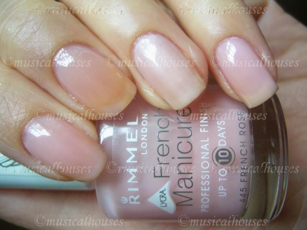
First up, we have Petite Polish, for French Nails (don't you just love how Eyeko tells you what sort of effect their polish is supposed to give? I think it's kinda cute). This one is sheer, as billed. One coat was a barely noticeable pale milky sheer pink, two coats still left VNL (visible nail line) but was still sheer. This swatch is two coats, in natural light. Pardon the stained nails:

Eyeko Petite Polish

As you can see, this is a far cry from my past experience with their Pretty Polish. While that one was impossibly streaky, this was actually even with just two coats. Streakiness is a major downfall of many a sheer french pink, so consider me impressed, even if the colour isn't devastatingly unique.

Speaking of not being unique, there are similar colours, and a close-but-not-quite-dupe in other lines:

Eyeko Petite Polish, Rimmel French Rose, Nails Inc Elizabeth Street

L-R: Eyeko Petite Polish, Rimmel French Rose, Nails Inc Elizabeth Street, Eyeko Petite Polish

I used two coats of each for the swatches to ensure consistency. As you can see, Nails Inc Elizabeth Street is the most opaque of the lot, reaching near-full opacity in 2 coats. Rimmel French Rose is the sheerest of the lot, showing the most VNL, while Eyeko's Petite Polish is sort of in between, but closer to the Rimmel French Rose polish.

I think these are great for French manicures, and also very work appropriate - barely anyone is going to notice you're wearing polish with these.

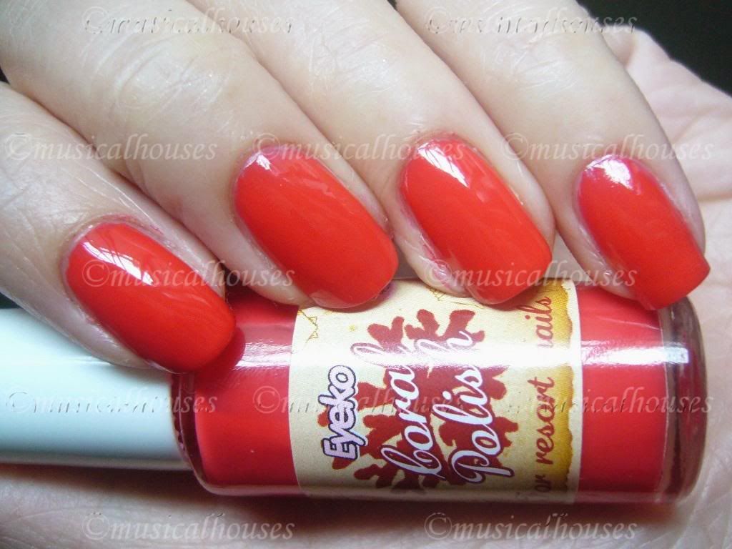
Next up, we have a stunner in Eyeko's Coral Polish, for Resort Nails. This one really gives a very summery, holiday feel, and was opaque in two coats:

Eyeko Coral Polish

This is really very pretty isn't it? I generally stay away from most coral colours, because they usually carry too much orange for my taste, but this is on the red side of coral, and thus doesn't make me look as jaundiced as it potentially could. I also liked the application on this one, it applied well and was smooth. I really love this one, it's not neon, but it's bright, summery and happy.

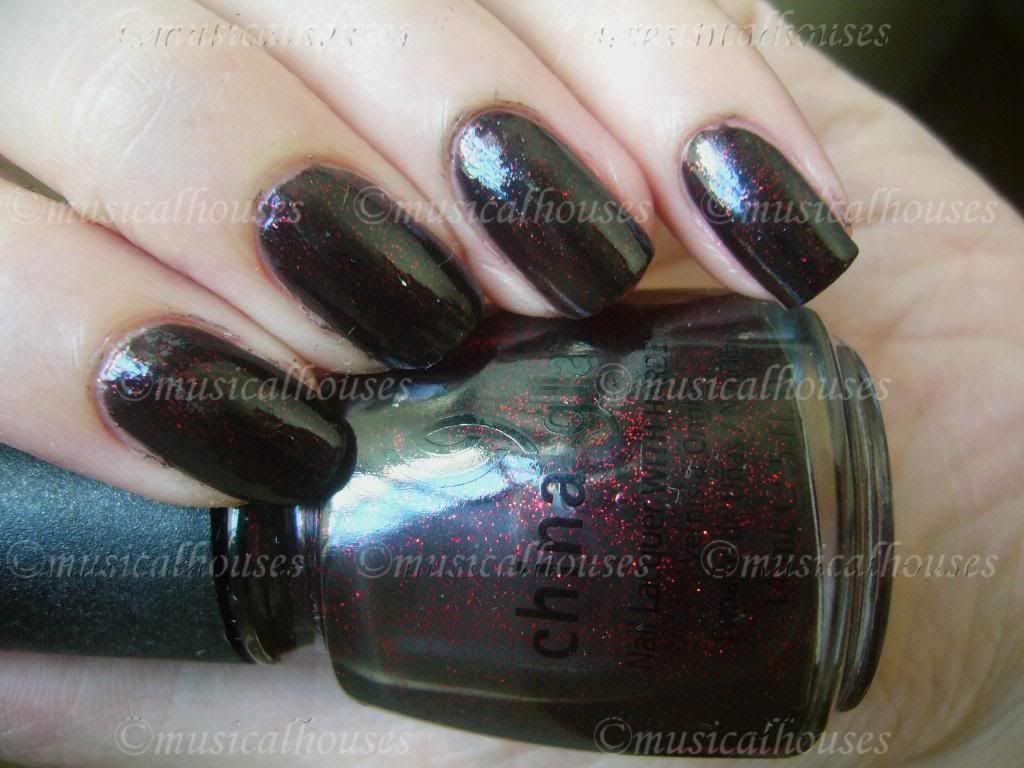
Lastly, we have Eyeko Vampira Polish, for Goth Nails. Although I'm not quite sure if black automatically equals goth, considering that China Glaze's Lubu Heels is pretty much a classic in the nail polish fanatic's world, and it's a very similar colour. Vampira Polish, as is Lubu Heels, is a sheer black with red glitter, which is pretty much opaque in two coats. If you can't see the red glitter bits, feel free to click on the picture to view the humongous full size version, complete with messy cuticles (don't say I didn't warn you):

Eyeko Vampira Polish

You know I love me my vampies, so you know I'll love this. Black with red glitter? I'll take it!

But how does Eyeko Vampira Polish compare to China Glaze's cult favourite, Lubu Heels? They look awfully similar, could they be dupes? Well, I know you'd be wondering, so I generously swatched them for you :P LOL! These swatches are two coats of each:

Eyeko Vampira China Glaze Lubu Heels Polish

L-R: China Glaze Lubu Heels, Eyeko Vampira Polish, China Glaze Lubu Heels, Eyeko Vampira Polish

As you can see, they are pretty much dupes, colour-wise, right down to the size and density of glitter. I know the China Glaze diehard fans are going to howl at the presence of a dupe of one of their cult favourites, but to be fair, the China Glaze version was easier to apply, and didn't pull or streak as much. So they might be dupes colour-wise, the China Glaze had a better application. But for anyone in the UK who can't get their hands on China Glaze, the Eyeko is definitely a good substitute.

After my previous mishap with the older Eyeko polishes, I swore I'd never buy anything Eyeko again. These polishes have redeemed Eyeko in my eyes. None of these colours are super unique, but they are good basics with good quality, and worth a look at.

These products were provided to me for review purposes. I am not affilated with the company. This review is my complete and honest opinion.

Sleek Makeup Pout Polish Lemon Meringue: Swatch and Review

Monday, June 14, 2010

10 comments
Sleek Makeup has launched two new Limited Edition colours of their Pout Polish. The permanent Pout Polish line, consisting of four colours, has been swatched before HERE, but the two new colours, Lemon Meringue (sheer yellow) and Raspberry Souffle, contain SPF15, unlike the perm shades, and are limited edition to boot.

Sleek has once again simultaneously stayed on-trend with their colour palette, while still producing something a little more wearable for the rest of us. Raspberry Souffle is the crowd pleaser, being a universally popular raspberry pink, while Lemon Meringue is the more edgy, on-trend colour, being yellow.

Here's a shot of Lemon Meringue in it's container. Like I said in my previous Pout Polish swatches, these come in pretty big jars for lipbalms:


Here's what the inside looks like, with a tube of carmex next to it just for a sense of size:

Sleek Pout Polish Lemon Meringue


And since I know you'll be curious to know what a yellow lipbalm would look like on, I've swatched it for you as well! I have to admit, I didn't really fancy the colour by itself. Although the gloss is sheer, it still has a yellow tinge. I've always been pretty conservative in terms of makeup colours (you know, no blue lipstick and bright pink face glitter for me) so I can't say I fancied the colour very much, it was just out of my stodgy ol' comfort zone. But I'm sure someone will like it more than I do.

Here's a swatch of my bare lips, for comparison purposes:


And here's my lips with the Lemon Meringue Pout Polish applied. As you can see, the yellow isn't opaque, since the balm is pretty sheer, but there is a tinge of yellow, especially from certain angles:

Sleek Lemon Meringue Pout Polish Swatch


Colour aside, though, I really liked this gloss. The texture was smooth and not tacky, yet not so watery that it feels slippery. It feels nicely emollient without being greasy or sticky, and it was quite moisturizing as well. The balm itself had a pleasant vanilla-ish sort of smell that dissipates upon application to the lips. I really liked the quality and the feel of the gloss, and I know I'd really love the Raspberry Souffle colour much more.

Anyway, because I knew some readers might be curious to know how Lemon Meringue would look when layered, I layered it over a blue-based lipstick to see how it would fare as a gloss to "warm up" the lip colour and make it look less cool-toned. I think it did pretty well in warming up the colour. Nifty, eh? It's like I managed to produce a totally different lip colour!

Sleek Pout Polish Lemon Meringue

While I personally wouldn't wear the Lemon Meringue colour alone, I think it would pretty useful when layered to change the colour and finish of other lip products, and might come in particularly handy when you have a lipstick that is too cool-toned, and you're trying to correct that. I also really liked the texture and feel of the balm, as well as how emollient it was. If you can find a colour you like in their range, and don't mind having your lip product in a pot, it's worth trying out.

This product was sent to me for review. I am not affiliated with the company. This review presents my honest and complete opinion.

Summer Cheek Stains: Bloom Bronze and Rose

Saturday, June 12, 2010

5 comments
Today's swatches are another summer staple - cheek stains! These are from Bloom, an Australian brand that's carried in Australia and other countries. They're most famous for their nail polish among other items, but other than their polish, they seem to be pretty underrated. Anyway, like Benefit, they also have cheek stains.

The interesting about the Bloom stains is that not only do they have a Rose (or Rosie according to the website - I'm not sure which is the correct name) tint that every brand has, they also have more uniquely, a bronze tint, that functions as a bronzer! This is pretty unique, especially at the drugstore beauty level, because most bronzers I've seen to date have been in powder or cream form. This is pretty much the first gel bronzer I've seen, especially in a drugstore context.

Anyway, here are swatches:

Bloom Cheek Stain

Rose or Rosie (whatever the correct name is), is a deep cool-toned rose shade, while bronze is a muddy brown that probably needs to be tried on before you buy it - I'm not sure how this shade would translate onto most skintones. It seems like a really odd shade of brown to have, and honestly, it kind of looks like something you'd find in the bathroom...

Anyway, the texture of these cheek stains was in a gel form, so they weren't too liquid, and unlike previous stains I've swatched, these come in a tube with a brush dispenser. This makes it a little more convenient for travel than other stains which come in an oversized-nail-polish-like bottle, although I'm wary of the brush dispenser because it just looks like a breeding ground for germs. I personally like the Rose (or is it Rosie?) shade a lot, but the Bronze shade is a bit more dubious to me.

I wonder if anyone has tried the Bronze shade? How did it turn out on you?

Bright Summer Eye: Collection 2000 Glam Metallics Coloured Eyeliner Swatches

Thursday, June 10, 2010

8 comments
Summer is always perfect for brights - bright nail polish, bright clothes, and bright makeup (not necessarily all at once, of course - but then again, why not?). For girls who aren't comfortable with bright nail polish or bright clothes, bright makeup is a good way to start off bringing some summer into your look. It's always good to pick one feature (lips, eyes, cheeks) and put a pop of colour onto it, like a bright lipstick in an otherwise-neutral face. But my favourite by far is to wear entirely neutral makeup, but with bright eyeliner. That way, your look isn't drastically changed (after all it's only a line or two of colour), but you get in on the brights trend.

Today's trend-related swatches are the Collection 2000 Glam Metallics Coloured Eyeliners. That's a long name, LOL! Collection 2000 is the Wet n' Wild of the UK - the cheapest drugstore brand for makeup you'll possibly find. The last time I talked about this brand, I swatched some of their eyeshadow palettes HERE, but I didn't think they were all that special. However, this time unlike the eyeshadows, the Metallic eyeliners aren't too shabby.

Here's a peek. Don't they look nice and metallic?

Collection 2000 Glam Metallics Coloured Eyeliner

L-R: Vinyl 1, Fierce 2, Ripped 3, Groupie 4, Punk 5, Grunge 6

Vinyl 1 is a pretty metallic silver, that really looks like metal.

Fierce 2 is a metallic gold, and this one also does look really gold.

Ripped 3 is a lilac purple, very pretty and a nice feminine twist on metallic eyeliner.

Groupie 4 is really cool. It's a turquoise aqua colour, and I think this one does have a slight gold sheen to it. It's not a duochrome, but just a slight sheen. It makes it a little more unique.

Punk 5 is a sky blue that's pretty bright.

Grunge 6 is a light yellow green, that reminds me of grass.

I noticed that when I swatch these they were decently pigmented. Not massive pigmentation, mind you, but decent, especially given the price. And another thing that I thought was good, was that after I had swatched them, I tried to wipe them off, and I found that a couple of the colours left a stain behind on my skin. I'm just going to take that to mean that these things have decent staying power, hopefully. It's hard to tell when you're just swatching them. But in terms of colour and pigmentation, these are not bad at all.

Summer Cheek Stains: Mememe Poppy and Pussy Cat Tints Swatches

Tuesday, June 8, 2010

8 comments
Legend has it that Benetint, the first rose-coloured stain on the market, was created by the founders of Benefit at the request of a female entertainer to stain a specific part of her body a nice rosy pink (sorry I can't be more direct guys, this blog is rated G, LOL). Since then, lookalike products have blossomed, and Benetint isn't unique anymore. Nevertheless, regardless of brand, stains seem to be more favoured in summer, presumably because they stay on after all other makeup has melted off.

One of the rumoured dupes of Benefit's Benetint and Posietint are the Mememe Pussy Cat Tint, and the Mememe Poppy Tint respectively. Now I wasn't able to swatch Benetint and Posietint beside Pussy Cat and Poppy, so I can't confirm any of the assertions, but they do look to be pretty close. The packaging is also very similar - they come in those oversized glass bottles with a nail polish-like brush, just like Benefit and Posietint. I'd personally prefer a packaging change to a squeeze tube or a pump bottle, so that it would be easier to handle. But hey,I guess if you're trying to copy the product, why not copy the packaging?


Poppy Tint is a sweet pastel magenta pink, while Pussy Cat Tint is a deep but clear rose red.

I personally like both colours, and I swatched them sheered out to show how they might look when actually worn, and also when built up, so you can get a clearer glimpse of texture. The Poppy Tint has a little more of a gel like texture than the Pussy Cat Tint - as you can see, the dollop of Poppy Tint stays where it is, but the dollop of Pussy Cat Tint is spreading out even as I took the photo. But I guess given that the Pussy Cat Tint is a clear transparent liquid, while the Poppy Tint was an opaque liquid, there would be some difference in texture. Both were easily layered for greater colour intensity, and they seemed to do fine in terms of being blendable while swatching.

I walked around with these for awhile to let them "set", and then I tried to remove them with rubbing and water, and I'm pleased to say they both held up relatively well. They held up better to rubbing than to water, but that's perhaps to be expected. I like that they are pretty much rub-proof once you let them absorb, so they won't come off onto clothes. These are probably good alternatives to anyone who wants a Benetint or Posietint dupe - they are similar, but much cheaper.

Glitter Summer Eye: Collection 2000 Glam Crystals Dazzling Gel Liner Swatches

Sunday, June 6, 2010

14 comments
If you are unafraid of glitter, then glitter eyeliner will probably be one of your staples during summer. Glitter eyeliner is a good way to jazz up an otherwise neutral face. While I myself personally am glitter averse (I'm eternally worried that the glitter bits will irritate my eyes), it seems to look good on others. And since glitter seems to be synonymous with summer, I figure why not swatch them for you guys?

Today's glitter eyeliners are the Collection 2000 Glam Crystals Dazzling Gel Liner. These are basically bits of glitter suspended in an almost-clear gel base. Because of this, they are perfect for layering over non-glitter eyeliner to give a little bit of bling to your look.

Collection 2000 Glam Crystals Dazzling Gel Liner

L-R: Glitz 1, Funk 3, Hustle 4, Le Freak 5, Night Fever 6, Dancing Queen 8, Retro Chic 9, Shake It Up! 11, Spandex 12

Glitz 1 is a silver glitter suspended in a clear base. This one had one of the denser glitters of the entire range.

Funk 3 is a yellow gold glitter in a clear base. As you can see, this one had less dense glitter than Glitz. This colour is pretty cool though. It's more yellow gold and not orange gold.

Hustle 4 is super super cool. Have you heard of OPI's polish Mad as a Hatter? It was a totally cool bottle of polish, consisting of multicoloured glitter in the bottle, and it looks kind of purple-silver-black on. Well, Hustle is like the eyeliner version of Mad as a Hatter. The swatch doesn't do it justice at all. It looks like a silver, but it's a lot more multi-dimensional than that. Sometimes it looks purple, sometimes silver, sometimes black-ish. It's a beauty.

Le Freak 5 is a turquoise aqua glitter in sheer turqoise gel.

Night Fever 6 is a colbalt blue glitter in a clear gel.

Dancing Queen 8 is a rosy red glitter in a clear gel.

Retro Chic 9 is a gold glitter in a clear gel, but this one is more orange than Funk.

Shake It Up! 11 is a blurple (a mix between blue and purple) in a matching blurple gel base. This one is also pretty cool. It's more purple than Night Fever for sure, and it's a very pretty stunning colour.

Spandex 12 is a yellow green glitter in a clear gel. On closer inspection this one has two kinds of glitter, green and yellow. Or is it my eyes playing tricks on me? It's hard to tell.

So what do you guys think? Is glitter eyeliner cool, or is it a no-no for you?

Win a $100 SkinCareRX Voucher! Have you Entered Yet?

Saturday, June 5, 2010

Leave a comment


Okay, if you haven't yet entered my giveaway, go HERE now! I really can't understand why. It's a $100 giveaway, and it's open internationally, so I have no idea what's wrong with the rest of you :P

Don't say I didn't warn ya, but if you don't enter, you'll regret it :P What are you waiting for? Enter now!

Beauty Blog Link Love

Leave a comment
Over at theNotice, Rae has been bitten stung by the Misikko bug -- and she is not pleased!


Betty Girl Makeup is back, and continuing on with her series on contouring!

Vex in the City shares her delight at discovering the wonders of Mehron's new Celebré HD-Pro foundation.


Lisamarie from Beauty Crazed checks out the multitude of choices in lash enhancers.

Louise pens a love letter to a BLUE eyeshadow, and is now trying to deal with her embarrassment.

Mz. More from The Glamorous Gleam tells you all about her experience with the Zoya Nail Polish Exchange, and shows off her new goodies!

Does your significant other complain about "too girly" shower gel scents? Want a happy medium? Look no further and discover what shower gel Hellcandy and her bf are raving about!

Jeweled Thumb shares how she spot cleans her brushes, and reviews 6 cleansers to help you find the best one for you!

Hot Beauty Health shares the top beach beauty buys for summer 2010!

Krasey Beauty meets Dany Sanz, the artist, legend, and creator of Make Up For Ever.

Spiced Beauty shows you that you can look fab in red lipstick... even if it just costs a dollar!

There's a new natural cosmetics line on the block! Lipglossiping casts her eye over Bourjois' little sister, Une.


Jolie Laide Girl is glowing with Make Up Forever's HD Blushes.

Learn how to get 'Perfect Skin' with the help of makeup artist Jon Hennessy at Makeup by Kim Porter.

Phyrra shows you the newest collection from Aromaleigh, Victoria’s Revenge. If you like steampunk, you’ll love this collection!

***


Find out what Audrey Dao is giving away for June's Reader of the Month Giveaway!


Cindy from Prime Beauty is a Stila IT girl and you can be too, with her awesome Stila giveaway!

NOTD: Barry M Mushroom: I haz it!

Friday, June 4, 2010

12 comments
Today's NOTD is Barry M Mushroom, and I have it thanks to Jellyminx, who writes the blog Jellyminx Thinks. Remember how a few posts back HERE I was whining about how I couldn't find it? Jellyminx had one, and she offered to send it to me! She's like the nicest person ever!

So anyway, here is Barry M Mushroom. I know some people will be wondering if this is a dupe for Chanel Particuliere. Unfortunately I don't have any comparison swatches, but by sheer fortune I was able to compare to my friend, who was wearing Particuliere on the exact same day I was wearing Mushroom. By comparing our fingers, we were able to do a quick visual comparison, and while I don't have photos, I can say that it isn't a dupe, although it is a similar shade. Mushroom is a tad darker than Particuliere, but otherwise they're both close, being brown-grey based shades with comparatively little purple (as compared to other mushroom shades).

Anyway, here is the NOTD:


And here's another picture of my crabby-looking hands with the bottle:

Barry M Mushroom Nail Paint

Gorgeous isn't it? How do you guys like this taupe trend? Still hot, or dying out?

Guest Post at Body and Soul Beauty: Teal NOTD with Flakies!

Thursday, June 3, 2010

4 comments


See that teal mani with flakies? Wanna see more pics of its colour changing properties? Then head on down to Mary's blog, Body and Soul, to check it out and show some love! She's a real nice lady too, and I promise the NOTD isn't too shabby either, and there are awesome pictures! It's teal with flakies - what could be better than a pop of colour with flakies to jazz it up even more? Well, you wouldn't know til you see it HERE, so please check it out!

Summer Contouring: Sleek Face Contour Palette Swatches

Tuesday, June 1, 2010

11 comments
Contour kits have been around for some years now, but for some reason they seem to be especially popular in summer. I figure it must be because everyone is trying to give themselves a tan or the illusion of lost winter weight. LOL! That, and the fact that a lot of summer colours are often perceived to look better with a tan or contoured face. Anyway, like bronzing, contouring is another of those things I don't normally do, primarily because I'm just too lazy. But since there are people interested in contouring, why not? And the most accessible and cheapest contour kits are the Sleek Contour Palettes, which I'll be swatching today.

A good contour palette is hard to find, primarily because a lot of companies assume people don't know the difference between bronzing and contouring, and so produce a lot of contouring powders that are too shimmery. ARRGH THE HORROR. While I'm tolerant of shimmer in bronzers, I personally maintain that ideally, a good contour colour should be matte, especially if it's a darker-than-your-skin shade you're using to shade your face with. The reason is that the shade is supposed to to enhance your face's natural shape by creating the optical illusion of shadows, and noone I know of has a shimmery shadow.

Which is why I think that given their drugstore background, Sleek has done a pretty decent job of their Face Contour Palettes. These come in three colours - light, medium, and dark, and the lighter shade is a highlighter, which is shimmery and an approximation to what Sleek probably assumes the average skintone of their users might be, while the darker colour is a matte contouring powder. I actually thought these were eyeshadow duos when I first looked at them, LOL, and although I'm sure they can be used to that end, I'll just swatch them as contouring products.

Sleek Face Contour Palette

Light is a set of a light pink-beige highlighter with a light brown matte contour powder.

Medium is a light orange highighter with a medium browm matte contour powder.

Dark is a tan shimmer highlighter with a dark brown matte contour powder.

Pigmentation on these was quite good, as you can see from swatches, which is why I thought they were eyeshadow duos at first! LOL! The texture was also not too shabby, it was like their powder blushes (which was one of my earliest swatches HERE, albeit in terrible lighting).

There isn't much else to comment on, what you see is what the colours pretty much are, although it's worth noting that the matte contour shades for the lighter colours are a bit more orange-based than the matte contour shades for the darker powders. The Light contour shade has the most amount of orange, while the Dark contour shade doesn't have much orange in it. This strikes me as weird, because for the highlight powders, it's the other way around - the darker the sets get, the more orange the highlight powders get. So it's like the undertones of the contouring powder and highlighting powder don't quite match up to me. But otherwise, I think they aren't too shabby overall, and definitely good value for money.

Linkwithin

Related Posts Plugin for WordPress, Blogger...