How to Fix a Broken Nail With a DIY Tea Bag Wrap

Friday, July 30, 2010

59 comments
There I was, opening the freezer door to get some food. I was hungry, therefore I was impatient, and therefore I wasn't really thinking too much about what I was doing. While opening the freezer door, my fingers slipped off the door handle - except my third finger, which caught onto the door handle. I felt a snag on my finger and a bit of pain, and it took me a few seconds to realize that I had just torn my nail.

I was so upset I had to Twitter about it, and my non-nail fanatic friends were laughing at me because they thought it was so funny that I could get so worked up over a nail. But you know how it is with these things. You spend months growing them out, shaping them, caring for them with hand lotion and cuticle cream, and then, just when you think "My nails don't look like rubbish after all", they tear. It's heartbreaking, really, because if you trim them all the way down after a tear, you start from scratch, all over again.

Have a look at the damage. The freezer needs to DIE. I'd have smashed it to bits, but it had three tubs of ice cream inside, and I didn't want to ruin the ice cream.


I didn't want to trim my nails all the way down and start from scratch again, so I decided to try a DIY wrap with a tea bag to hold the nail in place until it grew out. I don't do this very often, so my skills at making teabag wrap are really Noob-ish, so you'll have to put up with the lousy skills here.

You'll Need:
1. Nail Polish Remover or Acetone (swipe over nail before applying the wrap)
2. Cotton Pad (for swiping acetone over nail before application)
3. Nail Glue (not base coat or nail treatment)
4. Tea bags (cut to just slightly smaller than nail size)
5. Scissors (for cutting tea bag wrap to size)
6. Tweezers (for placing the tea bag wrap over your nail surface)
7 Orange Sticks (for holding down the wrap while they dry)
8. File or Buffer (for smoothing out the wrap after application)


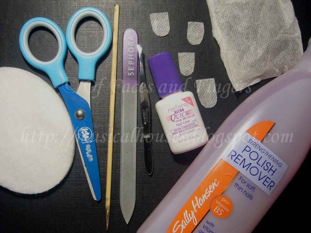
I'd like to point out that it HAS to be nail glue that you're using, as I had a question from a reader asking if she could use base coat or nail treatment instead. These weren't made to funtion as adhesives, so if you use them, the tea bag wrap won't stick to your nail. Any kind of nail glue will do, as long as it's a nail adhesive. I used the Nailene Ultra Quick Brush On Nail Glue, which dries fast, and also dries clear, which is useful if you don't want to sit around waiting for the nail glue to dry.

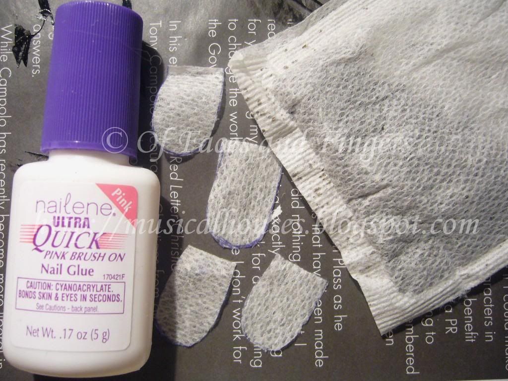
I also used a tea bag. Yup, your normal average tea bag. Cut it out to the size and shape of your nail. I just used a pen and a scissors for that. The cutouts here shown are the actual shape of my nail, but before you apply them you might want to make them a bit smaller than your actual nail size, so that you don't accidentally glue down the wrap onto the skin around your nail (which was what I did).


Step 1:
First, swipe your entire nail plate with acetone or nail polish remover. This helps get rid of the oils on your nails and helps the wrap adhere to your nail more securely.

Step 2:
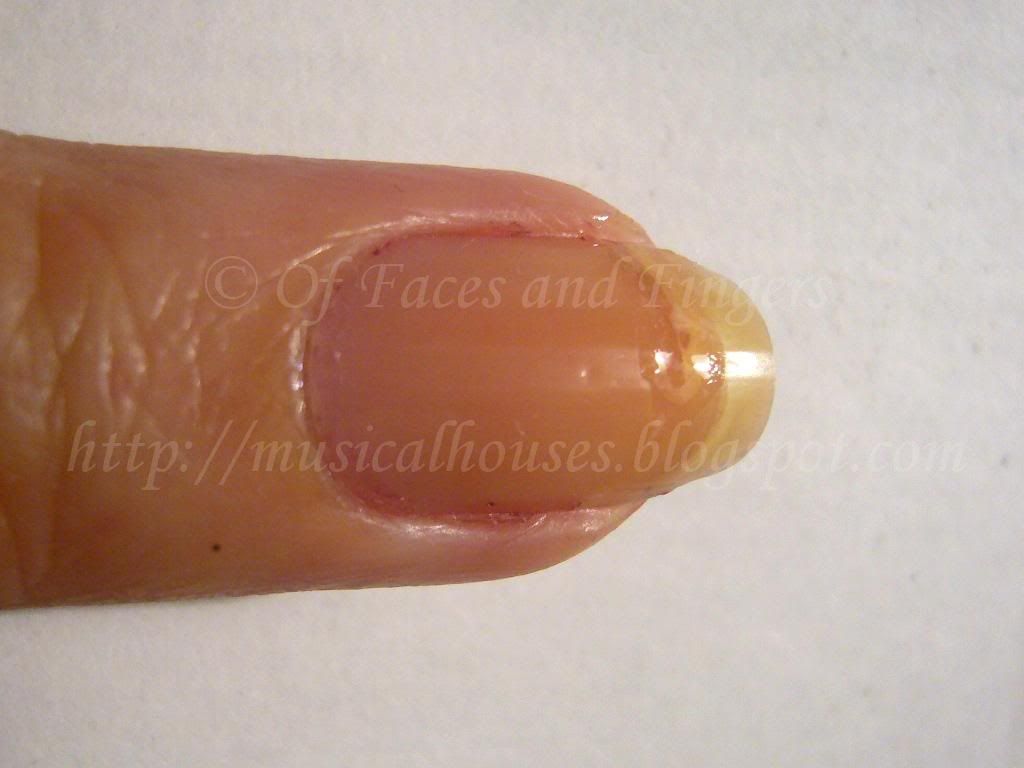
Seal the tear with a bit of nail glue. You don't have to do this if the tear is small, but for a huge tear where the torn bit doesn't stay in place and might move around, it's a good idea. I think I put a bit too much here. You only really need a little bit to seal the tear. Too much and it will cause a bulge on your nail, which will make it harder to apply the wrap on top. You want to keep the surface flat so the wrap goes on more easily:


I don't have pictures for the next couple of steps, because you have to work quickly, so there wasn't time to stop and take photos.

Step 3:
Apply nail glue over the entire nail. Leave a little gap at the sides and at the base of the nail, near the skin and cuticles and the sides and bottom of the nail. This is important because you don't want to glue your cuticles or skin to your nail wrap!

Step 4:
Then, working quickly, use a pair of tweezers and place the nail-shaped tea bag cutout over your nail. Use tweezers, and not your fingers, or you will glue your fingers to your nail. And that's painful. (Um, not like I would know....*looks away and whistles*)

Step 5:
After the wrap is on the nail, use an orange stick to press down and hold the wrap in place while the glue dries. Remember, use an orange stick and not your fingers, or you'll get your fingers glued to your nail. This step will take a few minutes or longer, depending on how fast your nail glue dries. The important thing in this step is to make sure that there are NO air bubbles under your wrap, between the tea bag material and your nail. If there are any air bubbles, moisture could collect in them, and lead to bacterial growth, on the nail. So if you do see air bubbles, it's better to redo your wrap at this point. Better safe than sorry!

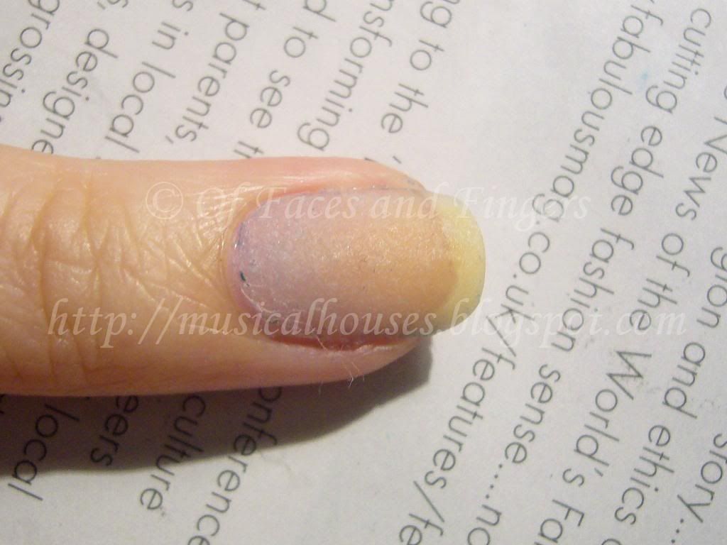
This is what my nail looks like at this point:


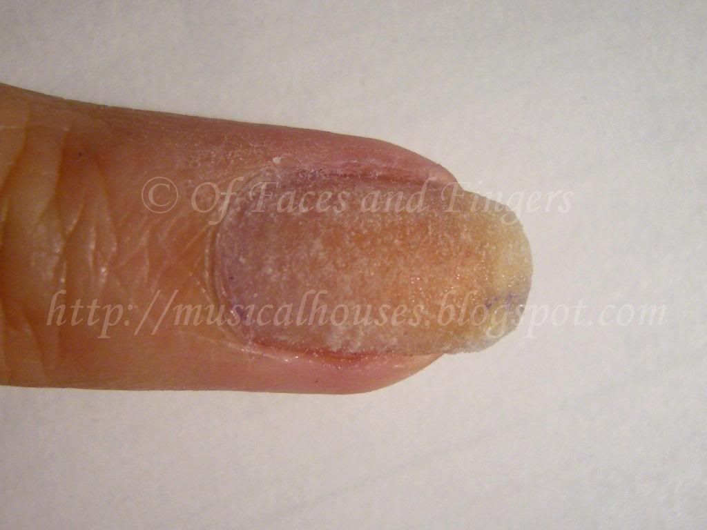
As you can see, I am a DIY nail wrap noob, and I glued my cuticles and skin to my nail wrap, because I accidently put too much nail glue and cut the size of the nail wrap a little too big. I ended up using a bit of nail polish remover to un-stick my skin.

Step 6:
Next, put another layer of nail glue on top, and let it dry. The nail glue will saturate the wrap and make it turn clear (or at least, clear-ish). This way, the wrap will be secure, and it won't look as obvious.

Step 7:
You're all done. All that's left is to lightly file or buff down the surface of your wrap to smoothen it out. Don't overdo it, or you'll end up buffing through the wrap. Once you're done filing or buffing, and you can proceed to paint your nails with whatever colour you want.

Here's a photo of the finished wrap (pardon the lint and the remnants of previous polish, this was a photo of the wrap taken later in between manicure changes):


This wrap, noob-ish as it was, lasted me for around 2 weeks. Eventually I redid it because my nails were growing out, and for some strange reason a corner of the wrap chipped off. (Seriously, how does that happen?!)

Here's my fixed-up and pretty-fied nail. You can tell its the middle finger that broke, because the too-big wrap is sticking out from the sides of my nail. Oops.


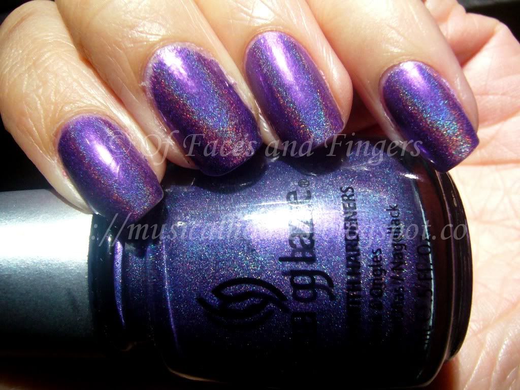
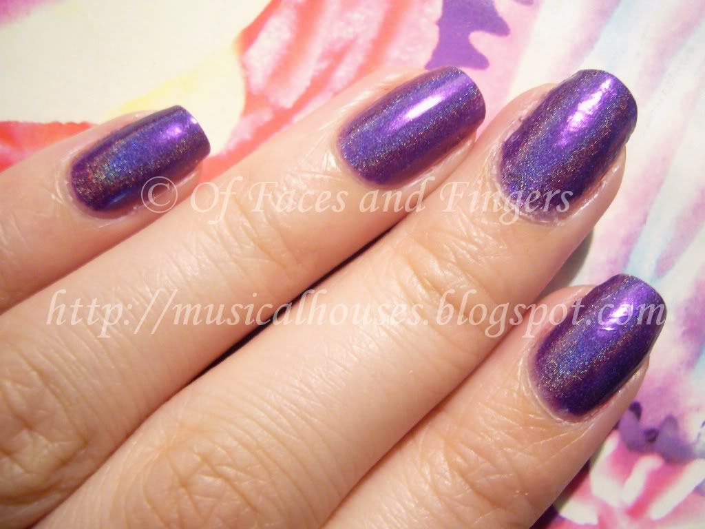
I love China Glaze LOL, it's an awesome royal purple holo. The only thing is that I feel sad about is that the holo effect was a little bumpy and rough on my broken nail, because the surface of the wrap isn't totally smooth, even after filing. And here's a slightly more flattering photo of my nails:


I guess this means I'm not going to be able to wear holos for the next couple of months until my tear grows out and I don't need the wrap :( And yes, this does mean that you'll see my nail wrap sticking out of all the next few NOTDs, unfortunately. They get less obvious as the wrap grows out, but I hope you guys can pretend it's not there! :X

FOTD: Illamasqua Beg and YSL Gloss Pur Pure Fuschia

Wednesday, July 28, 2010

6 comments
I realized that I don't have any posts on Illamasqua, despite owning a few of their products. Given that the amnesty is almost over, I figure I'd better squeeze in a couple of Illamasqua posts while I can! So today's Illamasqua post is a Face of the Day (FOTD) with my favourite blush of the moment, Beg.

Illamasqua Beg Blush

It looks quite warm in the pan, but it really isn't that bad once on. It's a warm dusty rose, but not so warm that it's unwearable for me. To me, this is on the warm side of neutral. Texture of the blush is good, as is pigmentation - with this one, you really want to use a light hand, especially if you're fair!

While I know that Illamasqua probably didn't create Beg with the fairer ladies in mind, I really like how it looks on, and when properly applied, it looks very pretty and natural. It just goes to show that any bright blush is wearable by even the palest of girls. The key is to apply just a little bit, and blend, blend, blend!

Here's the FOTD. See, it doesn't look so scary on, does it?


And here's what I used:

Eyes:
Stila eyeshadow trio Shimmer Shadows Cool (I don't even know the name of this one, it's really pretty and it's really old. I think it was from 1995! I absolutely LOVE the older Stila eyeshadows.)
Covergirl Lashblast mascara
Urban Decay 24/7 Eyeliner in Rockstar (outer lower lashline)

Face:
MAC Studio Finish Concealer NC20 (undereye area only)
MAC Select Cover Up Concealer NC20 (spot application on face)
Agnes B Radiant Loose Face Powder Lumiere D'aurore mixed with some CS Silica Powder
Illamasqua Beg

Lips:
YSL Gloss Pur in Pure Fuschia

I absolutely LOVE Beg on me. It doesn't look like it would work in the pan, but I love how it gives that very pretty slight flush on my skin. I also really love my YSL Gloss Pur - it looks bright and hot pink in the tube, but when applied it sheers out and becomes a pink lip that's not too bright. I think these are wearable brights - they're bright and add a pop of colour, but they aren't overpowering.

KOTD: Orly Foil Luxe and Wet n Wild Black

Monday, July 26, 2010

16 comments
A few weeks back, my programme had a boat party for the postgraduates, and of course I had to go - it was free for students, and they provided dinner, and you know I'm all up for a free meal :P The dress code was formal, but in rebellion of the utter impracticality of wearing tuxedos and gowns in summer, our class chose to go informal anyway.

Anyway, the whole point of me telling you this is because it actually has something to do with today's NOTD. I started building my outfit around my nails, as I am increasingly wont to do lately, and I decided that I wanted to wear blingy gold nails with some konad. (Note to everyone: only weirdos like me start thinking about their nails before thinking about their clothes.)

Naturally, I picked out Orly Luxe, from the Foil FX Collection, and I stamped it over with Wet n Wild Black. I used Konad plate M81 for the design. And tada:

Orly Luxe Wet n Wild Black Konad

This is two coats of Orly Luxe, under natural light, konaded over with Wet n Wild Black, which is a really opaque black creme. I just LOVE Orly Luxe. It's probably the best gold foil ever, and definitely the standout of the entire Orly Foil FX Collection. I mean, good gold foils are hard to come by, and this one is smooth, easy to apply, and opaque in one coat (ooh, gold foil konad coming up!). And not to mention I love the colour - it's a shade of gold that isn't too brassy or too warm, and would be perfect on almost anybody.

After I had done my nails, I realized that my nails matched a skirt I had just bought a few days ago (on sale from H&M, yay for 50% off summer sales!). So I ended up wearing the skirt, just because they matched my nails! And yes I know I'm a freak for matching my clothes to my nails, and not the other way around. What can I say - I probably have more nail polishes than I have clothes.

Here's a photo of my nails against the skirt. See, see? They match!

Orly Luxe Foil FX

And of course, since it was a boat party for postgrads, I managed to find something else that matched my nails:

Orly Luxe Wet n Wild Black

That was my friend's bottle, LOL. I don't drink very much, primarily because alcohol is full of empty calories, and I've never thought it was worth putting on weight for, with the possible sole exception of pear cider, LOL. I know, I'm a weirdo, but that's a pretty convincing argument to me, LOL.

Anyway, that was my KOTD, and I promise the next post won't feature any alcohol :P

KOTD: Revlon Plum Attraction and China Glaze 2030

Saturday, July 24, 2010

4 comments
Today's KOTD is a little old, but I thought I'd post it up anyway. I love this combination of purple and gold together - something about it makes the combination seem so regal and royal.

This has a base of Revlon's Plum Attraction, which is a beautiful plummy purple, and China Glaze 2030, which is a fabulous gold chrome that's opaque in one coat, and thus perfect for konading. I also used Konad plate M76 for the design, but I had trouble with it. My konading skills just aren't up to par :X

Anyway, here it is:

Revlon Plum Attraction China Glaze 2030

Plum Attraction was nicely opaque, and a very pretty plum colour with pretty subtle shimmer. China Glaze 2030 is a straight up gold chrome, but what I like about it is that the gold isn't too orange warm-toned even for cool-toned girls. It's really quite neutral for a gold, which is great for anyone looking for a gold but who might find most options too warm for them.

Application on both was good. This is two coats of Plum Attraction, which was opaque and went on smoothly. I think it could even be used for konading over lighter colours, because it's nicely pigmented. I didn't have any issues with wear either, this one lasted well on me.

MAC Rodarte Controversy: How You Can Help the Women of Juarez

Thursday, July 22, 2010

2 comments
I'm not going to expound on my opinions in this post (since my LAST POST was already quite clear on my views). But there's no point raising awareness without follow-up action, so here's what you can do to further help the women of Juarez:

1. Sign a petition: This is one started by Healing Beauty, and I think it's well-reasoned and articulate: LINK.

2. Donate money: Both PinkSith and Pretty in Dayton have compiled a list of charities that are safe to donate to. PinkSith's list is HERE, while Pretty in Dayton's list is HERE. I do think they have the same charities listed down, as they were helping each other with the research.

3. Continue raising awareness about it! You can tweet about the issue with the hashtag #rodartemac, or you can direct anyone who's interested to Tsunimee's compilation of blogposts on the issue. After all, MAC didn't offer an apology and agree to donate money just because they were feeling nice; they did it because the beauty community raised awareness about the issue and they were afraid of alienating customers.

I hope everyone who has been unhappy with the Rodarte collection will do one or more of these. And for everyone else who preferred the "it's just makeup" stance, I hope your indifference to the controversy doesn't stop you from helping out the cause by signing the petition or making a donation - if you're going to buy from the collection anyway, wouldn't it be good to see it go to charity? A good cause is always worth your time and effort, regardless of whether you agree with the opinions of others or not.

Collection 2000 Shimmer and Shade Powder Swatches!

2 comments
Collection 2000 is probably the cheapest brand of makeup you'll probably be able to buy in the UK, and it's akin to Wet n Wild in the US. However unlike Wet n Wild, which has a user base appreciative of its products, Collection 2000 doesn't seem to generate the same amount of interest. My personal hypothesis is that this is due to the fact that it is overshadowed by other UK drugstore brands (ahem, Sleek and Barry M), but also due to the fact that the quality of Collection 2000 items tend to be a little bit spotty. If you remember my previous Collection 2000 swatches, there were some items (the eyeshadow palettes, swatched HERE) that were just OK, and some items (the metallic liners, swatched HERE) that looked more promising, and some items that are just disappointing - today's swatches being a case in point.

Maybe disappointing was a strong word. I guess that in the age of NARS, Cargo, Illamasqua, and other fiendish brands that produce blushes that have wow-pow-wham-bam pigmentation, I've come to expect that my blushes and highlighters should have more pigment rather than less. I'm sure not everyone agrees with me on this though, since blush intensity is really more a matter of preference and the look you're going for than anything else. Which is why though I don't love these, some other people definitely will.

The Collection 2000 Shimmer and Shade Powders are touted as being a highlighter, bronzer, and blush all in one. Each Shimmer and Shade Powder has three colours, which you can blend together or use separately. The packaging is actually quite attractive too - they have these cute little flowers on the surface:


(Picture taken from Collection 2000 website)


Anyway, despite the adorable packaging, the pigmentation on these was pretty sheer, with some colours verging on being chalky. You'll see what I mean with the swatches.

First is Pink Me Up, Shade 1:


The swatch on the extreme right shows all 3 colours blended together, while the first 3 swatches from the left show the individual colours in the palette.

I think this one is alright. It's a bit chalky, and a bit weak in pigmentation, but the pink colour isn't too bad.

Next we have Golden and Gorgeous, Shade 2:


This one is a pretty peachy golden shade, which would work better on warmer-toned girls than cooler-toned ones.

Lastly, we have Just Peachy! which is Shade 3:


I know this is supposed to be peach, but on me it just turned out to be varying shades of off-white. And it was sheer. And chalky. This one probably the least impressive of the lot. It's probably best used as a highlighter for fairer girls since the colour doesn't really show up too well.

The last time I swatched Collection 2000's blushes (HERE) I said that I felt that while the quality of most of their products was not too shabby, the powder products aren't their strength, and I think this agrees with my assessment of today's swatches. They do have some pretty good stuff though - which I'll be swatching soon enough! :)

Tarte Cosmetics Sale on Gilt Today!

Leave a comment
I hate not being in the US anymore because of all these awesome online sales. It just makes me madly jealous. Like today's sale on Tarte Cosmetics on Gilt. It's a members-only sale, so you'll have to sign up HERE if you'd like to check it out but don't have an account yet. The cheekstains are huge, and award-winning, but my personal favourites are their eyeshaows.

(I am not affiliated with, paid or compensated in anyway by any of the companies mentioned. The sign up link provided is my own members sign up link.)

Edward Bess Ultra Luminous Eyeshadow Trio Swatches!

Tuesday, July 20, 2010

3 comments
Edward Bess blew me away with his single eyeshadows, which I wrote about in this post HERE, and his eyeshadow trios are exactly the same as the singles in terms of pigmentation and texture. These are awesomely luxurious. Often, especially for drugstore brands, the singles are often much better than the trios, but this is not the case with these.

There are only two colours for this, one that's composed of browns that would be more suitable warmer skintones, and one that's composed of greys, which would probably look better on cooler skintones. But both sets of shades are quite lovely, and quite neutral.

Here's a picture of them in their packaging:

Edward Bess Ultra Luminous Eyeshadow Trio

I apologize for the blurred swatches, these were taken under low and dim light at the Edward Bess Zuneta launch (which I wrote about HERE), and these were the best photos I could take. I promise all the other swatches are much better than these! I'm just putting them up anyway, because who knows, they might help someone.

Here's 01 Island Escape:


A really pretty trio of neutral browns that go with anything. I like this, it's basic, but it's really well done.

Here's 02 Soft Smoke:

Edward Bess Eyeshadow Trio

Another set of pretty, but basic neutrals. I like this though, I feel it has a bit more interest than Island Escape. The grey in the middle has this tinge of green to it, that I feel is pretty interesting. I'm sure part of it is the crappy lighting, and part of it is just my olive undertones making everything pull green, but I do think there is a hint of green to the colour - just maybe not as much as the photo suggests. I also like that the black in the trio is a soft, smokey black, not a harsh straight-up black.

Just like the single eyeshadows, the meanest thing I can say about Edward Bess' trios is that the colour combinations are kind of boring - who hasn't seen a brown trio, or a trio of greys? But that said, I don't find any other fault with these, the pigmentation and texture are good, and the shadows have a smooth fine shimmer that is not too obvious and totally appropriate for work. If you're looking for good basics, this may be a bit pricey, but it's worth taking a look at.

MAC Rodarte Controversy: How to Give Your Brand a Bad Name Part 2

Sunday, July 18, 2010

40 comments
Edited to add: Want to help the women of Juarez? Check out THIS POST to learn how you can do your bit to help!
Edited to add (again): View MAC's response to the issue HERE.

Stupid companies seem to be in abundance lately. First it was the heavy-handed and overreactive threat by G+L to sue a blogger, and now Rodarte and MAC have decided to join in and create their very own scandal. Will the controversy never cease?

MAC has collaborated with designer brand Rodarte to release an upcoming collection called Rodarte, which they claim is inspired by the etheral beauty of the towns that border USA and Mexico. In particular, they named two of their nail polish colours Juarez (a pale pink) and Factory (a pale green). These two names in particular were at the forefront of much backlash, as people accused MAC of exploiting the controversy and violence there for their own profit. In particular, Juarez and Factory were really offensive to many girls, because Juarez is pretty much a poster child for violence, drug crimes, cross-border trafficking, and border-town factories, and a lot of the violence is female-specific(apparently female homicide is particularly high, as is rape). Also, the police are corrupt (stories abound of people being mugged in Juarez by the police), these crimes have little to no response. If you want to know more about Juarez, here's an 8 mins audio segment on NPR radio called "Juarez: A City on the Edge", a link kindly passed to me by Tsunimee, a Youtuber I follow. If you prefer to read, there's also an NPR article on it, called "Whos Killing the Women of Juarez?"

MAC's response was to quickly issue an apology, and they also said they would donate some of the proceeds to charities in Juarez. Of course, this is where opinion splits, there are people who applaud it, and people who feel that the response is inadequate. Both these posts have valid points.

As for me, I'm somewhere in between. I don't believe MAC when they say they weren't trying to exploit the associations of the border towns in their collection. I mean, this is the age of controversial product names. NARS has Orgasm and Deep Throat, Benefit has Thrrob, and once a makeup artist with his own cosmetics line went on MakeupAlley to ask what we would think of a lip colour called Adulteress (fortunately, it was nixed, as most of the girls had a bad response to it). So I don't believe MAC, of all brands, with their hip-and-edgy image, wasn't trying to join the fray. I'm sure they were aware of the controversy. I mean, look at the promo image:

(Image from The Independent, credited to MAC)


Skinny, emaciated girl looking like she's on the brink of death, check. "Exotic", Mexican-inspired clothes, check. Black rings around the eyes and deathly-pale lips and face, check. I don't know about you, but that sure looks like they're trying to exoticise the image of the impoverished factory girl! And I hadn't noticed it until Styrch pointed it out, but there's a ghost in the photo as well - the outline on the left is the silhouette of a woman, and the way the cloth drapes suggests she's wearing the same clothes as the girl. That just creeps me out - the way the girl looks like she's backed into a corner, combined with the way the ghost seems to be staring at her, just gives me the heebie jeebies (but then again I'm one of those wimps who don't like to watch ghost movies). I don't believe they can put out an image like that and say they didn't mean to stir up any controversy at all. That's a load of bull.

And it gets even worse if you look at the items in the collection. In addition to Juarez and Factory, there's a lipstick called Ghost Town, that's white, and one that's called Sleepless, that's a "light grey taupe", for that chic abused factory worker look. And they're even promoting lip erase, a concealer for the lips that's used to block out your natural lip colour so your lipstick is more true-to-colour on your lips. I know it's a permanent item in their line, but including it in this collection is just bad taste. Yeah, now we can buy Lip Erase to look like a murder victim! And don't forget Bordertown, a mineralized eyeshadow that's black with red, blue and silver veining - so you can get a badly punched up black eye, just like the victims of rape and violent crime! And of course don't forget the pigment named Badlands, or the eyeshadow called Sleepwalker - I guess being raped and abudcted on your way to work in a factory must feel like a dream, huh? Is this what MAC and Rodarte means by the "etheral" inspiration of Mexico? I really don't know how MAC and Rodarte can claim that they weren't aware of the connotations with a straight face. Everything, from the promo pictures to the product names to the colour selection, looks very deliberately done. I know that the whole concept behind the colours and the names is a bit deeper than simply exploiting associations - I know there is this whole sleepwalking, etheral theme behind it as well, but it doesn't negate the bad associations nonetheless, and I think the companies were capitalizing on it. They wanted this. They made it happen. They wanted the buzz. They just didn't want to look bad in the ensuing discussion.

In light of this, I feel that MAC's response - donating some of the proceeds to charities - is horribly inadequate, but it's the best they can do for now. They really should pull the collection altogether, but that may not be possible, given that the Rodarte collection is a collaboration with the Rodarte designer brand, and that Rodarte was really the one who came up with the entire concept. You can read about their "inspiration" here, and they have deconstructed US$4000 designer dresses based on this whole border-town concept. Style.com reports that Rodarte was "interested in the troubled border town of Ciudad Juárez; the hazy, dreamlike quality of the landscape there; and the maquiladora workers going to the factory in the middle of the night." The whole bit about the factory workers inspiring the collection is in there - its not just supposed to be about etheral sleepwalking, they did in fact see those factory workers and think "Hey, it's great to do a collection on them!" And they did have Juarez particularly in mind. I don't know about you, but somehow that just strikes me as being really insensitive.

MAC, doing a collaboration with them, was probably contract-bound to imitate their concept for the makeup line too. So it would be hard for them to get out of it. In this case, I suppose the only other alternative is to donate the proceeds. It's not ideal, but I guess this is life. I personally feel that MAC should have gone one step further and donated ALL the proceeds to the charities, along the line of their Viva Glam lipsticks, instead of a measly unspecified "portion". That way, at least they wouldn't be profiting from any of the controversy they've created.

On a last note, I'm also surprised that while everyone is heaping criticism on MAC, while Rodarte - the collaborator and original designer that originated this whole fiasco - got away with it. The fashion press didn't give them a very hard time about their disgusting collection, and some even called it "beautiful", and as far as I know, Rodarte, unlike MAC, isn't donating any money to the associated charities at all. It just saddens me that Rodarte would stoop so low to get "inspiration" for their clothes, and MAC had to follow suit. I've never heard of or bought anything Rodarte, but now I don't even like or want to buy anything from them, and MAC has been tainted by association for collaborating with them. What are they going to come up with next, a Nazi-inspired collection with a red, white and black eyeshadow trio called Swastika?

Edited to Add: Looks like I'm not the only one feeling outraged. Here's a list of posts, compiled by Tsunimee, that other bloggers have made on the MAC Rodarte collection: LINK.

Edward Bess Ultra Luminous Eyeshadow Swatches!

2 comments
Continuing my Edward Bess swatches (don't you just love my unique ability to squeeze out as many swatch pics as I can from a 2-hour event?) I bring you swatches of another one of the standouts from his line - the Ultra Luminous Eyeshadow singles.

These come in nicely-sized packaging, and the modern black casing looks really luxe too, and they've put in a decent-sized mirror for on-the-go-application. The pigmentation on these shadows is one of the best I've seen. Much better than those pretenders MAC and NARS *waves hand disdainfully*. I'd put it on the level of higher-ups, like Chantecaille and Becca. Yes, that good. This is awesome. It's got Chantecaille's soft texture, without the sheerness, Becca's texture and pigmentation, without the puny product size, and the colour range of Bobbi Brown, without the chalkiness and hit-and-miss level of pigmentation. None of these shades are duds - they are all smooth, finely-milled and well-pigmented.

Edward Bess Ultra Luminous Eyeshadow

The meanest thing I can say about the single eyeshadows is that the colour range, while appealing to my taste for neutrals, isn't very unique. There isn't any shade that stands out and wows me, and I feel like I've seen all the shades before. We've all seen bronzy browns, charcoal greys, and nude beiges. But I guess given that there are only six eyeshadow colours in the line, Edward Bess has done a good job on these. These are all in line with his vision of high quality wearable, universally flattering colours.

Another thing to note about these shadows is that while they are called Ultra Luminous, they aren't actually OTT shimmery or frosty or sheen-y. In fact, these have more of what I call a soft glow - there is some shimmer in all the shades, but not so much that it's distracting - its a very soft, subtle shimmer that makes the colours more dimensional.

Here are swatches of the first three:

Edward Bess Eyeshadow Swatches

Nude is a lovely neutral beige, good for a highlight or a base shade. This is a great staple most of us could use, and would be a total workhorse shade for me.

Mystery is a beautiful grey-brown that leans a little to the cool side. Also a great staple colour. This is one of my favourites.

Escape is a bronze brown that's not too loud, brassy, or orange. This is a very wearable bronzish shade that would look good even on cool-toned girls.

Edward Bess Ultra Luminous Eyeshadow

Dusk is billed as a metal grey, but it actually swatches as a lovely neutral brown on me.

Night is a soft charcoal black. Very good for deepening a crease or outer V shade, without being too overwhelming.

Intimate is a lovely khaki-brown shade. This one is also a very pretty shade, another of my favourites - it's brown, but it's got some olive and green thrown in it, and that makes it a little more special. It kind of reminds me of Stila's Golightly.

You might be able to fault the colour range of the eyeshadows as being a little boring, however you can't fault the quality on these singles. There is definitely a lot of attention to detail paid to the shades to get them just the right neutral undertone, or to put in just the right amount of shimmer. These are great basic staples and work-appropriate shades that would suit just about everyone.

Ginger + Liz Threatens to Sue Blogger: How to Give your Brand a Bad Name

Saturday, July 17, 2010

20 comments
EDITED TO ADD: It has come to my attention that the situation was more complex than I thought it was, as by the time I had read Squarrell's post, she might have edited it slightly, and I've just seen her comments on All Lacquered Up's blog (which, by the way, is quite heavy on promotion for G+L. There is speculation among the nail fanatic community that ALU could have some sort of relationship with G+L for promoting them on her blog, but all that is unverified, since both ALU and G+L have refused to comment on it). While I do agree that this makes the situation different from what I originally thought it was, my main opinion on the entire issue is largely unchanged. I do agree that Sara may have been in the wrong if her comments of rebottling weren't true, and if that is the case, G+L should correct this. However, sending a lawyer's letter right off the bat is a very heavy-handed response given that they are just dealing with one individual, and one that is too harsh, and bound to give the company a bad reputation. Instead, a much better thing to do would have been to get a PR person to send out a more friendly-sounding email clarifying the situation - that would have gotten the same effect, and have avoided the drama. Justified or not, this is still really bad publicity for G+L, which could have been avoided. A lawyer's letter should be the last line of resort, not the first thing you think of, especially when dealing with harmless individuals who are your customers!


Have you ever heard of Ginger + Liz? Well, I haven't either. Did you know they made nail polish? Neither did I. So why am I suddenly blogging about them?

Turns out, my very first introduction to this brand is in THIS POST, where Squarrell, one of the beauty bloggers I follow on Twitter, writes about how she received a Cease and Desist letter from the legal team of Ginger + Liz. They accuse her of defaming their product, and want her to retract her posts, and not engage in further defamation.

Now, of course, being a blogger myself, this piqued my interest. What on earth could she have done to them to deserve this? Did she say their stuff sucked without trying it out? Did she spread lies about them? Well, turns out they were offended at THIS POST, and THIS POST, where she compared some Ginger + Liz nail polish colours (which she bought herself) with some cheaper Diamond Cosmetics colours.

So, this brand I know nothing about is threatening to sue a blogger I know and love for COMPARING COLOURS THAT ARE SIMILAR. They claim that's defamation, and she hasn't said anything bad about them in her posts at all (go back and read it if you haven't)! So now, writing that "this colour is X, this colour is Y, X is 1 coat, Y is 2" is defamation. Great, now I'm going to get sued by all the companies for all the comparison posts I made. Is MAC now going to sue me because I said their Coco pigment was similar to a YDK eyeshadow? Is Bobbi Brown now going to sue me because I said a L'Oreal Hip duo was a better dupe of her product?

Obviously not (or so I hope). The big guns know that that's not defamation - and more importantly, that comparisons are what we do on a daily basis. I compare stuff for you, I tell you what I like better after I've tried it, I show you colours I think might be similar, and hopefully help you save money, or at least make better-informed decisions. It's not defamation, it's all my own opinion, based on my own experience with their product. It's just the nature of blogging - our personal experience with a product is what makes us different from (and in my own opinion, more interesting than) your average beauty magazine loaded with ads, dripping with product placements and filled with slanted editorials. Now I know there are bloggers and blogs which are dripping with ads too, but Squarrell isn't one of them (go take a look at her blog - she doesn't even run GoogleAds). Ginger + Liz obviously has no clue what the nature of blogging is, or for that matter, how to better harness the collective power of the blogosphere to get their brand name out there. Instead they're threatening to sue people for having an opinion. It's like they mixed up their marketing team with their legal team.

Well, obviously Ginger + Liz is going to now make a name for itself, but for all the wrong reasons. I don't think having people associate you with lawsuits is a good thing if you're a nail polish company. They should really hire more PR people and less lawyers (and I hope they don't sue me for saying that). I've never bought anything from them, and now you can bet I never will.

Beauty Blog Link Love

2 comments
Have you tried Ellis Faas yet? Rae's reviewing a few of these super-luxe, super-chic products, starting with Ellis' Milky Lips line!

Armani Blushing Fabric Second Skin Blushers have caught Louise's eye.

No bruises here! Check out Maggie's soft pink & purple face of the day over at The Polka-Dotted Apple.

When do Lego's and cosmetics have something in common? When Jouer comes to town, that's when. Watch Jeweled Thumb act 5 and play with a recent haul!


Butter LONDON has some fabulous new nail shades for Autumn 2010 - come check them out on Lipglossiping!


Lisamarie from Beauty Crazed gets up close and personal with the Burberry Beauty line!

Hell Candy attends the Edward Bess UK launch and is blown away by the beauty of everything (the make up AND the man!)


Jolie Laide Girl gets silky soft with Kiehls Lightweight Body Lotion.

Sarah from IHeartCosmetics shows you how to get rid of spots,simply and easily.

Dry skinned and on a budget? Eyelining thinks Boots may have a bargain solution!

Looking for a perfect red nail polish for summer? Take a look at Illamasqua's Alarm at Makeup4All.


Lipgloss86 conquers all fears and grabs for the epilator in a bid for fuzz free legs.


The Lip Print discovers the sweetest nail shades for spring and has a chat with Orly's Creative Director about what's hot for nails!

There’s a new mascara in town! Check out Tsahi’s review on Revlon’s new Luscious Grow Mascara.

Madame B Fatale talks about a product that supports a great cause!

***


Be sure to enter Phyrra's Summer Giveaway! Two winners, great prizes, open worldwide!


It's Pink Diva Beauty's birthday and you receive the presents! Have you entered?

Ever wanted to try LA's Prtty Peaushun? Now you can - Beautywoome is giving it away this month!


Reviva Labs wants to protect and prettify you with their Summer Skincare Giveaway on Prime Beauty.

The Pink Sith is celebrating her second Blog Anniversary with a Purple and Silver giveaway!

Edward Bess Compact Rouge for Lips and Cheeks Swatches!

Friday, July 16, 2010

2 comments
In my previous post on the Edward Bess launch at Zuneta (HERE), I mentioned that I would be uploading swatch pictures of the Edward Bess products over the next few days. So as promised, here are swatches of probably my favourite product in his entire line - the Compact Rouge for Lips and Cheeks.

These are lip and cheek creams, along the lines of Becca, Bobbi Brown, and Stila. However, what I really like about these is the texture of the creams. They're not too soft and gooey, like Becca, and not too hard, like Bobbi Brown and Stila. They're firm yet blendable and soft. And they aren't sticky when you apply them, so that's a major plus in my book.

Packaging-wise, these come in sleek-looking black compacts with a mirror inside. They're not as huge as the Bobbi Brown Pot Rouges, but they aren't as tiny as the Becca ones either - I think they're somewhat bigger than the Becca ones if I recall correctly, but I'm not entirely sure.

Here's the product in it's packaging:

Edward Bess Compact Rouge for Lips and Cheeks

L-R: 01 After Sunset, 02 Love Affair, 03 Island Rose

I love these colours, they are so pretty and universal. In particular 01 After Sunset looks like it might be a dupe for Bobbi Browns Blushed Rose Pot Rouge, which was stupidly discontinued by Bobbi a while back. (Don't ask me why - I've no idea, and it was the best selling Pot Rouge colour for years...) So if anyone wants a substitute for Blushed Rose, this is worth a go.

Here are the colours swatched on skin:

Edward Bess Compact Rouge

01 After Sunset is a beautiful neutral pinky-brown. This is one of those colours that looks good on everyone, as long as it shows up on you. Like Bobbi Brown's Blushed Rose, it looks a little blah and brown and flat in the pan, but swatched and blended out, it's a beautiful muted rosy glow. I really love this colour, and I think it's very similar to Blushed Rose, even if it's not a dupe.

02 Love Affair is a light neutral pink. Also another universally flattering colour, this one is perhaps geared to the lighter girls among us.

03 Island Rose is a lovely medium neutral dusty rose. I really love this shade - its another of those universally-flattering colours that would look good on almost everyone. This is probably my favourite of the bunch!

The thing I really like about the colours is that they are all work appropriate - the colours are neutral, go with everything, and don't have any wild shimmer or sparkle. I mean, who doesn't need a pinky brown, a light pink and a rose blush? These are pretty much basic blush colours that every girl should have in her arsenal. If you're interested in these but hesitant about the colour - go ahead and get them, you might be surprised by how good they can look once applied.

Edward Bess Launches at Zuneta: Photos and Reviews!

Thursday, July 15, 2010

2 comments
Edward Bess has just launched exclusively in the UK at Zuneta. I'd never tried Edward Bess before, so I went to check it out with no preconceptions, and after two hours of swatching and digging my fingers into the testers there, I'm glad to say the line is of good quality, and worth every penny. Zuneta has a reputation for carrying quality brands, and Edward Bess is a worthwile addition to the range. Edward Bess himself is HOT, friendly, and very passionate about his work. Pretty much everything I tried, I wanted to buy.

The colour palette of Edward Bess consists of wearable neutrals and classic colours, along the lines of Bobbi Brown and Laura Mercier. So if you're fans of either of these lines, or looking for good quality neutrals, you'll probably love Edward Bess.

Over the next couple of days, I'll be uploading the swatch photos I took from the Edward Bess launch, so stay tuned! It'll take me a couple of days because the dim indoor lighting meant that a lot of my photos turned out too dark and too yellow, so I'll have to colour-edit them for accuracy, and you know I'm kind of nitpicky about colour accuracy in my photos...

To start off, here are pictures of the products I played with. Swatches for these are all forthcoming!

First we have my favourites from the line, the Compact Rouge for Lips and Cheeks. These are awesome. Perfect textures, and perfect colours. Not too soft, like the Becca's Lip and Cheek Cremes, and not too hard, like the Bobbi Brown Pot Rouges (both of which I love, by the way). Wait til you see my swatches for them:

Edward Bess Compact Rouge for Lips and Cheeks

L-R: 01 After Sunset, 02 Love Affair, 03 Island Rose

Here are the Ultra Luminous Eyeshadows, also another of my personal picks. These have excellent texture and pigmentation - they're soft, smooth and silky without being crumbly, and they are beautifully pigmented. They have more colours than these of course, and you'll see all of them in my swatches in the near future:

Edward Bess Ultra Luminous Eyeshadow

L-R: Nude, Mystery, Escape

Mystery is definitely my favourite of the lot. Beautiful neutral purple grey.

In addition to single eyeshadows, they also have eyeshadow trios, the Ultra Luminous Eyeshadow Trio. These come in two colours, and have the same lovely texture and pigmentation as the singles:

Edward Bess Ultra Luminous Eyeshadow Trio

L-R: 01 Island Escape, 02 Soft Smoke

These are the powder blushes, called Blush Imperiale. These are just a tad less smooth than the eyeshadows, but are still of very good quality. The colour selection is also excellent - these are as wearable and as universally flattering as blushes get, without being boring.

Edward Bess Blush Imperiale

L-R: 03 Morrocan Rose, 01 Soft Orchid, 02 Desert Bloom

Lastly, the Ultra Luminous Bronzer. These are also another of my personal favourites, and if I wore bronzer I'd be all over these. They come in huge-sized pans, and have the same soft, silky texture as the eyeshadows.

Edward Bess Ultra Luminous Bronzer

L-R: Daydream, Desert Sun

Other items I played with but didn't swatch were the lipsticks, which I LOVED (they also have this kickass neutral red, the perfect red lipstick!), and the glosses, which were on the sheer side, and had a lovely texture.

If you're curious about any of these, stay tuned, because swatches of all of these are coming up in the next few days.

And to end off, here's a shot of the bloggers and the Edward Bess and Zuneta staff from the launch!

Edward Bess Zuneta Launch

(I was invited to the event. I am not affiliated with or compensated by any of the companies mentioned. This review represents my complete and honest opinion.)

Eyeko Rain Polish and Saucy Polish NOTD, Swatches and Review!

Wednesday, July 14, 2010

8 comments
Eyeko has released two new nail polish colours, Rain Polish for City Nails, and Saucy Polish for Naughty Nails. These are limited edition and come in slim, small bottles, housing 8.5ml of polish. That's a slightly smaller bottle than average, but these bottles still pack a punch in terms of pigment - in fact, both of these can be one coaters if you're careful with how you apply your coats.

Eyeko Rain Saucy Polish

Rain Polish is quite aptly billed as being "for City Nails" (the way Eyeko tells you what effect their polish is supposed to give your nails never fails to make me chuckle, it's so cute!), and indeed it does kind of remind me of cities - particularly the ever-cloudy skies of London. When I first started living in London, I was struck by how it was always overcast, and the sky was never blue (well, it was Fall back then). It was always some weird shade of blue-grey, and it was a couple of months before I saw my first glimpse of blue sky in London.

So what did that all have to do with the polish? Well, Eyeko has done an awesome job of capturing the grey-blue colour of the skies I saw in their polish. This colour is just the colour of those skies, which I think is pretty cool. And it's a beauty, too! It's a cross between a blue and a grey, and I can't decide if it's a blued grey or a greyed blue. It's a muted, dusty colour, one that's really chic and stunning without being loud or neon. Awesome stuff.

Here's a swatch. This is as colour accurate as I could make it - you know how hard it is capturing accurate photos of greys and purples. But I think I pretty much nailed it!

Eyeko Rain Polish

She's a beauty, isn't she? This polish has a slight shimmer in the bottle that doesn't really show up on the nail, it kind of just reveals itself as a reflective sheen instead. This is definitely the next big hit for Eyeko.

And next we have Saucy Polish. Now this is billed as being "for Naughty Nails", but we all know reds are a classic - they just give off that 1940s movie-star vibe. Sexy, classic, and a little retro all at once. I always feel it's a pity that red nail polish, just like red lipstick, seems to have gone the way of the dodo now that girls are so cautious about wearing red.

Eyeko Saucy Polish

This is red. Straight-up neutral red. Fire engine red. Telephone box red. Hollywood movie starlet red. Colour wheel primary red. I love it! I don't normally wear reds, but I'm of the opinion that every girl needs a red lipstick and a red nail polish, and I like this one. It's a middle-of-the-road neutral that leans neither too cool or too warm - this is pretty much as neutral as red gets. And it's not too dusty or muted, but it's not so bright it's neon either. It's just right. I love it. If you're looking for a red nail polish on the cheap, this is probably as good as any other.

Application on both was pretty good. These are a little thicker than I'd like, and are not as thin as say, Zoyas, which may or may not be a good thing, depending on your preferences. These are also awesomely pigmented, which means if you're careful with application, one coat is enough. However, my swatches all show two coats, because I couldn't get the first coat to be even enough due to the slightly thick texture.

Colour-wise, I ABSOLUTELY LOVE Rain Polish. It's always going to have some sentimental value to me, reminding me of the London skies I glimpsed at when I first stepped foot into the city. The only catch is that being blue-based, it's a shade that might potentially be unflattering on girls who are really warm-toned. Still, I think it's a pretty shade worth a shot if you're game for it.

(These products were sent to me for review. I am not in anyway affiliated with or compensated by the company for this review. This review reflects my honest and complete opinion on the products.)

L'Oreal HIP Metallic Duo Electrified 510: Swatches and EOTD

Monday, July 12, 2010

5 comments
A long time ago, in THIS POST, I did a comparison of L'Oreal's HIP Electrified Duo vs Bobbi Brown's Heather Mauve. A reader posted a comment asking me to do swatches of both shades of the duo, because my comparison post focused on only one of the shades in the duo. I agreed, but then life got in the way, and I had no idea where my HIP Duo went to.

A few days ago, I found it, so I decided I'd better make good on my promise - I mean, better late than never, right? Right? *Awkward pause* Umm, well, I'm sorry it took awhile, but I hope this still helps!

Anyway, since I'm not in the US I don't really follow the HIP line (it seems to be a US-only thing, darnit!), so I'm not sure what exactly is the deal with these, but it seems like the Electrified HIP duo was launched awhile back, possibly as a Limited Edition duo, and has recently been re-released in the USA.

The first thing you'll see when you look at the packaging is that it has TAUPE. Beauteous, shimmery, neutral TAUPE:

Loreal HIP Electrified

Now is that gorgeous or what?! But just wait til you see the swatches:

Loreal HIP Electrified

These went on beautifully, especially the taupe. The texture was divine, even after almost a year of ownership by yours truly. The darker purple shade needed a bit more work, but it still had good application. One year on, I'm impressed - the eyeshadow hadn't hardened or developed a crusty layer on top or anything like that. Pigmentation was also stellar, as you can see.

Colour-wise, I really LOVE this colour combination. I think the colours are actually wearable - some of the older HIP duos I remember had the weirdest colour combinations that I would personally never wear. And I love the shades, especially that awesome TAUPE! I've raved about that shade before in THIS POST, but it's so awesome I think I'll just do it again. Mmm. Yes that taupe shade. It's so gorgeous and complex, yet so universally flattering. It has a lovely brown base that shows hints of tan, and silver (due to the frosty metallic finish of this shade), and it has the ability to look slightly different in different lights. In some lights it's more brown, in others it's more silver, and it's the perfect neutral taupe - I think this is probably the most wearable for all skintones that I've seen, and you know I have a lot of taupes :P I love how it's brown base makes it not too cool-toned for warm girls, yet the silvery frost makes it flattering for cooler-toned ladies too. I think it leans slightly to the cool side, and it does have a hint of purple, but not so much that it will look bruise-y on warmer ladies. The purple shade is a cool-leaning deep purple that pairs well with the taupe. It looks like it has bits of shimmer in the pan, but when applied it looks mostly matte. I think the matte-ness of the shade is a good complement to the frostiness of the taupe shade, and awesome for contouring with.

So I decided to take out this baby once more and put it to good use. Here's an EOTD I did with it:

Loreal Electrified Hip

For this EOTD, I used L'Oreal HIP Electrified for the lid colour (shimmery taupe), and the contour colour (deep purple), and Lorac Persuasion (shimmery neutral beige) as a base. Then I applied Urban Decay 24/7 Pencil Eyeliner in Rockstar (dark purple) 2/3 of the way on my lower lashline (I do this because I have tiny eyes, and lining them all the way makes them look smaller). Mascara is Covergirl Lashblast. Yes I'm wearing mascara! I just have short, tiny and sparse lashes, so they still look pathetic anyway :(

Here's a shot of the EOTD, eyes closed this time:

Loreal Hip Electrified

Lasting power of the shadows was good. They lasted the entire day without any primer. But then again, I don't really have a problem with shadows creasing or fading, so I generally never use primer. Still, the fact that they lasted one entire sweaty summer's day says something!

I'm so glad this duo is being re-released. When it was first released a year ago, I remember there was so much hype about it, and people were raving about it, but after awhile the hype died down, and people forgot how awesome it was. I'm glad I rediscovered this little beauty! If you still have yours, you should definitely take it out and give it a whirl, and if you don't, get it already!

Rock and Republic Sale on Hautelook Tomorrow!

Sunday, July 11, 2010

Leave a comment
Nothing makes me more miserable than a sale on Rock and Republic makeup when I'm broke. Thanks, Hautelook, I'm going to be sulking the whole of tomorrow. However, don't let my misery stop you from checking out the sale - the blushes and eyeshadows have been getting rave reviews since the line came out, so click HERE to check it out, while I live vicariously through your purchases and try not to feel jealous.

I am not affiliated with, or compensated in anyway by any of the companies mentioned. The sign up link provided is my own members sign up link.

Sleek Makeup iDivine Circus Palette Swatches!

Saturday, July 10, 2010

7 comments
Sleek has released yet another limited edition eyeshadow palette to their i-Divine collection, making that another palette to drool for if you're one of those girls who love Sleek palettes. Their eyeshadow palettes are one of the most popular and noteworthy things from the line, and are definitely worth taking a look at, if you see any in colours you might like.

The latest palette is full of brights, and aptly called Circus. Now I don't know about you, but just seeing that name and all the bright colours makes me want to sing, "All eyes on me in the center of the ring just like a circus!" Although I seroiusly doubt I could pull any of the Britney Spears moves.

Anyway, the packaging for this one, in keeping with the circus brights theme, is a rather eye-catching shade of red. And the shades? Bright and eye-catching.

Take a look for yourself:

Sleek Circus Palette

The shades on the top row consist of a bright matte tomato red, a lilac purple with a blue flash, a matte bright pink that was a little on the sheer side, a sheer matte white, a matte bright canary yellow, and a shimmery magenta purple.

The shades on the bottom row are a matte jet black, a matte perwinkle purple, a shimmery yellowish lime green, a matte bright sky blue, a shimmery blue that's a cross between cobalt and navy, and a matte bright orange.

While not all of these colours are shades I'd personally wear, I love the fact that for the most part these are bright and pigmented. Most of the colours aren't all-out neon, but they're bright enough to be noticed. In particular I really love the lilac purple on the top row - the blue flash makes it so pretty, and the periwinkle purple on the second row adds a pop of colour, but is still pretty and feminine.

However, there were a couple of duds in this palette. For one a couple of the shades were a bit sheer, like the white and the bright pink in the top row. You can see from the photo that they don't show up in the swatch pictures as well as the other colours. Also, as is usual with the Sleek iDivine palettes, the texture of the mattes and shimmer shades are different, with the mattes being a bit harder and more chalky, and the shimmery shades being softer, sometimes perhaps too soft. I've heard from a couple of people that the shimmery shades can be a little crumbly sometimes. But for the most part, the quality and feel of the shadows in this palette is just like their other palettes.

Between this palette, and the Acid palette (the other Sleek palette of bright shades, swatched HERE), I prefer this one. For some reason the colours strike me as being more interesting, complex, and more well thought-out. You can tell they've thought about which shades a user might pair together, and how they can co-ordinate the shades while still covering most colour bases. As a result, this palette seems a bit more wearable than the Acid palette, even though both of them consist mainly of bright shades.

I imagine that for someone who loves brights, and wears them often, this palette would probably get lots of use. Alternatively, for someone who doesn't wear brights often, but would like to have all their bright shades in one palette for the occasional use, I also imagine this might come in handy. If you've tried previous Sleek palettes and have liked them, this won't disappoint you if you want some bright shades.

OOTD: Looking Glam on the Cheap (£36 to be Exact)

Friday, July 9, 2010

11 comments
EDITED TO ADD: Thanks Yi Mei for all the awesome outfit advice! (She's the one who helped me to coordinate my outfit, YAY!)

I don't usually like doing OOTDs (Outfit Of The Day), because I have a pretty much non-existent fashion sense. I mean, I'm still at the top-and-a-jeans stage, so obviously I haven't quite graduated from college casual. But over the weekend, I was invited to my friend's postgrad graduation, and the dress code was formal. I don't know about you, but when my own university had our graduation boat party for us postgraduates, we went as casual as possible, despite the formal dress code listing (some of my friends showed up in jeans, woohoo!). So I hoped that for my friend's event, I could just make do with whatever I had, since I'm kind of on a student's budget now (aka not too far from being flat out broke).

Turns out I had no such luck. Thanks to the awesome stalking power of facebook, I was able to look at photos of people at graduation dinners from previous years and other programmes. Holy moley, some of them were wearing floor-length gowns!

And thus began my (first-ever) unwilling shopping trip. I found out just a few days before the event, so trust me when I say it was all one mad scramble - and on a shoestring budget too! I trawled through the sales racks of high street stores, looking for a knee-length gown-like thing that would carry me through the evening (I didn't want a floor-length gown, as they would probably have been more expensive, and I just KNEW I'd trip up in them). And then I had to shop for accessories. And shoes. It was a stressful couple of days. I think it was the first time I've ever been stressed out by shopping!

So how did I do? Here's what I managed to cobble together, for all of £36:


Such beautiful, lush greenery in the background. Why doesn't MY university have such opulent gardens, darnit! :P

And here's a closer shot of my outfit with my friend:


Obviously it's not the most put-together ensemble you could choose, but I think for only £36, I did a pretty good job, if I do say so myself! The dress was from Mango, and it was 50% off (woohoo!) and it was £25 (it could have been £24.99 or some weird number like that, but my brain remembers it as £25). The clutch was from Claire's, and it was 75% off (double woohoo!) and it was £4. And the necklace was also from Claire's, and unfortunately I paid full price for this (blah), but it was still decent at £7. So that made up £36 altogether!

Okay, I kind of cheated. The £36 didn't include any shoes, because I used the ones I currently had. Ideally I would have liked open-toed strappy heels, or something not close-toed, but there wasn't anything I liked that had a low enough heel (I'm a klutz!) and that was cheap enough, LOL. So I made do. The shoes themselves were the Dexter Auburn Patent Pump from Payless, which I bought a summer ago because it was all the rage among the fashion bloggers then. That, and the fact that they had a buy-1-get-the-2nd-pair-for-50%-off discount when I was in the store. LOL. But a quick google shows that they're still sold online.

Here's a screenshot of the shoes from the Payless website, HERE:


Anyway, here's a shot of my awesome cheap £7 necklace on:


This one is a bit more blingly than I usually wear, but I thought it was perfect since my entire outfit was all black, and I needed something to dress it up. So I thought a some nice bling was perfect. The necklace itself actually consists of four strands, with something different on every strand.

Here's a closer shot of the necklace detailing. It's a bit messy, but I guess with an all-black ensemble it worked:


And here's a photo of the £4 clutch. As you can see it's really cheap, and it kinda looks a little cheap, but I figured from far, and in photos, no one would be able to tell the difference :P


Anyway, that's my Glam-on-a-Budget (and when I say budget, boy, I mean it!) OOTD. I hope you guys have liked it. It's a little different from what I normally do, for sure, but I hope it wasn't too bad! We'll go back to makeup and nail polish in the next post, I promise!

And The Winner Is...

Thursday, July 8, 2010

2 comments
Thanks everyone for taking part in my SkinCareRX giveaway! We have a winner!


Random.Org has spoken, our winner is Anya! Congrats to Anya, and thanks everyone else for taking part!

This giveaway was sponsored by SkinCareRX. I am not affiliated with the company. I do not receive any compensation for hosting this giveaway.

Sleek True Colour Lipstick Swatches Part 2!

Wednesday, July 7, 2010

2 comments
If you think that drugstore lipsticks all have boring colour palettes that feature the same old baby pink over and over again, you need to check out Sleek's offering of lipstick colours. I really appreciate the fact that they strive to bring a greater array of colour options for all of us, especially my darker-skinned beauties. In Part 1 we looked at the first half of their colours, today we're finishing up the batch of swatches.

Without further ado, here are the swatches:

Sleek Lipstick Swatches

L-R: Cocoa 831, Majestic 836, Earth 829, Amethyst 825, Rose Petal 840

Cocoa 831 is a neutral brown. This is what I'm talking about when I said Sleek brings more colour options to the table. I can't imagine Revlon or L'Oreal making a colour like this, LOL!

Majestic is a deep purple. Sleek probably didn't make this with the fairer ladies in mind, but I kinda think this one would be pretty cool even on fairer ladies, if applied sheerly.

Earth 829 is another brown - that's three browns out of 10 colours that Sleek has. Pretty cool, huh? The browns aren't all the same though - Earth has a bit more pink is and is a bit lighter than Cocoa, while Blaze (swatched in the previous post), is a cooler-toned brown than either Cocoa or Earth, and has a hint of grey thrown in. Blaze is also darker than Earth, and slightly darker than Cocoa too.

Ameythst 825 is one of those colours I also think would be super cool on. Pinky-purple (with an emphasis on the purple here) with a blue flash. Cool.

Rose Petal is a warm medium rose with gold shimmer. This is probably the most conventional colour of the lot, and a very lovely colour too.

As I've said before, the finish on these is smooth and quite creamy, and pigmentation is pretty good - as you can see none of these are annoyingly sheer, and all can be layered to opacity, or sheered out for a more subtle look.

Linkwithin

Related Posts Plugin for WordPress, Blogger...