


Singapore Blog Awards Best Beauty Blog Finalist
2015
Vote Here
Mally Beauty on Gilt Now!
For my US ladies, Mally Beauty is currently on Gilt! It isn't too bad, they've got mostly sets of various items, ranging from $17 to $60. As usual, you need a membership to check it out, so go on HERE and take a look!

Sleek Ink Pot Swatches, and a Dupe for Bobbi Brown Violet Gel Liner!
Sleek Ink Pots are their gel eyeliners, in a small pot form, not unlike the packaging of Bobbi Brown Gel Eyeliners, or the MAC Fluidlines. The big differences is that these are packaged in a plastic pot, and are a lot cheaper. The range of colours is small, since they only have 5 colours, but nevertheless, there are some beauties in the bunch.
The first thing I noticed about these was that they always seem to be sold out at my nearest Superdrug. Sometimes entire racks of colours are empty. I've no idea why though. They do seem pretty popular. With the exception of one or two bright colours, the colour range is also incredibly subtle, making them perfect colours for work.
Here are swatches, as always:

L - R: Bobbi Brown Indigo Gel Eyeliner, Sleek Ink Pot in Denim 495, Sleek Ink Pot in Espresso 496, Sleek Ink Pot in Purple Rain 497, Sleek Ink Pot in Zest 501, Sleek Ink Pot in Dominatrix 498, Bobbi Brown Violet Gel Eyeliner
Denim 495 is a beautiful cobalt blue. At first I thought this might be close to Bobbi Brown Indigo Gel Eyeliner, so I swatched my pot of Indigo next to the Sleek colour, but no dice. I like Denim, though, it's a very beautiful glowy blue that's not too bright, and not too muted.
Espresso 496 is your basic matte dark brown. This one is a cool-toned brown, so no orange here. It's also so dark it's almost black, but when swatched next to Dominatrix 498, you can tell they're not close. This one might be good for girls who want an alternative to black eyeliner.
Purple Rain 497 is one of those colours that make people drool over Sleek. You know me, you know I love purples (for nail polish, eyeliners, eyeshadows and accessories), and you know Sleek's Purple Rain is just going to be up my alley! But seriously. This colour is gorgeous. It's a lovely jewel-toned violet that is still subtle enough for the office. I love it! It's glowy, and beautiful, and the colour is just to die for.
Zest 501 is a bright happy matte primary yellow. For some reason the texture of the tester in this one wasn't as good as the others. I'm not sure if it's just been abused more by people sampling it, or if it's the actual formulation of the eyeliner.
Dominatrix 498 is your basic matte black. Nothing much to be said - it's a flat out black.
And if you didn't already notice, I swatched Bobbi Brown's Violet Gel Eyeliner next to the Sleek Ink Pot Swatches because I thought they looked really similar - and lo and behold! We have a dupe! Well not a 100% dupe, but this is as close as dupes ever get! They're almost identical! When I swatched the Sleek Ink Pots, I was all over Purple Rain, and no wonder - I already have something like it! They're both jewel-toned purply violets with a certain muted-ness that makes them work-appropriate, and they both have that lovely glowy shimmer I love so much. In fact, I do think the Sleek is slightly more glowy than the Bobbi Brown, but I'm splitting hairs here - honestly if you wore Sleek Purple Rain on one eye and Bobbi Brown Violet on the other, I don't think I'd see a difference.
Now I'm sure you're wondering how these compare quality-wise to the Bobbi Brown Gel Eyeliners. Well first of all, let me state that Bobbi Brown Gel Eyeliners are my ABSOLUTE favourite, and it's hard to top that. So when I did my comparison swatches, I left them on my hand for awhile (so yes I was in fact going about my business in central London with eyeliner swatches on my hand - the things I do in the name of beauty! The great thing about London is that there are so many weird people I hardly stand out :P ). And after that, when I got home, I attempted to test the staying power of the eyeliners by smudging them around with my fingers, and then by washing them off with water. When it comes to smudging, the Bobbi Brown obviously won out, but I have to give kudos to Sleek for trying. Both Indigo and Violet barely smudged, while the Sleek Ink Pots smudged somewhat. Not a lot, but definitely more than Bobbi Brown. Given how cheap these are, and given that Sleek is a drugstore line, I'm actually really impressed. And then I subjected the entire batch of swatches to running tap water, with a bit of rubbing. Oops. The Sleek colours washed off almost entirely, while the Bobbi Browns stayed on for much longer. So while I'm really impressed with how the Sleek Ink Pots seem to be pretty smudge-resistant, I don't think they're actually waterproof, so if you're planning on going swimming with these on....please don't. But if you're not entering the water, I think these are actually pretty good for day-to-day usage, since they hold up well to smudging.
Another comparison I want to make between the Bobbi Brown Gel Liners and the Sleek Ink Pots is the level of pigmentation and texture. As you might expect, the Bobbi Brown Gel Eyeliners were a lot more pigmented than the Sleek Ink Pots. I only needed 1-2 swipes for the Violet Gel Eyeliner swatch, and 1 swipe for the Indigo swatch, but each of the Ink Pot swatches took about 3 swipes or so. Some Ink Pots are more pigmented than others though. I found Zest, the bright yellow, to have the least pigmentation, while other colours were generally decently good. Also, the texture of the Bobbi Brown Gel Eyeliners is much better than that of the Sleek Ink Pots. In general they were much smoother and softer, although I might add that since I was using testers for the Sleek Ink Pot swatches, they could have just dried up due to being tested multiple times a day. So I'm not really in a position to comment on that.
I pretty much like these Ink Pots, given the price. They're decently pigmented, are pretty smudge-resistant (on my hand at least), and value-for-money. And if I ever run out of my Bobbi Brown Violet Gel Eyeliner and happen to be on a budget, I'd give Sleek Purple Rain a shot!
I have a Facebook Account!
Monday, March 29, 2010
So I'm technologically challenged. But I've finally set up a facebook account! =Wipes sweat off brow= So if you'd like to be my friend on facebook, and have me friend you back, go to http://www.facebook.com/musicalhouses and feel free to add me! :)
Essie Aruba Blue NOTD
Sunday, March 28, 2010
An unfortunate accident has befallen my fingernails, so while I grow out the damage, I probably won't be taking NOTD pictures for a little while. Fortunately, I do have a backlog of NOTDs. Not a lot, and they're not very good, because they're from the days before I learnt about shaping my nails and cuticle cream, but they'll be sufficient to tide us over til my broken fingernails grow out again.
Anyway, today's featured NOTD is Essie Aruba Blue. Ahh, how I love this one. I know it's nowhere near summer yet - not here at least - but this is the perfect encapsulation of summer in a nail polish. It's a perfect blue, and I don't even normally wear blues! It recalls beaches, pools, and tans (not that I'm a fan of tanning, fake or real, due to the skin damage it causes). Just wearing Aruba Blue kind of makes me feel like the weather is warmer already!

The thing I really like Aruba Blue is that it's a good cross between a darker navy blue, and a brighter jewelled blue. I think it's a happy medium. And of course, how can you not love that glowy, reflective shimmer?
Application on this one was also good - it was pigmented and covered in one coat, although I did two out of habit. Wear time was also good, about 3-4 days before chipping. I usually don't like Essies because they're synonymous with boring pinks, sheers, and blahs, but when Essie decides to get a bit more creative, she does produce some really nice stuff. Come on Essie, we know you have it in you to give us something more than yet another ripoff of Ballet Slippers and all its sisters, brothers, cousins, half-cousins, and uninvited uncles, aunts, and in-laws. Will you now expand the family of Aruba Blue, please?
GOSH Velvet Touch Eyeliner Swatches!
Friday, March 26, 2010
Today, I bring you GOSH Velvet Touch pencil eyeliner swatches! These babies are totally awesome. They're my second favourite brand for pencil eyeliners, and that's saying a lot because those of you who know me will know that nothing, and absolutely NOTHING, can top my love for Urban Decay's 24/7 pencil liners, so to be second is a big wow.
These are of really good quality. They glide on just as smoothly as the Urban Decay 24/7s, and they are just as creamy. They also last for almost as long, and are a lot cheaper too. And they have an awesome range of colours too - the swatches below aren't everything, but they're what my Superdrug had testers for, so there are actually other colours out there that I didn't swatch. I really highly recommend these with all my heart, I do love them so.
Some of the liners had numbers with the names, and some didn't, so that explains the inconsistent labelling. Don't ask me why though - they were all Velvet Touch Eyeliners (i.e. the eyeliners that were in non-twist pencil form with the cap). I'm pretty sure they're all from the same range, but if I got anything wrong, let me know!
And, here we go! Swatches:

L - R: 010 Copper Girl, 008 Silver Screen, Purple Stain, Green Grass, Golden Moss, Woody Green, Cool Mint, Pretty Petrol, Black Ink, 001 Blue Moon, 002 Girl Power, 004 Green Boost, 005 Golden Cadillac, 003 Green Devil, 006 Bananas, 007 Alligator
Most of the names are pretty self-explanatory, so I guess I'll keep my chatter to a minimum today. Most of the colours have shimmer that gives a certain sheen to them, although a couple are matte, and some have a metallic or duochrome finish. Surprisingly, because of the greyed-out nature of most of the blues and greens, especially the darker ones, they're actually more wearable than they look at first glance.
010 Copper Girl is a bronzey brown that's on the warm side - I could see this veering pretty orange if you're really cool-toned.
008 Silver Screen is a pure platinum silver. Very pretty. As you can see this one has a nice metallic finish that really makes it stand out as compared to just pure grey. I like this one.
Purple Stain is really cool. I think it might have had a slight blue/purple duochrome that the swatch didn't fully capture, and is a very pretty violet-purple that leans blue.
Green Grass is is a mid-tone green that is neither too yellow nor blue (as opposed to the yellow-green 003 Green Devil, or the blue-green 007 Alligator), and it's a pretty basic green.
Golden Moss is one of my favourites, as it's a very pretty olive green, and it reminds me of Urban Decay's Stash 24/7 liner. You know I love a good olive green eyeliner, so I'm all over this one.
Woody Green is a very pretty greyed teal. I don't know why they called it Woody Green, seeing how it has so much blue in it. Nevertheless, this is really pretty, and one of my favourites. It's a dark bejewelled teal that is pretty, and lends a pop of colour, but the way the colour is greyed keeps it muted and wearable.
Cool Mint is one of those colours I'd ooh and aah over, but would never dare to wear (I know, I'm a wimp). It's positively glowing in this swatch, and has a slightly frosty metallic finish. So pretty.
Pretty Petrol is a it's a bright but wearable colbalt-bordering-on-navy blue. I like how it's a cross between colbalt and navy - it's wearable, but still pops for a bit of colour.
Black Ink is a flat out matte black, so that's one to look at for those who are looking for a good basic black eyeliner, or who want a cheaper version of Urban Decay's 24/7 liner in Zero.
001 Blue Moon is a blue with shimmer. Your basic mid-toned shimmery blue.
002 Girl Power is an orange shimmer. I wouldn't wear such a colour, but hey, how often do you see orange eyeliners around?
004 Green Boost is a pastel pale jade or mint green - sort of like Chanel Jade (and all its imitators) but in eyeliner form, instead of nail polish form. If anyone liked the whole mint green or jade green nail polish trend and wants to try it in eyeliner form, this is it. It's also got a frost finish to it.
005 Golden Cadillac is a sunny bright yellow. It's a good primary yellow - the kind you see in colour charts.
003 Green Devil is a yellow-green, and it reminds me of grass more than Green Grass. But it's a great green for very warm-toned girls who find most green eyeliners tend to pull blue on them.
006 Bananas is another one I like. It's a shimmery vanilla yellow that does remind me of the inside of bananas. For girls who like to rim their waterline with light colours, or use a light-coloured eyeliner in the inner corners of their eyes, this is a good one.
007 Alligator is a pretty slightly greyed blue-green that reminds me of emeralds. I like the jewel tone of the colour.
Stila Sale on Hautelook!
Wednesday, March 24, 2010
For all my US ladies, Stila is on sale on Hautelook now! As usual, the sale is open to members only, so please go HERE to get an invite! Picks of the day are the Precious Pearl palette ($24 now) and the 24Kt lip glaze set. Check it out!
I am not affiliated with, paid or compensated in anyway by any of the companies mentioned to release this information, nor do I receive any freebies from either company to post about it here. I release it because I think it might be useful to my readers. The sign up link provided is my own members sign up link that is available to all members upon signup, and does not award me any benefit outside of their usual membership programme.
Cellnique Skin Action Sebum Gel Review: Get A Free Sample!
Those of you who know me will know that for most of my later teenage life I've been struggling with acne. Even as an adult (albeit a relatively young one), I've never been the girl with smooth, problem-free, oh-I-didn't-airbrush-this-photo-I-just-look-like-that skin. In part this is due to various external factors (yeah, yeah, blame everything else but me for my own crappy skin) - the weather I grew up with (you try having nice korean-actress clog-free skin in a place where you sweat even in your sleep!), the fact that I fly long distances pretty often (and that my skin has trouble adjusting to new climates), and the fact that as a grad student attempting to have good grades, a social life, and a regularly updated blog, sometimes I skimp on proper nutrition and sleep, which of course can wreck havoc on my skin. Right now, I'm dealing with clogged pores, blackheads, and some stray pimples here and there. So if a product promises to clear my skin, you bet I'm going to be sooo tempted to try it.
Enter Cellnique Paramedical Skin Action Sebum Gel. Cellnique is a company specializing in skincare, and they produce a whole range of serums, cleansers, toners, and moisturizers for various skin types. The Skin Action Sebum Gel is particularly targeted at problem skin, and it's one of the best sellers from Cellnique. It promises to clear out blackheads and whiteheads, reduce oil secretion, and generally keep congested skin clear. It's billed as a serum, which means it's used after your cleanser and toner, but before your moisturizer, sunscreen, or masque. It seems to get pretty good customer reviews on Cellnique's own site for the product, HERE. You can check out the company's main website and see their other skincare products HERE.
Ooh. Another skincare product? For my clog-prone skin? You've got my attention.
The product itself is very nicely and practically packaged. It comes in a white bottle, with a pump dispenser. I personally favour pump dispensers for facial products because I hate sticking my fingers into a tub...I always feel like I'm contaminating the product that way. The pump is easy to use, and allows you to squeeze out as much or as little as you want.
The Skin Action Sebum Gel has a light texture, which I really like. It's a gel, and it has a pretty nice consistency - it's not too thick or too watery, and it applies well. It also has a nice minty smell, and it tingles as it goes on. I personally didn't mind the tingly sensation, but this is a matter of personal preference - I know of friends who like the tingly feel as it convinces them the product is working, while others with hyper-sensitive skin don't like the tingling sensation. This is about the amount I used everyday, on my nose and my chin:

So how did the product itself work? I tried it on two areas of my face that were experiencing clogs and blackheads, and I used it everyday for 2 weeks. Here are the unedited results, in super-close-up photos, and in full macro mode:

Here, I used it in a spot on my face that was particularly clogged (I know the photos look really gross, but this is like 23423532x magnification...don't judge me!) with small bumps, blackheads and a couple of small-ish pimples. It didn't clear out the blackheads, but it helped reduce the swelling of the small bumps and the pimples. As you can see, in the "before" picture there are numerous small tiny bumps all over the area, but they're all gone in the "after" picture.

And in here, I used it on my nose - which mostly suffers from blackheds. I was actually really skeptical that this product could help blackheads, because in my experience, most products don't do anything for my blackheads, which seem to have roots all the way to my bones or something. Pore strips don't do anything, scrubs don't do anything, masks don't do anything, and those random cleansers with this-or-that acid don't do anything either. So when I used this on my nose, I was thinking, "Ah well, I'll just use it for a couple of weeks, and mention that there wasn't a difference for my blackheads, just like any other product", but it did make some difference. It didn't make them all disappear (if it did I would have been REALLY surprised), but it lessened the severity of the blackheads. As you can see, they're smaller, and less deeply embedded.
This was after a 2 week trial. Originally I had wanted to do a one-month trial, but I figured since I was seeing results in 2 weeks, I may as well just do a post. I liked this product, and I think it worked for me. It didn't further irritate my skin, and it helped with my pimples and swelling. And I didn't actually use a lot of product on those areas (remember that pea-sized amount in the photo I showed?), so I'm actually pretty impressed.
If you liked what you just read and want to give the Skin Action Sebum Gel a try, Cellnique has offered the first 50 readers of this review a 3ml sample of their product! Just email your full name and shipping address to fbfreesample@cellnique.com with the subject musicalhouses.blogspot.com. Please allow around 4-6 weeks for delivery. It's valid for a week and ends 31 March, so hurry!
If you're looking into buying a full sized bottle for yourself, it can be bought directly from the Cellnique website HERE. You can check out the company's take a look at their other skincare products HERE.
Ingredients: Purified Water (Aqua), Aloe Vera (Aloe Barbadensis) Extract, Witch Hazel (Hamamelis Virginiana ) Extract, Carbomer, Propylene Glycol, Menthol, Poly(Oxy-1,2-Ethanediyl),α-(Donyl Phenyl)-ω-Hydroxy, Sodium Hydroxide, Peppermint (Mentha piperita) oil, Male Fern (Dryopteris filix-mas) Root Extract, Hydrolyzed Milk Protein, Potassium Azelaoyl Diglycinate, Tea Tree (Melaleuca alternifolia) Leaf Oil, Methylparaben, Propylparaben, Diazolidinyl Urea.
This product was sent to me for review purposes. I am not affiliated with the company, nor do I benefit from the links posted. This review is my complete and honest opinion after an unbiased trial of the product.
China Glaze Lubu Heels and Color Club Perfect Plum NOTD
Monday, March 22, 2010
Today's NOTD is the cult favourite, China Glaze Lubu Heels, together with Color Club's Perfect Plum. Lubu Heels, named after the shoes, are a hot favourite, due to its unique combination of a black jelly base and red glitter. Perfect Plum isn't so much plum as it is red, which is why I used it as an accent colour on the ring finger. And as you can tell by the terrible cuticles, this is also an old NOTD. Trust me, you and I both wish I could photoshop the cuticles out, but my skills really don't reach those heights of digital manipulation.
Here's a shot of it in natural light, two coats of Lubu Heels on all the fingers, except the ring finger, and two coats of Color Club Perfect Plum on the ring finger:

While you can tell Lubu Heels isn't just black-black because the red glitter is still somewhat visible through the black jelly, but I still kind of wish the black jelly was a little bit less opaque, so that we could see more of the red glitter. Perfect Plum, meanwhile, isn't so much plum as it is a beautiful jewel-toned red with shimmer.
Here's a shot of it indoors:

I think that Lubu Heels is one of those colours that looks better indoors than outdoors, because the red glitter really shows through much more indoors - here you can see how beautiful it really is. You can also see the shimmer and glow of Perfect Plum in here.
Application was good for both Lubu Heels and Perfect Plum, and wear time was also decent - about 3-4 days, which is average for me. I didn't have any quality issues with either polishes in either way.
Skin MD Natural 20% Off Discount Code!
Sunday, March 21, 2010
Skin MD Natural has kindly offered a 20% discount to all OFAF readers! From now til the 21st of April, enter the code FINGERS for 20% off any purchase made on http://www.skinmdnatural.com.
I've written a review on their Shielding Lotion, which you can read HERE. I found it to be very gentle and light while still being effective, and it has an ingredients list that I really like - there isn't anything that shouldn't be in a skin lotion, and there is minimal risk of irritation from the various ingredients. I also actually quite liked it as a primer before makeup, although it wasn't formulated that way, but due to the slip of some of the ingredients, one of the accidental side effects was a very nice priming effect. And while you're at it, why not check out my Skin MD Shielding Lotion giveaway HERE. Either way, whether you purchase or not, you save money, which is a win-win situation, right?
This discount code was given to me by Skin MD for the benefit of my readers. I am not affiliated, neither do I receive any compensation or benefit in anyway from this discount code.
Revlon Spring/Summer Collection 2010 Eyeshadow Quad and Super Lustrous Lipgloss Swatches!
Saturday, March 20, 2010
Revlon has launched their Spring/Summer 2010 Collection this week. I happened to see this in Superdrug this week, and the collection was so on-trend with the colour range that I just HAD to swatch it. This collection has all the trendy colours for spring. Part of the collection consists of two nail polishes - one was the pale mint/jade green that's been popular lately, and the other was a pale pastel pink. I couldn't swatch those of course, but they also had a new addition to their ColorStay Eyeshadow Quad, called Summer Suede, and a few new Super Lustrous lipglosses, which I'm sure will be a hit among their many Super Lustrous lipgloss fans.
First up is the Revlon ColorStay Eyeshadow Quad for Spring/Summer 2010, called Summer Suedes:

This quad consists of a light pastel blue, a medium warm brown with a slight green duochrome (probably the most interesting colour in the palette), a pale pastel pink, and a bright coral. This quad is pretty unique, as far as quads go, and I especially like the duochrome brown. Although the duochrome is only very slight (it's more visible in the pan, but once swatched you can only see a hint of it), it's still pretty interesting in its own right - how often do you see a drugstore eyeshadow in a duochrome finish? It kind of reminds me of a much watered-down version of MAC Club, only that Club is much, much darker, less warm-toned, and has a stronger duochrome. They're not identical, but they're distant relatives in the colour family. Also the pale sky blue in the Summer Suedes quad is interesting. It looks like it was made to go along with the mint green nail trend, only that this colour is definitely more blue than green. The pale pastel baby pink is also really on trend, with all the pale pinks, pastels and lilacs this season. The coral colour is part of the "brights" trend that has been worming it's way into nail colour lately with collections like China Glaze's Up and Away.
I wouldn't personally wear this quad because coral and blue just aren't my thing when it comes to eyeshadows, although I do appreciate how on-trend and unique it is. I also really like how Revlon has combined the mint green/blue and bright coral colours with other more muted and neutral colours, so that you can actually create wearable looks with the palette. The pale pink works as a base or highlighter to go with either the mint green/blue or bright coral for a lid colour, and the light medium brown can feature in the crease. I think as long as you don't wear both the mint blue and the bright coral together, this palette coordinates pretty well.
The texture of the quad is soft enough, and not crumbly. They're not as soft as the Sleek shimmer shades, but they're not too bad. Pigmentation-wise, some of the colours were a bit weak, but they're buildable with some effort.
Next up are the Super Lustrous lipglosses for Revlon's Spring/Summer 2010. As I'm sure you know by now, Revlon's Super Lustrous lipglosses have acheived some kind of fame - there's a huge following. Personally I'm not a huge fan, but I have a couple I quite like. Once again, the lineup of lipglosses this season looks like a list of the season's trendiest colours - fortunately, they're pretty sheer for the most part so they're more wearable than they look. Here are swatches:

Left - Right: Pink Pop 180, Coral Reef 170, Lilac Pastelle 200, Peach Petal 150, Firecracker 160
Pink Pop 180 is a bright pink that leans cool. This is not as sheer as the other Super Lustrous lipglosses in the series, but it's not totally opaque either. If you wear it, you'd still get a pop of colour.
Coral Reef 170 is a bright coral colour, and it looks like the lipgloss version of the coral colour in the Summer Suedes Colorstay Eyeshadow Quad. LOL. This is also one of the less sheer ones. Like Pink Pop 180, it doesn't provide complete coverage, but you will get a pop of colour.
Lilac Pastelle 200 looks like it was made for girls who want to match their lilac nail polish with a lipgloss! While I don't personally advocate the look, I think this lipgloss might be a good first start for anyone who wants to try out the lilac trend but is worried about looking like a corpse, because it's one of the most sheer colours in the line. It's probably about as wearable as lilac lipgloss is going to get.
Peach Petal 150 is also another sheer colour in the line, and this is a pale pastel peach, as the name suggests. It's a warm-toned colour, although I can see some cool-toned girls pulling this off too.
Firecracker 160 looks really bright in the tube, but it's actually quite sheer when swatched. It's a bright orangey red, with an emphasis on the orange. It's got pigment, but its transparency kind of reminds me of a lipstain, but only that this is actually a gloss.
One of the reasons why the Revlon Super Lustrous lipglosses are so popular is that they aren't sticky, and fortunately, these colours have the Super Lustrous formula, so they're not sticky at all, or at least as un-sticky as lipglosses are ever going to get. The downside though, is that they have a thin, watery texture, as opposed to a creamy texture. I personally prefer a creamy texture, but this is totally a matter of preference. Some girls will like the lightness of the Super Lustrous range.
Like I said, these colours were probably created with the current colour trends in mind, and if you're looking for a classic everyday colour, you're not going to find it in this collection. But for trend-conscious ladies, these are a cheap way to get into the latest makeup trends.
Sleek Bohemian iDivine Palette Swatches and Review!
Thursday, March 18, 2010
Sleek has just launched the latest addition to their wildly popular i-Divine Palettes series, the Bohemian Palette, which is apparently Limited Edition. I wasn't one of those lucky bloggers who got the Bohemian Palette in advance for free, so I had to rush down to my Superdrug to check these out, and endure the ignomy of swatching in-store and having the salesgirls look at me all funny. You guys better appreciate the effort! :P
Anyway, these palettes are snazzy, and Sleek seems to be trying to build up the buzz around them. They really don't have to, though - these palettes have a cult following, and for good reason too. Although they're not without faults, they're one of the best UK drugstore eyeshadow palettes I've seen and swatched ever, and excellent value-for-money given the price.
This time round, perhaps in keeping with Spring/Summer trends, Sleek has opted for a white palette, in a paper box (not like the previous plastic box of other palettes). Here's what the box looks like:

And here's the actual case of the eyeshadows. Isn't it sleek-looking (haha, pun):

This is what the eyeshadows look like. Pretty, aren't they? They really look like little jewels with waffle-print! Mmmm, waffles...

And of course, here are swatches!

This palette contains an olive green with frosty shimmer, which I really like, a very bronzy brown with shimmer, a matte deep maroon red, a bright canary yellow - you know, bright primary yellow, a sheer-ish pale beige, a matte black, a matte mid-tone tan beige, a frosty deep maroon red, a matte yellow-green that's a more neon version of grass green, a dark bluple (you know, a cross between a blue and a purple) that's a mix of indigo and violet, a bright matte midtone purple, and a matte mid-tone cool brown, with just a hint of grey and taupe.
I think this roundup of shadows is pretty, but perhaps not the best palette out there. Personally I prefer the Original, Storm or Graphite (yet another LE, and annoyingly, one that was gone before I could swatch it) palettes, but this isn't bad. I appreciate the good mix of colours, spanning from warm to cool, and covering most colour bases, but if you're going to use this palette successfully you'd probably have to know something about pairing colours, since this palette has both warm and cool shades, so it's not a slap-on-any-two-colours-and-it'll-still-coordinate type of palette. But I do like the diverse span of shades, and some of them are really pretty - in particular, I love the olive green in the first row, and of course I love the matte taupey-brown in the last row...but you know I love taupes. I also love the fact that there are two beiges, a pale one and a tan one, so either of those would work as eyeshadow base colours for most skintones too. I think this palete has almost everything - highlight colours, lid colours, base colours, and accent/crease colours.
Quality-wise, I can't comment about lasting power, fading or creasing since I haven't worn it, but during swatching I noticed that like other Sleek palettes, the texture of the eyeshadows was pretty soft, but the shimmer shades were noticably much softer than the mattes. Some of the matte shades were a little hard. And although I swatch heavily for all the shades, you can still tell that in general the shimmers are more pigmented than the mattes, as is the case with other Sleek palettes too. Overall I'd say the quality is identical to other palettes - if you liked the previous Sleek ones, you'll like this. If you didn't, then don't bother trying it out - they haven't changed the formula on these. I personally think they're not bad though, and good for the price.
Eyeshadow Tutorial for Asian Eye Shapes: Deep Set Hooded Almond Eye
Tuesday, March 16, 2010
(Edited to add: This is part 1 of a multipart series. Part 2 can be found HERE, and more parts are forthcoming.)
Welcome readers, to a brand new occasional series of posts: Eyeshadow Tutorials for Asian Eye Shapes! In this series I hope to give out a few tips for Asian eye makeup. Note that I said that these are tutorials for Asian eye "SHAPES", with a reference to plurality, rather than "Shape", and this is going to be a very important point I'll be referring back to throughout these series of tutorials, and this distinction lies at the heart of my series of Asian eyeshadow tutorials.
There are, of course, gazillions of tutorials, tips, tricks and techniques for Asian eyes out there - however, often they lead to more confusion instead of actual enlightenment. In part this is often because a large number of thse tutorials are done by Caucasian girls using their own eyes, so imagining it on an Asian girl can be hard, but also, more importantly, this is because almost all these tutorials I've come across so far assume that there is only one "generic" Asian eye shape.

However, as anyone who is Asian will tell you, just as Caucasians have different eye shapes, Asians have different Asian eye shapes too! So a generic "Asian Eye Makeup Tutorial" would be pretty useless for most girls just as in the same way a generic "Caucasian Eye Makeup Tutorial" would be pointless for most Caucasian girls. A generic "Caucasian Eye Makeup Tutorial" does not take into account that there are various Caucasian eye shapes. Some eye shapes are rounder, some are more deep-set, some are hooded, and all these require different application techniques, and a set of eye makeup tips for one eye shape won't really work for another. Thus similarly, eye makeup tutorials that claim to be for "Asian eyes" really rub me the wrong way, because they make the implicit assumption that ALL Asians have the same eye shape (just like how some people like to assume ALL Asians are warm-toned, but I've touched on that in this post HERE). And of course we know that is not true either! Some Asian eyes are small, some are not as small, some are hooded, some are not, some are almond shaped, some are more round, and some have little space between the lid and the eyebrow, and some have lots of space, and some have a lot of lid space, and some don't. So a generic "Asian Eye Makeup Tutorial" is not wrong, because it will help SOME Asian eye shapes, but it probably won't be applicable to ALL Asian eyes.
However, the sad fact is that a billion tutorials abound for a generic "Asian eye shape", but there are virtually none for a generic "Caucasian eye shape"! This just goes to show you that while we are used to thinking of Caucasians as having varying eye shapes, we are still not as accustomed to recognising that Asians have varying eye shapes too. Instead, we assume that tricks and tips that work for one type of Asian eye shape will work for all Asian eyes. (This brings me back to the not-so-far-gone-days when I was in college in Chicago, and the underaged Asian students used to alcohol with the IDs of other Asian students, and they ALWAYS got away with it because some people thought that "all Asians look alike" and couldn't tell us apart. No wonder why they think there's only one type of Asian eye shape! That kind of thinking is actually pretty ignorant, if not racist, but back then, we were just happy getting our booze. LOL.)
Don't Forget To Enter My Giveaway!
Monday, March 15, 2010
I guess giveaway season must be in full force and that's why everyone's getting a little tired of freebies, but hey - why pass up a giveaway when you have a fighting chance? Don't forget to enter my Skin MD Shielding Lotion giveaway HERE! It's open to international readers, and it's ending in two weeks time, so don't forget to enter :) I know some of you will have seen this giveaway all over the place, but if you haven't, and you'd like to see what the fuss is about, this is a great chance to enter! If you want to know what I thought about the Skin MD Shielding Lotion, you can check it out HERE.
Collection 2000 Angelic and Poptastic Eye Palettes Swatches!
Sunday, March 14, 2010
Not all brands are created equal. Some brands just get more hype than others, and this is pretty obvious if you're a UK brand looking into other countries. Barry M and Sleek get a lot of press among US ladies, but brands like Collection 2000 barely get a peep. Collection 2000 is a UK-based drugstore brand, and it has its own website you can browse at http://www.collection2000.co.uk. They're pretty cheap as far as UK drugstore goes, even cheaper than Barry M. And they've recently released two eye palettes, called Angelic and Poptastic. As you might suspect from the names, the Angelic Eye Palette contains more day-neutral colours, while the Poptastic Eye Palette contains the brights and the neons. These retail for 3.99GBP each.
.
How are these palettes faring? Well for one they're scoring on the packaging. It's paper, and it's flimsy, but its cute and pop-artsy. I actually ended up getting the Angelic Eye Palette, because it came free with another purchase. And as you can see, I've also started watermarking my makeup pictures in addition to my nail pictures - I may or may not decide to phase this in and make it a permanent thing, depending on feedback.

This is what the palette looks like inside. There are nine shadows in each palette, arranged in three rows of three:

So far, so good. Not too bad for drugstore. But what kind of beauty blogger would I be if I didn't offer you a swatch? So here you go!
First is the Collection 2000 Angelic Eye Palette, which is supposed to contain neutrals:

Neutrals? Really? I don't know if I'd call pink, blue or yellow neutrals, and this palette, despite being touted as a day palette is definitely not for work. However, it does have a nice range of colours, covering most colour bases, and it doesn't fare too badly given the price. The shadows for the most part are decently pigmented, but some shadows are more pigmented than others. You can see that the last two, the bronzey brown and the golden bronze colour, are a lot more pigmented than the pink that's third from the right. Texture-wise, these were alright - they were smooth enough, although not awesomely fantastic. Some of the shades were a little crumbly. I think they're value-for-money given the price, though.
None of the colours are particularly outstanding or unique, but they're good basics to have. The Angelic Eye Palette has a deep hunter green, a shimmery white, a mid-toned pink, a purple that has a bit of blue in it (probably the most interesting colour in the palette), a navy blue, a bright sky blue, a yellow, a golden bronzey with some orange that has a metallic finish, and a bronzey brown with a metallic finish. If you'd use these colours, I think this palette's worth getting. Although I had to build up the colour in my swatches, in general the shimmers in general tend to have better pigmentation than the mattes.
Next up is the Collection 2000 Poptastic Eye Palette, which is supposed to contain neons and brights.

Most of the colours here are indeed brights, and there is a black colour for accenting and shading. Once again the shimmer shades have better pigmentation than the mattes for some reason. Here we have a matte bright primary canary yellow, a matte plum purple with lots of red in it, a pretty shimmery and glowy aqua blue (one of the standout colours in the palette), a slightly muted neon pink, a matte sky blue, a sheer shimmery slightly lemon yellow, a shimmery but sheer-ish yellowed grass green, a matte colbalt blue, and a matte black. I do have to make a qualification though - although these colours are brights, I don't think they're truly retina-searing neons. They do come up a little bit muted once swatched, but I guess for anyone who's just venturing into brights and doesn't want anything to OTT, this would be worth a try. I think a true in-your-face-neon lover would probably prefer something with a greater intensity of pigmentation. But if you're the occasional neon user, this is probably up your alley - it's got a good selection of neons all in one place.
Overall, I do like these palettes, primarily because they're really good value for the price you pay. They're not as pigmented or as soft as the Sleek palettes (which I've swatched in this post,) but they're a little cheaper, and have a good range of colours. If you're on a shoestring budget, if you're just getting into brights, or if you just want a small palette for the occasional use of bright colours, I think these are worth checking out.
L'oreal Hip Electrified Duo vs Bobbi Brown Heather Mauve: Dupes or Not?
Friday, March 12, 2010
I never need more taupe eyeshadow. But I can't help it, I'm just drawn to taupes..Everytime I see one, I just HAVE to have it. So of course, I end up with dupes, or near-dupes of my various taupes. The good thing, of course, is that dupes save you money! And as is the case for today's post, the cheaper dupe is actually superior to the more expensive pretender! That happens, but not that often, so everytime it happens, it's a huge WOW for me.
So what mystery product is this? And what is it a dupe for? I'm talking about the L'oreal Hip Metallic Shadow Duo in Electrified. I bought it all the way back in June last year, when I was still in the US. I saw it at Walgreens, and my first reaction was, "OMG TAUPE TAUPE TAUPE TAUPE!" And then my next reaction was, "But I have a gazillion taupes!" So "TAUPE TAUPE TAUPE" and "But I have a gazillion" battled in my head for a grand total of 15mins (it doesn't sound like a lot, but if you actually stood in front of a display looking deep in thought for 15 mins, you're going to look like a weirdo!), and in the end "I have a gazillion" won, so I went home empty handed.
And then, as I always do, I went on MUA. And lo and behold, EVERYONE was talking about Electrified. And how it was gorgeous. Beautifully pigmented. Awesome in colour. And then my brain started screaming "TAUPE TAUPE TAUPE" again, and I headed back to Walgreens to get it.
I know. I'm such a loser with no taupe self-control.
Anyway, did the L'oreal Hip Electrified duo really live up to it's reputation? You bet it did. The duo itself is a pairing of two colours, a shimmery metallic light-to-medium taupe colour (TAUPE TAUPE TAUPE) and a more boring deep matte purple-brown. The metallic taupe in particular is beautiful, and a cut above other taupes. It's taupe, sure, but it's a complex taupe. It has hints of brown, tan, silver (thanks to the frost) but at the same time it has just the slightest bit of purple. And it's a straight up neutral, neither too warm or too cool - well, maybe leaning just ever so slightly to the cool side, but this looks neutral enough to me, as far as taupes go. And it has this lovely metallic finish, almost frosty, that makes it look silvery in some lights, and gold in others. I think this is because the 'base' color for the taupe in Electrified is brownish, but the frost gives it a slivery tone, thus producing a color that transcends the cool-warm divide. (Am I getting off my rockers here?) The brown side is a lovely brown with purple thrown into the mix, and is a good cool-leaning-neutral basic type of color. Nothing too exciting, but certainly a basic well done, and a great complement to the taupe shade, bringing out it's complexity with the purple tinge of the brown.
I wore the duo out for one entire day, and I found both colours to be awesomely pigmented, have no creasing problems, and stay vibrant all day. No fallout from both shade either, so the texture is divine. The only thing is that my eyes got a little irritated by the dark purply-brown colour...At the end of the day, the skin on my eyes started itching where I had put the dark purple-brown colour. Although in all fairness it could have been a mix of my own pesperation that interacted with the colour and caused this reaction, because it was a really hot and sweaty day. (And yes, I have uber sensitive skin.) But other people seem to have used the duo with no problems whatsoever, so it could just be me. Strangely enough though, the beautiful metallic taupe didn't have any reaction on my eyelids.
But because this is a dupe post, and not a full-out review post, I will now tell you what the beauteous metallic taupe is a near-dupe for. And I know you're not going to believe me, so I have pictures! It's a dupe for Bobbi Brown's Heather Mauve eyeshadow!
I have a small tiny version of Heather Mauve (awww, it's a baby!) that came as a sample for spending too much money on Bobbi Brown stuff, so here is a photo of both them in their pans:

Okay, they look similar enough. Now for swatches. These are indoors, in natural light, as always.

Bobbi Brown Heather Mauve is on top, while the L'Oreal Electrified HIP Duo taupe is on the bottom.
Now it's evident the colours are really very similar, but they're not 100% dupes. Of course not. L'Oreal Electrified has just totally kicked Bobbi Brown's little rear! Sorry Bobbi, but I really do prefer Electrified to Heather Mauve. First of all, the taupe from Electrified is so much more pigmented - it took a few swipes to get the taupe from Electrified to show up, but as you can see, even with extensive built-up swatching over and over, Heather Mauve still looks kind of sheer and wimpy in the swatches. Secondly, the L'oreal taupe is a lot more frosty than the Bobbi Brown version. I know some girls will prefer the Bobbi Brown version because of that, and if you're a sheer eyeshadow girl who hates frost, you might just like Heather Mauve better, but I really like Electrified better. I also think that the taupe in L'oreal Electrified just looks more frosty simply because it's better pigmented, so the frost and the colour show up more.
Other than the big differences in pigmentation and frostiness, I do believe that the colours are very, very similar, if not near-identical. For one, the base colours are the same. They both have a taupey-brown base, silver shimmer, and a hint of purple. But I somehow feel that L'Oreal Electrified is a little more complex, because it als has hints of gold from certain angles, which you don't get with Heather Mauve - I feel like Heather Mauve is a little more 'flat' and not as multi-dimensional as Electrified.
So which one should you get? Well, Bobbi Brown's Heather Mauve is more than double the price of L'Oreal's HIP Electrified duo. If you're cheap like me, it's enough to make up your mind. But if you really want a sheer eyeshadow with no frost, you might try Heather Mauve over Electrified. I do believe there are girls out there who would prefer Heather Mauve. But for the rest of us, and for girls who want a more complex colour with better pigmentation, I think the L'Oreal Electrified duo is a better choice.
Face Shop Color Nuance for Cheeks Blush Swatches!
Wednesday, March 10, 2010
Today's swatches are from The Face Shop. The face Shop is a Korean-based cosmetics brand, and they don't really have counters in drugstores although they're a drugstore brand. They tend to prefer having standalone shops instead. They get a lot of traffic though, because they're pretty reasonably priced. They're cheapest in Korea though, so if you ever go there, do be sure to stop by and pick up some!
The Face Shop has a few lines of blushes, and today we're looking at one of the more lauded lines, the Color Nuance for Cheeks. This is a line of powder blushes, and they have garnered some awards in a local Singapore magazine, so I thought they'd be good to swatch. That, and the fact that they only have 8 colours. LOL.
Anyway, I found these to be lighty pigmented, as is common of Asian brand blushes. They're also quite blendable, so they'll be good for anyone looking for a hint of colour. These blushes didn't have anything weird, so that's good - no weird smells, no weird chunky glitter, and I think overall these aren't bad at all, especially considering they're drugstore.
And as usual, here are swatches!

L - R: PK101, PK102, PK103, BR803, OR201, OR202, OR203, BR802
PK101 is supposed to be the colour that won the award, but it's just a normal light pink. It's a nice basic neutral pink colour, but you know, every brand already has a colour like that.
PK102 is also pink, but darker and less pastel.
PK103 is a pink with a hint of magenta in it, but it's by no means dark.
BR803 kind of reminds me of a less pigmented NARS Sin. It's that kind of plummy colour with some pink.
OR201 is a light peach.
OR202 is an orange colour.
OR203 is a pinky peach colour.
BR802 is a ruddy brown.

The Face Shop has a few lines of blushes, and today we're looking at one of the more lauded lines, the Color Nuance for Cheeks. This is a line of powder blushes, and they have garnered some awards in a local Singapore magazine, so I thought they'd be good to swatch. That, and the fact that they only have 8 colours. LOL.
Anyway, I found these to be lighty pigmented, as is common of Asian brand blushes. They're also quite blendable, so they'll be good for anyone looking for a hint of colour. These blushes didn't have anything weird, so that's good - no weird smells, no weird chunky glitter, and I think overall these aren't bad at all, especially considering they're drugstore.
And as usual, here are swatches!
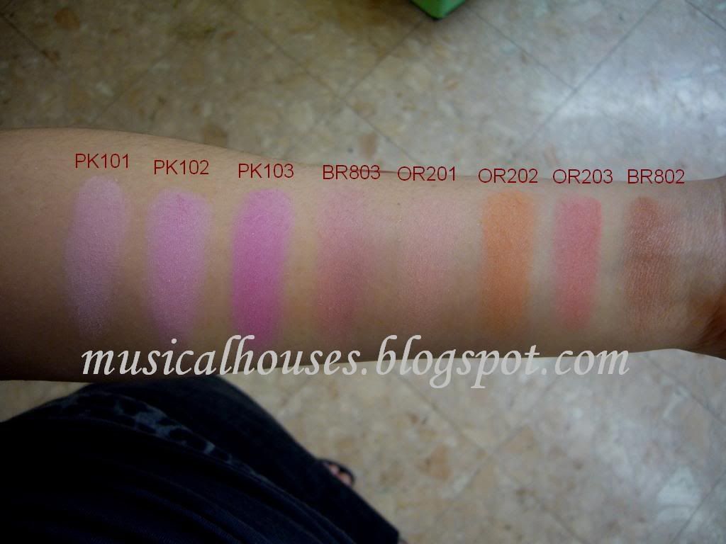
L - R: PK101, PK102, PK103, BR803, OR201, OR202, OR203, BR802
PK101 is supposed to be the colour that won the award, but it's just a normal light pink. It's a nice basic neutral pink colour, but you know, every brand already has a colour like that.
PK102 is also pink, but darker and less pastel.
PK103 is a pink with a hint of magenta in it, but it's by no means dark.
BR803 kind of reminds me of a less pigmented NARS Sin. It's that kind of plummy colour with some pink.
OR201 is a light peach.
OR202 is an orange colour.
OR203 is a pinky peach colour.
BR802 is a ruddy brown.
Barielle Lava Rock and Essie Angora Cardi KOTD
Monday, March 8, 2010
Today's NOTD is Barielle's Lava Rock, together with Essie Angora Cardi for the ring finger. I like both colours, and I like them together too. The splatter paint drop was made with Lava Rock and Konad plate M21. And as you can tell from the terrible skills and the lack of nice watermarking, this is a slightly older NOTD. I really need to get up to speed on my NOTDs, I just have this tendency to take photos and then forget about them :X


As you can see, Lava Rock is a black, sheer colour with purple pearl. I like this one, it has that glowy quality that really reminds me of lava. Also, as the Konad shows, Lava Rock is sheer and needs 2 coats to acheive opacity - the Konad was just barely opaque enough to show up over Angora Cardi. As the photos also show, I had slight application issues with this one, but nothing serious - it was probably just my noob skills more than anything else. The sad thing about this though, is that Lava Rock chipped on me within a day or two, which was really heartbreaking, since I do love this colour so. I don't know if it's just this colour, or Barielles in general, or just that I got a dud though, as this is the only Barielle I have (gasp, I know. But hey, US stuff is hard to get here).
Essie Angora Cardi is also a gorgeous mauve colour that is just deep enough to really make it pop. I love this, it's mauve and it's boring and mumsy, but somehow I like it. I don't know why. I love it, I really do. This one had no application issues and had good staying power - I had to take off my mani because the Barielle was getting all chippy on me, but Angora Cardi was still fine. Ahh, Essie, why do you bother to do three gazillion pinks and sheers when you work the dark colours so well? Please stop producing yet more Marshmallows and Ballet Slippers and Mademoiselles - much as I appreciate sheers in a work setting (because they're not noticable enough to garner snarky comments from mean co-wokers, and because even if they chip noone will really be able to tell) we have enough of them! Come on Essie, us nail fanatics are your greatest customers!
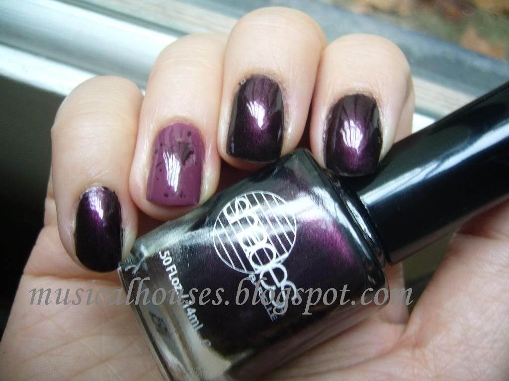
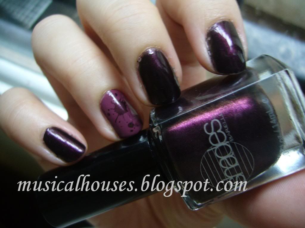
Gel Eyeliner Swatches and Review! Bobbi Brown, MAC, Stila, Etude House
Saturday, March 6, 2010
Today's swatches are also featuring my stash! Yay! Some time ago I did a post on my stash pics (which you can read about here), and it had a measly number of gel eyeliners. Well, since then, I've acquired a couple more, and now I can show them all off!
Unfortunately, I'm not much of a bright colours person when it comes to eyeliner (or for that matter, makeup in general), but I swear, although they're almost all neutrals, they're all different!
Most of these that I've shown here are pretty awesome - as everyone knows, Bobbi Brown is pretty much the queen of gel eyeliners, and MAC is her little more tempremental daughter, and Stila is the court jester who spouts out golden gems in between bit of rubbish. That's my opinion of it, anyway. But I do love them so, and all of these are pretty good, although some are better than others, and I'll go into more detail when I discuss each individual colour. In general though, the Bobbi Brown ones have the best texture, consistency and pigmentation, although the rest are pretty good too. That being said, there's a difference between the different types of Bobbi Brown gel liners too - some are better than others, and rumour has it that the "newer ones" in the clear glass jar aren't as nice as the "older" ones in the frosted glas jar, although whether the eyeliners were reformulated or merely repackaged is still a mystery. Still, there aren't any duds in this stash, because, you know, its MY stash. Duh. :P
Also, most of you would probably already know this, but it's always a great idea to store your gel eyeliners upside down. This allows you to not only see the labels on the bottom of the pots (and thus save yourself the trouble of looking through your stash to find that one pot), but it also prevent the gel eyeliners from drying up so fast. I'm not sure how exactly, but it does seem to work for me.
Anyway, here are swatches to start off:

L - R: MAC Ostentatious, Bobbi Brown Black Mauve, Etude House Orgel Light Gel Eyeliner 04, Bobbi Brown Violet, Bobbi Brown Indigo, Stila Jade Smudgepot
MAC Ostentatious is a neutral taupey brown that's not too cool-toned for warm-toned people. I actually expected this to be more grey, but it's more brown than anything else. It's not a brassy, bronzed, orangey brown though, it's a greyed out brown, the kind that I love. This one is really very work safe, and it doesn't have a hint of shimmer at all. I didn't like this as much as I should have - the pigmentation is not as good as the Bobbi Browns or the Stila, so with this particular colour you do have to go over the line a couple of times. It does last for awhile, but it does tend to get a little smudgy towards the end of the day - just a bit.
Bobbi Brown Black Mauve is a purply-grey-brown, another one of those colours that I could have a million of and still love. It has just a hint of shimmer that disappears once on your skin. I was disappointed by the case of the disappearing shimmer though, it was the shimmer that really got me excited. This one looks less interesting on skin than in the pot, unfortunately. The texture is also great, but the one I have is the "newer" repackaged gel eyeliners, in the clear glass jars rather than in the frosted glass jars, and it doesn't seem as nice as the other Bobbi Browns I have. It does have good staying power though - I've no problems with this.
Etude House Orgel Light Gel Eyeliner 04 (what is it with Asian brands giving their products ridiculously long names!?) is a beautiful, captivating colour - the kind you look at and just HAVE to have. It's a cross between a purple and a grey, with a really cool pink flash/duochrome to it. I LOVE THIS. It's neutral but interesting, and it's really glowly. Unfortunately, the texture of this is the driest out of all the gel eyeliners I have, and I attribute this to the terrible lousy packaging of Etude House. When I first got thi gel eyeliner, it was a little harder than my Bobbi Browns and MAC, but after a couple of uses it just slowly hardened. Now whenever I use it I have to dig my brush into it. Although the packaging doesn't keep the gel eyeliners moist, it does look really cute. I've included a few photos further down in this post, just so, you know, we can ooh and aah over the innate ability of Asian brands to be kawaii :P LOL OK I'm kidding, but the packaging is really very pretty, which is always a plus. Also the pigmentation on this is a little bit skippy, so you do have to go over your work again to really build up the colour. The good thing about it though, is that it stays forever on your skin. This colour is the most unique neutral I've ever seen in awhile, so I feel sad that it just had to be ruined by quality problems. I think it was also possibly limited edition, although I'm not certain.
Bobbi Brown Violet is very very pretty, it's a muted deep purple violet with shimmer, and it doesn't lose any of it's oomph even when it's on your skin. And it' incredibly pigmented, and glides on like butter. It also stays on for a really long time without smudging. The one I have is in the older packaging though, and I'm not sure if that makes a difference.
Bobbi Brown Indigo is blue, but it's not a screaming neon blue. It's a beautiful matte deep blue, more navy than indigo actually, since indigo implies that there is some purple to the colour, but this one has no purple at all. I'd have called it Navy instead, but I'm not Bobbi. Anyway, This one is also awesomely pigmented - you really only need to touch your brush to the surface - and also very smooth, and also really long lasting.
Last, but not least, Stila Jade Smudgepot. Now the Smudgepots are a bit of a hit-and-miss affair - some are really awesome, and some not so much. Fortunately, Jade is one of their better colours - very creamy, very pigmented, and really long lasting. I really like this a lot. It's also got gold shimmer in it which really amps up the colour. Beautiful. They call it Jade, but Jade to me conjures up images of minty green colours, no thanks to the ongoing Chanel Jade craze. Still, true Jade is indeed not really mint green but a bit deeper than that. I'd say this one is sort of a jade green with some emerald in it, because it really has that vibrancy of colour.
Anyway, that was a really lengthly review, wasn't it? But I'm not done yet! I said I would show you the cute Etude House packaging right?


Is that cute or what?! Cute pink plastic top (and they even put shimmer in the pink plastic! Talk about attention to detail!) with nice girly swirls and design...Unfortunately the pretty packaging doesn't do much to prevent drying up of the eyeliners - and I stored them upside down too! I'm so disappointed.
Anyway, here's an EOTD I did awhile back with the Etude House eyeliner. Unfortunately the lighting wasn't very good, and the pink flash seems to have disappeared, but here you go:

Wow, my eyes are really small and hooded, aren't they :X
And, that concludes this real looong post for today, finally! :)
Unfortunately, I'm not much of a bright colours person when it comes to eyeliner (or for that matter, makeup in general), but I swear, although they're almost all neutrals, they're all different!
Most of these that I've shown here are pretty awesome - as everyone knows, Bobbi Brown is pretty much the queen of gel eyeliners, and MAC is her little more tempremental daughter, and Stila is the court jester who spouts out golden gems in between bit of rubbish. That's my opinion of it, anyway. But I do love them so, and all of these are pretty good, although some are better than others, and I'll go into more detail when I discuss each individual colour. In general though, the Bobbi Brown ones have the best texture, consistency and pigmentation, although the rest are pretty good too. That being said, there's a difference between the different types of Bobbi Brown gel liners too - some are better than others, and rumour has it that the "newer ones" in the clear glass jar aren't as nice as the "older" ones in the frosted glas jar, although whether the eyeliners were reformulated or merely repackaged is still a mystery. Still, there aren't any duds in this stash, because, you know, its MY stash. Duh. :P
Also, most of you would probably already know this, but it's always a great idea to store your gel eyeliners upside down. This allows you to not only see the labels on the bottom of the pots (and thus save yourself the trouble of looking through your stash to find that one pot), but it also prevent the gel eyeliners from drying up so fast. I'm not sure how exactly, but it does seem to work for me.
Anyway, here are swatches to start off:

L - R: MAC Ostentatious, Bobbi Brown Black Mauve, Etude House Orgel Light Gel Eyeliner 04, Bobbi Brown Violet, Bobbi Brown Indigo, Stila Jade Smudgepot
MAC Ostentatious is a neutral taupey brown that's not too cool-toned for warm-toned people. I actually expected this to be more grey, but it's more brown than anything else. It's not a brassy, bronzed, orangey brown though, it's a greyed out brown, the kind that I love. This one is really very work safe, and it doesn't have a hint of shimmer at all. I didn't like this as much as I should have - the pigmentation is not as good as the Bobbi Browns or the Stila, so with this particular colour you do have to go over the line a couple of times. It does last for awhile, but it does tend to get a little smudgy towards the end of the day - just a bit.
Bobbi Brown Black Mauve is a purply-grey-brown, another one of those colours that I could have a million of and still love. It has just a hint of shimmer that disappears once on your skin. I was disappointed by the case of the disappearing shimmer though, it was the shimmer that really got me excited. This one looks less interesting on skin than in the pot, unfortunately. The texture is also great, but the one I have is the "newer" repackaged gel eyeliners, in the clear glass jars rather than in the frosted glass jars, and it doesn't seem as nice as the other Bobbi Browns I have. It does have good staying power though - I've no problems with this.
Etude House Orgel Light Gel Eyeliner 04 (what is it with Asian brands giving their products ridiculously long names!?) is a beautiful, captivating colour - the kind you look at and just HAVE to have. It's a cross between a purple and a grey, with a really cool pink flash/duochrome to it. I LOVE THIS. It's neutral but interesting, and it's really glowly. Unfortunately, the texture of this is the driest out of all the gel eyeliners I have, and I attribute this to the terrible lousy packaging of Etude House. When I first got thi gel eyeliner, it was a little harder than my Bobbi Browns and MAC, but after a couple of uses it just slowly hardened. Now whenever I use it I have to dig my brush into it. Although the packaging doesn't keep the gel eyeliners moist, it does look really cute. I've included a few photos further down in this post, just so, you know, we can ooh and aah over the innate ability of Asian brands to be kawaii :P LOL OK I'm kidding, but the packaging is really very pretty, which is always a plus. Also the pigmentation on this is a little bit skippy, so you do have to go over your work again to really build up the colour. The good thing about it though, is that it stays forever on your skin. This colour is the most unique neutral I've ever seen in awhile, so I feel sad that it just had to be ruined by quality problems. I think it was also possibly limited edition, although I'm not certain.
Bobbi Brown Violet is very very pretty, it's a muted deep purple violet with shimmer, and it doesn't lose any of it's oomph even when it's on your skin. And it' incredibly pigmented, and glides on like butter. It also stays on for a really long time without smudging. The one I have is in the older packaging though, and I'm not sure if that makes a difference.
Bobbi Brown Indigo is blue, but it's not a screaming neon blue. It's a beautiful matte deep blue, more navy than indigo actually, since indigo implies that there is some purple to the colour, but this one has no purple at all. I'd have called it Navy instead, but I'm not Bobbi. Anyway, This one is also awesomely pigmented - you really only need to touch your brush to the surface - and also very smooth, and also really long lasting.
Last, but not least, Stila Jade Smudgepot. Now the Smudgepots are a bit of a hit-and-miss affair - some are really awesome, and some not so much. Fortunately, Jade is one of their better colours - very creamy, very pigmented, and really long lasting. I really like this a lot. It's also got gold shimmer in it which really amps up the colour. Beautiful. They call it Jade, but Jade to me conjures up images of minty green colours, no thanks to the ongoing Chanel Jade craze. Still, true Jade is indeed not really mint green but a bit deeper than that. I'd say this one is sort of a jade green with some emerald in it, because it really has that vibrancy of colour.
Anyway, that was a really lengthly review, wasn't it? But I'm not done yet! I said I would show you the cute Etude House packaging right?
Is that cute or what?! Cute pink plastic top (and they even put shimmer in the pink plastic! Talk about attention to detail!) with nice girly swirls and design...Unfortunately the pretty packaging doesn't do much to prevent drying up of the eyeliners - and I stored them upside down too! I'm so disappointed.
Anyway, here's an EOTD I did awhile back with the Etude House eyeliner. Unfortunately the lighting wasn't very good, and the pink flash seems to have disappeared, but here you go:

Wow, my eyes are really small and hooded, aren't they :X
And, that concludes this real looong post for today, finally! :)
Fake MAC Twitter Acount: MACartists on Twitter
Thursday, March 4, 2010
Update:
As of March 5th, I tried to access the MACArtists twitter page, and I received a HTTP 404 not found error instead. It looks like they self-deleted, got removed, or something - I've no idea what happened, only that the account doesn't seem to exist anymore. Has anyone managed to access anything more than a 404? I just hope they got deleted before they filched anyone's personal information from their 'giveaway'...You've heard of fake MAC cosmetics, now check out the newest fake to hit the block - a fake MAC Twitter account! For years MAC has been plagued by ever-increasingly sophisticated fake eyeshadows, pigments and blushes, but now it look's like MAC's got a new problem on it's hands. It turns out that user MACartists on Twitter isn't actually affiliated with MAC. Unfortunately, it seems like most of their followers think they're following an actual MAC account, so I thought I'd just run a quick post on it to alert everyone.
This was discovered by Karlasugar, who runs the very helpful and positively awe-inspiring swatch blog The Next Best Thing to Going Shopping Yourself, and reported on her Twitter account.
According to Karla, real MAC artists have usernames like MAC_Gordon_E, MAC_Vimi_J, MAC_Gina_B, MAC_Gregory_A, MAC_Bianca_A, and MAC_Caroline_D. Those are all real MAC artist accounts.
For anyone wanting to follow real MAC artists, there is also a list of actual MAC makeup artists who are on twitter, located at http://www.macartiststweets.com.
Naturally I'm puzzled. Why anyone would want to pretend to be a makeup company is beyond me. I've heard of people setting up twitter accounts as a form of satire - anyone vaguely familiar with the finance industry will recall the (now suspended) fake twitter account set up to mock the John Boden incident, in which the managing director at the investment bank Thomas Wiesel Partners sent this email telling his underlings to get back to work, on Good Friday too, no less: "We are an investment bank. Unless you are an orthodox something, please get into the office. We are getting paid minimum wage for a reason – we are not making money, which is hard to do from home. Join Wells Fargo and become a teller if you want to take holidays." The fake twitter account (screenshot and more info here) mocked Boden, with tweets like "Analyst slacking again. Headed to mosque to get him back to work. Traffic sucks", "Just made plans for sushi tonight. Man, I love chinese food!", and of course, "Unless you are an orthodox something, please get into the office."
But in thise case, MACartists is obviously no satire twitter account. The account is answering people's questions about MAC products, giving out "MAC Tips", making announcements on upcoming products and collections, and even holding contests under the guise of being affiliated to MAC. The last one is particularly disturbing - even if you won the contest, would you really want to hand over your address and details to someone you cannot trust? If it was some sort of satirical account, set up purely for the purpose of humour, I would have found it funny, but in this case, I found this about as repulsive as those dodgy MAC eyeshadows with the too-thick print logo, the lousy colours, and the toxic, untested ingredients.
Of course, if anyone wants to follow MACartists for whatever reason, I'm not stopping them, or even saying that they shouldn't follow MACartists. I just thought that people should know that they aren't actually affiliated to MAC. If they know that and still choose to follow them, that's their right, but at least they should make the choice informed, knowing who they are really following.
Sephora by OPI Domestic Goddess Matte: NOTD
Today's NOTD is a bright happy matte - Sephora by OPI Domestic Goddess Matte! Now I know the mattes trend isn't in the spotlight anymore, what with the advent of mint green, lilacs and neons, but there's still something about mattes that makes them look so cool to me. And to me the best thing about wearing mattes/suedes is that they dry super fast, so if I'm in a hurry they're perfect.
Domestic Goddess is a happy, bright purple that is still wearable despite being bright because of the matte finish. I kind of feel like the matte finish seems to "flatten" colours, and makes them less shocking? So while I would never wear Domestic Goddess if it wasn't matte (it would probably be a tad too bright for me), I'd happily wear it as as matte. And I feel like colours like Nails Inc Jermyn Street (here) look tres chic when they are not matte, but just look kind of blah when mattified. I suppose it's all a matter of preferences, but I personally prefer my mattes to be brighter (so that they don't look like blah mattes), and my non-mattes to be more muted (so they don't draw attention from my professors and remind them that I'm "that girl with the bright nail polish who's always late for class").
Here it is:

This is two coats. The first coat was a tad streaky and uneven, but two coats fixed it nicely. It also dries really fast, as is common for mattes and suedes.
Also, while I usually have a problem with wear when it comes to mattes, this particular one was actually surprisingly long-lasting on me, as far as mattes go. I think it lasted for a good 3-4 days (with base coat) before the first chip came on, so in effect it was probably as good as a regular non-matte polish. That's not bad at all. If you are using a base coat with this one though, it is vital that you wait for the base coat to dry before putting on any polish, because matte polish dries faster than normal polish, so to avoid problems with the different drying rates, it's just best to wait for the base coat to dry before putting on any matte polish.
Interview with Prim and Polished's Gina!
Here is a little interview I had with Gina, of the fabulous and absolutely beautiful blog Prim and Polished. Please do check out her blog, she has great photos and awesome posts! You can read the full interview HERE. I guess no one's really interested in my personal life, but if you're curious about how I became so obsessed with makeup or polish, what I'm actually doing when I'm not blogging, and exactly how large my polish stash is, head on over to check it out! Gina is also looking for other bloggers to interview, so if you're up for it, do contact her!
Thank You So Much Everyone!
Wednesday, March 3, 2010

OFAF has been voted the winner of the Everyday Woman Award category for the 2010 Beautyjudge awards! I only just got the email, and I am totally floored, as this has come as a total surprise. I do think I had to pick up my jaw from the floor after reading the email..in fact I probably had to root around to find it because it probably rolled under my bed. LOL! :P
I am truly overjoyed and humbled, as I really did not expect to get many votes, let alone to win, and I am so, so indescribably thankful to all the kind people who took the time and effort to vote for me! Your support has meant the world to me - I really want to thank those who voted, posted encouraging comments on my blog/twitter/elsewhere, and who helped me RT my annoying pimping "Get out the vote" tweets...we both know who you are, and I am truly grateful! And to everyone who has in some way interacted with my blog - read, commented, requested a swatch, asked a question, tweeted me, thank you! Without you, swatching and reviewing would not be half as fun!
You can find out more and view a list of the other nominees here: http://www.beautyjudge.com/uk-beauty-blog-awards-2010.html. There are some really fantastic blogs that I frequent there! Once again, thank you everyone! I am truly blessed to have you!
Wet n Wild Megalast Infatuation: NOTD
Tuesday, March 2, 2010
Today's NOTD is Wet n' Wild's Megalast nail polish in the colour Infatuation 216. It's a pretty red jelly, and I would have liked it more if not for the application and wear issues. It's also easily built up to near-opacity, despite being a jelly. I don't have many red nail polishes (because why wear reds when you can wear taupes, greys, and purples?) but this is one that I like. I actually bought it when it was buy-one-get-one-free at Walgreens, and although it wasn't my colour, it was cheap so I thought, why not? Now that I'm no longer living in the US, I really miss the drugstore beauty sales. I don't think you can get buy-one-get-one-free drugstore makeup anywhere else.
Here it is in natural sunlight. This is two coats. And as you can tell by the watermark this was an old NOTD when my nails were ugly and my skills were le suckage (I mean, my skills are still bad, but this was worse):

As you can see it's a very pretty red with a very nice glow.
Here it is indoors:

You can see that it has some shimmer in it. It's superfine, and I can't tell what colour the shimmer is (gold maybe?) but it's really fine and it just shows up as a glow, even indoors. It's not a unique, OMG colour by any means, but it's a nice basic colour.
Unfortunately, despite the nice colour, the application was not too great. The brush has a tendency to dispense too much colour on the nail - hence the overly thick application you see in the photos. I guess as long as you wipe the brush before applying it should do the trick though.
Also, wear was an issue for this colour. It chipped the very next day, and it chipped in really weird places, as you can see from the NOTD pictures. Or maybe I was just especially rough with my nails. I guess wear and application vary from person to person - some people love OPIs, some find OPIs chip on them, and different people have different preferences when it comes to brushes (like how some like wide brushes and some prefer narrower brushes). But for me, I don't really like this one, and I doubt I'll be wearing it again.
Giveaway: Skin MD Shielding Lotion!
Monday, March 1, 2010
As promised, here is the Skin MD Shielding Lotion giveaway! If you liked my review of the Skin MD Shielding Lotion, here is you chance to get a bottle of Shielding Lotion for free!

Awesome! What do I have to do to take part?
1. Be a follower of this blog
2. Click on this link to go to www.skinmdnatural.com, take a look around, and then return to this post, and leave a comment on this post saying what you have learned about Skin MD from their site! Don't forget to include your email address so I can contact you!
I'm a follower, I've visited the site, and I've posted my comment on this entry! What can I do to get extra entries?
Do any one of the following for an extra entry each:
1. Follow me on twitter (HERE) and RT this message "Follow @musicalhouses and RT to win a Skin MD Shielding Lotion! Details http://goo.gl/fb/76bM"
2. Include me in your blogroll
3. Blog about this giveaway
So that gives you a total of 4 entries!
to
I'm international, can I enter?
Yes, as long as you're not on the moon, you can take part.
I'm a procrastinator, how long can I wait?
This giveaway ends April 1st, in honour of April Fools' Day (and no, this isn't a joke!). So don't wait too long!
This giveaway is sponsored by Skin MD. There are no strings attached for this giveaway. I was not paid for this giveaway, neither am I affiliated to Skin MD.
Rock and Republic Beauty is on Hautelook!
Wow, I'm so jealous of my US ladies! Rock and Republic Beauty is on sale at Hautelook! As usual, the sale is only open to members, so be sure to sign up HERE.
I am not affiliated with, paid or compensated in anyway by any of the companies mentioned to release this information, nor do I receive any freebies from either company to post about it here. I release it because I think it might be useful to my readers. The sign up link provided is my own members sign up link that is available to all members upon signup, and does not award me any benefit outside of their usual membership programme.
Subscribe to:
Posts (Atom)
Linkwithin


Tuesday, March 30, 2010
2 comments