Well, turns out, although they're totally clashing in every way possible, they both have one thing in common - they're both secondary colours on the colour wheel! So I decided to add in the last remaining secondary colour, green, into the mix. Because it wouldn't be nice to leave the last one out!
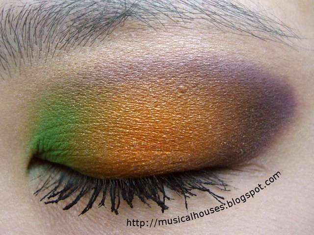
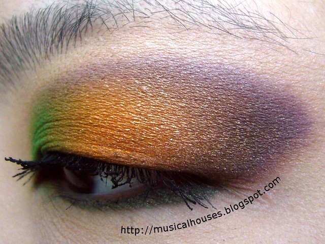
So, you must be wondering what this bunch of colours looks like on the eye. Not that bad, actually, if you keep in mind that they aren't exactly supposed to "go" together.
For this look, I think I picked out all the colours from my Sleek Curacao Palette (I can't remember exactly, I apologize). I used the green on the inner corner of the eye, the orange in the lid, and the purple at the outer corner and the contour area.

I think the hard part was trying to blend out the colours without them looking muddy. I think I did an okay job at that. I have to say, I really love how this looks, although I didn't wear it out. It was just something I wanted to try out, just because of Jamilla's tweet!

So there you have it, my eye look inspired by a single tweet! Isn't it great how inspiration can just strike anywhere sometimes and lead you to do all sorts of things?


Looks Great!!
ReplyDeleteVery nice! :-)
ReplyDeletehttp://www.itsbellatime.blogspot.com/
Oh wow, this is gorgeous, I love how you incorporate such bright colours and the colours do not look muddy. Do you wear it out?
ReplyDeleteLooks fab!
ReplyDelete