Sleek Pout Paints: Mixing the Perfect Coral Lip

Tuesday, August 30, 2011

9 comments
I am so on a roll with these Sleek Pout Paints! The variety of shades you can get by mixing your own lip shades has really fired up my imagination and sparked my creativity! This time, I've created another shade that was tricky for me - coral! Coral is usually one of those popular-every-summer kind of lip shades, so I thought it would be fantastic if this summer I managed to conjure up my own coral shade!

Here is the shade of coral that I cooked up. It's circled below, swatched next to my other creations.

Sleek Pout Polish Creations wearable coral lip


For this shade, I actually used the same three colours as for my previous warm rose shade, but although I used the same three tubes of colours, the ultimate shades created turned out so differently! It just goes to show that the possibilities are truly endless!

Sleek Pout Polish custom colour 2


For this shade, I used Peachy Keen, Pin Up, and Cloud 9. This time around, though, I used more of Peachy Keen, less of Pin Up, and more of Cloud 9.

sleek pout paints wearable coral lip 1


Once mixed together, I pretty much got the shade I wanted. So after this, I didn't mix the shade a little more.

sleek pout paints wearable coral lip 2


As you may have read from my previous two mixing experiences, I used a clear gloss to increase the amount of gloss I mixed. The Pout Paints are pigmented enough for you to dilute the mixture with some clear gloss without sacrificing any pigmentation. So here I mixed in the same clear gloss with shimmer, which I also used for the previous two mixes.

sleek pout paints wearable coral lip 3


And this is the final shade I came up with. I love this shade!

sleek pout paints wearable coral lip 4


And here is the gloss on my lips! I love how it's noticably coral, but not so orange that it's unwearable. And I feel like it's just the right coral for my skintone too!

sleek pout paints wearable coral lip swatch


If you like playing around and mixing up your own shades, I think the Sleek Pout Paints will be just your cup of tea. I've loved all the shades I've come up with so far, and although I never thought that I would be able to mix up shades that I would actually like, it's actually been easier than I thought!

(Product was sent for review. Review is my complete and honest opinion. I am not affiliated with/compensated by the company.)

Anastasia of Beverly Hills: Brows and Beauty

Monday, August 29, 2011

2 comments
When most of us think of Anastasia of Beverly Hills, we think of brows! Indeed, she is the only beauty mogul around who built her entire empire almost solely upon one part of the face that, we have to admit, often gets overlooked - the humble eyebrow. Like an architect, she is best known for shaping the brows to best suit the face.

I've always been quite impressed by her personal story, and there is a piece that Anastasia wrote for the Huffington Post detaling her progression from an immigrant in the USA to a successful businesswoman. It is a truly inspiring story about how hard work, grit, and business acumen can take you far.

Here she is demonstrating the use of one of her signature products, the Beauty Express Palette:

"Beauty Express" brow-kit instructional video from Anastasia Beverly Hills on Vimeo.


I've never paid much attention to my brows, but I love how her kit has FIVE shapes of eyebrow stencils. Makes me want to experiment with my own brow shape.

But the piece of news that really interests me most is that Anastasia has branched out into makeup! And since I'm such a makeup junkie, that really gets me excited. There's a bit of everything other than just brow products - eyeshadows, lipglosses, blushes, bronzers, concealers - the whole nine yards. Has anyone checked out the line, and formed any opinions on any products yet? I'm tempted!

Sleek Pout Paints: Mixing the Wearable Purple Lip

Saturday, August 27, 2011

12 comments
I have an ambivalent relationship with purple as a lip colour. Although purple is possibly my most favouritest colour ever, and I happy wear it in my clothes, bags, nails, eyes, and even cheeks (yes! I love my pinky-plummy blushes), I've never quite come around to purple as a lip colour.

Everytime the purple lip trend comes around (usually in Fall, sometimes in Spring), my brain starts going into overdrive. My right brain thinks, "Ooooh, purple! Me likey!" and my left brain thinks, "Eww, gross purple lips!" and "Oooohm purple!" and "Eww, gross!" end up battling in my brain. And I never actually end up buying any purple lip colour. I guess I've just never found the shade of purple that's just right for me.

So I decided that with the Sleek Makeup Pout Paints, I can actually mix my own wearable purple lip shade! I wanted a shade that was purple (as opposed to just pinky-plum, or pinky-lilac), but a nice kind of purple, not an "eww, she's wearing purple lips!" purple. And this was what I created, circled below. I'm quite proud of it, actually!

Sleek Pout Polish wearable purple lip


For this shade, I actually used all five colours of the Sleek Pout Paints that I had - although in all honesty I think i didn't have to. I was really just experimenting as I went along, so I think that if I ever wanted to re-create this shade again, I'd tweak the recipe a little. But for this colour, I used Peachy Keen (peachy-orange shade), Pin Up (true red), Peek-a-bloo (blue), Mauve Over (purple), Cloud 9 (white).

First, I used a small drop of Mauve Over, and tiny, tiny amounts of Pin Up and Peek-a-bloo. I also added in some Cloud 9, because adding Peek-a-bloo to any mixture tends to darken it. On hindsight, however, I'd probably remove Peek-a-bloo from the mix and use a little less of Cloud 9.


This was the interim resulting mixture that I got - a light purple shade that I didn't like. It was a little too purple to be wearable for me. So I decided to balance the shade out a little by adding a drop of Peachy Keen to warm up the shade, and Pin Up to redden the shade and make it more pink/red-based and less outrageously purple.

sleek pout paints wearable purple lip 2


This is the final colour I acheived after adding Peachy Keen and Pin Up. I liked it, so I didn't want to change it anymore.

sleek pout paints wearable purple lip 3


Next, I decided to add in a clear gloss to bulk up the mixture, and give it a nicer, less tacky and more gloss-like texture. If you read my previous mixing attempt with the Sleek Pout Paints, you'll know I had good luck with mixing in a clear gloss with shimmer, so here I did the same. As with the previous warm rose shade I created, for my wearable purple lip shade, I found that the Pout Paints were so pigmented that you can actually add quite a big dollop of clear gloss without sacrificing much pigmentation! The photo below shows how much clear shimmery gloss I added:

sleek pout paints wearable purple lip 4


This is the final wearable purple lip colour that was acheived. It did require a bit of tweaking, and I didn't get the right colour in one shot, but otherwise, quite easily done!

sleek pout paints wearable purple lip 5


Here's the wearable purple Pout Paint mix taking its place of pride in my Sleek Pout Paints self-made lip colours collection. I've circled the shade just created below.

sleek pout paints wearable purple lip pot


And lastly, here's a swatch of my self-created purple on my lips! I'm absolutely loving it! It's purple, without being too unusual or shocking!

sleek pout paints wearable purple lip swatch


This just highlights my absolute love for the Sleek Makeup Pout Paints. I never used to like any purple lip colour, but with the Pout Paints, I was actually able to create a purple lip shade wearable enough for me to try it out! To me, that's a great use for the Pout Paints. If there's any lip colour you've seen on the runways or in stores which you've liked, but felt wasn't for you, the Sleek Pout Paints are a great way to mix up your very own version of the shade. Now, I have no excuse for not wearing a purple lip!

(Product was sent for review. Review is my complete and honest opinion. I am not affiliated with/compensated by the company.)

Sleek Pout Paints: Mixing the Perfect Warm Rose Shade

Thursday, August 25, 2011

15 comments
Ever since I got my Sleek Makeup Pout Paints, I've been happily mixing all sorts of shades to my heart's delight - it really sparks my creative juices and gets them all flowing! And of course, I get to mix my favourite shades that I know I'd love to wear!

One of the shades I especially like is this shade, shown below. I'm not too sure what to call it, so for want of a better colour description I'm just going to call it a warm rose shade, which isn't too far off, methinks - it's warmer than your usual blue-leaning rose shade, and is neutral enough to be universally flattering, if I do say so myself! The warm rose shade is circled in the photo below, placing it side-by-side with some of my other creations, which I will also write about on this blog:

sleek pout paints warm rose pot


And this is what the colour looks like swatched on my arm. This was featured in my Pout Paints swatch post, but I've circled the shade I'm featuring today. It kinda looks like a warm rose-ish shade, doesn't it?

Sleek Pout Polish warm rose swatch 2


For this shade, I used just three of the Pout Paints, circled below. I used Peachy Keen 156, the peach shade, Pin Up 157, the red shade, and Cloud 9 153, the white shade.

Sleek Pout Polish custom colour 2


Now, time to create! First, I added the three colours together. I used a drop of Pin Up, and added a little bit more of Peachy Keen. And then I added just a little bit of Cloud 9. The following shows the colours in the amounts they were used, before mixing.

sleek pout paints warm rose shade 1


Next, mix and blend the colours together. I got this shade, a rose that had a neutral undertone and wasn't too light or dark. I have to say, Pin Up is seriously pigmented, and if you're using that shade to colour-correct a mixture, remember - a little goes a long way! I've noticed that red shade tends to show up quite strongly in any blend it's added to.

sleek pout paints warm rose shade 2


I liked the shade I got, so I didn't bother to customize further. As you can see from the photo above, though, I only created a teensy tiny amount of the shade - literally just enough to almost cover the base of the blending jar. The mixture was super-pigmented, and also quite sticky and tacky in texture. So I decided to blend in clear gloss to lighten the texture, as well as increase the amount of gloss I had.

However, I didn't actually have any totally clear gloss on me. So I just ended up using some clear gloss with bits of shimmer. I think it's some random Lancome Juicy tube which came as part of a set. That thing is seriously annoyingly sheer. Nothing shows up on my lips except the shimmer, so I thought it would be just as good as clear gloss, only with more shimmer. The photo below shows the amount of gloss I added. As you can see, it was a pretty big dollop of gloss compared to the drops of Pout Paint I was working with previously!

sleek pout paints warm rose shade 3


The final end result is this. Ta-da! Even with the relatively big dollop of clear gloss added to the mix to bulk up the mixture, the final shade was still pretty pigmented, and opaque in one or two swipes. I expected the gloss I added to sheer out the final result somewhat, so I was quite surprised to see that the good pigmentation was still retained - I guess this shows just how much pigment is crammed into those tiny Pout Paint tubes!


Lastly, here is my self-created warm rose shade on my lips. You can't actually see any glitter from the clear gloss I added, whether in the pot, on my arm swatch, or on my lips, although I'm sure it's in there somewhere (I would know, right, I added it in there). I think it's because all the shimmer got lost in the pigmented-ness of the Pout Paints.

sleek pout paints warm rose swatch

What can I say - I'm absolutely loving these, and creating a shade I liked was actually easier than I thought! I originally thought I'd end up with some blob of brown muck that would be disgustingly unwearable, but I gotta say I'm in love with my own shade. If you don't mind experimenting with mixing your own shade, the Sleek Pout Paints would be the perfect place to start. I'll be showing more "recipes" for other shades I've mixed soon, so if this shade wasn't your cup of tea, hopefully there'll be more to interest and inspire you!

(Product was sent for review. Review is my complete and honest opinion. I am not affiliated with/compensated by the company.)

Biotherm Skinergetic: Anti-Oxidants for Tired Skin: First Look

Wednesday, August 24, 2011

1 comment
Biotherm is one of those companies that doesn't get much buzz, but does have solid products - I myself am a huge user of their Aqua Source moisturizer. And almost as though the company has read my mind for liking their moisturizers, they magically release another one!


The newest release is Skinergetic, as as the name suggests, it's meant to reduce signs of tired skin, making your skin look more alive and, well, energetic. This product features various plant-based ingredients, including the very unlikely broccoli. Skinergetic comes in a green bottle, and has a capsule of broccoli powder that is mixed in with the lotion upon opening. The idea is that the anti-oxidant power of the active ingredient, broccoli in this case, is kept as fresh as possible until the consumer wishes to use it. Pretty nifty, huh? The only catch is that you have to use the product within 3 months, or the efficacy of the active ingredient decreases.

biotherm skinergetic bottle


Here's a look at the capsule of broccoli, and how it looks when first mixed into the product. You see that yellow-brown powder floating on top of the lotion? Yeah, that's the powder. After dispensing the powder into the moisturizer, you then mix it in. There isn't any change to the moisturizer once the powder has been mixed in; it just remains a white lotion.

biotherm skinergetic powder


The product is applied with a dropper, which I quite like, as it's a little bit more hygenic than sticking your fingers in a tub. The recommended usage is to place two drops on your palm, emulsify the drops on your hand, and then apply them in an upward and outward motion on your face. The lotion can also be applied to the neck too, in a downward motion. There are also some massage steps that went with this.

The Skinergetic moisturizer itself is a white, light-textured lotion, that smells very sweet. It kind of reminds me of apples and lemons (fortunately it doesn't smell like broccoli). I was told that the smell was actually re-formulated and toned down for the Asian market. Apparently the European version has a stronger fragrance. The lotion absorbs pretty easily, and doesn't leave behind a sticky residue.

biotherm skinergetic dropper


Because it is generally meant as a moisturizer with anti-oxidation properties, any woman of any age would be able to use it. At the event, we were actually shown this pretty darn cool video of two apple halves oxidizing. Basically, the apple half that had Skinergetic applied to it browned much more slowly than the half that didn't, a testament to it's anti-oxidizing powers. We were told that we could try this with the lotion on our own apple halves at home - I haven't gotten around to doing it yet, but boy, am I itching to try that out now!


Biotherm Skinergetic launches in Singapore on 25th August, and is priced at S$99 for a 50ml bottle which is meant to last for three months. For the first month, if you buy one Skinergetic mask hyou get one Source Therapie mask for free, making this a pretty good deal if you like the mask. I think this would probably be best for girls who are looking for a light moisturizer that is easily absorbed. I'll definitely be updating the blog with my thoughts as I use this product more!

(Product and information provided at an event. Any views held are my complete and honest opinion. I am not affiliated with/compensated by the company.)

Sleek Pout Paints Swatches/Review

Monday, August 22, 2011

17 comments
I'm so utterly excited for Sleek Makeup's new Pout Paints - after all, what's not to like about super-pigmented cream lip colours that you can mix and match to create your own shade? This is probably the first time I've seen such a concept brought to the drugstore on such a huge scale. OCC (Obsessive Compulsive Cosmetics) had their Lip Tars, but I don't think they were so readily available, and were positioned more as an artistry item. Now, it looks like any girl can mix up your own shade!


Sleek Makeup has released 11 shades in all, so the five I have right now is just slightly half than less of their shade range. But just imagine the possibilities that you can create with these five shades! I'm drooling all over my keyboard just thinking about it.

Sleek Pout Polish 1


The Pout Paints come in a range of colours, some that you can wear on your own, and some that are meant more for mixing (e.g. blue and white) to adjust your colour to that exact shade of purple-leaning greyed pink. Let's take a closer look at the shades.

Sleek Pout Polish 2

L - R: Peachy Keen 156, Pin Up 157, Peek-a-bloo 163, Mauve Over 154, Cloud 9 153

I find that out of the shades I have, I tend to use Pin Up and Peachy Keen quite a bit. Peek-a-bloo is useful when a shade leans too warm or yellow for your liking, and you want to make it more blue-based. I find I use Cloud 9 most when a shade is too dark for my liking, and I want to make it a tad lighter.

Just a word of caution, though - a little goes a very, very long way with these. When I want to colour correct a shade, or mix a shade, I'm literally adding the colour from the tube in drop by miniscule drop. I guess that's why the Pout Polishes come with very fine-tipped nozzles at the end:

Sleek Pout Polish Tip


See that? Sleek probably knew that clumsy girls like me would be squirting out way too much colour at one go if they didn't make the openings so small, LOL. The tubes are tiny - for sure, each tube of Pout Polish is smaller than your average-sized lipgloss (8ml per tube, if you want to know), but I kind of think that I could probably mix up at least a few months' worth of shades with the five tubes of Pout Polishes that I have.

Anyway, enough of my over-excited blathering. Here are swatches. These things are madly pigmented. Did I say they were madly pigmented? Usually when I swatch stuff I like to pile a whole lot onto my arm, just so the colour is captured in photographs, but I literally used a tiny smidgen when doing these swatches.

Sleek Pout Polish Swatches


Peachy Keen 156 is a peachy orange shade. Not bright orange, but pale orange. I find this very useful for warming up a shade, or making it more coral.
Pin Up 157 is a true fire-engine, Hollywood-starlet, telephone-box kind of red. I really like this, and I'd totally wear it alone.
Peek-a-bloo 163 is a blue that to my eye looks like it has a smidgen of green in it. I find this most useful when making lip colours more cool-toned (blue-based). It's more blue than in the photo - for some reason, this seemed to appear really green in photographs.
Mauve Over 154 is a magenta purple that is quite useful if you're trying to add a dimension of plumminess to a shade.
Cloud 9 153 is white. For some reason (not sure if I got a bad tube) this is a tad sheerer than the other shades. I use it mainly to make a shade lighter.

In addition to using just a tiny, tiny bit, I've also found it helpful to thin out my colour creations with some clear gloss at the end. If you find the Pout Paint mixture you've created stunning in terms of colour, but a little bit too thick for actual application, this tip may help! I've found that I can easily add in clear gloss to my lip shade in a 1:1 ratio, and I still get an opaque-in-one-coat lip colour. I also like to add in glitter this way :)

Here are some of the shades I've whipped up using the five Pout Polishes I have:

Sleek Pout Polish Creations


I know the third shade in the row kinda looks like Mauve Over, but I swear it's different in real life! I'll be posting more on how I created each individual shade in a series of posts, because there's just too many photos and too much information to be dumping them all into one post! I really love some of the colours I've created, and I can't wait to share them with you.

I'm thoroughly impressed by the Pout Paints - they're super pigmented, there's a wide enough range of colours for you to create a variety of shades - really, what's not to like? Perhaps the only negative I can think of is that the texture does tend to be on the thick side, so I prefer to thin out my own creations with clear gloss. But if you're at all interested in mixing your own lip colour, these would be a great place to start!

(Product was sent for review. Review is my complete and honest opinion. I am not affiliated with/compensated by the company.)

Shiseido Aqualabel White Liquid Foundation Swatches

Sunday, August 21, 2011

3 comments
Shiseido Aqualabel is the drugstore version to its more upmarket parent brand, Shiseido, much like Majolica Majorca. However, while Majolica Majorca, ZA, and a bunch of other brands tend to focus on cosmetic products, Shiseido Aqualabel actually focuses more on skincare - in fact, it has very few makeup items, and the best-sellerss in the Aqualabel are the lotions and essences. Thanks to its association with Shiseido, Aqualabel has also been very popular here, as it is often considered to be similar to Shiseido in quality, but at a drugstore price.


Today I'm bringing you some quick swatches of one of the rare makeup items in Shiseido Aqualabel's line - the White Liquid Foundation SPF 23 PA ++ range. Wow, that's quite a mouthful for a foundation name, isn't it? But it's perfectly in keeping with Japanese product naming conventions - somehow, an eyeshadow just isn't an eyeshadow unless it's named "Girly Make Luminous Pearl Wet Eye Jelly" or something like that. You know, just like how Western brands like to sex up their product names (I'm looking at you, NARS), Asian brands lovingly give their products grandiosely long and uselessly descriptive names. (Just to clarify some comments I've seen on the post, this entire paragraph is meant to be taken with a sense of humour - because you know, the propensity of brands to give products ridiculous names to acheive sales targets happens in both Asian and Western brands. I just comment more on Asian brands because, well, I happen to live in Asia, so I see a lot more of this stuff here. Perhaps some of the humour may have gotten lost in translation when it went from my brain to the blog. It's not intended to offend.)

Anyway, the Shiseido Aqualabel White Liquid Foundation comes in a slim, blue tube with a nozzle at the end. To use the foundation, you have to gently squeeze the foundation out of the tube - I say gently, because squeeze too hard and you get a big squirt of foundation. But enough of my blather. Here are swatches:

shiseido aqualabel white liquid foundation swatches


L - R: BO10, OC10, PO10, OC20, OC30

Maybe at this point it might be good for me to briefly mention Asian foundation shade naming conventions. Generally, BO would stand for Beige, PO would stand for Pink, and OC would stand for Ochre - so you know, BO and OC would lean yellow, and PO would usually be a bunch of pink-based shades. And following the colour prefix (BO, OC, PO, etc), there will be a number (10, 20, 30 etc), and the higher the number, the darker the shade. When you know that, breaking down those confusing shade names makes a lot more sense!

BO10, as the name suggests, is a fair beige that leans a little yellow. It's the best match for me, and I'm about NC20 in MAC.

OC10 is a fair yellow beige as well. The difference between OC10 and BO10 is that one is more yellow than the other, although it's kinda hard to make out the difference, even though they're swatched thickly side by side on my arm. I think OC10 is a hair yellower, but I could be wrong.

PO10 is a very pink-toned beige. I can't even imagine why a shade like that is in the Asian market, because in my entire life I've never come across any Asian girl with this skintone. This is so pink it's really more of what I'd call a "Caucasian pink beige" kind of shade, as opposed to an "Asian pink beige".

OC20 is one step up from OC10 in terms of shade depth. I'm thinking this may be MAC's NC25 - NC30 in shade, but that's just pure guesstimation on my part.

OC30 is one step darker than OC20, and just as yellow-toned. I'm going to guesstimate that this may be rougly a MAC NC35, possibly a NC40?

The Aqualabel White Liquid Foundations have a very fluid, watery texture, making them a little harder to control. Pigmentation on these is pretty decent, giving you light-to-medium coverage. The White Liquid Foundation also doesn't have any shimmer or glitter in it. This would probably appeal to girls who are looking for a foundation with a light texture and pigmentation.

Canmake Candy Wrap Lip Swatches/Review: Candy Lips!

Friday, August 19, 2011

15 comments
Ooh look, a lipgloss that looks cute, comes in a range of colours, and performs well! Of course, it's none other than Canmake, a Japanese drugstore brand that's got the kawaii image down pat. Everything in their line is packaged in the most cutesy, girly way you can imagine. And while I tend to squeal over cute packaging, I've got to admit, Canmake's latest offering, the Candy Wrap Lip range of lipglosses, also has quality to boot.


I absolutely love these little guys. Just look at how cute the packaging is! While I know the name Candy Wrap Lip may sound a bit odd to a westernized audience, I kind of get the image - shiny, sweet, and in candy colours, and I quite like it! Very evocative of candy lips. The Candy Wrap Lip has four colours, ranging from your typical pale pink to a jelly-like red. Don't they just look so delicious and candy-like?

Canmake Candy Wrap Lip 1


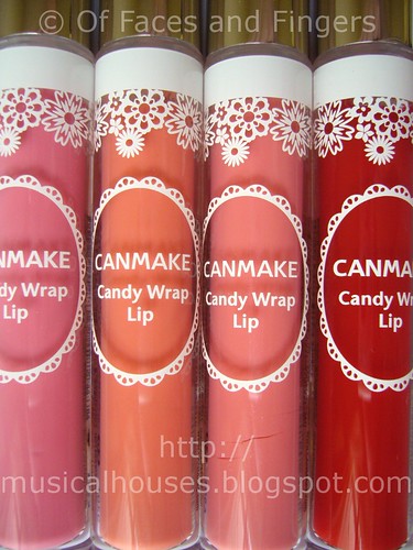
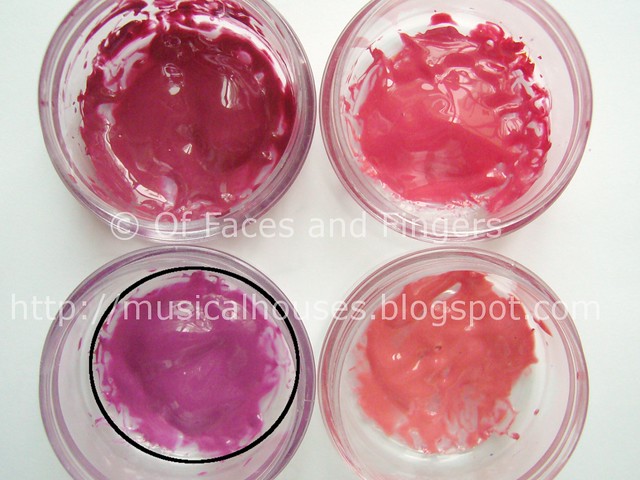
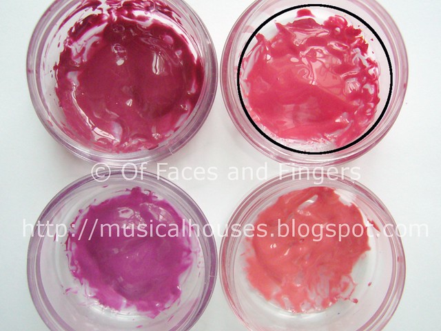
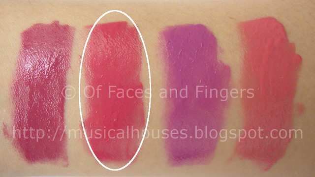
L - R: 01 Sugar Love, 02 Navel Orange, 03 Peach Shower, 04 Lady Strawberry

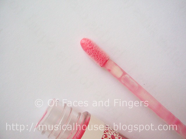
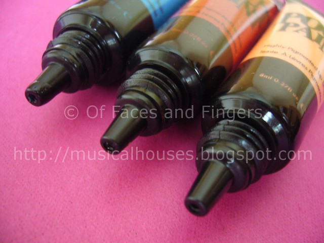
The glosses come packaged in a plastic tube, with a doe-foot wand applicator. That's not anything particularly unusual, but doe-foot just happens to be my favourite type of gloss applicator.

Canmake Candy Wrap Lip 2


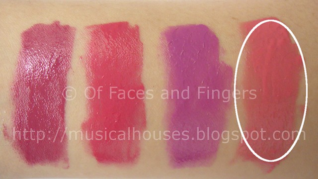
Here are swatches of the Candy Wrap Lip range. As you can see from the swatches below, all the lipglosses have this jelly-like, transluscent finish that's very shiny. Just like candy!

Canmake Candy Wrap Lip Swatches


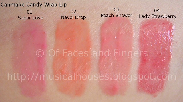
01 Sugar Love is a pale, pastel neutral pink.
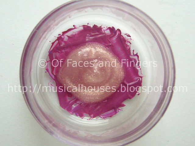
02 Navel Orange is a pale orange with a hint of pink.
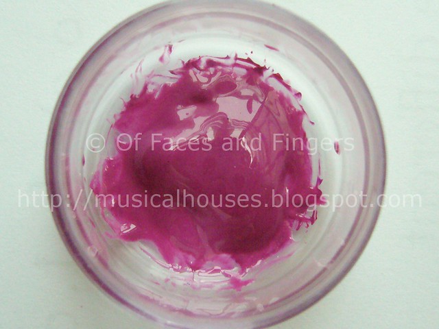
03 Peach Shower is a peach-coral shade that isn't actually very peach or orange.
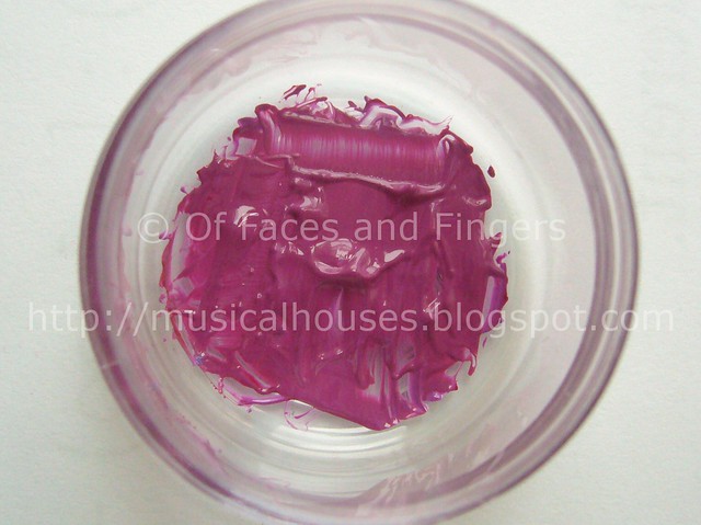
04 Lady Strawberry is a juicy sheer red.

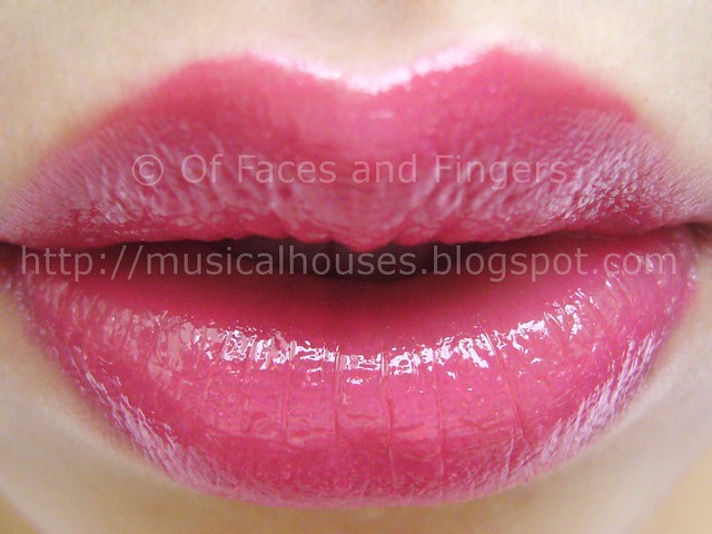
And of course, I know you're dying to see how the Candy Wrap Lip glosses look on the lips, so here you go!

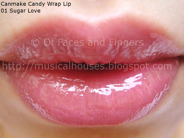
First, we have 01 Sugar Love. On my lips, it registers as a shiny pale pink nude. Very useful if you like shiny nude lips - it's a good nude in that it tones down your lip colour, but because it's transluscent, some of your natural lip colour still shows through, avoiding that dreaded "corpse nude lips" look.

Canmake Candy Wrap Lip Sugar Love 01


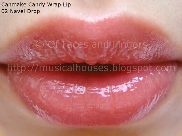
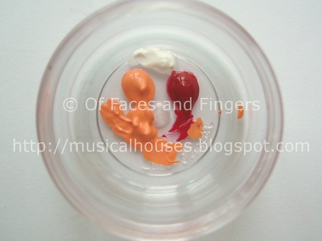
Next is 02 Navel Orange. Navel Orange - I have no idea what that name is supposed to mean, but the colour is pretty lovely nonetheless. Although I didn't think I would like it, because it seemed quite orange in the tube, it actually registers as more of a very pale caramel nude on me, quite wearable and quite pleasant to look at. Also has that transluscent, squishy, shiny finish.

Canmake Candy Wrap Lip Navel Orange 02


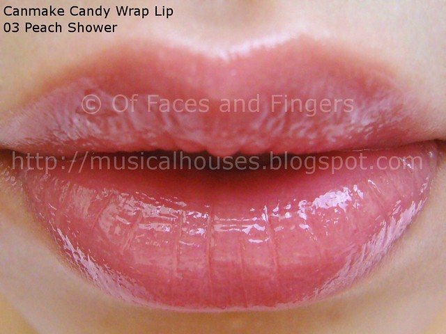
03 Peach Shower isn't as peach as the name makes it sound - in fact, to my eye, it's more of a pale coral-pink than anything else, both in the tube, as well as in swatches, both on my arm as well as on my lip. It's a pale colour, but isn't exactly a nude shade - it has a tinge more colour than that.

Canmake Candy Wrap Lip Peach Shower 03


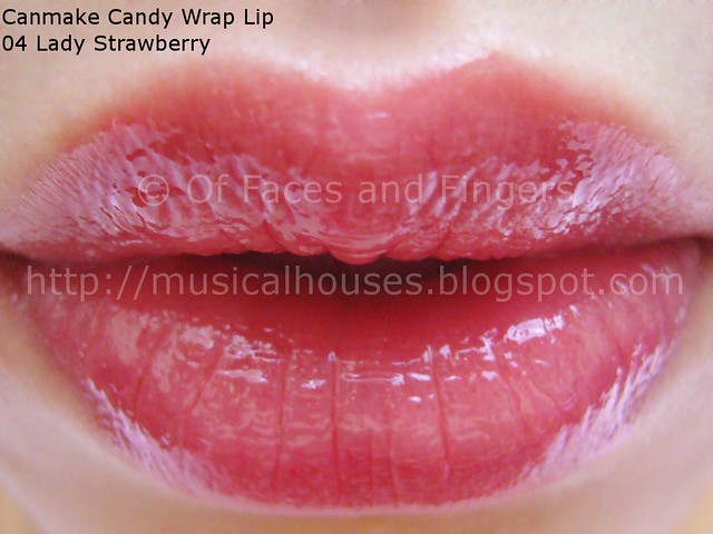
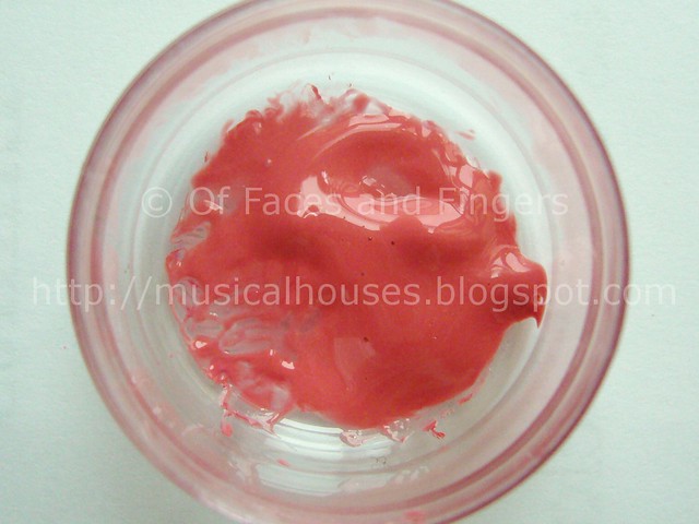
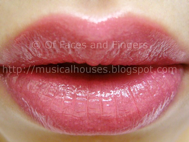
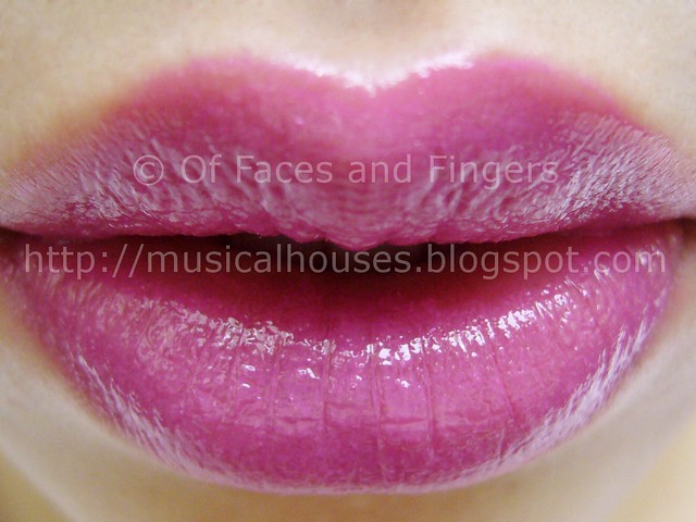
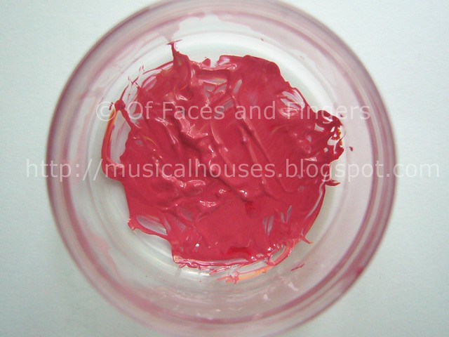
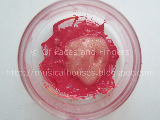
Last of the lot, we have 04 Lady Strawberry. Now, you know I love a sheer, juicy, succulent looking red lipgloss, so you'll know that this shade is definitely right up my alley. In fact, Lady Strawberry is probably my favourite of the bunch, because it really has that juicy, candy look and feel to it. I like it - it can be sheered on for a very wearable red lip, or you could layer it a little for slightly more colour. It's still pretty sheer, though, so you don't have to worry about looking like you're wearing a screaming red lip.

Canmake Candy Wrap Lip Lady Strawberry 04


All in all, I quite like these, and I feel that they really do feel, smell, and look like candy. I also like the selection of colours, and feel that they fit in with the candy theme very well. My only gripe with the lipglosses is that they feel a bit sticky, but at least they don't dry out my lips. If you're interested in pretty, girly shades of sheer lipgloss in cutesy packaging, the Candy Wrap Lip is definitely worth a try! These will be launching in Singapore in November this year, and I'm sure they'll be popular - to me, the Candy Wrap Lip line is definitely one of the standouts of Canmake's offerings this year.

(Product was sent for review. Review is my complete and honest opinion. I am not affiliated with/compensated by the company.)

MUA Nail Quake Shatter Polish Swatches: Quiver, Shiver, Shockwaves

Wednesday, August 17, 2011

5 comments
Shatter polish now comes in colour - and without the exorbitant price tag, or the crap-it's-only-available-in-the-USA headache! Superdrug MUA has now launched six (yes, six!) awesome shades of Nail Quakes, and I'm absolutely shattered (I know, so lame)! The first three, which I showcased yesterday, were great polishes, but the colours were largely already available on the market (black and silver shatter? Been there, done that). So this batch is definitely much more interesting to me - all colours, and not a single boring shade in sight!


The shades here are all cream finish - no foils (like the silver shatter polish) or interesting finishes. But they definitely bring in some colour to your nails - on the cheap, too! These come in Shiver, a peach-coral shade, Shockwaves, a red shade, and Quiver, a cobalt blue. All the names are earthquake theme - I guess that's why they're called Nail Quakes!

mua nail quake shatter polish 1


L - R: Shiver, Shockwaves, Quiver

I'm sure you don't want me blathering on about how awesome these shades are, so without further ado, here are swatches of the Nail Quakes!

First up we have Shiver. This is a coral-looking peach in the bottle, but on my finger it looks a bit more pinky-peach. It was the hardest of the lot to apply - for some reason it didn't seem to want to cooperate with the polish underneath. Perhaps it was because I was using one of the China Glaze Khromes, which can be tricky to layer with (if you've tried konading on top of them, you'll know what I mean). Still, it went on nice and thin, instead of thick and goopy like most shatter polishes, so I'm not complaining.

MUA Nail Quake Shiver Shatter Polish


Next up, we have Shockwaves, a red. Mmm, red shatter polish. Just imagine the possibilities. Red over black, red over white, red over silver, red over anything! This one was also easy to apply, coming out in thin instead of thick coats, and more fluid than some other brands. Because it tends to apply thin instead of thick, it tends to crack into longer, thinner, pieces, instead of shorter, square-shaped pieces, which I rather like.

MUA Nail Quake Shockwaves Shatter Polish


Lastly, but definitely not least, we have Quiver, a colbalt blue. This one also applies fluidly and thinly, and thus doesn't look as dark as it appears to be in the bottle. It's actuallyi more of a medium blue on. I really like this one - blue is definitely another colour where the possibilities are endless.

MUA Nail Quake Quiver shatter polish


All in all, I can't actually find anything I don't like about the MUA Nail Quakes. They apply well, aren't as prone to being dried up or goopy unlike other (sometimes more expensive) brands, and come in a wide variety of colours to shatter yourself into shatter nirvana! The only downside I can think of is that because these apply in thin coats, rather than thick coats, they aren't as opaque as some other brands, although they are by no means sheer, as the photos attest. If you're looking for cheap and good quality shatter polishes, I definitely recommend the MUA Nail Quakes.

(Product was sent for review. Review is my complete and honest opinion. I am not affiliated with/compensated by the company.)

MUA Nail Quake Shatter Polish Swatches: Jailbreak, Shattered Ice, Broken Arrow

Monday, August 15, 2011

9 comments
Superdrug MUA has come out with a whole range of colours for their new Shatter Polishes! As a huge shatter fan, I'm so excited. They have not one, not two, not three, but SIX colours of shatter polish! How exciting is that!

I'm featuring three of the shatter polishes today, and three more the next time. There's just so much shatter goodness that it simply won't fit into one post!


Here is a closer look at the MUA Shatter Polishes below. There is a shimmery deep royal purple, Broken Arrow, a silver, Shattered Ice, and a black, Jailbreak. These come in tiny little bottles that are slightly smaller than your average nail polish bottle - think along the lines of the Rimmel 60 Second Nail Polish range, and you've got the size about right. Still, for the affordable price, these still make good value for money.

MUA Shatter Polishes


First up, let's look at Jailbreak, the black. This is just plain, pure black - not very interesting as far as colour goes, and of course black shatter polish has been done by a gazillion brands. The good thing about MUA's Jailbreak, though, is that it's not thick or goopy in texture. It's actually very thin and fluid, and thus has a tendency to crack into finer, thinner pieces, although you could layer it on more thickly for bigger shatter pieces. I quite like this - it has the visual effect of looking shredded into thin, long pieces, rather than crackling into big fat chunks.

MUA Shatter Polish Jailbreak


Next, we have Shattered Ice. Like Jailbreak, Shattered Ice is also a colour that
other brands have done before. But unlike other shatter polishes I've seen before, Shattered Ice also has a very thin, fluid texture that makes it easier to apply than some of the thicker types. This one doesn't "shred" as much as Jailbreak, but if applied thinly it would produce a similar effect. I quite like Shattered Ice, the silver finish is really cool and it twinkles a little in the sun.

MUA Shatter Polish Shattered Ice


Last, but not least, we have Broken Arrow. I'm not sure why the polish is called Broken Arrow - to me, that gorgeous shade of shimmery royal purple doesn't resemble an arrow or anything being broken, but it's a lovely shade all the same. Like the other shatter polishes, the texture of Broken Arrow is also thin, fluid, and easy to apply, and the polish also shatters vertically, giving it the same shredded effect. I really love Broken Arrow, and out of all of today's shades, this is probably my favourite, simply because I love purple.

MUA Shatter Polish Broken Arrow


For the price of the MUA Shatter Polishes, I've got to admit I'm very impressed by the quality. If you're looking for a range of shatter polishes that is easy to apply, come in a variety of colours, and is of good quaity, these are definitely worth looking at. These colours are so value for money, there's nothing stopping you from getting one of every colour!

(Product was sent for review. Review is my complete and honest opinion. I am not affiliated with/compensated by the company.)

Linkwithin

Related Posts Plugin for WordPress, Blogger...