Barry M Dazzle Dusts Swatches Part 5 of 6!

Friday, April 30, 2010

4 comments
Like yesterday, today's Barry M Dazzle Dust swatches actually feature some colours that are a lot more demure than Parts 1-3. Some of these are actually pretty work-appropriate, and I love the taupes featured here.

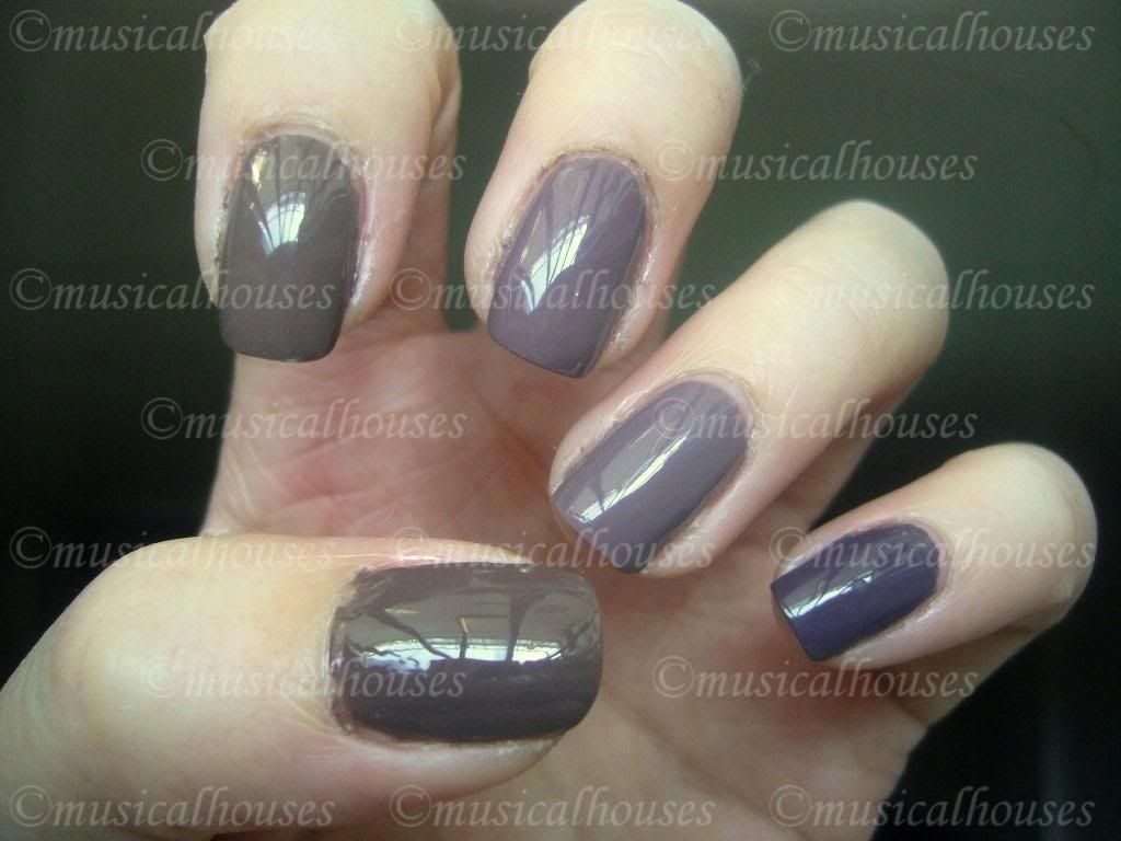
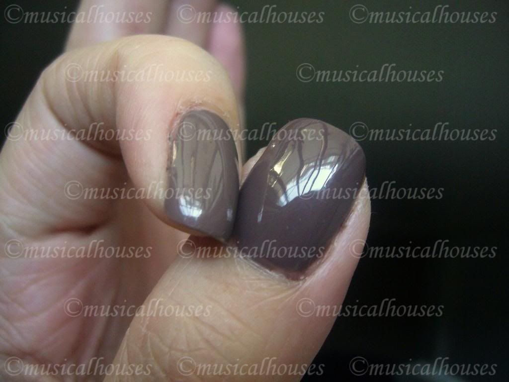
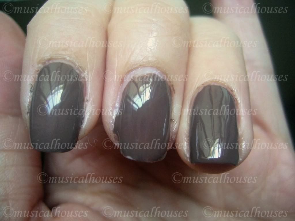
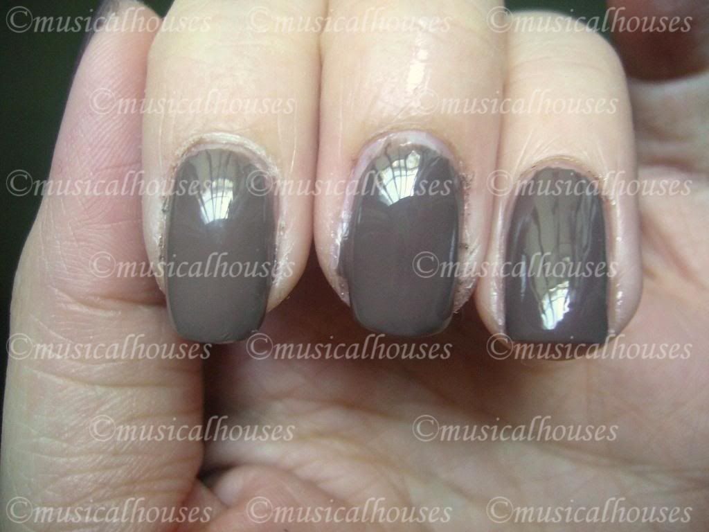
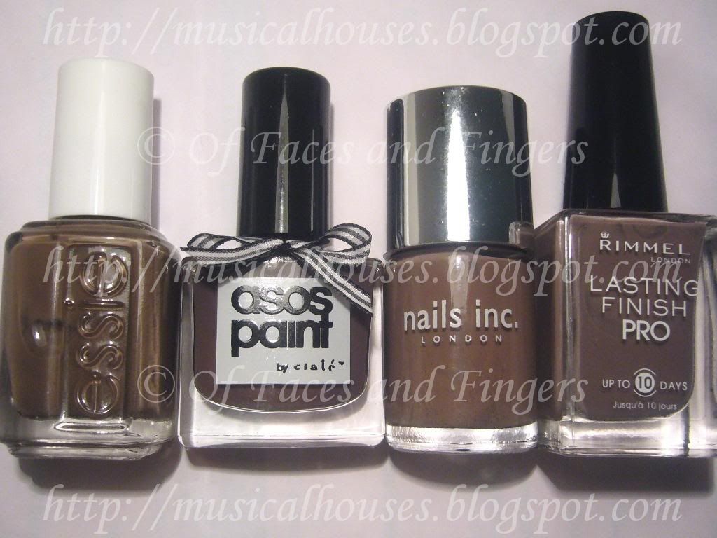
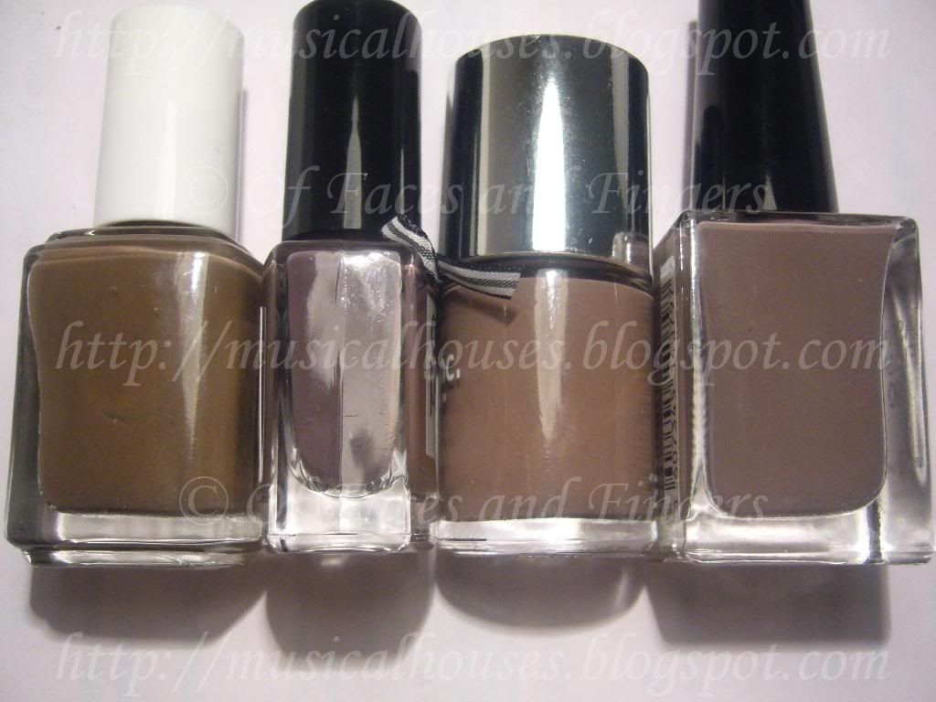
Yes you heared me right! TAUPE ALERT!

Anyway, I bet you want me to shut up so you can see pictures of the taupes, right? Here you go, swatches:

Barry M Dazzle Dust Swatches

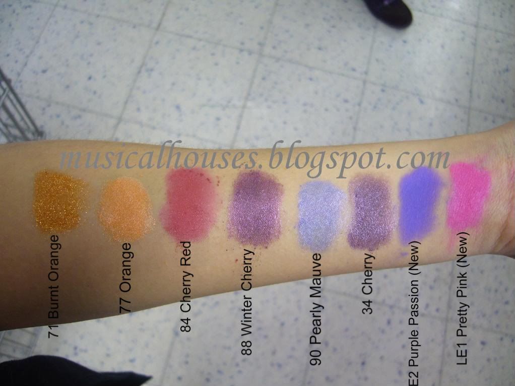
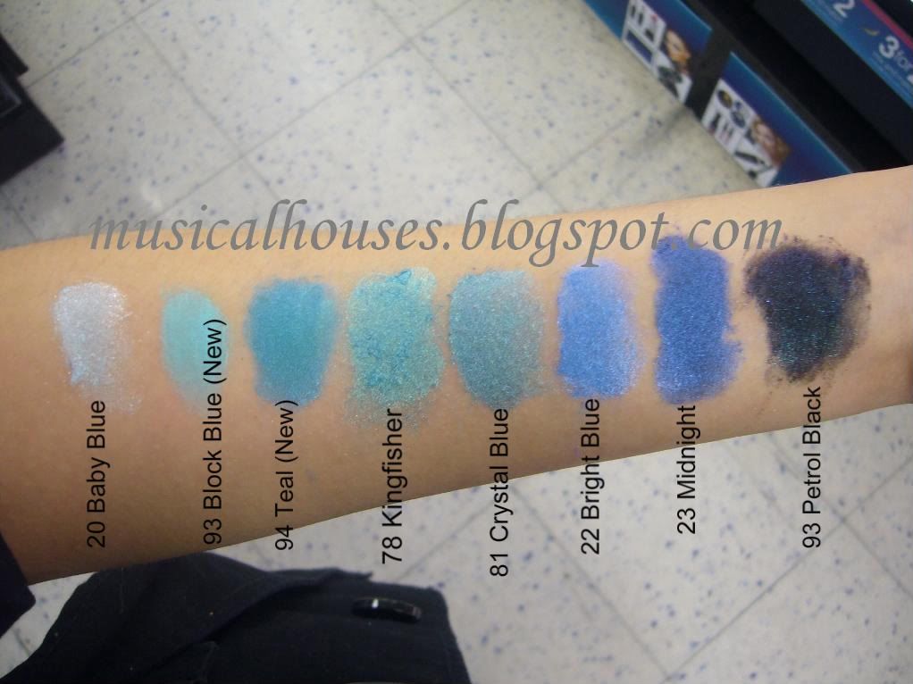
L-R: Yellow 76, Gold 96, Gold Iridiscent 27, Tan 39, Bronze 44, Old Gold 24, Mushroom 51, Oyester Grey 89

Yellow 76 is a bright primary yellow with big bits of sparkly glitter.

Gold 96 is also a bright primary yellow, better in pigmentation than Yellow 76 and less in glitter. It does have glitter, but the glitter bits are smaller and finer.

Gold Iridiscent 27 reminds me a lot of MAC's Vanilla pigment. I need to get out my MAC Vanilla pigment to check if they are dupes or not one day. I think the shimmer in Gold Irisdiscent might be a tad grainier and less fine though, and Gold Irisdiscent also doesn't have the pink flash that MAC's Vanilla has (which may make it better than the MAC version or not, depending on your preferences). Anyway, I like this colour, and I think it's a great highlighting shade for most people.

Tan 39 is very pretty, and work appropriate (if you don't mind shimmer), and not at all tan. I'd call it pink with some beige. This is a great lid colour for cool-toned girls who want to wear pink but don't want to wear neon fluorescent pink.

Bronze 44 is a pretty bronze that isn't harsh and too orangey. I actually quite like it. This one is also work appropriate, if you don't mind the shimmer.

Old Gold 24 is another one of my favourite Barry M Dazzle Dusts. It's an antique gold shade that's neither too warm or too cool. I love it. You know how hard it is to find a gold shade that isn't too warm? This is great, it isn't gold-gold though, because it isn't yellow enough. But it's a browned gold that's pretty in its own right.

Mushroom 51 is - TAUPE ALERT! TAUPE ALERT! TAUPE ALERT! - oh sorry where was I now? Oh yes. Mushroom is a very pretty, albeit glittery, TAUPE! Now you know I love my neutrals, so you know I'll LOVE this. *Starts singing Lady Gaga* Love, love, love, I want your love! Okay, but anyway. This is taupe, and it's pretty. It's got equal parts brown, grey, and purple (maybe more purple than the other two colours), so it leans a little to the cool side, but I think it's neutral enough for most people, if you want a purply taupe. This one is also makeup that's suitable for work.

Oyester Grey 89 is not taupe, but it's also pure gorgeousness. I LOVE this one. It's not quite taupe, because it doesn't really have that much brown in it, but it's still absolutely lovely. It's purple and grey combined, with a pink duochrome. This one is also very finely textured because it doesn't have any big bits of glitter (although it does have a pearly shimmer finish). I love this one, and dare I say, I love this one more than Mushroom because it has a better texture.

So that's it for today! Tomorrow we'll be doing the last of the Dazzle Dust swatches - but I still have more Barry M swatches, because I'll be swatching the Fine Glitter Dusts as well. So I hope you guys don't get sick of Barry M swatches :X

Jergens Skin and Bare It Online Show: Win a Jergens Hand Cream Set

Wednesday, April 28, 2010

15 comments
(Picture from Jergens)


Jergens has launched an online show, called Skin and Bear It. It consists of five webisodes on Channel 4 (accessible HERE) and the Jergens UK site (accessible HERE). This series is hosted by Anna Richardson, and in each webisode they get two real people with contrasting skin regimes to switch their skincare routines for 3 weeks, and see the results. They also give a simple recipe for DIY skincare. It's pretty interesting watching. In the first episode, they got Jo, a girl who's into all-natural, all-organic skin products, to swap with Charlene, a girl who barely has time for her not-so-natural beauty regime.

Check it out, it's available HERE or HERE for your viewing pleasure.

In tandem with the launch of their new show, Jergens has offered to do a giveaway! One reader of OFAF will win a set of their new hand cream, pictured below:

Photo provided by Jergens


Awesome! What do I have to do to win?
1. Be a follower of this blog
2. Post a comment below with your email address, so I can contact you if you win.
3. Please note that this giveaway is only open to UK residents - sorry guys, I don't love the non-UK people any less, but those are the rules :X

Done! Anything else I can do?
Sure! You can do any of the following:
1. Follow me on twitter: HERE and RT about this giveaway, leave a link
2. Add me to your blogroll, leave a link
3. Post about this giveaway, leave a link

When does this giveaway end?
This giveaway ends on 14th May, so hurry!

The giveaway prizes are sponsored by the company. I was not provided any form of compensation for writing this article.

Barry M Dazzle Dust Swatches Part 4 of 6!

Tuesday, April 27, 2010

5 comments
We have more Barry M Dazzle Dust swatches today, and this time, they're all neutrals! While it's true that most of the Dazzle Dust shades tend to be loud bright colours, the selection of neutrals is also pretty decent. Today's swatches feature browns, greys, and a couple of blacks. The colours are basic, but useful. Most of these are actually really work-friendly, too.

Here are swatches:

Barry M Dazzle Dust Swatches

L-R: Pale Silver 9, Grey 10, Rust 25, Chocolate 53, Dark Chocolate 97, Silver 91, Charcoal 11, Black 66

Pale Silver 9 is a nice basic colour, but it isn't really silver. It's sort of white-grey. It has visible glitter, too.

Grey 10 is a straight up basic grey.

Rust 25 is...I have no idea. I'd describe it more as an antique gold colour, because I've always thought rust was reddish? This one has no red. It's a gold-brown with shimmer. One of my favourites of the bunch, this colour is pretty universal since it's a good neutral, and leans neither cool nor warm.

Chocolate 53 is another shimmery neutral, this time a dark chocolate brown. A tad boring, maybe, but a good basic colour.

Dark Chocolate 97 isn't quite brown, but it's more of a black on me. It swatched darker than in the pot. In the pot it looks like a deep, deep brown. On me it looks black, with shimmer. I was a little disappointed when I swatched this.

Silver 91 is a midtone grey with silver sparkle. Unlike most of the other colours, which have a more subtle shimmer (subtle as far as Barry M Dazzle Dusts go, anyway) this isn't shimmer, it's glitter, and it's visible.

Charcoal 11 is a dark dark grey, so dark that it looks more like black with a tinge of blue. I think this colour is pretty cool, though.

Black 66 is a basic black, with some shimmer.

Swatching is hard work. I swatched all of the Barry M Dazzle Dusts at one go, so I vividly remember my arm protesting at this point, LOL. I was swatching, then wiping off all the eyeshadows with a makeup wipe, then writing down the colour names, and then swatching again. I remember the skin on my arm turning red (through excessive scrubbing with the wipe) about halfway through the Dazzle Dust swatches, LOL. But well, you know, I'm young and defiant, and so I continued anyway, which is why we have more swatches for the next time. LOL.

Barry M Dazzle Dust Swatches Part 3 of 6!

Sunday, April 25, 2010

7 comments
Today we are on part 3 of 6 of our Barry M Dazzle Dust swatches! Today's swatches are of a varying bunch of colours, featuring orange, reds and some purples. There's also the appearance of a matte Dazzle Dust, the comparatively rare creature.

Here are swatches. Some of the colours were marked "New" by the display, so I just dutifully copied that information down, although I think they've been around for a bit:

Barry M Dazzle Dust Swatches

L-R: Burnt Orange 71, Orange 77, Cherry Red 84, Winter Cherry 88, Pearly Mauve 90, Cherry 34, Purple Passion LE2 (New), Pretty Pink LE1 (New)

Burnt Orange 71 is a glittery bright orange. It's a great colour if you like something bright with visible glitter. It really pops on my arm.

Orange 77 is also orange, but a bit paler. This one has no visible glitter, but a smooth shiny frosty, pearly finish instead.

Cherry Red 84 is a red that leans more to the cool side. It does sort of remind me of cherries. It also has a shiny frosty finish, although the finish is a lot more toned down than Orange 77.

Winter Cherry 88 is a beautiful colour. It's a purple, but with a red tone to it, and a shimmery pearly finish that makes it glow. I like this colour.

Pearly Mauve 90 isn't quite mauve, but it's a very pretty violet or periwinkle colour. It's pretty though, and yes it does have a pearly frosty sort of finish that's glowy.

Cherry 34 is similar to Cherry Red 84, but it has less red. This one is more blue-based, but it has the same finish as Cherry Red.

Purple Passion LE2 is pretty cool - it's neon, and it's matte. Neon matte violet. 'Nuff said.

Pretty Pink LE1 is a shimmery hot pink that leans cool - it's a pink with good amounts of blue in it. It's also got that shimmery, pearly finish that's similar to Winter Cherry and Pearly Mauve, just more toned down.

Whew! We're halfway through our massive Barry M swatchfest! I hope you guys aren't getting bored yet, because we still have 3 more instalments to go! *Imagines follower count dropping like flies* Oops, LOL. But I promise for the neutral-lovers there are a couple of good colours coming up, so expect a change :)

Chanel Particuliere Dupes: Do They Exist? Comparison Swatches

Friday, April 23, 2010

12 comments
I never bought Chanel's famed nail polish, Particuliere. I just couldn't imagine spending 16GBP on a polish, especially when Orlys, Nubars, OPI, and China Glazes go for less. But I was curious to know if there was a dupe, and to see for myself if any of the other taupe-brown-purple polishes were close enough. So I borrowed my friend's bottle of Particuliere, and made a few swatches. Mind you, these are very messy swatches, because I wanted to return Particuliere to her immediately (I'd feel bad hogging a 16GBP bottle of polish!), so I didn't really have time to be as neat as I wanted to be, and we all know haste makes a mess of nails!

First up of course, are bottle pictures.

Asos Paints by Ciate Sienna, Rimmel Steel Grey, Nails Inc Jermyn Street, Chanel Particuliere, Essie Mink Muffs

L-R: Asos Paints by Ciate Sienna, Rimmel Steel Grey, Nails Inc Jermyn Street, Chanel Particuliere, Essie Mink Muffs.

Nothing seems to be an outright dupe for Particuliere. Essie Mink Muffs does look similar, although deeper, in the bottle.

And here's how they fared in swatches. Once again, please excuse the terrible state of cuticles and my messy swatches. Like I said, they were done in a hurry because I wanted to return Particuliere ASAP. The swatches show two coats of each:

Essie Mink Muffs, Chanel Particuliere, Nails Inc Jermyn Street, Rimmel Steel Grey, Asos Paints by Ciate Sienna

L-R (Thumb to Pinky): Essie Mink Muffs, Chanel Particuliere, Nails Inc Jermyn Street, Rimmel Steel Grey, Asos Paints by Ciate Sienna

Application-wise, I had no complaints about any of the colours. They all applied like butter, although the Nails Inc, Essie, and Chanel were better than the other two. And as you can see, nothing is quite a dupe for anything else.

I know Essie Mink Muffs and Chanel Particuliere look like dupes for each other in this photo, but in reality they aren't that close. The Essie is a little darker, and a little more brown than the Chanel. I don't think most people would notice, but if you're a nail fanatic like me, if it's not an exact dupe, it isn't a dupe! :P

Here's a photo that exaggerates the differences between the two. Essie Mink Muffs is on my thumb, while Chanel Particuliere is on my pointer finger. The differences aren't as massive as they are in this photo (stupid camera), but you get the idea:

Essie Mink Muffs, Chanel Particuliere

L-R: Chanel Particuliere, Essie Mink Muffs

And I remembered reading somewhere that Essie Mink Muffs is a dupe for Chanel Particuliere, if you lighten it by wearing it over white. So of course I HAD to try that. So I applied Essie Mink Muffs over GOSH Snow (a sheer white), and here are the results:

Chanel Particuliere Essie Mink Muffs

L-R: Chanel Particuliere, 1 Coat Essie Mink Muffs over 1 Coat GOSH Snow, Essie Mink Muffs

Similar, but no dice. It's a tad lighter than Particuliere. The purple in Mink Muffs really shows up when you layer it over white. It's really cool.

So, I added on another thin coat of Mink Muffs on top of GOSH Snow, and the results were better:

Chanel Particuliere Essie Mink Muffs

L-R: Chanel Particuliere, 2 Coats Essie Mink Muffs over 1 Coat GOSH Snow, Essie Mink Muffs

As you can see, it's close, but not identical. Mink Muffs is now the same depth of colour, but just a tad browner than Chanel Particuliere, while Particuliere is a hair more grey than it's Essie counterpart. I think someone might be able to franken a dupe of Particuliere using Mink Muffs, white, and something to make it more grey.

So, which of these should you choose, if you only had to go for one of them? All the colours applied well, so your choice would depend on your colour preferences, and your skin undertones. Although all these colours are pretty neutral, in general, colours with a stronger purple/grey tinge to them look better on cooler skintones, while colours with more brown tend to look better on warmer skintones. And it also depends on your preference - do you want more grey, brown or purple in your colour? If you want more brown, Essie Mink Muffs or Chanel Particuliere are good choices. If you want something that's more grey, Rimmel Steel Grey is a good choice. And if you want something that leans more purple, Nails Inc Jermyn Street and Asos by Ciate Sienna are your best bets.

Barry M Dazzle Dust Swatches Part 2 of 6!

Thursday, April 22, 2010

4 comments
Today's Barry M Dazzle Dust swatches focus on the blues. For the unintiated, Barry M is a very popular drugstore brand that has even found a following across the Atlantic, in the great ol' USA, and the Dazzle Dusts are one of their most popular items. They have a lot of colours, which is why the swatches are going to take up 6 entire posts...I hope this doesn't bore you!

The Dazzle Dusts in particular are cheap, cheerful, and have some really kickass colours. Most of them also have some form of glitter or frost finish, so they may not be the best choice of loose eyeshadows for those who are looking for something completely matte. Today's swatches feature colours with more muted glitter.

Here are swatches. The display labelled some of the colours as "New" although they've been around for awhile, but I've just included that information for anyone who might need it:

Barry M Dazzle Dust Swatches

L - R: Baby Blue 20, Block Blue 93 (New), Teal 94 (New), Kingfisher 78, Crystal Blue 81, Bright Blue 22, Midnight 23, Petrol Black 93

Bably Blue 20 is a very very light blue - so much that it looks to me to be more of a blue-tinged white than anything else. This one has small white glitter bits.

Block Blue 93 (New) is a pale blue that still packs a punch - it's a pale colour, but it isn't a wimpy pastel, as it's quite bright. This one is one of the more matte colours, so it's great for anyone who doesn't like glitter.

Teal 94 (New) is a bright blue with just a smidgen of green. It isn't my idea of teal, although it is a pretty colour. It has some fine shimmer.

Kingfisher 78 is a hybrid of Teal 94 and Block Blue 93. It has the colour base of Block Blue 93, but mixed with the punch of Teal 94, and it a frosty glitter finish that is all it's own.

Crystal Blue 81 is like Kingfisher 78, but with the base colour of Teal 94 instead of Block Blue 93.

Bright Blue 22 is blue, with a tinge of violet in it. Unlike the other blues, with had some green in them, this one has some purple in it instead, making it a cooler colour than the previous shades discussed. Bright Blue has a similar finish to Crystal Blue and Kingfisher.

Midnight 23 is a cobalt blue, not too dark or light, and it has a frosty shimmery finish similar to Bright Blue, Crystal blue, and Kingfisher.

Petrol Black 93 is absolutely gorgeous. It's like blue stars in a night sky! I love it. Small blue glitter suspended in a black matte base. The glitter really pops in this colour. The thing I like about this colour is that the glitter is relatively fine, too. It's not as chunky as I expected.

Well, that's it for today, and we'll be moving on to Part 3 of 6 of the Barry M Dazzle Dust Swatches next! :)

Haul Post: Illamasqua Beg, Models Own and Why I Didn't Buy Chanel Particuliere

Wednesday, April 21, 2010

8 comments
I know we're in the middle of swatching our Barry M Dazzle Dusts, but I just had to take out a bit of time to show off my haul - we'll be back to the Dazzle Dusts in my next post, promise!

ASOS had a sale and I bought makeup and nail polish, and only makeup and nail polish. I don't know why I have that problem. I never buy clothes, rarely buy shoes, occasionally buy bags (my other weakness), but give me a sale and throw in some makeup and I'll be all over it.

Anyway, this means I get to show off my haul, and because I love you guys (aww!), I included a couple of bottle comparison pictures. I know they're bottle comparison pictures and not swatches, but I promise I'll get around to the swatching soon!

But first, the haul.

I got my first Illamasqua blush ever, and it's in the colour Beg. It's a pretty, slightly deep dusty rose colour, that is more neutral than anything else. At some point in the future I will do swatches and possibly an FOTD and a full review, but you'll have to go on this for now:

Illamasqua Beg Blush

I know, it's a beautiful thing right?!

Then, because it was also really cheap, I bought a duo set of nail polishes, consisting of two Asos by Ciate colours. This particular set has Sienna, a purply-taupe-grey-brown creme which is the type of nail colour that is right up my alley, and Alexa, a navy blue creme. Obviously you can tell I bought the set just for Sienna:

Asos Ciate Alexa Sienna

And I also bought a Models Own It set, because it was just 2.50GBP. How could I resist? It had a nail buffer (which I doubt I'll use), a lipgloss and a nail polish:


Ok, Ok, so on to the comparison pics. I do intend to swatch and review these and make them more extensive, but here is why I didn't buy Chanel Particuliere, although purply-brown-grey nail colours are just my thing. *clears throat* I already have too many taupey-purply-brown-grey nail colours. I know Particuliere may not be a dupe for any of them, but I feel like I may have too many shades in the same colour family, as it is.

essie mink muffs ciate sienna nails inc jermyn street rimmel steel grey

L-R: Essie Mink Muffs, ASOS by Ciate Sienna, Nails Inc Jermyn Street, Rimmel Steel Grey

I know, that's not a lot by nail fanatic standards, but by civilian standards, that's way too many! :X And what's more, these are just the ones I have here. There are a couple that I don't have on me right now, like $OPI Metro Chic.

To make the comparisons easier to see, I've turned the bottles on their sides as well, so you can look at them:

Essie Mink Muffs, ASOS by Ciate Sienna, Nails Inc Jermyn Street, Rimmel Steel Grey

L-R: Essie Mink Muffs, ASOS by Ciate Sienna, Nails Inc Jermyn Street, Rimmel Steel Grey

See, I tell you, I can own all of them because they're NOT identical, not even in the bottle, even if they're all close. Honestly, this makes me vacilliate a lot on Chanel Particuliere, because chances are, I know Particuliere won't be an exact dupe for any of these, but it'll probably be pretty close. And while I abide by the if-it-isn't-an-exact-dupe-it's-a-justified-buy rule of nail fanatics, I also know that 99.99% of people aren't going to be able to tell the difference. Add that to the fact that Chanels here retail for 16GBP (and yes, I do know they're more expensive elsewhere), and you get a very indecisive girl.

That said, I am happy with what I have, and here's how they're different. ASOS by Ciate Sienna is the most purple, while Essie Mink Muffs is the most brown, and Rimmel Steel Grey has strong hints of purple and grey, while Nails Inc Jermyn Street is an equal mix of all three. If you're just going for one, I guess which colour you'd be picking is a matter of preference, and skin undertone. I think they're all neutral enough to be worn by most people, but if you really want to split hairs, in general, some purples and greys can look a little odd on girls who are really warmtoned, so if you're really warm, you might want to try Essie Mink Muffs and Nails Inc Jermyn Street, which are more brown. If you're cooltoned and you love your purples, Asos by Ciate Sienna is a good pick, while if you want something a tad more grey, Rimmel Steel Grey (which is only partly grey) is perhaps best.

Alright, showing-off time over! We'll be back to the Barry M Dazzle Dusts in my next post. Thanks for humouring me guys!

Barry M Dazzle Dust Swatches Part 1 of 6!

Tuesday, April 20, 2010

6 comments
Today we'll be swatching the entire series of Barry M Dazzle Dusts! And since there are a lot of colours, we'll be doing it in 6 parts. Barry M is, of course, a much-acclaimed UK-based drugstore brand that has fans in the US as well. And their Dazzle Dusts are one of their star products in the brand's lineup, along with their Lip Paints (which, by the way, were swatched and reviewed extensively by yours truly. The roundup post, with links to all the other posts, is HERE).

Personally, I really like the Dazzle Dusts, and I can see why they have such a cult following. They're value for money, and a good alternative to MAC pigments - in fact, there are some colours that are pretty similar to some rather popular MAC pigments, like Vanilla Pigment. But it is my experience that although they're cheaper, they don't quite last as long as MAC - after awhile they do fade, but just a tad. But I really don't have anything to complain about, especially given the price. I think this is good as drugstore pigments are ever going to get, and I absolutely love the fact that they have a wide range of colours. There really is something for everyone, whether you like glitter or not, whether you like neutrals or brights...And for ol' boring me, who loves taupes, I'm pleased to report that there are indeed some killer taupes!

The Barry M Dazzle Dusts also have a range of finishes. There are few, if any matte ones, so most, if not all, the shades have some form of glitter. The glitter varies, however. In some colours it takes the form of big bits, in some it's more of a fine shimmer, and in others it's a frosty finish. Again, there's something for everyone, as long as you're not glitter or shimmer averse.

So without further ado, here are the first batch of swatches for your viewing pleasure:

Barry M Dazzle Dusts

L-R: Silver Irisdescent 8, Lime 75, Parrot Green 95, Aqua Gold 92, Mint 82, Emerald 72, Khaki 14, Aqua 15

Silver Irisdescent 8 isn't really silver, or irisdescent. It's more like a white frosty glitter. But I guess White Frost isn't as exciting a name as Silver Irisdescent. Nevertheless, this basic shade will make a good brow highlighter for anyone wanting one, especially for pale girls who feel that all the brow highlight shades tend to fade into their own skin.

Lime 75 is a bright lime green with glitter bits. It's a yellowed green, which makes it lean more warm than cool. It's a close relative of Parrot Green 95, but they aren't identical.

Parrot Green 95 is another green, and this one actually does kind of remind me of parrots! It's similar to Lime 75, except that Lime has bigger bits of glitter than Parrot Green, and Parrot Green is a bit more green and less yellow than Lime, and just a shade more intense.

Aqua Gold 92 is a beautiful turquoise shade with a little bit of gold duochrome. You can see the duochrome effect in the edges of my swatch. The shimmer in this one is also really fine, unlike it's sister shade, Mint 82.

Mint 82 has a similar base shade to Aqua Gold 92, but it has much bigger bits of glitter, and no gold duochrome. As you can see in my swatch, the glitter is actually visible to the eye. It's also a bit brighter and less subdued than Aqua Gold 92.

Emerald 72 is a beautiful jewelled forest green that does kind of look like what I imagine an emerald might look like. It also has a pretty gold duochrome and a fine shimmer to it.

Khaki 14 is Emerald 72's close sister, but they aren't twins. It's darker, more blue-based (and thus cooler toned), and also doesn't have the gold duochrome. It does, however, also have the same fine, slightly frosty shimmer Emerald 72 has.

Aqua 15 is a hybrid between Mint 82 and Aqua Gold 92 - it's sort of like the base colour of Mint with the duochrome effect and frosty shimmer of Aqua Gold. Although I have to qualify that the duochrome effect is barely there.

Well that's it for Part One! Part Two will be up the next time! :)

Urban Decay on Hautelook Today!

Leave a comment
My US ladies always get the good deals! Sometimes life isn't fair :X =Pouts= Anyway, for my US girls across the pond, Urban Decay is on Hautelook today! Sale is only open to members, so CLICK HERE to check it out!

I am not affiliated with, paid or compensated in anyway by any of the companies mentioned to release this information, nor do I receive any freebies from either company to post about it here. I release it because I think it might be useful to my readers. The sign up link provided is my own members sign up link that is available to all members upon signup, and does not award me any benefit outside of their usual membership programme.

Diamond Cosmetics Chainmail Charm and Orly Foil FX Shine KOTD

Sunday, April 18, 2010

6 comments
There are times when I really hate my photo-taking skills, my camera, and my crappy looking nails, because on the rare times when I really like a KOTD, my photos never ever seem to do it justice. Today's KOTD, using a holographic polish (OOOHHHH HOLOS!) and an Orly Foil FX, is one case in point.

For the base I used Diamond Cosmetics Chainmail Charm, also known in some circles as Chacha (you know, CHAinmail CHArm?). It's a beautiful black holo, and the holographic shimmer really shines through. Unfortunately, my camera didn't seem to like the holographic goodness as much as I did:

Diamond Cosmetics Chainmail Charm

Please excuse the messiness, because that was a pre-cleanup picture (because I was going to konad over it). But the point is, that is a gorgeous holo which my camera didn't capture. I really like it, it's cool, and I love holos. Something about the colour-changing shimmer just captures me.

I could look at Chainmail Charm, but in one of my rare moments of brilliance, I thought I would konad over it, with one of the newfangled Orly Foil FXs, Shine (I've been trying to get Luxe - the gold one), using a full nail design from the Konad M78 plate.

Diamond Cosmetics Chainmail Charm Orly Foil FX Luxe

Diamond Cosmetics Chainmail Charm Orly Shine Foil FX

I know it doesn't look like much in the photo, but can I pinky promise you that it looks soooo much better in real life? Orly Shine (and the other Foil FXs I'm told) make for good konading polishes, so I wasn't disappointed to konad with this. Shine is a Foil with plenty of bling to draw attention to any dull manicure! The Orly Foil FXs have not been disappointing so far - I've got Rage and Shine, and I've been trying to go after Luxe. I love the combination of black and silver, holo and foil, and bling and more bling! I just wish my camera and my skills were better at capturing this blingy goodness.

Lusting After: Boots No7 Colour Miracle Nail Polish

Saturday, April 17, 2010

5 comments
Boots Colour Miracle Nail Polish
(Image from Boots)


Can someone tell me why I can't seem to find any of these anywhere? Are they long discontinued or unavailable in the UK, or just hard to get? I went to three separate Boots stores (and one REALLY large one) but I couldn't find any of them!

These are from Boots' No7 Colour Miracle line of nail polishes, that change colour. However, unlike colour-changing mood nail polishes (like the ones from Claire's), which change colour according to temperature, these ones are one colour throughout, and change colour only when you apply a layer of clear polish on top (like a clear topcoat). Boots claims that it is the perfect day-to-night nail polish colour, as you can wear the polish without topcoat during the day (although personally I really don't like doing that myself), and just apply a clear layer of varnish over to reveal the darker colour for night!

That's all fine and dandy, but personally, I'm thinking more along the lines of nail art than day-to-night office conformity :P Can you imagine all the exciting designs that can be done with something like this? Alright then, Boots, where have you hidden the stash of Colour Miracle polishes? Show me the goods already!

Mememe Colourama Long Lasting Cream Eyeshadow Swatches!

Friday, April 16, 2010

5 comments
I really need to apologize for the state of today's swatches, but as some of you who follow me on Twitter may know, the past few weeks have been nothing short of hectic for me. But anyway, today's swatches are from another UK drugstore brand, Mememe. They're pretty cheap, and they have some products that are quite outstanding - in particular their cheap-and-accurate dupes for Benefit's Benetint, Moonbeam and Posietint have been garnering a lot of press (note to self - swatch those sometime!). But personally, my favourites from the line are their eyeshadows, powder and cream. And today, we're looking at their Colourama Long Lasting Cream Eyeshadow.

Mememe's Colourama Cream Eyeshadows come in a tube, with a wand applicator in a doe-foot shape. Personally, I'd rather they put it in a squeeze tube because the doe foot applicator seems kind of unhygenic, but I guess you can't complain. They have 5 colours, and among them, a particularly beautiful taupe.

Mememe Colourama Long Lasting Cream Shadow Swatches

Top row L - R: 04 Sparkling Silver, 05 Liquid Bronze
Bottom row L - R: 01 Molton Brown, 02 Chiffon Rose, 03 Aruba Blue

01 Molton Brown is the beautiful taupe I was talking about. It's taupe, it's shimmery, and it's gorgeous! It's a brown taupe with silver shimmer. Very pretty. This one is also very work appropriate.

02 Chiffon Rose is a light pink colour that isn't pastel, but isn't bright pink either. If you like a wearable pink, I think this is it.

03 Aruba Blue is, as the name suggests, a bright glowy blue that reminds me of open skies.

04 Sparkling Silver isn't really a silver, so much as it is a frosty metallic white. It isn't quite a true silver (which would imply some sort of grey tinge to the colour). But this is good as a highlighter, if applied sheerly.

05 Liquid Bronze is a nice bronze with a metallic finish. It has a warm medium brown base colour, and is packed with metallic shimmer. Since this bronze is leaning to the warm side, it would probably look better on warmer-toned ladies than on cooler ones.

One of the things I noticed while swatching these is that they dry pretty quickly, so if you're using these you probably won't have all the time in the world for blending. Also, they have good pigmentation, and although the first layer of these shadows is a bit sheer, they can be easily layered for intensity without peeling or caking (as I did in my swatches). Overall, I think these are pretty good quality, particularly for the price.

Nail Polish Haul: OPI, Essie, China Glaze, and Orly!

Wednesday, April 14, 2010

12 comments
Awhile back, to reward myself for getting through a particularly stressful period of school (believe it or not, despite all my professors' assumptions about the "copious free time" we have, us grad students are actually a relatively busy bunch), I decided it was time to place an order of my lemmings. Hey, don't judge me - my groupmate bought himself a camera, so I figured it was perfectly reasonable for me to buy nail polish. And so I did. And these babies arrived all the way from the great USA, the land of cheap Chinaglaze, etailers of nail polish, and buy-1-get-1-free drugstore makeup promotions. Oh, just thinking about it makes me so jealous!

Anyway here is my amazing haul. Please pardon the crappy pictures, they were taken at night under my yellow lamplight, and I suck at using photo-editing software:


Ooh, China Glaze Khromes! I've been wanting these FOREVER for konading purposes! I got China Glaze Sci Fi, Robotika, Millenium, and 2030, in that order from left to right. I'm going crazy just imagining the konading possibilities! Oh, I also got Essie Chinchilly. Mmmmm, grey. But this is not any ordinary grey. This is grey with the slightest green tinge, so chic and unique.


Ooh holos! And duochromes! And my favourite nudey greige mushroomy colour! In order it was Orly Golden Halo (this one is supposed to be sheer though, darn), Orly Country Club Khaki (my favourite! I know I have enough greige nudes, but I can't help it...I need to collect them ALL), and OPI DS Signature and DS Extravagance. I kind of prefer Extravagance, because it has that jewelled quality to it in the base colour, but DS Signature shows more of the holographic "rainbow" in the bottle. I can't wait to try these on my nails - I just KNOW they'll be amazing!

So that's my stress-induced haul. I know I can't be the only one hauling during times of stress, and hey, I figure at least getting a few more pretties is a better way of coping with stress than smoking pot, gambling or drinking :P Yeah, yeah, I know I'm full of excuses...But I can't help it, they're all so pretty!

John Frieda Luxurious Volume Thickening Shampoo and Conditioner Review

Monday, April 12, 2010

8 comments
My hair is really fine and annoyingly little. It has no volume, and it just tends to sit on my head like a dead dog. I often have trouble with styling my hair because it's really fine, very little, and has no body. I know people say layering is the key to giving fine hair body, but layering is tricky for me since I have very little hair. As a result, I don't actually do anything to my hair in the mornings, since I don't have a clue what to do with it, and because I'm just generally kind of lazy. I wake up, I comb it, and I leave. LOL.

Here's what I'm talking about. Yup, that's me. You can see why I have major, major hair envy whenever I see girls with lots of nice, thick hair:


So, one of my bathroom essentials is a volumizing shampoo for fine hair. Over the years I've tried a bunch of them, and some of them are better than others. The good ones give volume while still keeping hair soft and moisturized, while the crappy ones don't give any volume, AND leave your hair dry, tangled and damaged. And the middling ones often do one or the other - they may volumize your hair, but leave it dry, or they may give your hair softness but weigh it down.

One of the ones I've tried lately is John Frieda's Luxurious Volume range. The range seems to get raves from other people, and so I was excited to try the Thickening Shampoo and Thickening Conditioner. They have a range of products under the Luxurious Volume line, and if you're interested, you can view them HERE.

The packaging itself is in large blue tubes with fliptop caps. The shampoo comes in a clear tube while the conditioner has opaque packaging:

John Frieda Luxurious Volume Shampoo and Conditioner

What about the product? The shampoo is a clear gel, while the conditioner is a milky, white gel with a slightly heavier texture. I particularly liked the shampoo, it lathers very well, so if you're one of those shampoo users who get a sense of satisfaction out of a good lather (I know I do!), this is definitely one to check out. The conditioner doesn't lather, but I like how it feels creamy without being too heavy. Both products have a very nice, light pleasant smell that I really liked, although I know smell is a matter of personal preference. It kind of reminds me of cucumbers or something. Another thing I liked about both the shampoo and the conditioner is that they rinsed off well - I didn't get product residue on my hair after a shower, and I didn't have to struggle to wash them off.

Here's a photo of a bit of the products on the back of my hand. As you can see, although they're both gel textured products, the shampoo is a little bit more runny, while the conditioner is more creamy:


After about 3 weeks of usage, I felt ready to give a review. I used the products as I do normally - shampoo, conditioner (every couple of days), and I just let my hair air dry. As you can see from my photo, my hair is REALLY limp, so I was skeptical about the effects it would have on my hair. But even with the first few days of usage, one of the first things I noticed is how the products really left my hair very soft, without leaving any residue or stickiness behind. I don't know why, but the John Frieda Luxurious Volume range really worked for me on this front. Even on days when I didn't use the conditioner, just using the Thickening Shampoo alone seemed to leave my hair soft. I was able to comb through my shoulder-length hair after a shower with no problems, whereas some other shampoos tend to leave my hair tangled and impossible to comb out after a shower. I really liked the softening effect these products had on my hair, and I think girls with hair that tends to dry out or get tangled easily will like the John Frieda Luxurious Volume range.

I also liked how both John Frieda products didn't irritate or dry out my scalp. Sometimes some really harsh shampoos tend to make my scalp flake, itch, or just generally get really irritated, but with both these products, I didn't have any problems on the irritation front.

Volume-wise, I felt that these products were also generally good. They gave my hair some volume, but not a whole ton. Then again, I wasn't expecting anything more than that, since it's hard to add volume to your hair with just shampoo, conditioner, and air-drying, without any additional styling products (I really need to get around to trying those). So I'm going to say that these met my expectations. The good thing though, is that neither of the products weighed down my hair, which I was partially expecting to happen, because of how smooth they left my hair. The first couple of times I used it, when I stepped out of the shower and combed my hair, I was thinking, "Wow, my hair is so soft. I bet it's going to be really flat when I wake up tomorrow", but it wasn't. So I was quite happy with that.

To me, the major benefit of John Frieda's Luxurious Volume Shampoo and Conditioner is that the products really soften your hair, while ensuring that it doesn't lose it's volume. So if you're one of those girls with relatively fine hair that is dry or tangled, and you want something to soften and smoothen your hair without making it lose it's volume, this is definitely one to try. This one will also please girls who want a shampoo that lathers and rinses well, as both products are really lightweight, and don't leave much residue behind. You can find out more about John Frieda's Luxurious Volume range HERE.

This product was sent to me for review purposes. I am not affiliated with the company, nor do I benefit from the links posted. This review is my complete and honest opinion after an unbiased trial of the product.

Two Blog Tag/Awards: Purple Fairy and Sunshine Award!

Sunday, April 11, 2010

2 comments
So I got two awards! YAY! :) I love blogger tags, it's like one big game of passing round the love...

Anyway, for each one you're supposed to pass it on to some number of people - I've no idea how many, but here you go:

From Simply Mel Mel,


I don't believe in fairies, but these beautiful bloggers are like the fairies of bloggerdom!

1. Magic Maid
2. Dempeaux
3. Prim and Polished
4. Strawberry Mochi
5. Deez Nails

And from Aquilah,


So many smiley bloggers!

1. Obsessed Makeup Addict
2. Fashioned in Finland
3. Let Them Wear Gloss
4. Painted Lady Fingers
5. Metro Chic

Sally Hansen Purple Pizzazz: NOTD

Saturday, April 10, 2010

3 comments
By now, if you've been reading my blog long enough, you'll know I love purples. And that I also love jellies (although I know of plenty of nail fanatics who don't, because they don't love the lack of coverage), and in particular, I love glitter suspended in a good jelly. There's something about the transluscence of a jelly that just lends itself to tons of glitter being embedded in the jelly finish. It's like looking at stars in a night sky...you know, glitter bits suspended in a jelly polish.

And which is why I LOVE today's NOTD, which is Sally Hansen's Purple Pizzazz. Not only is it purple (well it's bluple, a cross between purple and blue, but I think it leans more purple), and not only is it a jelly, but it also has glitter in it! Ooh purple jelly with glitter...Mmmm.

Anyway I was totally unable to capture the beauty of this in photographs. The next time I wear it I so need to try harder. As you can see, this was 2 not-so-thin coats, and you can still see some VNL (Visible Nail Line). I'm personally okay with a little bit of VNL, but if you're not one of them, you might want to layer this over black, or another colour, or just pile on more coats. Personally, I really like this.

Sally Hansen Purple Pizzazz

Appliction on this one was pretty good, and wear time was the average of 3-4 days. I didn't have any problems with the brush, the formula, or the wear time, so you can bet I'll be keeping this around in my stash. I actually had to beg a friend of mine to send it to me from faraway USA, because Sally Hansen in the UK has a pitably limited range of colours, and this was totally worth it. Of course, if VNL, glitter and jellies aren't your thing, this probably isn't a colour you should be looking at. But if you like any of the above, this one won't disappoint.

Nails Inc Belgravia: NOTD

Thursday, April 8, 2010

4 comments
I know brown isn't the conventionl choice of nail colour, and if it's badly done it can look like poop, but colours like Nails Inc Belgravia and Essie Mink Muffs really appeal to me for some reason. Maybe it's because they're incredibly chic, yet understated enough for work in some areas, and they aren't your "usual" colours. But whatever the reason is, I like brown. Not all browns, some browns. It's hard to describe. Some browns are just "off", but some are chic.

Nails Inc Belgravia is one of the "chic" ones, that doesn't look like you stuck your fingers into a soiled baby's diaper. It's a brown that looks slightly grey in some lights, although it's always definitely brown. It also has a subtle shimmer that I quite like - I feel like it's the shimmer that gives it a dimension that keeps it from looking like poop. And as proof that it's a "chic" brown and not a poopy brown, I actually got a compliment wearing this! And as you can tell from the crappy paint work, this is also an older NOTD.

Nails Inc Belgravia NOTD Swatch

Application was smooth as butter, as is usual for Nails Inc. It was also very nicely opaque in 2 coats. I know I've raved so much about Nails Inc in my previous posts that you're just expecting me to do the same for this one, and rave about how the application is the best, the formula is the best, and the wear time is the best...And you're almost right. Almost. Application was the best, formula was good, but wear time was disappointing. I've no idea why though, because all my previous Nails Inc polishes lasted an average of 3-4 days on me, which is usual. But this one chipped in 1-2 days. I've no idea if this was because I was particularly rough with my nails or not, but I was surprised that it chipped so easily. Otherwise, I would be raving. Still, great colour. Pity about the lasting power, though.

And the Winner Is...

Wednesday, April 7, 2010

4 comments


And we have a winner! I know this was supposed to be out on the 1st of April, but it got delayed because I was travelling (I swear, I wasn't trying to prank you guys!). For the past week I've had my behind frozen in Edinburgh, had my why-is-it-snowing-in-April moment in the Scottish Highlands, saw Shakespeare's home in Stratford-upon-Avon (a little disappointing, frankly, but I guess not much survives from the 1500s), and went to the beautiful towns of York, Cambridge, and Oxford (coincidentally I actually have friends studying in all of the 3 universities there, but unfortunately I only had time to meet up one of them - such a waste). And of course I went to Bicester Village for some outlet shopping - which you KNOW means I bought makeup (just when you thought I had a life outside of makeup, LOL). It's a really tiny haul, but I got a longtime lemming! Woohoo! Lemming fulfilled!

Anyway, this means that while I was able to keep a sense of normalcy when it comes to blog posting (because I can schedule posts to go up even when I'm away, and I do that because I love y'all and I know you'll miss me - HAH, I guess only my imaginary puppy will notice I'm gone), I wasn't able to draw a winner til just now.

So here we go! I asked my good friend Random.Org to help me pick a winner:


Random.Org has spoken! Our winner is Victoria! Congratulations Victoria! And thank you for taking part everyone!

Nails Inc Elizabeth Street and Fitzhardinge Street Leopard Spots KOTD

Tuesday, April 6, 2010

7 comments
Today's KOTD is using two Nails Inc colours, Elizabeth Street, and Fitzhardinge Street. I konaded using plate M57. As you can see it wasn't that great - I'm still struggling to put on a full nail design properly.

Nails Inc Elizabeth Street is a sheer-ish, pale milky pink creme, very subtle, very pretty, and work appropriate. The first coat is a little streaky, but it applies well after 2 coats, and evens out after that. Nails Inc Fitzhardinge Street is a deep, deep green that looks like black, also another creme. It looks a little more green when you konad with it, because you only use a thin layer of the polish for konading. I guess this isn't the best konading job ever - as you can see, there are patches in the leopard print.

Anyway, here is the not-that-great konad job, in natural shaded light:


I really love Nails Inc, I do believe they're just about the best polish brand I've tried out there. And I keep saying it everytime I use something from them, but I can't help it. I'm starting to have this dangerous need to collect every Nails Inc colour out there. I've always found the application and wear to be pretty good. Elizabeth Street isn't as awesome as some of the others, but it is still really decent. I suspect this relative lack of quality might be due to the fact that I got Elizabeth Street when they were giving them out free with a copy of Glamour, and maybe the free bottles aren't as good as the bottles in stores? I really wouldn't know though, it's just a guess, since all my other Nails Incs apply soooo smoothly. Fitzhardinge Street had the usual awesome Nails Inc application. This konad lasted for about 3-4 days before chipping, which is about average for me, so wear time is decent as well.

NARS Abyssinia vs Smashbox Strike vs LORAC Persuasion: Dupes or Not?

Sunday, April 4, 2010

3 comments
You know I'm a taupe ho, and a purple ho. But did you know I'm also a beige ho? And not just any beige ho, a specific-type-of-beige ho. In particular, I'm always searching for the perfect all-over lid base colour, for days when I don't want to wear eyeshadow but just want to even out the discolouration on my eyelids, for days when I want to do the no-makeup look for my eyes, and for a base on days when I do indeed want to wear eyeshadow. In other words, I'm searching for the perfect MLBB (My-Lids-But-Better) eyeshadow - the one eyeshadow that looks exactly like your skin colour, to even out any flaws you might have in your eyelid. And it's also my opinion that every girl should have at least one of these - they really do work wonders in making you look wide awake.

But the thing about MLBB lid colours is that they're really personal, because what makes a good all-over lid colour really depends on your own skintone. For some people, this involves years of searching for the right skintone nude - even if you find the right colour, the formula could be crappy. Fortunately for me, being a rather common NC20 in MAC means that I actually have more than one colour that might work. And of course, this means that some of the colours are pretty much dupes of each other. Which means you could potentially save money!

First of all is the much-famed NARS Abyssinia. I know Abyssinia doesn't get hyped up as much as other colours such as Ashes to Ashes, but those who have it like it because of its versatility and it's easy basic-ness. It's a pale neutral beige with slight shimmer.

Secondly we have LORAC Persuasion. LORAC doesn't get much press from other bloggers, but that's really too bad for the bloggers. LORAC eyeshadows are simply one of the best out there, and they are cheap within the US if you buy them from the official Lorac site clearance section. My one great regret was not getting more LORAC eyeshadows before I left the US! All the ones I have apply like a dream, are as smooth as butter, amazingly pigmented, and very blendable. Suffice it to say I haven't met a LORAC eyeshadow I haven't liked yet.

Lastly, we have Smashbox Strike. Now this colour has been foolishly discontinued by Smashbox, but is available online for cheap. Smashbox is also another rather underrated brand, and I really like their single eyeshadows, lipglosses, lipsticks, and soft lights. Strike is a pale nude beige, also with shimmer.

So we have three pale nude beige shadows, all with shimmer. So just how dupey are they?

Here's a view of them in their little pots:

NARS Abyssinia LORAC Persuasion Smashbox Strike

Top Row: Nars Abyssinia. Bottom Row L - R: Lorac Persuasion, Smashbox Strike

They look pretty close, don't they? But as with all things in life, such as dating, guys, and that dress that looked cute on the hanger but not on the body, looks can be deceiving. So here are swatches:

NARS Abyssinia LORAC Persuasion Smashbox Strike

L - R: Smashbox Strike, LORAC Persuasion, NARS Abyssinia.

I know it's hard to see the colours on my skin - after all, these shadows are supposed to match my skintone. But if you squint hard enough, I promise you they're actually swatched on my arm!

From the swatches, you can see very very slight differences between the two. For one, NARS Abyssinia has the worst pigmentation out of the lot. Now I know NARS are famous for eyeshadows that supposedly have pigmentation so great it cannot be used by mere humans, but in real life I've found them to be rather hit-and-miss. Some shades are great, some are not as great. Abyssinia is alright. It's a little sheer, but it works well as a base. LORAC Persuasion and Smashbox Strike are both quite pigmented relative to the NARS.

Also, if you squint hard enough, you can see that Smashbox Strike has a very slight pink tinge to it, as compared to either NARS Abyssinia or LORAC Persuasion. It's just a hair pinker, ever-so-slightly. I don't think my swatches captured it, but I promise you there's a slight difference. Very slight, though.

By now I bet you're wondering why I'm dedicting a post to a bunch of boring beiges, of all things. Well, I'm hoping this helps anyone who is searching for their perfect MLBB lid colour, and since they're pretty similar I thought they'd make a great addition to my "Dupes or Not?" comparison series of posts. I hope this helps someone!

Nails Inc Miss Nail Bar and Kensington Caviar 45 Second Top Coat Reviews

Friday, April 2, 2010

1 comment
Today, we have a tale of two Nails Inc top coats. Non-nail fanatics often ask me why they should wear a top coat, and I usually give them three reasons - to smoothen out the finish of their nail polish, and to extend the wear time of their manicure, and, if you use a quick dry top coat, the top coat dries your manicure superfast, so you don't have to sit around waiting for your polisth to dry. Seriously, the last reason is pretty important. Many a nail fanatic (including me) swears by quick dry topcots. Without them, I probably would only wear polish once a month, because you know I'm impatient and clumsy, and if I had to wait any longer for it to dry, I'd nick it and totally ruin my hard work. But with a good topcoat, nicks, smudges, and the dreaded sheet marks, are a thing of the past! So, today's review will be on two Nails Inc top coats, both which are billed as fast-drying. The first one is the Miss Nail Bar Top Coat (now discontinued, I believe), and the second one is their ever-popular Kensington 45 Second Top Coat.

First, we'll look at Nails Inc Miss Nail Bar Top Coat. It dries clear, and is clear in the bottle with a pink tinge.

Nails Inc Miss Nail Bar Top coat

Looks cute right? Unfortunately it's not a very good top coat. In fact, it kinda sucks. For one it dries reaaalllly slowly despite being a fast dry top coat (which is why I bought it), and when I was using it, I had a suspicion that just leaving my nail polish to dry would be faster than using this topcoat. The only good thing about this is that once dry, it does have a nice glossy finish, and it does extend the wear of my polish, but you know me, and you know I hate waiting for my nails to dry. Not impressed! I like to use this in tandem with the much celebrated Seche Vite Dry Fast Top Coat, or the cheaper-but-equally-celebrated Sally Hansen Insta-Dri Top Coat, because these two tend to cause major shrinkage on me. I find that if I layer a really slow-drying topcoat (like Miss Nail Bar) under my Seche or Insta-Dri, the shrinkage of colour is much reduced. So I still have a bottle of it around, but I only use it to prevent the dreaded shrinkage with a real fast-dry topcoats.

Now for the second topcoat of the day, Nails Inc Kensington Caviar 45 Second Top Coat. This one is one of the perennial favourites, and if you ever watch QVC UK, they're always putting it in sets and things like that. It also dries clear, and is clear in the bottle. Take a look at my baby bottle!

Nails Inc Kensington Caviar 45 Second Top Coat

So how does this one do? I'm glad to say - I like it! While they're lying when they say it dries in 45 seconds (I think only Seche Vite lives up to this claim, and even then it's more like gingerly-dry-to-the-lightest-touch in 45 seconds, not dry-and-hard in 45 seconds), it does dry fast. Now it doesn't dry as fast as Seche Vite or Sally Hansen Insta-Dri, but it's a close second. In the case of Seche Vite and Sally Hansen Insta-Dri, once you're done with all your fingers, you can (very) lightly touch your nails, and they'd be pretty much surface dry, although not totally dry. With the Kensington Caviar Top Coat, you have to wait a couple of minutes to be able to touch your nails. But tht said, I like it better than either Seche Vite or Insta-Dri because it doesn't cause any shrinkage on me. I guess it's a trade-off; drying time for shrinkage. But I do think this has a good balance of the two. I also like that unlike Seche Vite and Insta-Dri, this one also works well over dry, in addition to wet, polish. With Seche Vita and Insta-Dri, using them over dry polish causes the polish to peel off in sheets for some people, but I haven't yet had this problem with the Nails Inc Kensington Caviar Top Coat. It's not replacing my Seche Vite, or my Sally Hansen, because those are the ones I go to when I'm really impatient, but this one is pretty good, because it doesn't shrink as much. It's also really glossy when dry, which I like, although it's not as glossy as Insta-Dri or Seche Vite.

So that's it for my two topcoat tales. I've no idea how the same company can produce two topcoats, call them fast-drying, and have one suck so bad, and one be such a winner, but I guess it just goes to show every company has its hits and misses, and just looking at the brand name of something doesn't tell you anything about how good it is. But I guess it also applies to other areas of life, you know, sort of like dating and guys - kinda like how some seemingly nice and decent guys can turn out to be absolute jerks, and how some guys look like a write-off actually turn out to be not so bad. LOL.

Linkwithin

Related Posts Plugin for WordPress, Blogger...