Sparitual Wilde Collection Swatches

Thursday, September 29, 2011

9 comments
Sparitual's highly anticipated Wilde Collection perhaps best epitomizes what Autumn is - moody, varied, and unpredictable. There is a good range of shades in this collection, and I'm sure there's something for everyone. For those who are more eco/health/whatever-conscious, the Sparitual polishes are all vegan too. I personaly don't check to see if my polishes are vegan or not (since most brands aren't), but I'm aware that some consumers like the vegan aspect.

By the way, my Singaporean girls can all get 10% off on their Sparitual purchases with the code sparitual_musicalhouses - all you have to do is email squovalicious (at) hotmail (dot) com to place your order, and put the code sparitual_musicalhouses in the subject line of your email. And that's all you have to do! Hopefully the swatches that follow will help you on your purchasing decisions - there are some really fab colours in here!

First, let's take a look at the Wilde Collection in its entirety. Wow, there's purple, grey, green, red...Sparitual sure has got it all covered!


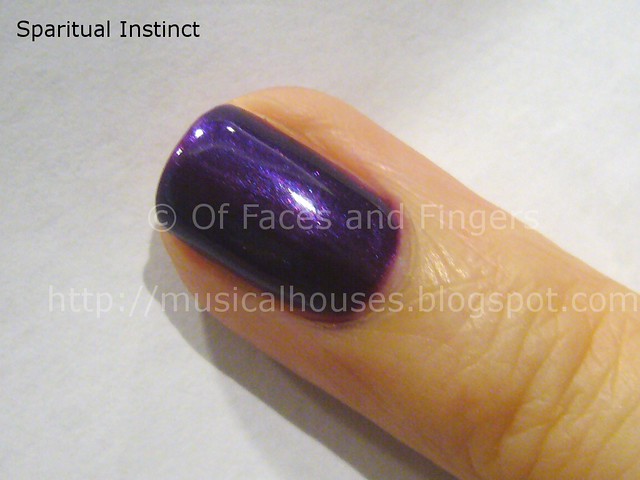
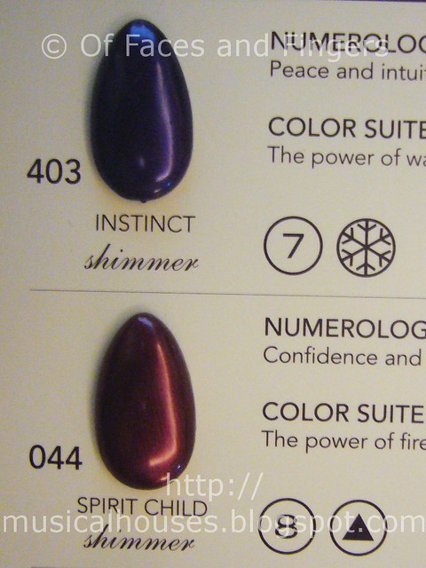
Now for closer up swatches of the official Sparitual swatches, followed by my corresponding finger swatches. I do feel that my finger swatches are a more accurate representation of colour, as for some reason, swatching on plastic just isn't quite the same to me. First up, we have Instinct and Spirit Child. Instinct is a nice bluple (cross between blue and purple) colour that leans more purple than blue. Spirit Child is a shimmery red - nothing very interesting here, just a shimmery red for Fall.

sparitual wilde collection 1


On my nail, you can really see how purple Instinct is. You can also see that it has this very pretty shimmer that is visible when the light hits the nail, that isn't captured in the official Sparitual swatches. This looks much prettier on. Unfortunately, I didn't manage to get swtches of Spirit Child, oops.

sparitual instinct wilde collection


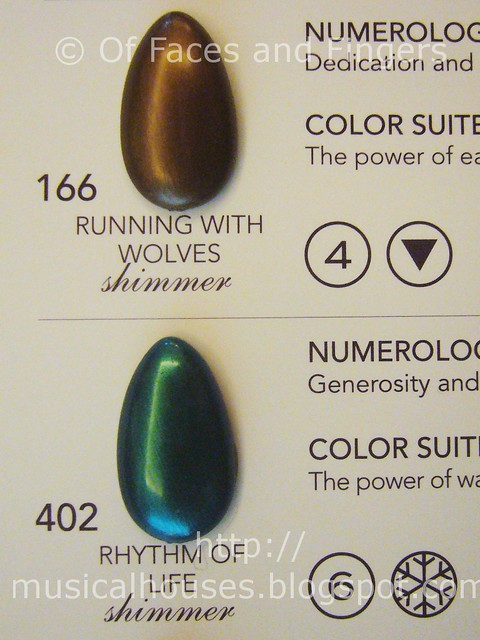
Next we have Running with Wolves, and Rhythm of Life. Here are the official swatches, but you'll really have to see these on to see how much nicer they look on the nail. Come to think of it, I'm not sure how Running with Wolves is named...I mean wolves are grey, not brown, aren't they?

sparitual wilde collection 2


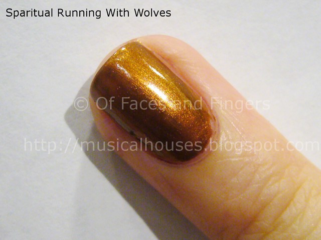
Running of Wolves looks like a poopy diaper brown on the nail wheel swatches, but it really is a brown-based shade with an interesting duochrome finish. Sure it's brown, but it isn't poopy brown. On my nail it looks more like a brown with gold and possibly russet duochrome. It's actually quite an interesting shade, and very eye-catching.

sparitual running with wolves wilde collection


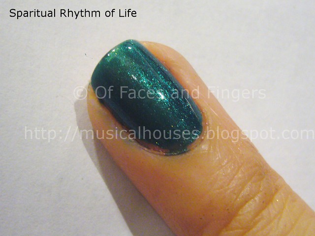
Rhythm of Life is a emerald greeen shade that is very jewel-toned. Quite pretty, and the shimmer that is on my nal doesn't show up as much on the official Sparitual swatches. I like how Rhythm of Life looks almost alive...it has that glow to it.

sparitual rhythm of life wilde collection


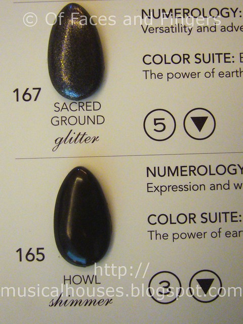
Lastly, we have Sacred Ground and Howl. Sacred Ground was one of the favourites at the Sparitual event, and is definitely my favourite out of all the Sparitual shades I've swatched so far (previous swatcches included the Sparitual Twinkle Collection and the Sparitual In Pink Collection).

sparitual wilde collection 3


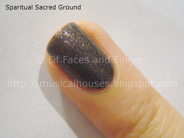
I am pretty excited about Sacred Ground, simply just because it's so gorgeous. It's a grey, but it's more than that. If you look closely, you'll see that Sacred Ground is acttually comprised of smal teeny glitter bits of various colours, that meld together to give the effect of a twinkling grey foil. Actually, this colour reminds me of Hard Candy's Mr Wrong (which I've had forever but never used), as it is simlar in its grey foil finish.

sparitual sacred ground wilde collection


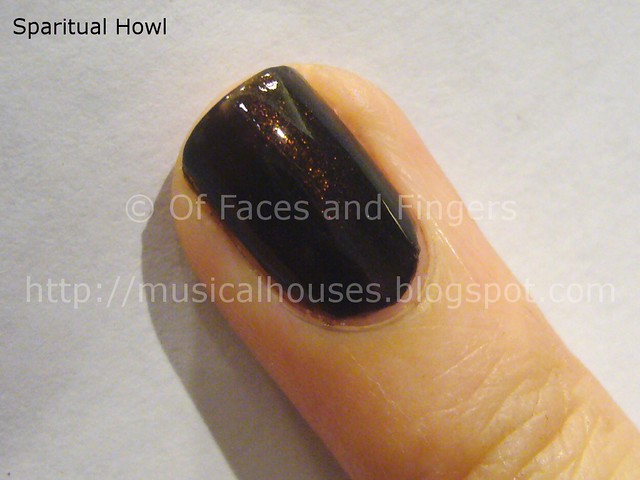
Last but not least, Howl. Howl is an almost-black (or is it actually black?) deep, deep brown shade with embedded red glitter. You can't really see the glitter though, unless strong light hits the nail - here in the photo you can kinda see a little bit of red shimmer showing through where the nail is lighted. I kinda wish the glitter showed through a little more, it would make for an exciting colour. Still, this isn't too bad a vampy shade.

sparitual howl wilde collection


Out of all the Sparitual collections I've swatched so far, this onne looks the most promising. Sacred Ground is a gorgeous colour, and definitely the standout of the entire Wilde Collection to me. But Rhythm of Life and Running with Wolves are also gorgeous, and Instinct is also a great pick if you like purples. I'm pretty sure that if Sparitual keeps coming out with more colours like these, they're going to win over many more nail fanatics.

(Some information supplied by PR at an event. Photos and content are my own. Post is my honest and complete opinion. I am not affiliated with/compensated by the company.)

Leader's Clinic Collagen Infusion Mask Review

Tuesday, September 27, 2011

6 comments
Leader's Clinic is a Korean clinical skincare brand that's been increasingly popular in Asia lately, in particular Hong Kong, and here in Singapore. The brand was supposedly developed by dermatological specialists in Korea utilizing their knowledge and experience in dermatology, and is fast developing a reputation for products that actually work. Their best selling items are their masks, which apparently sell 500,000 sheets a month! With such a reputation, I couldn't wait to try it - after all, nothing is better worth your money than skincare that actually delivers.

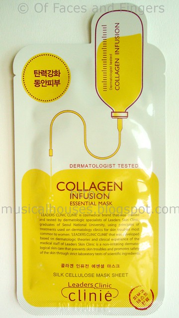
And so, I began my foray into Leader's Clinic with the Leader's Clinic Collagen Infusion Mask. This is a sheet mask, and comes in a very neat-looking white-and-yellow foil packaging. It's meant to deliver moisture to the skin, and leave the skin more hydrated.


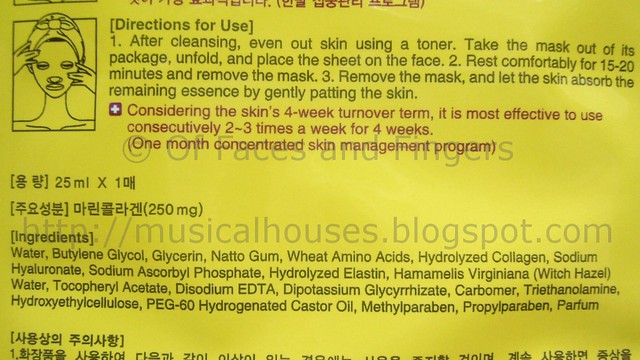
I really like the little illustration of a bottle of collagen being emptied out - really looks like a collagen infusion, doesn't it? The mask itself surprisingly doesn't make any fanciful claims, which I really appreciate. Usually, most products with collagen inside will tend to make all these outrageous claims about plumping up your skin from within, which isn't technically true, since collagen molecules are too big to be absorbed by the skin. So collagen can sit on top of your skin as a moisturizer, but there is no way the collagen is going to be absorbed by your skin and form part of your skin. The molecules are just too big for that.

leaders clinic collagen infusion mask 1


The ingredients list is also something I respect in the Collagen Infusion Mask. I can't tell you how many times I've come across products that claim to be collagen-enriched, or this-or-that-ingredient-enriched, only to find that they are listed last or next to last on the ingredients list (ahem, Biore Marshmallow Whip, I'm looking at you).

The top few ingredients include glycerin, sodium hyaluronate, both of which moisturize the skin, as well as some other ingredients which may possibly help the skin. Collagen is listed near the top of the list too, which means that Leader's Clinic has actually bothered to put in a significant amount of collagen - or at least, much more than other skincare products do.

leaders clinic collagen infusion mask ingredients


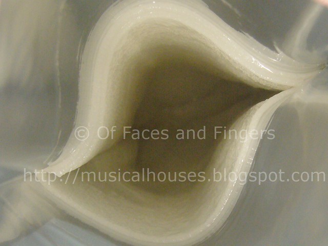
When you open the mask, you get a very plump-looking silky sheet swimming in a clear liquid. The liquid has a light pleasant floral smell, and although I'd rather not have perfumes in my skincare, I do appreciate that the smell isn't overwhelming. The texture of the clear liquid is like water, but a little stickier. If applied in small amounts to the skin, it actually absorbs very fast - I'm thinking that it actually may be possible to produce a bottled serum from this liquid.

leaders clinic collagen infusion mask inside


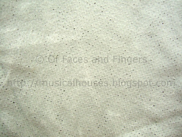
The mask material is made out of silk cellulose, which makes it thicker and stronger than paper, but otherwise, it feels and behaves like paper. The mask is also very porous, and there are tiny holes in the mask. I quite like the material, actually, it isn't as flimsy as paper, but still light. Below is a photo of the dried mask sheet, so you can see what it is like.

leaders clinic collagen infusion mask sheet


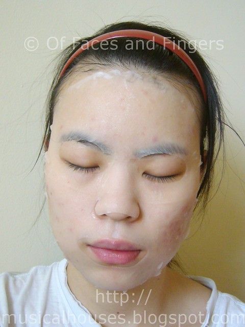
Another thing I liked about the mask is that it fit very well on my face. I kinda have a large-ish face, so a lot of all these teeny weeny sheet masks don't fit well. But with the Leader's Clinic masks, I had very little problem with fit. I was so pleased with the fit that I just had to take a photo of myself with the mask on, just to show you guys. Pardon the pimples in the photos below - as you probably know if you're a regular blog reader, my sensitive, acne-prone skin isn't the easiest to manage!

leaders clinic collagen infusion mask demo


The Leader's Clinic Collagen Infusion Mask did leave my face feeling hydrated, and I think it did live up to its claims of moisturizing my skin. The liquid residue it leaves behind does have a slightly sticky feel to it, but it also did leave my skin feeling softer. I'm also pleased to report that it didn't break me out - since I have sensitive skin, some skincare products do break me out, so I was glad to find that this mask moisturized and softened my skin without any adverse effects. Also, while the mask felt cool and refreshing upon application, it didn't sting my face, which was also a good thing. So this mask will probably work on sensitive skin as well.

All in all, I think this is a mask that I could definitely look forward to using again. If you want a mask that provides hydration and works well on sensitive skins, the Leader's Clinic Collagen Infusion Mask would definitely be one to check out. If you're ordering online, Leader's Clinic is available on Joypharm's Wordpress Sales Page, where she sells Leader's Clinic and other Asian brands (both makeup and skincare). She's also excellent with customer service, and also is pretty generous with freebies and samples, which is definitely a plus! Lastly, if you use the code JERLENEJP with your order, you'll get a free facial mask with every S$30 purchase on top of the usual freebies. So do check out Joypharm's site if you're interested, and I'll be bringing you more Leader's Clinic reviews soon.

(Product was sent for review. Review is my complete and honest opinion. I am not affiliated with/compensated by the company.)

Eyeshadow for Asian Eye Shapes: Round Prominent Hooded Eyes

Sunday, September 25, 2011

12 comments
More than a year ago (wow, it's really been that long!), I started a Eyeshadow for Asian eye shapes series. I felt there was a need for such a series of posts because I was seeing a lot of "Asian eye tutorials" flying around, promoting themselves as applicable for ALL Asian eyes. Most of them (if not all) were working on the premise that was one generic type of Asian eye shape, which was why one particular mode of application (promoted in their tutorial) was sufficient to cover all Asian eyes.

Being an Asian girl myself growing up and living in Asia, I felt this was a gross over-generalization, as there was obviously more than one type of Asian eye shape! Thus, any tutorial for a generic "Asian eye shape" just isn't going to cut it. Instead, we should examine the eye shape, see what features it has, and then adjust the eyeshadow placement accordingly. To draw a parallel, if some Youtube guru had a "Caucasian eyes eyeshadow tutorial", that guru would probably get a lot of hate comments saying that there's no such thing as a one-size-fits-all eyeshadow tutorial for all Caucasian eyes, because there was more than one type of eye shape - so in a similar manner, because there are many different types of Asian eye shapes, we shouldn't be limiting ourselves to just one particular method of application.

My series sought to examine a few types of Asian eye shapes I commonly saw, and suggest a suitable way to then apply eyeshadow given the particular features of the eye shape. Of course, it's also not definitive, and by means not the only method that can be used - it was just more to debunk the myth held by some that all Asian eyes were the same, and to suggest potential alternatives.

Anyway, if you want to read more about the rationale behind this mode of thinking, you can read the introductory post to the Asian eyeshadow series. But today I thought I'd bring that up again because I recently received a request from one of my readers, Josephine, who asked me to suggest some eyeshadow placement tips - so I thought, why not?

Josephine has kindly allowed me to use the photos of her eye that she sent me for illustration purposes for this blog (apologies that they're a tad blurry - but hey, she's nice enough to let me use her pics!). Her eyes are relatively round, and quite prominent. And she also has a crease line that is slightly hooded. You can see this in the photo below:

asian eye photow


Now that we've looked at her eye, let's get on to the good stuff! This post may end up being a bit longer than my usual posts, so I've taken the liberty of including headings to make it clearer what each section is about.


How NOT to Apply Eyeshadow for this Eye Shape

One of the popular methods I've seen used by Asian girls with a crease line is that they tend to fill the eyelid area up to the crease with a very thick line of eyeliner, or dark eyeshadow, and leave the rest of the eye bare, or with a very light shade. The diagram below illustrates this placement. It's a commonly used technique, but I personally don't like this technique, especially for eyes like Josephine's, where the crease is hooded, and the creaseline falls below the actual contour area of the eye.
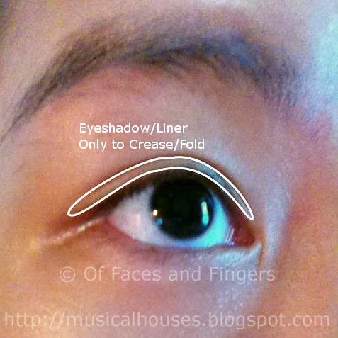

asian eye eyeshadow 1w


The reason why I'm not a fan of such placement is because it doesn't contour the eye at all. In contouring eyes, we typically want to recess prominent areas, and highlight recessed areas. This is why if you have small eyes with a relatively recessed eyelid area (like me!), a common tip suggested will be to use light shades on the eyelid area, and contour the crease area with a darker shade, and is also why if you have large round eyes that protrude slightly, a common tip will be to use a darker shade on your eyelid area. There are some exceptions (e.g. brownbone areas are generally always made more prominent), but this is the case more often than not.

However, in the case of this technique, where a dark shade is applied only until the crease line, and the rest of the eye area is light, we are in fact recessing the areas that are already recessed, and bringing forward areas that are already prominent. Because her crease line is low and hooded, the eyelid space below the crease line is recessed, while the space above the creaseline is prominent (you can see in the above photos) The diagram below illustrates this:


asian eye diagram 1w


So as you can see, for Josephine's eye shape, this is not a great way to contour the eye. By putting dark eyeshadow/eyeliner up to the creaseline, we are recessing the already recessed area under the creaseline further. And by leaving the rest of the eye untouched, or by filling it with a light eyeshadow shade, we are highlighting an already prominent area and bringing it forward further. In fact, far from contouring the eye, we are anti-contouring it! This technique works on some eye shapes, but not all, and Josephine is an example of why this commonly-used technique isn't optimal for all Asian eye shapes. I have to admit that whenever I see it employed by a girl whose eye shape doesn't suit this technique, I cringe a little inside.

Now that we've covered how NOT to apply eyeshadow for Josephine's eye shape, what are possible eyeshadow placement techniques that we can use? There are a few methods, but I'll just cover two possibilities.


Eyeshadow Placement #1: Full Contouring of Eye

The first is that we would have to contour the eye more effectively - so we have to ensure that the darkest contouring colour lies above her creaseline, and is actually placed at the cotour area of her eyes. This is because in some Asian eyes, as in Josephine's, the creaseline actually lies below the contour area of the eye. The first step would be to identify the actual contour area of her eye, and place the dark contour shade there. Josephine's eye shape is pretty similar to a previous post in the Asian eyeshadow series, so if you wish to read more about identifying the contour area for such eye shapes, do head on to that link. In the interests of not making this post too long, I'll just skip ahead to the diagram:


To contour her eyes, we would have to place the lid colour on her lid area, beyond the creaseline that she has, and up to the actual contour area of her eye. Her "crease colour" area would then be placed not in her actual crease line, but the contour area of the eye - where the eyeball meets the bone socket is usually a good indication of this. And lastly, we can highlight her eyes. In the other previous post with my friend Blair, I suggested contouring the outer-V area of the eye - this is also useful for Josephine's eyes, since they are round, although I didn't include that in this diagram.


Eyeshadow Placement #2: Simplified Contouring of Eye

The second way we could apply eyeshadow on round, prominent and hooded eyes like Josephine's would also use the same principles, but simplified for days when you don't have time to do a full eye makeup, and just want to swipe some eyeshadow on. Here, I'm suggesting the use of a single lid shade, and applying from the lashline up to the contour area, blending at the contour area. The diagram below illustrates this:
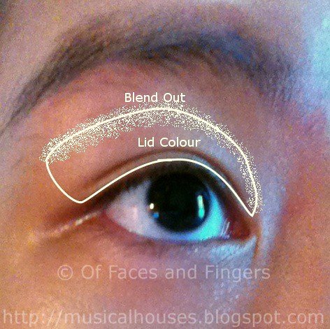
asian eye eyeshadow 2w


Like the first eyeshadow placement, this one also identifies the contour area of the eye as being above the actual crease line, and then filling the area up to there with the lid colour. The effect is that the prominent area above the crease line and the recessed area below the crease line are both being treated equally, thus visually balancing the eye a little more. Also, by applying the lid colour up to the contour area, we open up the eye a little bit, instead of closing in the eye visually by applying the shade only until the crease line.

This technique may also be useful for girls who are not comfortable with the Eyeshadow Placement #1 suggested, as it contours the eye without making it look too made-up. Some girls I've met are so used to lining their eyes up to the creaseline with a dark eyeliner, that they get used to seeing their eyes that way. Thus, even when they realize that it may not be the optimal technique for their eyes, they are still resistant to contouring their eyes fully because, after being used to just a thick lined eye, having to contour feels like "too much eyeshadow" for them. So this placement also strikes a compromise for such girls.


Finally: Conclusion and Final Tips

Wow, that's been a long post! I'm surprised my fingers aren't sore from all that typing...Oh wait, my shoulders are. LOL. Anyway, in general, I would say that identifying the contour area of your eye is perhaps the first step towards proper eyeshadow placement. Sometimes, Asian girls with crease lines think that the crease line is the contour area, when usually it is below the contour area. Josephine is a good example of such a case. So in Asians, identifying the contour area alone can be a challenge! But once the contour area has been identified, then all that remains is to then place the eyeshadow according to the eye shape - is it round/almond, large/small, prominent/recessed and so on. (My previous posts in the series have a bit more information on this, if you'd like to read it.)

One last word though, is that I'd like to stress that this isn't by any means the only way you can apply eyeshadow. It's certainly not definitive, but it's just a few suggestions about what could work, and may not work for everyone. At the end of the day, makeup is all about trial and error sometimes. But I hope this has helped some of my readers out there who may have eye shapes similar to Josephine, or who are wondering why their friend can rock a thick line of eyeliner and they can't. It all boils down to finding the most suitable eyeshadow placement for your eye shape! And a big thank you to my dear reader Josephine for allowing me to use your eye photos! I hope you've liked this post too! :)

La Prairie Cellular Power Infusion: Quick Look

Friday, September 23, 2011

1 comment
La Prairie has finally brought their Cellular Power Infusion serum to Singapore. Touted as the most advanced skincare product ever produced by La Prairie, it's definitely set to grab the attention of consumers. Apparently the Cellular Power Infusion is the fruition of 70 years of research, and the result of three patent-pending technologies, and is supposed to kick-start your skin's renewal process to give you younger looking skin.

The product consists of a clear liquid base, as well as a purple/blue coloured liquid active ingredient, which you then mix into the base before use. La Prairie has this really cool-looking promo image showing the active ingredient being mixed into the product.


At the event, we also got to play around with "activating" the Cellular Power Infusion, and I have to say, it does look pretty impressive in person as well. The liquid active ingredient is actually stored in the bottom of the container, and you twist the base of the container to send it shooting into the clear base. After that, you're supposed to shake the bottle well to mix the serum thoroughly before use.

The bottle on the right shows a bottle just after being activated, while the bottle on the left shows a bottle that's been mixed up. After the serum is mixed, the Cellular Power Infusion takes on a transluscent lilac colour - probably the most unusual colour I've seen for skincare to date.


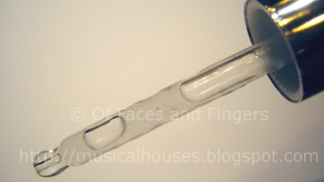
The product itself is housed in a very stylish, sleek bottle, and you apply it using a dropper. Place a few drops on your palm and spread out onto your skin to apply. The interesting thing about this product is that La Prairie claims that it recharges the energy of your skin cells, and speed up stem cell renewal, as well as protect your skin from the elements.. La Prairie also lists the key ingredients as Swiss Snow Algae, Phyto Stem Cell Extract, and Tissue Guidance Matrix (apparently a similar skin-like matrix is also used to treat burn patients), further adding to the product's "wow" factor.

la prairie cellular power infusion dropper


One thing I was wondering was: can a topical product really affect your skin's DNA? I mean, part of the reason why cancer is so hard to treat is because nothing that is applied or ingested into our body can rectify those rogue cells that keep multiplying, right? If stuff applied to our faces really changed our bodies, scientists could probably invent a cancer-curing body cream. So I'm admittedly a bit skeptical about the "increasing cell energy" part. But then again, I'm not a cosmetic scientist, so I really can't say for sure.

That said, the La Prairie Cellular Power Infusion does contain tried-and-true ingredients that do help improve the skin's quality, such as glycerin, panthenol, sodium hyaluronate, grape seed extract, and carica papaya fruit extract. Some of these ingredients hydrate the skin, some provide anti-oxidant benefits, and some encourage skin cell renewal and have exfoliating properties. So even though I'm a skeptical ingredients-obsessed label reader, there are still other ingredients in the product that convince me that it's more than just a bunch of marketing mumbo-jumbo.

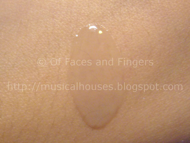
The serum itself is a light, lilac liquid that's quite watery in feel and texture. It isn't your typical serum with a thicker gel texture.

la prairie cellular power infusion serum


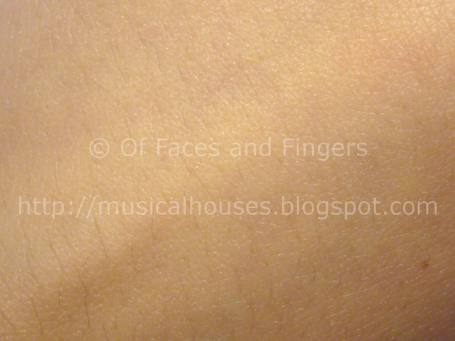
Once you rub the Cellular Power Infusion into your skin, it absorbs fully, without leaving behind any residue. However, it does feel a little sticky immediately after application, and the feel is similar to other products which also have a high concentration of sodium hyaluronate (that's not a bad thing, since sodium hyaluronate hydrates the skin). However, if you let it absorb for a few minutes after application, it absorbs fully without leaving behind any sticky feeling.

la prairie cellular power infusion serum absorbed


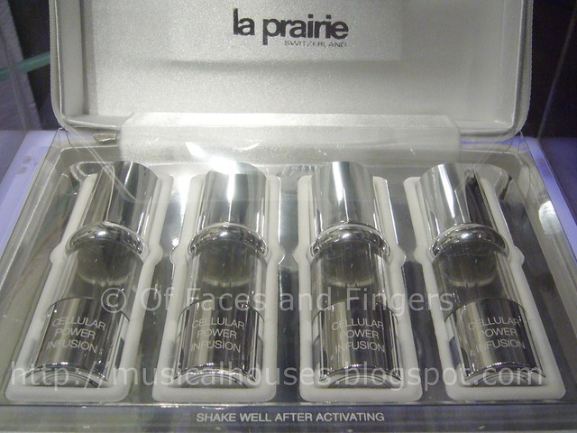
The Cellular Power Infusion is only meant to be used once every 3-4 months, the reasoning being that once your skin's regeneration has been improved, the effects will last for some time. How this works out for the consumer is that when you buy a set, you get four vials of product, and each vial lasts 7 - 10 days. After all four vials have been used 28-40 days later, you can wait for another 3-4 months before you need to get another set. I guess the infrequency of usage helps to even out the high S$780 price tag somewhat. Continuous usage of the product doesn't harm your skin, but is just unnecessary.

Each set of four vials comes in a very nice white leatherette case, featuring possibly the sleekest-looking skincare packaging I've seen in a while!

la prairie cellular power infusion serum set


One thing I have to say is that the consumer testimonials and reviews I've seen for this product are very positive. We were also told at the event that the PR people even received phone calls by excited users after a few days, claiming that their skin had shown visible improvement within just a few days. Now, I have to admit that is quite something - I usually think of skincare as showing effect within a few weeks, not days!

Another thing I felt was a good point about the product was how easily it fits into anyone's skincare regimen. The Cellular Power Infusion is meant to be used after cleanser and toner, but before moisturizer and other creams. It is meant to help the skin renew itself better, so regardless of what other products you're using, high-end or drugstore, the product would be a standalone addition to whatever routine you have right now, without the need for accompanying creams or other products.

la prairie event group shot


Obviously, the Cellular Power Infusion won't be for everyone - not everyone may have aging as a main concern, and not everyone may want to splurge on skincare. But if you want a luxurious, novel addition to your skincare regime, and if you are looking for a product that would make a difference to your skin without having to revamp your entire routine, this would probably be as good as you could get.

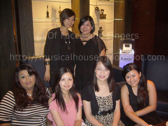
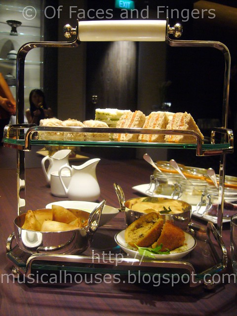
And yes, the above photo is a picture of some of the bloggers and kind PR folks at the event. And the below photo, is a photo of food! Although I don't really post food photos on my blog (because, you know, this isn't a food blog), I love taking photos of food, so yes, here's a gratituous food photo!

la prairie event food


(Information provided at an event. All opnions are mine. I am not affiliated with/compensated by the company.)
Halloween Eye Look: Red and Black

Wednesday, September 21, 2011

18 comments
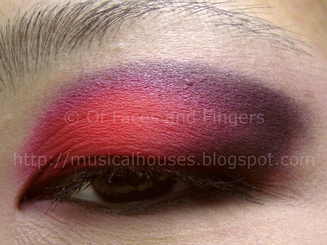
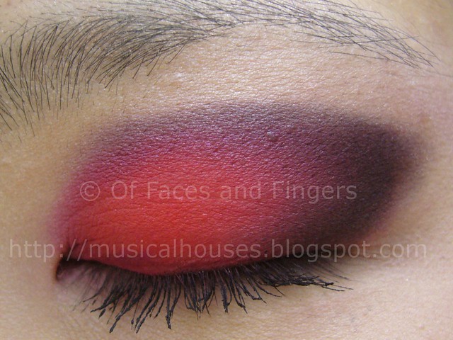
After my Halloween nail look, I decided I needed to match it with a Halloween eye look. So here you go, a corresponding Halloween EOTD (Eye of the Day)! I decided to keep this look simple, and so I just followed with the red, black and white colour scheme from my Halloween nails, and simply used them in the most no-brainer way possible. And although this look isn't very complicated to reproduce (I mean, it's not very complicated), it really does stand out!


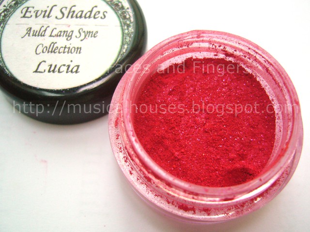
What I feel really made this look stand out was the use of Evil Shades Lucia, a shade I'd had for awhile now but had never dared to use up to now. It was just so scary looking in the pot, all red and bright and...just really intimidating, you know? I've had this for a long time, but I'd just never dared to use it! In fact, as you can see from the photo below, Lucia was part of Evil Shades' Auld Lang Syne Collection (yes, a CHRISTMAS collection) from last year. So yes, I really had it lying dormant for awhile. But I thought, well, since it was Halloween, why not bust out the shades I hadn't tried yet?

evil shades lucia


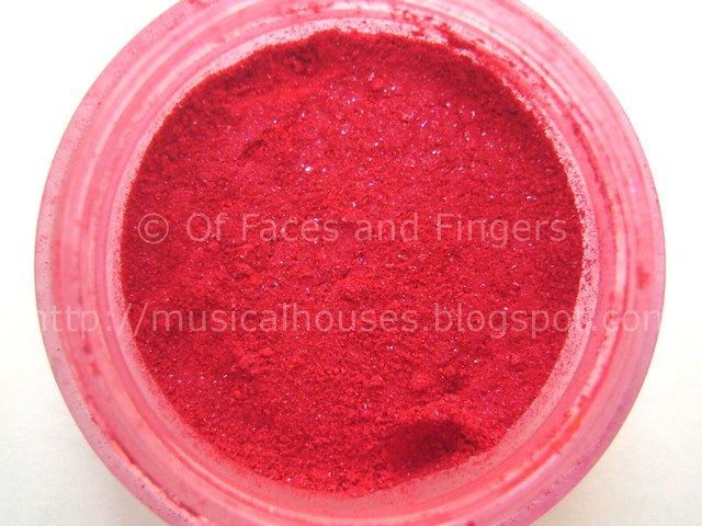
Lucia is a bright red shade, very bright, and very red. It's also a true red - no orange or blue tones in this one, just screaming, pure red. But in true Evil Shades style, Andrea (the owner of Evil Shades, blogger at Black Nail Polish and Lip Gloss, and generally awesome all-around friend) has thrown in something a little more special into what would be just another matte red. There is actually pink shimmer dispersed throughout the shade, which gives it an interesting pink dimension in some lights and angles.

evil shades lucia close up


I really like the pink shimmer in Lucia, because on my eye, it reflects pink at different angles. This effect is most noticable when light hits the shade, and you get a pretty cool pink flash. In the photo below you can see the pink flash where the red meets the black portion, as that one is reflecting the most light. Pretty cool, huh?

halloween eye look red black 4


For this Halloween eye look, I used Evil Shades Lucia on the lid, and used just a shimmery white on the browbone, and a matte black in the contour area. It probably doesn't really matter which white or black you're using with a shade as stunning as Lucia, but the white was Stila Moonlight and the black was Stila Ebony. Another thing I thought I'd add is that all the Evil Shades eyeshadows I've tried so far are really very pigmented. Evil Shades sure knows how to create a good shade, and they don't skimp on the quality!

halloween eye look red black 2


Because Lucia is so pigmented, and because it's so intensly red, I found that where this shadow goes, it STAYS. Sure it's blendable (as you can see from the EOTD photos), but I did end up having to really wipe my brushes down to remove the last bits of Lucia before applying the next shade, in order to avoid colour mixing. Although Lucia isn't available, the latest Evil Shades Halloween Collection , has a couple of very interesting reds, with a shimmer and slight duochrome flash much like Lucia (although not pink).

All in all, I'm really glad to be rocking this awesome colour, although it's really quite far out of my comfort zone. (I have to confess: I eventually chickened out of wearing this out of my house, and had to wash it off before heading out. I'm a loser, I know.) I've always been a great fan of Evil Shades, and Andrea is such a nice person, everytime I use one of her products I really wonder why I don't have more Evil Shades stuff - I think it's just because I tend to prefer my eyeshadows in pressed form. But if you like indie makeup brands with very unique pigmented colours, it's a brand definitely worth your money. Now, I'm officially ready for Halloween!

(Evil Shades product given to me because Andrea is just a great friend. All other products were purchased by me. Review is my complete and honest opinion. I am not affiliated with/compensated by the company.)

Halloween Nails: Cobwebs and Blood Splatters

Monday, September 19, 2011

14 comments
Halloween, one of the few times of the year you can get complimented for dressing absolutely crazy! Since outrgeous and scary costumes are de rigueur for Halloween, I took the liberty to do some Halloween nails! I thought nothing could scream Halloween better than cobwebs and splats of blood, so I attempted to incorporate both of them into my NOTD (Nail of the Day).

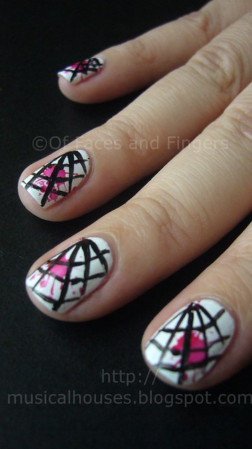
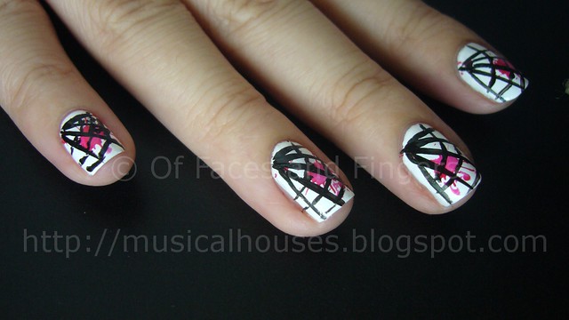
In the nail look below, it consists of two red blood splatters and a black cobweb on a white background. I don't know about you, but I kinda feel like this isn't quite as scary as I'd have liked. I really wanted to spook everyone out with my nails, but I actually ended up getting compliments on them - twice! At least, they thought it was nice until I explained how those cute designs were supposed to be spider webs and blood...Oops.


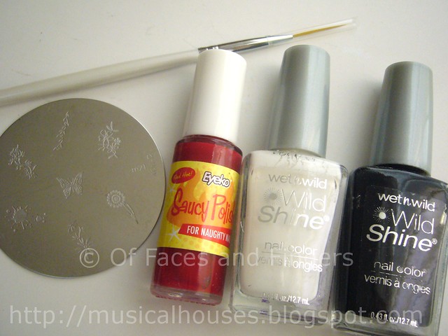
The photo below shows what I used for this look. The white base was Wet n Wild White, the red blood splats were created by konading with Eyeko's Saucy Polish, using Konad Plate M21. I used the design of two paint splats on the M21 plate. The cobweb was created by using Wet n Wild Black, and my new favourite plaything for nail art, my nail art brushes.

halloween nails tools


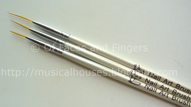
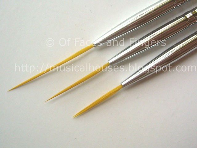
I've never actually tried freehanding nail art with a brush before, so using the nail art brushes was totally new to me. I got mine from Born Pretty Store, and these are being sold in sets of three each, for the awesomely cheap price of US$2. Here is the link to the nail brush set that I bought.

born pretty store nail art brush 2


You get nail brushes of varying lengths, so these are perfect for drawing lines, curves, or, if you're skilled enough, I can imagine them being used for french tips and other similar nail art. I personally didn't notice much difference between using the longer or shorter lengths, but some others might - it really is personal preference. The bristles are thin and flexible, so you can really draw both thick and thin lines with these.

born pretty store nail art brush

For the cobwebs on my nails, I used the shorteset brush, dipped it in Wet n Wild Black, and basically just freehanded the lines. I did the straight vertical lines first before doing the horizontal lines. It's definitely not perfect, but I'm pretty happy with my first attempt at using nail art brushes! Here is a close up shot of my nails so you can see the lines created.

halloween nails 2


I painted on the cobwebs after konading the blood splatters. I used Eyeko Saucy Polish for the konading of the blood splats because in my previous Eyeko Saucy Polish NOTD, it was opaque in pretty much one coat, so I thought it would be ideal for konading as well. Turns out, the blood splats looked a bit pinker than I'd like, but well, it does look like blood splats!

halloween nails 3


Although I have to admit my Halloween nail art is a little bit noob-ish, I'm still enjoying it! I had never thought of doing nail art for Halloween before, but I was just so inspired by seeing all the different Halloween nail looks around the blogosphere. I'm so glad to be rocking my own Halloween nails!

(Bornprettystore product was sent for review. All other items were purchased by me. Review is my complete and honest opinion. I am not affiliated with/compensated by the company.)

Sparitual Twinkle Collection Swatches

Saturday, September 17, 2011

7 comments
Sparitual's Twinkle Collection, consists of six shades meant to sparkle and shine. If I'm not wrong, this is meant as a seasonal collection for Christmas, and if this is indeed meant for Christmas, then Sparitual has done a good job of making some festive shades while eschewing the traditional all-red-green-gold-and-white colour schemes we see so often in Christmas collection. Sparitual's Twinkle Collection does have its fair share of usual colours (another red shimmer), but overall this collection does look pretty interesting.

Now without further ado, let's jump straight into swatches! First up, we have the swatches for the first three colours from the official Sparitual colour wheels.


Top - Bottom: Blue Moon, Illumination, Solstice

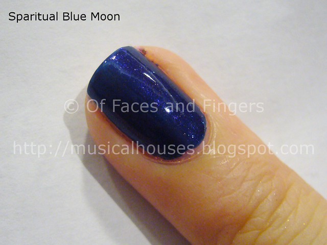
And here are the swatches for these three colours as they appear on my finger. Let's start with Blue Moon. Blue Moon, as the name suggests, is a blue colour - but this isn't quite the deep, almost-black type of blue you'd expect from a colour name like that. Instead, Blue Moon is always discernably blue, even in low lights, and looks to me to be a deepened colbalt blue, not quite dark enough to be called navy. It has small suspended glitter bits that give the shade a slight twinkle - just like a blue moon.

sparitual blue moon twinkle collection


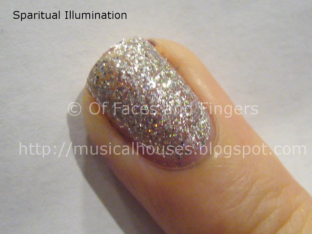
Illumination, as the name suggests, is pure bling. This is actually a mix of holographic and non-holographic glitter bits suspended in a clear base. The glitter bits are rather large, and really add to the bling factor. My photo doesn't really capture how the holographic glitter bits dazzle when hit by the light, but I'm sure you know what I mean. What you see on my nail is two coats, and coverage is pertty decent, although you'll need three coats to ensure opacity.

sparitual illumination twinkle collection


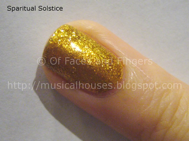
Solstice was marketed to us as a gold shade that would suit Asian skintones, and I can't say I really agree with that. For one, Solstice is a gold that I see as bordering on the warm side, so it probably would end up looking a little "off" on cool-toned girls, Asian or not. No doubt, the colour is certainly stunning, being a true yellow gold that is reminiscent of gold jewellery. However on me I felt it looked a tad weird. I felt that personally, for myself, a cooler shade of gold, like Orly's Luxe (which I've blogged about before), would have been more flattering. But to each his own right? And a great gold foil is always a good addition to any collection.

sparitual solstice twinkle collection


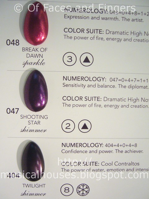
Now for the second half of the Twinkle Collection. These consist of the darker, deeper shades, as well as more traditional reds, purples, and vampy shades.

sparitual twinkle collection 2


Top - Bottom: Break of Dawn, Shooting Star, Twilight

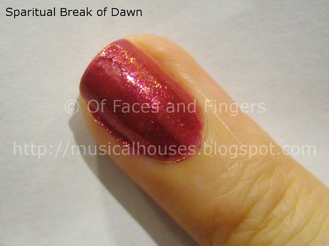
Break of Dawn is a red with shimmer, some of which is holographic. To me, this was the least interesting of the collection (oh yeah, another shimmery red for the holiday season), but this is pretty if you are looking for a red shade. The shimmer is generously added to the red base, so the shade sparkles even in low lights. And as you can see, in the photo below, I accidentally nicked the swatch, and flooded my cuticles. Oops.

sparitual break of dawn twinkle collection


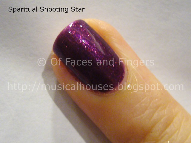
Shooting Star is a deep royal purple loaded with glitter bits of medium size. This one has that "lit from within" (in Scrangie's terms) quality to it - you see the shimmer really bursting and sparkling where the light hits it. This is visibly purple, and visibly shimmery even in low lights, and is very pretty, although it does remind me of something in my collection...I'd have to go look it up.

sparitual shooting star twinkle collection


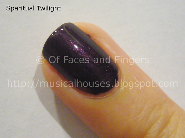
Twilight (oh man, those movies and Stephenie Meyer have ruined any polish called that for me now) is a deep, vampy purple with slight shimmer., It's one of those almost-black colours, but to be honest, in low lights (e.g. dim indoors lighting), it looks mostly black. It does look purple where the light hits it, so you'll probably need stronger lighting to showcase this shade at its best.

sparitual twilight twinkle collection


To me, Solstice is the clear standout of the collection, even though it makes my hands look jaundiced. I also quite liked Shooting Star and Blue Moon, although neither is all that unique. Generally, application on these polishes was also pretty good - nice, even application that was pretty streak-free, and a nail polish texture that was neither too thin or thick. Overall, I'd say Sparitual's Twinkle Collection is a very pretty collection that is festive without being too cliched.

Lastly, my Singaporean girls can all get 10% off on their Sparitual purchases with the code sparitual_musicalhouses - all you have to do is email squovalicious (at) hotmail (dot) com to place your order (she's the Sparitual ambassador in Singapore), and put the code sparitual_musicalhouses in the subject line of your email. And ta-da, instant discount code! Hope the swatches help you make your purchasing decisions!

(Some information supplied by PR at an event. Photos and content are my own. Post is my honest and complete opinion. I am not affiliated with/compensated by the company.)

Sparitual In Pink Collection Swatches

Thursday, September 15, 2011

4 comments
Sparitual is a US-based brand that has a line of vegan nail polishes - I know vegan and nail polishes sounds so weird, but apparently these are just that. The line also sells some body care and spa treatment products, such as hand and foot products, as well as soy wax-based candles. I guess you could say that Sparitual is looking at more than just nails!

One of their collections launched recently this year, In Pink, is actually created to raise awareness about breast cancer, with 20% of the proceeds going to the cause. Of course you can buy your nail polish because it's vegan and for a good cause, but it helps that the colours in the In Pink Collection are quite pretty too. There are three shades in this collection - Strength, Knowledge, and Clarity.


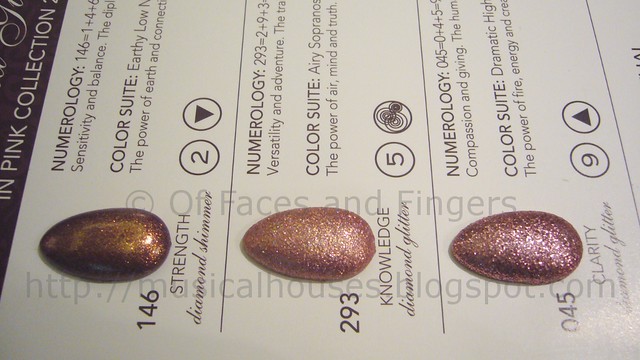
Top - Bottom: Strength, Knowledge, Clarity

The entire In Pink Collection is made up of varying types of pink glitters, in keeping with the theme of raising awareness for breast cancer. A lot of the glitters are actually quite big and chunky, so if big blingy glitter is your thing, these colours will make you one happy nail polish addict. These swatches are from the official Sparitual colour wheel. I apologise for the lousy lighting in the photos, as they were taken at the recent Sparitual blogger's event, and this was as much as I could tweak it for better colour accuracy.

sparitual in pink collection 2


L - R: Strength, Knowledge, Clarity

Now, for actual finger swatches! I do think that my finger swatches are probably a more accurate representation of what you would probably see if the polish is applied. Again, apologies for just swatching on one lousy finger - like I mentioned earlier, these were all swatched at an event, and I have to admit that I was in a lot of hurry to try and swatch as many as I could for you guys! Yes, I actually didn't bother to listen to the PR spiel, or eat the food served, and al things considered probably came across as being anti-social because I just kept swatching and swatching and swatching...Man, the PR folks must think I am so weird now.

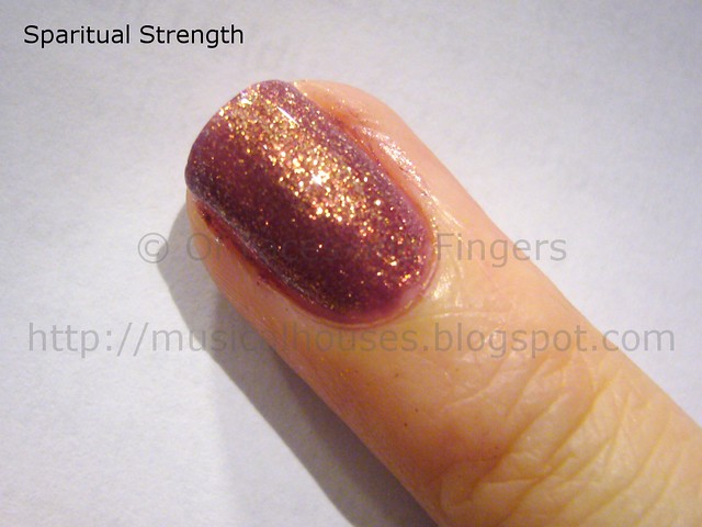
Anyway, up we have Strength. This is my favourite colour hands down, because it has such a pretty finish to it. It's a glitter, for sure, but the glitter colour also bears some sort of duochrome shift - the colour sort of shifts between pink, bronze, and hints of purple. And it glints gold in some lights, too, so it's truly a very multidimensional colour. Definitely the most unique colour of the bunch. This was opaque in two thick-ish coats.

sparitual strength in pink collection


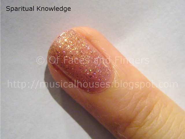
Next up, we have Knowledge. Knowledge is also a pretty shade, although not as interesting or unique as Strength. Knowledge has big bits of pink glitter, mixed in with big bits of holographic glitter, so although the entire polish isn't holographic, you do get pretty rainbow glints here and there as the individual holographic glitter pieces suspended in the polish reflect the light. It's basically a mix of big pink and holo glitter, and as a result, you will probably need 3 coats or so to make it opaque. What you see here is two pretty thick coats, and you can still see some bare spaces on my nail, and VNL (visible nail line). The polish isn't actually as glitter-dense as the official Sparitual nail wheel makes it look. Still, a very nice colour.

sparitual knowledge in pink collection


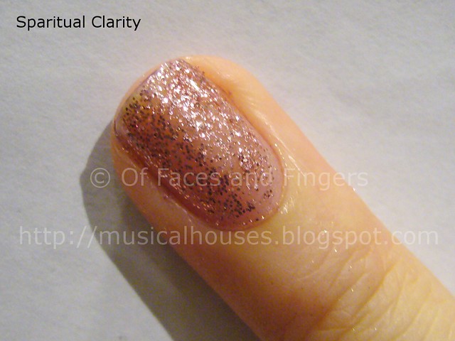
Lastly, we have Clarity. Out of all the shades in the In Pink Collection, I have to admit that Clarity was the one that I didn't get excited about. Clarity essentially comprises of pink glitter suspended in a clear base. It's nice, but not terribly unique. Also, the glitter is quite sparse, so even after the two thick coats you see on my nail, there are still plenty of bare spaces. I think this would probably make a great layer over another colour because the glitter isn't very dense, so any colour underneath would definitely show through.

sparitual clarity in pink collection


I can't comment on wear time or lasting power though, since these were just swatches at the event, but application was good on all the In Pink shades, considering that they are all glitters, and glitters can be tricky to apply without leaving bald spots. Even in my hurried swatches, you can see that the glitter bits are pretty evenly spaced out, and more or less are nicely spread out to cover the entire nail area. I also quite liked the brush. It's thicker than Orly's brush, but thinner than OPI's. I personally prefer OPI's Pro-wide brush, because I have man-hands and huge nails, but these are probably a happy in-between in terms of brush size. I'm definitely loving Strength the best out of all the colours, and if I only could get one colour from this collection, Strength would definitely be it. I also like Knowledge, because of the holographic glitter.

Lastly, my Singaporean girls can all get 10% off on their Sparitual purchases with the code sparitual_musicalhouses - all you have to do is email squovalicious (at) hotmail (dot) com to place your order (she's the Sparitual ambassador in Singapore), and put the code sparitual_musicalhouses in the subject line of your email. And ta-da, instant discount code! I'll be swatching more Sparitual collections for those interested in taking advantage of the code and want to see swatches, so stay tuned!

(Some information supplied by PR at an event. Photos and content are my own. Post is my honest and complete opinion. I am not affiliated with/compensated by the company.)

Linkwithin

Related Posts Plugin for WordPress, Blogger...