theBalm Timebalm Concealer Swatches!

Thursday, December 31, 2009

18 comments
Today, I have swatched TheBalm's TimeBalm concealer. I didn't manage to swatch all the shades, because unfortunately the shop only had the lighter to medium shades available. I know, breaks your heart, doesn't it? Sometimes, it just seems that darker girls have it hard when it comes to beauty - first of all, many brands don't make colours with them in mind. And when they do, sometimes the retailers don't even want to carry them! But nevertheless, I swatch whatever I can, and whatever is available to me, and I hope it helps somebody.

So here you go, swatches. The names are really cutesy, ranging from Lighter than Light (which honestly isn't THAT light), to Light, and then it starts getting uncreative - Light-Medium, Medium, and the really inexplicably named Mid-Medium.

The texture of the Timebalm concealers is pretty smooth and decent, without being over-emollient. Pigmentation is also very decent, each of these swatches being 2 - 3 stripes - that's total opacity with 2 - 3 swipes of product. Overall, a not too shoddy product. Not bad at all. They also seem to be getting a lot of love in general, so I guess it's worth trying out, if you can find one in your colour.

theBalm Timebalm concealer swatches


Lighter than Light is a very pink-toned pale flesh colour, that I would guess is probably NW15 or NW10? I'm not too familiar with the NW colours.

Light is neutral-to-cool-toned pale flesh colour that, but not as pale as Lighter than Light.

Light-Medium is a hair darker than NC20 (that's my colouring), and is yellow-undertoned. It's definitely similar to NC20.

Medium is what I'm guesing NC25 would be, although I don't really know. Also slightly yellow-toned, athough I think it's neutral enough.

Mid-Medium is a neutral-undertoned flesh shade, although it might just veer towards yellow undertones.


The good thing about the TimeBalm concealers is that most of them, with the exception of Lighter than Light, have pretty more-or-less neutral undertones. Sure, each individual veers slightly towards warm or cool, but they're all close enough to neutral to be wearable for most people.

theBalm Pick Up Liners Swatches and Review

Tuesday, December 29, 2009

Leave a comment
Today's swatches and reviews are that of theBalm Pick Up Liners, a cutely-packaged set of three liners and a sharpener. These liners are REALLY small - they aren't longer than a couple of inches.

Each set has three liners, but I've just swatched them altogether because there were only 2 sets and thus 6 colours altogether. That, and I got mixed up as to which pencils were in which set :X

TheBalm Pick Up Liner Swatches

The pencils are all matte, and none of them have shimmer or glitter - which would appeal to some of us here. The colours are nice but boring basics, so these are good, but nothing to scream about. Sugar Daddy is a dark olive green, Ladies Man is a pretty navy blue, Casanova is a mid-tone brown, Lover Boy is a grey-purple, Don Juan is black, Romeo is dark grey. Like I said, nice but basic. Perfect colours for work, I suppose. I actually like every colour here except black (but that's only because I don't wear black liner).

These liners are relatively soft, and go on pretty well. Pigmentation is also pretty decent. Staying power, however, I find a little lacking. Maybe I've been spoiled by the Urban Decay 24/7 liners (I always say that once you use those you won't use any other pencil liners), but these seem to smudge off easily in comparison. Still, they're not all that bad, they just aren't wow-ing me.

Color Club Fashion Addict and OPI Lincoln Park After Dark: KOTD

Sunday, December 27, 2009

5 comments
Hey guys! I'm back from X'Mas break and crazy laptop hard drive issues!

Today's KOTD is Color Club's Fashion Addict as the base with OPI's timeless LPAD for the flowers. Plate is M34 I believe.

Once again, excuse the frazzles, the pre-clean-up pics, and the general sloppiness of application - I'm so not a pro. I so suck at nails, but I promise I'm getting better. Slowly. Sort of.

Color Club Fashion Addict OPI Lincoln Park After Dark

I liked this, but it's not the most creative or the best KOTD/NOTD ever. I don't mind it though, This was 2 coats of Fashion Addict. Unfortunately the holo effect is rather weak on me - I don't know how other bloggers get their awesome holos to show on photograph, but this was under natural light in my room beside the window, and it doesn't look holo at all! I'm utterly crushed. Maybe I got a dud. Sigh.

I tried getting other pictures of this KOTD in other lighting, to see if I could get the holo to show up - warm light, white light, natural light, a mix of lights - and this was the best I could get:

Color Club Fashion Addict OPI Lincoln Park After Dark

Don't you just hate it when holos aren't holo enough?

TheBalm Stainaic Swatches: Beauty Queen and Homecoming Queen

Wednesday, December 23, 2009

1 comment
Today I am providing swatches with Thebalm's Stainaic in two colours, out of three. Unfortunately I'm only able to swatch two out of the three colours, as this is all that was available. :(

The Stainaics are gel stains, and they are much like Benefit's Benetint and Posietint, only better, because they are less runny, and the gel-like texture makes it easier to control, as well as easier to blend. I think their gel texture also gives them a bit more time before they dry and set, which makes them much better than Benefit's competitor products, as these tend to dry really quickly, in my opinion.

The Stainaics are packaged in a wand with an applicator, much like lipgloss. I think this packaging is a little unsanitary - I'd much prefer that they be in a squeeze tube - but at least in this form of packaging, there's no chance of spilling any product, unless the entire tube breaks.


thebalm stainaic swatches beuty queen homecoming queen

L - R: Beauty Queen, Homecoming Queen

Beauty Queen is a colour very similar to Benefit's Benetint, and all its imitators. It's a rosy red colour with a berry tint, and very pretty. It's a deep red that can be sheered out or built up for colour. It would probably look better on cool-toned than on warm-toned girls, but I imagine this would look good on most people.

Homecoming queen is a very orangey peach. In fact, I think it's probably 90% orange and 10% peach - it reminds me of the colour of marmalade or orange jam. I think this would probably look good only on warm-toned girls, given how orange it is.

Complete Sleek Blush Swatches

Tuesday, December 22, 2009

6 comments
Today, we will be swatching and reviewing Sleek's entire line of blushes. That isn't very hard, because there are only 5 of them. Nevertheless, there are, as usual, some hits and misses.

First off, here are the swatches:


L - R: Pixie Pink, Flamingo, Sahara, Flushed, Coral

Pixie Pink is a matte pale baby pink, this one took a bit of building up to get the color intensity seen in the swatch. It's pretty much a very neutral pink, although I'm tempted to say it leans to the cool side just a tad. I'm guessing this one will be popular with the paler girls, who might find the other colours too intense for them. I'd say this is pretty much your universal pink, although I do imagine that it could potentially look chalky on darker skins. I like this colour, but it doesn't excite me for some reason - I mean, doesn't every other brand have their universal matte light pink? It's boring, but I guess it's a basic colour you have to have in your stash.

Flamingo is probably easily my favourite of the bunch. This one had good pigmentation, and I really like the colour. It's a peachy-pinky colour with a bit of red to give it that extra oomph, setting it apart from it's fellow peachy-pinks like NARS Orgasm. This one had a bit of gold shimmer in it, but I really like the dimension that gives. And the fact that this is my favourite says a lot, because I didn't even like NARS Orgasm. Anyway, I have a hard time deciding whether this is cool or warm, so I'm just going to say it's neutral. I do imagine Flamingo could be used on everyone, and I really really like it a lot.

Sahara is a rather orangey bronzed browned colour, and I'm having trouble picturing who would wear it, because it really leans very orangey on me (maybe it's just my colouring that pulls out the orange or something). It's very heavily orange and brown, even in the pan. This one is matte. Obviously, this isn't my favourite colour-wise, but someone else might like it.

Flushed is a red-berry colour, with just a bit of brown, and it sort of reminds me of a sort-of NARS Outlaw or Exhibit A, as it is sort of in the same colour family. I also really like this one, and with careful use it could probably work on most people, the emphasis being on 'with careful use'. I'd say this colour is a neutral, although it does lean a little to the warm side.

Coral isn't really coral at all, but a browned orangey red colour. I know the swatches make Flushed and Coral look similar but they really aren't (@#%@#% camera). Coral is a good bit browner, and a good bit warmer, and a good bit more orange, Once again, this isn't really one of my favourites, because of the inordinate amount of orange in it, although it has less orange than Sahara. This is definitely warm toned.

In general Sleek blushes had a pretty decent quality - they weren't fantastic and rivalling the high end brands, but they were certainly good for drugsore quality. In general, the lighter colours tended to be weaker in pigmentation than the darker colours, and Pixie Pink in particular was a bit weaker in pigmentation than the rest of the colours. Texture-wise, these felt alright. A couple of the testers were on the hard side, but most of them felt pretty decent. The packaging of these is quite cute, especially if you like NARS. These are packed in NARs-esque packaging, complete with black rubber case and little mirror inside, and rectangular pan of blush with no brush. I probably wouldn't rush out to collect these, but I do like the look of Flamingo.

On another note, Christmas is coming! Merry Christmas everyone!

Comparison Swatches: Nude/Beige Nail Polishes

Monday, December 21, 2009

6 comments
So I've finally decided to do a comparison of the various nude/beige nail polishes I have. So far I have 7 of them.

Nude nail polishes comparison

L - R: Nails Inc Elizabeth Street, Nails Inc Basil Street, OPI Tickle My Francey, Rimmel Beige Style, Misa High Waist Hue, OPI Barefoot in Barcelona, Rimmel Euphoria

OK OK so I know Nails Inc Elizabeth Street isn't really a beige nude..But I'm putting it in there anyway.

Here's the first four of the nail polishes, swatched. Each of these were 3 coats, although most only needed two.

Nude nail polishes comparison

Index to Pinky (that's R - L): Nails Inc Elizabeth Street, Nails Inc Basil Street, OPI Tickle My Francey, Rimmel Beige Style

Nails Inc Elizabeth Street was a bit disappointing. First of all, it was streaky and uneven and sheer, and required 3 coats to be opaque, and even then it didn't really look that good :( This was why I had to use 3 coats for all the swatches - I figured since I had used 3 coats for Elizabeth Street, for comparison's sake I might as well use 3 coats of the rest, although they weren't nowhere as sheer. It's a pale milky baby pink type of colour, a creme finish. I don't mind this colour, I just wish the quality was better.

Nails Inc Basil Street...I've talked about this before haven't I? Creamy, smooth, and opaque in two coats. I really love this, and I really LOVE Nails Inc, so I have no complaints about this one. It has a little pink in it, but it's pretty beige for the most part.

OPI Tickle My Francey needs no introduction, with it's now-famous pink-grey-nude hue. I like this one a lot. The grey tinge gives it an edge and makes it more unusual. This requires two to three coats, depending on how thin or thick the coats are, to acheive full opacity.

Rimmel Beige Style also was a 2-3 coater. Unlike the other colours, which were all creams, this one has a slight shimmer. It's more pink than Basil Street, but less pink than Tickle My Francey. I really like this one, I imagine it'd be pretty much universally flattering on most people because it has a nice balance of pink and beige.


Here's the last three, along with OPI TMF again for consistency:


Nude nail polishes comparison

Index to Pinky (that's R - L): OPI Tickle My Francey, Misa High Waist Hue, OPI Barefoot in Barcelona, Rimmel Euphoria

Wow. These all look so different on the nail.

Sadly, Misa High Waist Hue and OPI Barefoot in Barcelona seem to veer very warm on me - and I have no idea why. Barefoot in Barcelona looks positively orange, and Misa High Waist Hue looks like it has a slight peach tinge to it. Unfortunately I don't really like how they look. The OPI was nicely opaque in 2 coats, while the Misa required a little more, 3 to be perfectly even.

The last one, Rimmel Euphoria, is a pinky nude that seems to have a little bit of taupe thrown in - maybe its the shimmer. I really like this one, and I think it's a rather interesting colour. It applies a bit unevenly, but nothing nightmarish.

I guess out of the entire lot, my favourites are Nails Inc Basil Street, Rimmel Euphoria and of course, OPI Tickle My Francey. But of course, a good nude is so dependent on skintone that it's hard for me to say who would look good in which nude. I just hope these pictures and my ramblings have helped someone.

Pink Bling! GOSH FrouFrou: NOTD

Sunday, December 20, 2009

Leave a comment
This is another great NOTD! GOSH Froufrou:

Here's my NOTD swatch, and as usual pardon the general lack of skills and pre-clean-up state of my nails:

GOSH FrouFrou nail polish NOTD

I really love this colour because it's such a great pink, and it goes with everything, but it's far from boringly neutral. In fact, this is really bling, without crossing the line and becoming tacky or overly blingy (although I'm pretty sure some people would tell me that there's no such thing as over-blinged when it comes to polish!). I believe it is many flecks of small light pink glitter suspended in a clear base, but the pink flecks are so numerous and so tiny that when you put it on your nail it gives the illusion of having pink nail polish that's glittery or frosty. Really cool. If you want your nail to be totally covered, 3 coats would probably be optimal, but this is 2 coats - as you can see, the glitter is dense enough to cover almost all the nail, but if you look closely you can still see some bald spots where the glitter didn't cover, but the spots aren't visible from far away though. I'd hesitate at calling work safe though - this could probably pass in some environments, but its glittery nature makes it a bit hard to pass off in a really stern office environment, even if the base colour is inoffensive and neutral.

And as usual, this one has the ridiculously-fast-drying quality that all the GOSH polishes I've encountered seem to have. I also had no application problems with this. I'm really starting to like GOSH a lot for nail polishes.

Speaking of nail polishes, tomorrow I will give you a nail polish comparison post, like I promised yesterday. I'm comparing the various nude/beige polishes I have, so stay tuned! :)

Shu Uemura Tsumori Chisato Collection Swatches!

Saturday, December 19, 2009

4 comments
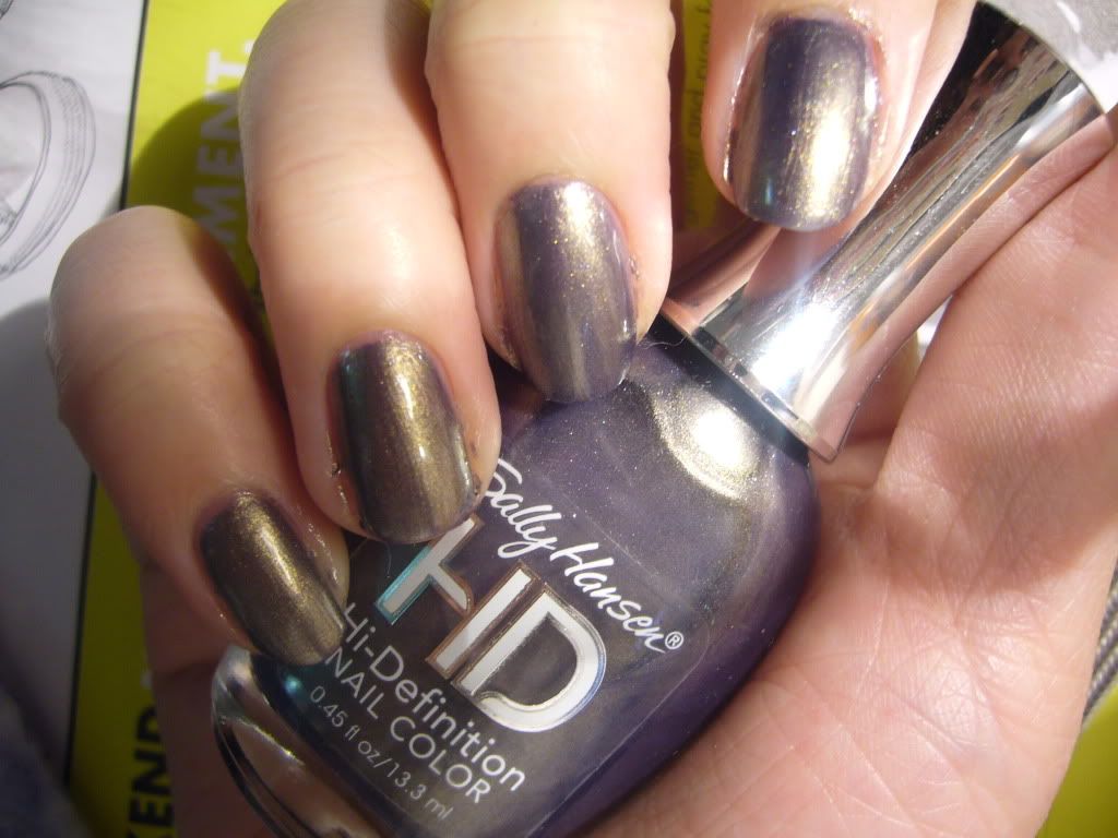
Today, I bring you Shu Uemura Tsumori Chisato collection swatches! This collection consists of two face palettes, three lipsticks, a highlighter, and a trio of lipglosses in a set. The Tsumori Chisato collection is a collaboration with (of course) Tsumori chisato, who is apparently a fashion designer and protegge of Issey Miyake, and is inpsired by fantasy, stars, art deco, animal elements and Greek mythology, all translated Japanese kawii style, I guess. I suppose if anyone can make Greek mythology cute, it's gotta be Shu, right?

The palettes consist of three powder eyeshadows, one cream shadow, one cream eyeliner, and one blush. There are two palettes, whimsically named the Planet Cat Palette and the Planet Rainbow Palette.

Normally I'd split this into a few posts, because no one likes reading long blog entries, but I figure since the collection's been out for awhile I'll just do it all at one go.

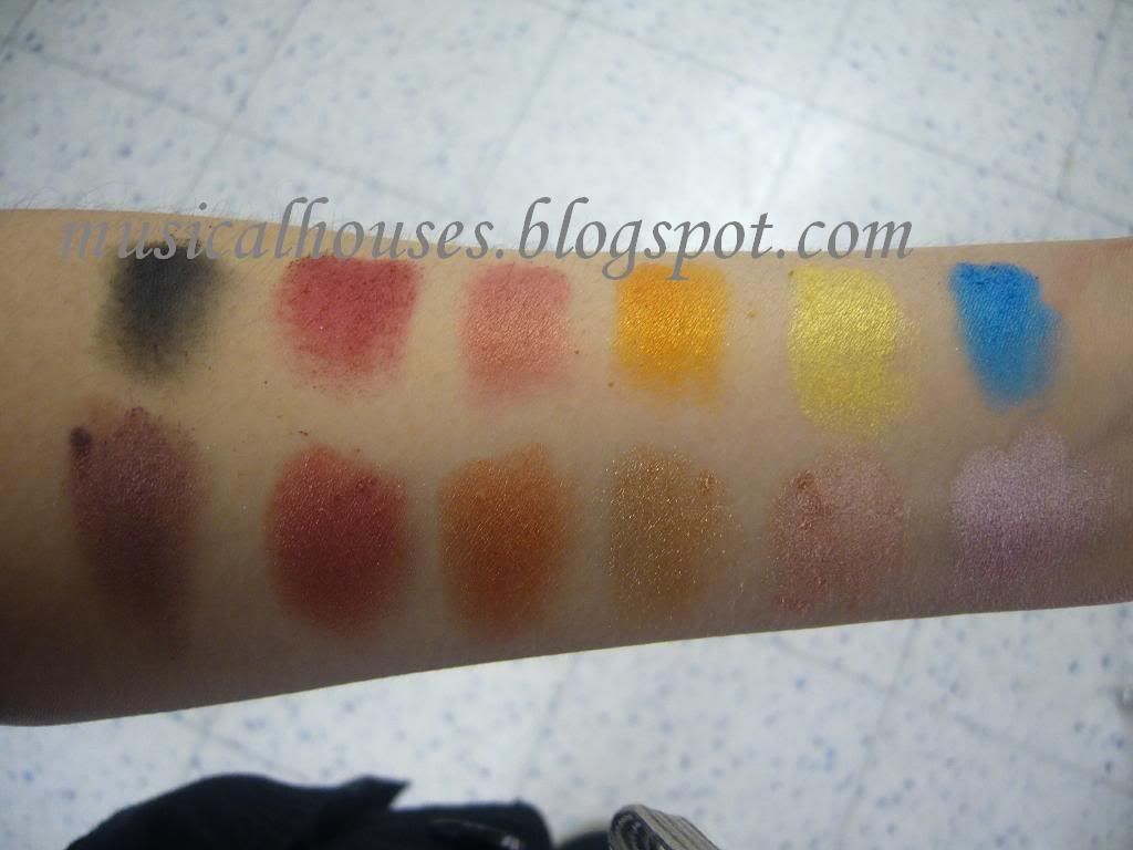
Swatches of the two palettes are below. The first one here is the Planet Cat Palette:

Shu Uemura Tsumori Chisato Planet Cat Palette

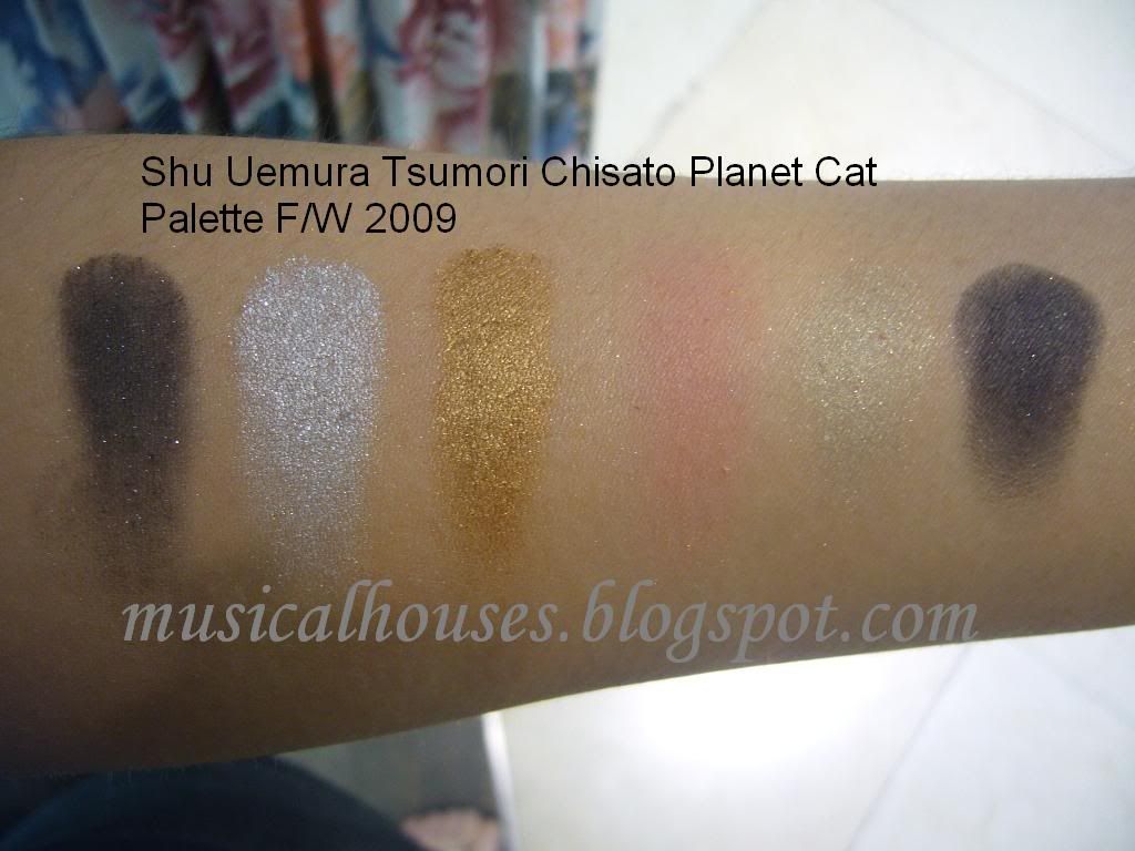
L - R: Powder shadows: black with glitter (glitter), metallic silver grey (shimmer), warm gold (shimmer) blush: pinky peach with gold shimmer (shimmer), Cream shadow: off-white with gold shimmer (shimmer), Cream eyeliner: soft black with gold glitter (glitter).

Quality-wise, it's not too bad, I suppose. The eyeshadows are pretty good, and they're nice and soft and pigmented, and have the usual Shu softness to them. The blush is rather sheer, and despite my attempts to build up the swatches, it doesn't show up very much. The cream shadows and liners are soft, but have I think too much slip, making them a tad hard to buid up, although they are buildable. But it kind of feels like digging around in a jar of partially melted butter or something - the shadows and liners are just very 'slippery'. It makes me wonder how good the lasting power will be, especially on oily lids. And another thing annoys me. This palette is seriously glitter heavy. I know it isn't a problem for some, but for those out there who are like me, the black powder shadow, and the cream white shadow, seriously have huge glitter bits. The blush is shimmery, but not by a lot - it's a do-able shimmer that I quite like. The non-glitter shadows, such as the silver metallic grey and the yellow gold shadow, have a nice shimmery, metallic finish that I think is very festive for the season.

I don't really like this palette, colour-wise. I don't imagine anyone's going to use all three colours together - I mean, how do you pair a cool-toned metallic silver with a warm gold? - but I guess using various individual components you could create a variety of eye looks. And to be fair the off-white cream eye shadow is very nice, and would make a good highlighter or base for most of the looks. But the palette isn't partiularly imaginative or creative, or even interesting. Come on, Shu, you can do better than that. And the blush - pinky peach with gold shimmer....Hmmm, now where have I seen that before? NARS Orgasm? Milani Luminuous? Quo? Mark? Wet n' Wild? It does look similar to NARS Orgasm and its many dupes, and as I'm sure any girl with a large enough makeup stash will know, that's a colour that's been done before, many times. Meh.

So that's it for the Planet Cat Palette.


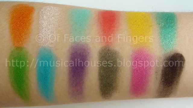
Now, here is the Planet Ribbon Palette:


Shu Uemura Tsumori Chisato Planet Ribbon Palette

L - R: Powder eyeshadows: Light pastel baby pink with metallic shimmer (shimmer), Metallic gold (shimmer), Off white with a vaguely purple hue (matte), Blush: Light coral pink, Cream shadow: yellow vanilla beige cream (shimmer), Cream liner: dark aubergine purple (matte)

I liked this palette marginally better than the Planet Cat one - but that's not saying much. Quality-wise, this was identical to the Planet Cat palette too. Planet ribbon also features, soft, buildable pigmented eyeshadows with the characteristic Shu feel, a very sheer blush that really needs building up, and slippery, soft, almost-too-slippery cream eyeshadow and liner.

Colour-wise, however, I think this is a bit better. Hey, at least there aren't two blacks in this palette. And I quite like the corally salmon pink blush. I think it's cute, although by no means OMG-WOW. But it's a pretty colour. The eyeshadows also contain a gold, which looks to me to be identical to be the gold in the Planet Cat Palette, so I guess unless you're hardcore collector there's really no need for both palettes. Once again, I presume that this palette is meant not to be used all at once, although I guess you COULD potentially use the pale pink and gold together for some sort of look. I like the highlighting cream colour, it kind of reminds me of MAC's Vanilla pigment in cream form, without the pink flash. But unfortunately the powder highlighter colour just looks white on me - and I'm by no means super dark so as to render all light colours ashy...I'm NC20, so I was kind of sad to see this pale lilac purple go so white on me. Meh. Also, I felt the cream eyeliner was a tad disappointing. In the pan it was dark purple gorgeousness, but once swatched on skin, it just looked kind of dull, flat, and almost-black.


I guess the palettes were just okay for me, although I can imagine lots of people would like them.


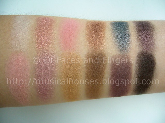
Now here is the highlighting powder, the Duo Highlighter in Stardust.

Shu Uemura Tsumori Chisato Duo Highlighter in Stardust


L - R: Individual areas: Pink beige (shimmer), pale yellow (shimmer). Together: Neutral beige (shimmer)

This highlighter was one of the nicer items in this collection, but that's just my personal opinion. One side was a light pinky beige, and the other was a pale yellow gold, both with shimmer, and together when combined give a neutral beige that would be pretty wearable for most ladies. I think this is quite nice, actually - the shimmer in it is there, definitely, but it is by no means huge bits of glitter. Its comprised of smaller shimmer that is pretty, and glowy without being too glowy. It's also on the sheer side, so you're going to get shimmer more than colour. I think the quality of the shimmer is just alright - it's not coarse and huge like drugstore can be, but it's not on par with Becca or Smashbox either. But then again it's hard to top Smashbox, and especially hard to top Becca when it comes to doing sophisticated shimmer that doesn't make you look like you overdid it. This is somewhere in between. It's alright, and it's not bad.


Here now, we have the lipsticks, or as Shu Uemura likes to call them the Unlimited Rouges, with planatery-themed names:

Shu Uemura Tsumori Chisato Lipsticks


L - R: Venus Pink, Moon Peach, Jupiter Brown

Ahhh, such inspiring names, such dull colours. People who love sheer lipsticks will LOVE all of these - they're sheer, and have to be layered on. But if you prefer your lip products more pigmented like me, then you'll just want to give whoever did this a slap - I mean, out of three lippies, all of them have to be sheer?!

Anyway, Venus Pink is a bright, cool-toned pink, Moon Peach isn't so much peach as it is pink - I guess there is some peach in there, but it looks more pink swatched for some reason. Jupiter Brown isn't really brown-brown, but more of pinky-peachy-beigey-brown, and very wearable. It's my favourite of the bunch.

The lipsticks are all very sheer, and very work appropriate - no odd shimmer, glitter, duochrome or anything that would look distracting at work.


Lastly, we have the glosses,aka the Gloss Unlimited, and these make me REALLY want to slap someone:

Shu Uemura Tsumori Chisato Lipgloss Trio


L - R: Venus Peach (sheer pinky-peach), Moon Gold (glittery gold bits in a clear base), Scorpion Red (sheer rosy red)

AGAIN?! Three glosses, and all of them are sheer?! Someone better get fired right now....Anyway, these glosses are deceiving. They look bright and pigmented and fun in the tube, but when swatched, only Scorpion Red appeals to my little heart. Venus Pink is a virtually clear pinky-peach, and kind of reminds me of MAC's Love Nectar, only much less interesting, and Moon Gold is a huge-glitter-bits nightmare - it's essentially transparent gloss with a HUGE amount of gold glitter bits that aren't exactly very small. They don't show up in the photo, but trust me, THEY'RE THERE. SO THERE. Anyway, out of the bunch, I like Scorpion Red, which to me is the other highlight of the collection. I like it a lot - it's a wearable rosy red gloss, which is perfect for people who want to try a red lip, but don't want to go full on in the opacity department. The glossiness of Scorpion Red will also help to soften some of the "I'm wearing red!" impact of the colour.

So how do I feel about this collection? My answer would - as I'm sure you know by now - be meh, meh, and meh. I'm kind of disappointed I didn't like anything, because if you know what a huge makeup ho I am, you'll know I want to like EVERTYTHING, but these are just such a terrible disappointment. Nothing appealed to me at all, and I'd pass on the entire collection unless you put a gun to my head, and if you did, I'd probably just buy the Gloss Unlimited Lipgloss Trio, and give away Venus Peach and Moon Gold, and just save Scorpion Red. And if you put another gun to the other side of my head, I'd get the Duo Stardust Highlighter, ooh and aah over its cute packaging, and never use it. There. Now you've heard it. I didn't like this, and I'm disappointed I didn't. But maybe someone else might, and they'll love both the inside, and the outside, too.

Nails Inc Basil Street and GOSH Purple Haze: KOTD

Friday, December 18, 2009

1 comment
Did I tell you I've been on a nude nailpolish kick lately? As of now I have 7 nudes in my collection, and I totally plan on doing a swatch comparison one day. But for now, here's a simple NOTD/KOTD for you!

Here's Nails Inc Basil Street:

Nails Inc Basil Street NOTD Swatch

Excuse the frazzle, and the fact that there are cotton wool bits stuck in my mani (I hate when that happens).

Basically, the perfect opaque non-pinky (or almost non-pinky, rather) beige nude. Perfect, perfect perfect. This one was smooth and easy to apply, and it was even and opaque in 2 coats. Unlike most nudes which can be often sheer or streaky or just a pain to apply (ahem, Essie), this covered well in 2 coats. Love, love, love.

Then, because I was bored, I just had to do this over it:

Nails Inc Basil Street GOSH Purple Haze KOTD

I know, I know, let's not talk about that smudge ok? :( And the fact that I suck at centralizing my designs :(

The interesting thing about GOSH Purple Haze is that it's a very dark, almost-black purple/green duochrome. AND it's opaque in 1 coat - thus making it ideal for Konading. The interesting thing though, is that depending on what color it is used to konad with, Purple Haze shows up either as a dark purple, or in this case, a dark green. It feels so weird to see your konad being green when you really used a dark purple, but I love this colour. It's like, self-adjusting or something. Really, really cool. So far when used with pinks it tends to veer purple, and here, with a beige it looks green. GOSH nail polishes are also in general one of my favourites, because they dry very fast. Sometimes I even wonder why I use a topcoat with them, but then I remember that I need to prevent the polish from chipping so fast. They also have a pretty decent wear time. Basically, I've pretty much liked everything I've tried from GOSH and Nails Inc.

Well, that's it for this post! I hope noone threw up from my terrible mani skills...

Roundup of Sleek iDivine Eyeshadow Palettes Week

Thursday, December 17, 2009

5 comments
So, this is the recap post of all the Sleek iDivine eyeshadow palettes I've swatched so far - Original, Acid, Sunset, and Storm. EDITED TO ADD: I've included swatches of the more recent Sleek palettes that have been swatched as well, to keep this list complete :)

Here are swatches of all of them. If you want to see my in-depth review of each palette, do click on the links provided!

Original iDivine Palette (full review link HERE):

Sleek Original iDivine Eyeshadow Palette


Acid iDivine Palette (full review link HERE):

Sleek Acid iDivine Eyeshadow Palette


Sunset iDivine Palette (full review link HERE):

Sleek Sunset iDivine Eyeshadow Palette

And lastly, Storm iDivine Palette (full review link HERE):

Sleek Storm iDivine Eyeshadow Palette

EDITED TO ADD: I've included swatches of the more recent Sleek Palettes here too, although they were swatched after this post had been written, just for completeness.

Bohemian iDivine Palette (full review link HERE):

Sleek Bohemian Palette Swatches

EDITED TO ADD: Circus iDivine Palette (full review link HERE):

Sleek Circus Palette

EDITED TO ADD: Curacao iDivine Palette (Curacao Palette review full post):

sleek curacao palette swatch


EDITED TO ADD: Oh So Special iDivine Palette (Oh So Special Palette full review)

sleek oh so special palette swatches


For some reason, it seems that for Sleek eyeshadows in general, the shimmers are of better quality than the mattes. Thus palettes with more shimmer shadows in them tend to be better than palettes with mostly mattes, so this would mean the Sunset and Original palettes, for example, are of better quality than the Acid palette, because they have more shimmer colours in them.

In terms of color coordination, I don't have very much to say about the palettes - after all, colour is a very personal thing. But I might like to point out that the two blues in the Sunset palette swatched very similarly on me. To be sure they arent 100% the same, but they just look rather similar on me. Maybe it's my colouring or something :X For someone who is looking for a work appropriate palette, the Storm palette would probably be your best bet, since it has a good mix of various neutral colours.

My favourite palette is probably the Original palette, although I prefer the colours in the Storm palette. However, the Storm palette has a couple of mattes which I feel bring down the overall quality of the palette a little. Also, between the Circus Palette and the Acid palette, I prefer the Circus Palette. Comparing the two, I just feel like the colour coordination and eyeshadow texture is better in the Circus palette.

I've still got more UK drugstore swatches, including more Sleek, Barry M, and GOSH, and I hope to put those up soon :)

Sally Hansen Opulent Cloud: Why only in the USA?!

3 comments
Sally is such a ho! She just has to make one of her most beautiful polishes ever hard to find, AND she had to make it available in the US only as well, so people like me who aren't in the US have to beg, borrow or steal - or rather, CP, ebay, or OA. But anyway, this is an awesome polish.

WARNING: TERRIBLE MUCKY PRE CLEAN UP PICS AHEAD!

Anyway, I know the whole of the blogosphere is already on it, bu did I say how much I love this thing? It has the most interesting duochrome ever:

Sally Hansen Opulent Cloud

That's two coats of Opulent Cloud, and that is what it looks like most of the time under indoor lighting - a greyed blue, or is it a blued grey? With some sort of taupey-greeny sheen? Interesting! The taupey-greeny sheen becomes much more prominent when outdoors, when the sunlight hits it directly. Then you get very little blue and the entire nail looks almost taupe.

Here's a picture showing the gradiation change of colour:

Sally Hansen Opulent Cloud


I know, I know. That is BAD. Polish overflow, frazzled cuticles, etc. That's why I put that warning at the top of the post. But it's there because unfortunately, this is the only picture I could take that fully showed the change in colours. Sadly, all my attempts at repeating the picture post-cleanup failed miserably. Sometimes some things only happen once, I guess.

But anyway, the gradiation in colours for this is so stunning. This is all 2 coats of Opulent Cloud, but each nail looks so different from the next! The last two fingers look grey-gold-green, while the index and middle finger look blue-grey-purple! I really love that duochrome, it really is very stunning! I really love the complexity of the colour, I can never quite decide if it's blue, grey, purple, gold, green, grey, or something else entirely!

Formula-wise, this is a little on the runny side - not annoyingly runny though. And it takes 2 coats to cover completely, and wear time is pretty alright. The colour is what makes it a real winner though! This is the first polish I might ever want a backup for!

Sleek iDivine Palette 4: Storm Palette Swatches!

Wednesday, December 16, 2009

1 comment
Today is the last day of our Sleek iDivine palette swatchfest!

And concluding this line is one of my favourites, the Storm Palette! Here are swatches:


Top row: Light neutral beigey tan (shimmer), Matte white (matte), Lightly browned beige (matte), Pale yellow gold (shimmer), Beigey peachy pink (shimmer), Medium warm brown (shimmer)

Bottom row: Medium ever slighly bronzed brown (shimmer), Greyed gunmetal blue (shimmer), Dark teal green (shimmer), Navy blue (shimmer), Cool brown (matte), Jet black (matte)

This palette is probably one of my favourites because it's so work appropriate with its browns, beiges, and pops of color. It's very versatile and lovely, color-wise. Also, most of the shades - particularly the shimmers - have really good pigmentation, and went on really smoothly, and the shadows were very soft. I also really love some of the colours, in particular the shimmery tan beige in the first row, it really looks so versatile and work-friendly.

However, like the Acid Palette, the few matte shades that were here in this palette were chalky and unpigmented, as my photo shows. The white, beige, brown, and black were all unpigmented and a bit chalky. Not very fun. It's a pity, because the shimmer shadows were of really great quality, and it just seems like their matte shadows aren't up to par. To be fair, there are worse matte drugstore eyeshadows out there, and these aren't THAT bad - but I guess after experiencing their shimmer shadows, I'm just feeling that the matte ones aren't really up to par, especially in the Acid palette.

This would have been my favourite palette of the entire bunch, but due to its lack of pigment, it's second after the Original palette instead.

So this almost-concludes my Sleek week! (LOL LAME, I know.) Tomorrow, I will do a recap of all the Sleek palettes! I also still have more great UK brand makeup swatches, from Sleek AND other brands, so stay tuned! :)

Sleek iDivine Palettes Part 3: Sunset Palette

Tuesday, December 15, 2009

4 comments
Hello everyone! I hope you liked the past two Sleek paletes we've been swatching. Today we will have a look at the Sleek iDivine Sunset Palette.

As usual, to start us off, here are swatches:

Sleek iDivine Acid Palette Swatches

Top row: Jet black (matte), burnt red (shimmer), peachy-pink with a hint of red (shimmer), yellow orange (shimmer), pale primariy yellow (shimmer), bright sky blue (shimmer)

Bottom row: Midtoned russet brown (shimmer), orangey bronzed red (shimmer), midtoned red-orange (shimmer), orange with silver glitter (glitter), shimmery peachy pink (shimmer), pale purple-pink lilac (shimmer)

This palette, as its name implies, is full of colors that make up a sunset - oranges, reds, yellows. I guess this is just one of those palettes that aren't for me - I just don't have the skills required to put together red, yellow, and blue. I imagine that this palette, with its many variations on orange, red, and yellow, would be perfect for someone who likes to do gradient looks in this color - you'd have a whole range of shades to blend with. The good thing is, this palette doesn't do too shabbily in the quality department.

Firstly, pigmentation, as you can see, is really quite good. It is almost on par with the Original palette, if not the same, and the shadows in the palette also have that soft, powdery quality that the original palette did. So quality-wise, I'd say this is pretty similar to the Original palette. Thus, as with the Original palette, I'd want to be careful when handling the palette, as the shadows might break easily, since they are so soft.

Another thing to note is that most of the colors are shimmery - not shimmer overload, to be sure, but there's a shimmer. Personally I like this very much, I feel it adds some dimension to the colours, but if you dislike shimmer then perhaps this is not for you. Only two of the colours have huge glitter bits a la Urban Decay - and those are the second last and the third last in the second row. Otherwise, I have little to complain about when it comes to this palette. Fortunately, it's very different from it's sister Acid Palette, which seems to be a dud out of all the palettes I swatched.

Anyhow, this concludes day 3 of 4 of our Sleek iDivine palettes swatchfest! Tomorrow, I will bring you the Sleek Storm iDivine palette, and hopefully another post of a recap of all the 4 palettes together. I've got more UK brand swatches planned after the Sleek iDivine palettes swatchfest runs its course, and I'll post them up after we're done with the iDivine palettes! :)

Sleek iDivine Palettes Part 2: Acid Palette

Monday, December 14, 2009

3 comments
Today, I bring you Part 2 of 4 o the Sleek iDivine Eyeshadow Palette swatches! And today I'm swatching the Acid Palette!

Again, as with all my pics, feel free to click on that tiny pic for the full-sized version.

Sleek Acid iDivine Palette Swatch


The top row consists of: a magenta-pink-purple color (shimmer), a white (matte), neon yellow (matte), neon orange (matte), a midtone royal bright blue (shimmer), a midtone jewel brighter blue (shimmer).

The bottom row: midtone neon purple (matte), bright olivey green (matte), screaming neon pink (matte), bright lime green (matte), shimmery midtone gunmetal grey with tiny silver shimmer(shimmer/small glitter), jet black (matte).

As you can see, unlike yesterday's palette, today's palette is bright, screaming, and highlighter-colored, eye-blinding neon, as well as matte. And of course, I'm a neutrals ho, so screaming neon is out of the question for me, but in the name of makeup equality and non-discrimination, I can always appreciate and admire a good neon. But this palette kind of makes me a bit sad.

Well, firstly, 2 of the colours kind of look the same to me, the two blues in the first row. Well, to be fair, they're not 100% the same colour. The second blue is brighter than the first blue, and the second blue is more of a bright jewel toned aqua kind of blue, whereas the first blue is more royal blue, but otherwise, they look very similar when swatched. That disappointed me, because in the pan they looked different.

Secondly, 3 of the colors are of really poor quality. I know I know, this is Sleek, and their eyeshadow palettes are supposed to be good! Well...I don't know. Maybe the testers were a bit messed up, but the neon orange, the matte white, and the lime green were disappointingly sheer, as my photo attests. I have no idea why. I tried piling on more eyeshadow, I tried scraping off the top layer of powder off the testers, all to no results. I hope this is just a dud, but I really wouldn't know. I'm quite disappointed by the Acid palette, for some reason it seems to be the dud of the lot, and it's by far the lousiest in terms of quality, as compared to its fellow iDivine Palettes. I suspect it's due to the fact that unlike the other palettes, which are mostly shimmers, this palette is primarily composed of mattes.

But that's not to say the palette's all bad. After all, as promised the colors are very neon, and they really do have that day-glo quality of brightness. If you like brights, this is just up your alley. It's also mostly matte, so this is good for people who like mattes as well. And it has a few nice colors - the gunmetal grey, while not particularly unique, is very pretty, and the magenta-purple-pink at the top left corner has a certain glowy shimmer to it. So they're not all bad, they just didn't blow me away with screaming neon pigmentation. It's such a pity to see pretty neons ruined by sheerness, but maybe this might be someone else's cup of tea.

So that's it for today's review on the Sleek iDivine Acid Palette. Tomorrow, I will bring you another Sleek palette!

Sleek iDivine Palettes Part 1: Original Palette Swatches

Sunday, December 13, 2009

5 comments
Good morning my lovelies! Today, as promised, we begin our 4-day swatchfest of the Sleek iDivine Palettes! Unfortunately I didn't manage to swatch Graphite, because my local Superdrug was out of palettes and there was no tester, but I have everything else! Today, we begin with the Original iDivine Palette - what better way is there to start, than to start with the original palette?

As usual, as is with all my pics, you can click for the full-sized picture.


Unfortunately, the individual colors have no names, but this is a really good palettes, and one of my favourites out of the entire range. Here's the colour breakdown, along with my monologue:

The top row of the palette consists of: a black (matte), a light lilac purple (shimmer), a deep indigo blue (shimmer), a light aqua blue(shimmer), and a lovely turquoise color that is a nice balance between green and blue (shimmer), a lovely emerald green that is very pretty (shimmer).

The bottom row of the palette has: a pale cool gold, which I love, because it's so hard to fine a cool gold (glitter), a lovely and unique light purple-pink rose color with gold flash (duochrome), a nude tan pink (glitter), a warm mid-toned bronzey brown (shimmer/small glitter), a dark neutral brown (shimmer/small glitter), an olive green with small gold glitters (shimmer/small glitter).

This palette was one of the better ones in terms of pigmentation and texture of the eyeshadows. Pigmentation-wise, there wasn't a single dud in the lot - all of them swatched smoothly, and went on with lots of colour. However, there are two shades that are particularly glittery, the pale cool gold, and the nude tan pink, both in the bottom row of colours. Both of them have pretty huge bits of glitter, and had a bit of glitter fallout. Some other colors had glitter, but not in huge bits, just tiny bits that didn't actually bother me, which are the last three colors in the bottm row. I felt that although there was glitter, it was fine enough to make it pretty usable, and I do think the glitters add to the dimension of the colours. I really loved the olive green with small gold glitters - it's like Urban Decay Stash 24/7 eyeliner in eyeshadow form! Cool.

The colors were also very vibrant. The lighter shadows in the top row, such as the light aqua blue, the turquoise, and the emerald green, were all very glowly jewel-tone colors, and there was a certain depth to them, as they were very clear, unmuted colours. I also liked in particular the light purple-pink color with gold flash, it really adds interest and depth to the color. I like the contrast of a warm gold flash with the coolness of the pink-puple lilac base color. It's pretty neat.

Now for texture. All of these had above average texture, especially for drugstore shadows. These are pretty good, there was no chalkiness, and every single one of the shadows was very soft. In fact, a little too soft perhaps, as some of them were a bit powdery. I'd have to handle these palettes carefully, since they're a little bit on the soft and powdery side.

So that's it for today. Tomorrow I will bring you another Sleek iDivine palette, and I will leave you to speculate on which one it is :)

Face Brushes Review and Comparison 3: Flirt Feather Dust-her, Stila #8, Stila #21

Saturday, December 12, 2009

1 comment
Today is the last installment of my comparison and review of face brushes (Part 1 is HERE, and Part 2 is HERE). But you know what? Today I just spent a whole day swatching stuff, so I'm SO EXCITED about what I'm going to bring you! :) You'll love it, trust me ;) Starting tomorrow, I'm going to be posting swatches of ALL the Sleek iDivine palettes, one a day! :) So you're going to love it :)


Anyway on the topic of face brushes. Today we're reviewing the Flirt! Feather Dust-Her, the Stila #8, and the Stila #21, all of which are brushes which make my heart melt with delight everytime I see them.

First of all. The Flirt! brush is really nice, and it has bristles that are floppier and sparser than the 188. Unfortunately, this sparseness and floppiness means that it picks up...almost nothing. At least, that is if you're using it for powder. However, when used it for cream blushes, it gives the perfect application! I like how the soft bristles work well with all types of cream blushes, from the harder Bobbi Brown ones to the soft-as-mush Becca ones, but this one works with all of them. I think in this case the floppiness of the bristles works to its advantage - you don't get dots of cream blush on your face as might happen if the bristles of a skunk brush are too unwieldy, you just get a nice blended look. This is my HG brush for all cream blushes, although it's totally useless for powder.

Next, we have the Stila #8. This is just an ordinary powder brush, and it's definitely too big to be used for blush or highlighter or anything else - unless you happen to want to put it all over your face. But it does the job very well. There's something about this brush that totally kicks the ass of all my other powder brushes, including the MAC 134. For one, the bristles are not too dense, and not too sparse. And another thing is that the bristles are very soft. And another thing is that the dome shape is just right. This brush is a flat paddle powder brush, and I like how the dome shape works with that. Altogether, this is a very well constructed brush, especially for loose powder. Nothing compares to this baby. It's perfect, but it's also discontinued...*Shakes fist*

Lastly, we have the Stila #21. Unlike it's sister, it's actually still in production - so if you use pressed powder or blush, get this now! I love how I can use this for any and everything - except eyeshadow, LOL. For pressed powder or loose powder, I use the entire circular face of this brush, and for less pigmented blushes, I also 'stamp' on the brush using its circular face. For more pigmented blush, however, as well as for highlighters, I use the edge of the brush, and gently blend it in. Viola! Face done! I could use this for powder, then blush, then highlighter, and throw on some lippie and be out of the door, so this is really a great multi-tasker. It's really one of the best brushes there is!

So that concludes it for today! Starting tomorrow over the next 4 days, I will be posting SWATCHES OF THE SLEEK I-DIVINE PALETTES! So look out for it! :)

Face Brushes Review and Comparison 2: MAC 188, Stila #24 and Body Shop Blush Brush

Leave a comment
Flirt MAC Body Shop and Stila face brushes

OK, so we had a nice diversion with Bourjois Brun Nylon. Now back to brushes: here's Part 2 of my face brushes review!

So in this previous post, I talked about the MAC 187 and 189, and how they were nice, but not really must-haves for me. Today, I will review and compare The Body Shop's synthetic blush brush, and the Stila #24. Just like how last post's brushes were all for face and foundation, today's brushes are all blush brushes!

The Body Shop has a really nice and soft range of synthetic brushes, comparable to the Too Faced ones in feel and quality, and I really like them for the face. I don't like them so much for eyes because sythetic brushes by their nature tend to pick up less pigment than natural hair brushes - this isn't so annoying when applying face powder or blush, when you want a sheerer application, but can be a pain if you're trying to put on eye colour, and you want the colour to show up. Thus, I tend to buy synthetic brushes for face use only. That said, I really like The Body Shop's version, for what it's worth. It has a nice dome shape, which fits into your cheek nicely, and it's nice to hold and use. I use this pretty often, especially for my more pigmented blushes, because like I said, the synthetic bristles pick up less pigment than, say the Stila #24, which is all natural hair. Although of course, if I reallly want a very sheer wash, I'd use my MAC #188 for that, because of its smaller size and it's sparse bristles. The only minor gripe I have with this is that the distribution of powder that it puts on your face isn't totally even. For some reason (I think it's because the dome shape ends abruptly at the sides - does that make sense? I can't think of a better way of putting it), it tends to put a greater amount of color in some areas than in others. It's not a big deal, because I just blend it out and it works well, but it's something I thought I'd just note. Like I said, it's a minor gripe.

The MAC 188 is of course, the little sister of the MAC 187, except, much better due to its smaller size. Here, like I mentioned above, it works reallly well for the most pigmented of blushes, like for example, your NARS Exhibit A. It also works fantastically for highlighters, especially for MSFs, because the sparse bristles work to prevent glitter overload. Very useful indeed. I like this one, and there's not much else to be said for this.

Last of all, the Stila #24 is a must-have for anyone who loves blush, but has a stash of mostly moderate-to-lightly pigmented blushes. Like the MAC 188, the Stila #24 is made out of natural hair, but the bristles are denser on both ends (duh!), and the larger end has a dome shape. If you look at the picture above you'll see that the larger domed end is actually just the right shape for blush - meaning that the brush itself isn't big, and the other end (which resembles a mini Stila #21), is really, really tiny. A lot of people ask me if the Stila #24 can be used for the entire face, like for face powder application, because they have been woefully misled by pictures on the Stila website, which somehow always seem to make the Stila #24 look a lot bigger than it is. You defintely won't be able to use this to powder your face, unless you're a pixie or something....Although it COULD double up as a powder blush if you want to squeeze one into your makeup bag, since its bristles are just the right type and density. It just would take a lot longer than using an actual powder brush, such as the Stila #8. Despite its smallness, I really like this brush! I love the rounded, domed end for powder blushes that aren't too pigmented, as it picks up just the right amount, deposits it evenly, and is just the right size for fitting on my cheek! And as for the other mini end? Wellllll....I'm not really sure what to do with it, and to be frankly honest, I rarely, if ever, use that tiny end. I do guess it would probably be good for powder highlighters, for spot highlighting. Otherwise, I can't think of a use for this - suggestions anyone? I do think the tiny end makes this brush a pity, since it is so expensive. I do love the bigger end, but I kind of think for USD$50, it isn't really worth the cost if you're not going to use the smaller end at all. The fact that I have it in my stash shows that I'm a sucker, I guess..

Anyway, that concludes Part 2 of my review and comparisons of face brushes for today. In Part 3, we will deal with the remaining brushes, which are all on my can't-live-without list, and you'll see why! :)

GOSH Holographic Nail Polish: NOTD

Friday, December 11, 2009

7 comments
I know that this blog is about faces (makeup) and fingers (nail polish), but due to my lowdown on my makeup brushes (Part 1 here and Part 2 will be up tomorrow!) I've been neglecting the fingers side of the blog a little. But now I'm evening the score with this darling of an NOTD: GOSH Holographic!

For those who don't know what GOSH is, it's a drugstore brand found in the UK. (EDITED TO ADD: Thanks to Pixie, I've learned that they're actually a Danish company! Cool! Thanks Pixie!) Superdrug carries it, I believe. And even then, it's pretty expensive - for drugstore that is. But they make some awesome items, particularly their lipsticks, eyeliners and nail polish. At some point I hope to swatch the lipsticks and eyeliners, but I don't think I could ever swatch all their polishes...

Anyway back to the story. Yes, GOSH Holographic. I've heard this touted as a dupe (possibly a better dupe, even) for Chanel Holographic, but I don't own the Chanel, so I can't verify. But this polish was holo awesomeness in a bottle, and even though the holo doesn't look like much on the bottle, on the nail, it is absolutely STUNNING. My friends always exclaim, "Look! Your nails!" whenever I wear this, so you know it's a keeper.


As you can tell, these were pre-cleanup pics, and they were 3 coats. I'm sorry for the ickiness of the pre-cleanup-ness, and for the frazzles on my cuticles. But frazzles and ickiness aside, isn't this a beauty? It's HOLO, BABY, HOLO! I even took two pictures just to show you how holo it can be, since the first picture sucked in showing the holo.

Application on this one isn't bad once you get the hang of it. I read a lot of blogs saying that they had to use 3 or 4 coats, and this was a nightmare to apply as the holographic glitter tended to clump together and become uneven when you apply subsequent coats....Well, that is true, if you don't wait for the polish to completely, and I DO mean completely, as in let's-wait-an-extra-3-mins-to-be-sure kind of completely, dry. Yes, it's a little of a hassle in that sense, because with most polishes you can get away with not waiting for the layers to dry, but with this one, you simply can't - if you put more polish on top of a wet layer, you will get the result of having your holographic glitter clump together, and you'll get too much holo in one spot, and no holo in other spots. And THEN you'll have to use 3 or 4 coats to cover up the uneveness. So, as long as you wait for each sheet to dry, you could probably just 2-3. Of course, I didn't know this, so I painted on top of wet polish, and had to use 3 coats.

Same goes for the basecoat. I've also read a lot of blogs going on about how you simply can't use a basecoat with it, and in this NOTD I've successfully used it with a basecoat - once again, the trick is to wait for the basecoat to completely, completey dry.

The polish in this bottle has a consistency that's more on the watery side, but not enough to irk me. All the GOSH polishes I've had were all of that slightly watery consistency, with the exception of GOSH Rainbow (which I should totally do an NOTD with sometime!) because of the suspended flakies in the polish. The good thing about GOSH polishes that I really like though, is that they dry SUPER fast. Sometimes I even wonder why I bother to use a topcoat with these things, because when I'm done doing my last nail, my first nail is already dry to the touch, albeit a very light and ginger touch. Of course these don't dry as fast as the OPI Suedes, but for non-suede polish, they're pretty much the fastest drying ones I've found so far.

Edited to add: The day after, IT CHIPPED! And I don't mean like tiny, at-the-corners-of-your-nails chipped. This is odd, because the other GOSH polishes I've tried weren't like that. But Pixie tells me it might be because it's a holo polish, and holo polishes in general tend to be chippy. I think she's right :) Thanks again, Pixie!

Taupe of the Day: Bourjois Ombre Stretch Brun Nylon Swatch

4 comments
As you know, from my stash pics here in this post, I have more taupes than I could ever use up. In fact, I suspect that there will be enough for me, my children, and my grandchildren - future generations will always have enough taupe!

So today I wil show you a taupe from my collection, but wasn't in my stash pics (horror!) - Bourjois Ombre Stretch Eyeshadow in Brun Nylon. Now I'm not that huge a fan of Bourjois - I mean, I don't hate the brand, but it's just never been one of those that caught my eye, although I've heard people rave about their blushes. But I think this shadow isn't shabby at all - in fact, I quite like it. As usual, feel free to click on all the pics for the full-sized picture.

Bourjois Ombre Stretch Brun Nylon

That's the outside packaging. Please ignore that purple residue from the huge tag Superdrug likes to put on all its products.

Bourjois Ombre Stretch Brun Nylon

And that's a closeup of the baby.

Bourjois Ombre Stretch Brun Nylon

Oh yes. Hey there, gorgeous.
And of course, no review is complete without a swatch!

Bourjois Ombre Stretch Brun Nylon Swatch

That swatch is in shaded natural light (in other words, me pressing my arm against my basement bedroom window, hoping enough light flows in to take a picture...) so there shouldn't be too much color distortion.

Anyway, here it is. It might surprise some people, since this isn't your expected 'taupe', like Satin Taupe or ME850, but it's a good bit lighter, and a tad browner. I kind of like it this way though, it's actually pretty unique in my stash, and that's saying something :P It's not a dark taupey, purply taupe, like MAC's Satin Taupe, but it's a good medium-to-light taupey color, with a good shot of silver, beige-ish-ness (I think that's what makes it medium-to-light, instead of a dark plummy taupe), and just a hint of purple. But it's still taupe. It reminds me of a more purple, less beige and brown Stila Wheat, since it's of a similar color depth. It's a little on the frosty side, but not so frosty that it's unwearable. Because of the mix of beige and purple in the color, I'd say this color is pretty neutral, maybe leaning a tad to the cool side. I think for most people, this would work as a lid color for most people, and would probably have to be paired with a darker colour for the crease - for my NC20 self, this shows up well enough on my skin. I personally really love this color, because for me a lot of the cult taupes out there tend to be on the dark side, and it's hard finding a nice light taupe. This for me is perfect - not too dark and not too light.

Pigmentation starts off sheer at first, but color is very buildable. I think that's what the 'Ombre Stretch' selling point means - the idea is that they have these nylon micro-spheres that allow the shadows to be 'stretched' out - i.e. stretched out sheer, or packed on opaque. I don't believe nylon particles are going to make an eyeshadow fantastic, but at least they got the description right on this one - it is buildable, and very nicely buildable, even if it starts off sheer. Just the whole thing about nylon-microspheres is such a terrible way to put it across to the consumer - I'm not sure if the average consumer is going to understand the mix of nylon and eyeshadow. Bu at least there's no false advertising here - it does start off sheer, and builds nicely. The texture of Brun Nylon is also pretty smooth, which is good, and it applies well.

I wore Brun Nylon for one entire day to try out how it wore as the day went on, and I'm pleased to say this is decent. It doesn't fade, but it does crease a little by the end of the day, but I wasn't wearing any primer or base (I don't have major eyeshadow issues so I've never found it necessary), so I think with a little primer this will be much better.

If you don't mind frosty eyeshadows, or the fact that you have to build up the pigment, and if you've been wanting a light taupe, not a deep, dark, taupe, this is worth a shot. It's harder to find a light taupe than a dark taupe, and good ones are hard to come by, so if you feel that alot of the taupey colors out there are too dark for you, this is worth a try. Brun Nylon isn't a flashy colour, and it isn't going to start any periods of obssessing on MUA, nor is it going to garner a whole host of cult followers, but it's a good workhorse basic.

Face Brushes Review and Comparison: Part 1 MAC 187 and 189

Thursday, December 10, 2009

3 comments
So I said in this post that I should do a post on my face brushes. And here you go! Over the next few days/weeks/however long it takes (with interruptions), I'll be doing reviews of my favourite brushes in my stash! Here they are. Not all of them are here, of course, but these are my favourites, my must-haves, and the ones I use the most often. Just a disclaimer: None of these brushes are free samples etc. I bought every single one of these with my own hard-earned money! I'm just reviewing them because...well they're in my stash, and well, a HG powder or blush brush can be the hardest thing to find sometimes, and it doesn't help that brushes tend to cost a lot of money:

Makeup Brushes MAC Stila Body Shop and Flirt

L - R: Flirt! Feather Dust-Her, Body Shop blush brush, MAC 188, MAC 187, MAC 189, Stila #21, Stila #8, Stila #24

So here they are, after being washed, mostly dry. I thought it would be a good idea to take all the face brushes together, to give an idea of scale and relative size, so you can get a good idea of how big/small one brush is next to another. Sadly, the Stila #8 has been discontinued, much to my chagrin, because it was one of the best powder brushes I've ever had (and this is after trying the MAC 134 and the Shu Uemura 18R). *Shakes fist* When I contacted Stila Customer Service about it, the jokers at CS told me to go and look at the Stila #31, which is NOT AT ALL like the #8. The #8 is much better in quality than the #31, but then again I have a thing against retractable brushes in general (except my Too Faced Kabuki - wait, why is it not in the picture? Nevermind, it gets it's own review, then I guess).

Anyway, today I will kick off my Face Brushes Series with a review of the MAC 189, and the MAC 187, because I don't have much to say about them. To be honest, they're the least used and the least favourite in the bunch, but that's probably just me.

The MAC 187 brush has reached cult status across makeupdom, and is the HG brush of many a liquid foundation user. Which herein lies why I don't like the MAC 187 as much as other people do - I don't use liquid foundation. I did use it to try to blend out my Kevin Aucoin Sensual Skin Enhancer, but somehow it didn't quite look 'right' even then. For blush application this is pretty good though - I like how the shape of the 187 fits just right onto my cheek area, not too small, and not too big. However, I tend to prefer the either the 188, the Stila #24, or the Body Shop blush brush, depending on what blushes I'm using (more on that in later reviews). So as a result, my 187 suffers from neglect. I do think this is a good quality brush though, it's just that the fact that I don't wear liquid foundation - coupled with the fact that I tend to use my other blush brushes over it - makes it rarely used.

The MAC 189 brush was first launched together with the MSF Naturals, and was touted as a blush that can be used for BOTH powder and cream. Now of course this flies against the face of all my makeup training and knowledge - traditional makeup theory says that synthetic brushes are best for cream, and natural brushes are best for powder, although of course in recent years the boundary has been blurred with the advent of better synthetic bristles etc etc. Anyway, I was curious to see how this worked for both powder and cream, and I have to say....I'm a bit ambivalent when it comes to poweder. Sure it applied face powder fairly well, but it just felt weird using a paddle synthetic brush to put on powder, if you know what I mean. I felt the finish was acceptable - it wasn't fantastic, but it wasn't le suckage either. I also tried using it for powder blush, but the effect wasn't as great as using an actualy blush brush, as the blending was a bit hard to do with the brush. I tried using this baby for cream blushes too, and once again, I found it a bit hard to blend out the cream blushes, as it tended to leave a hard line where the edges of the bristles were. Maybe I'm spoiled by all the skunk brushes out there, but this was just a meh for me. Not impressed.

So that's it for this brush post. I've no idea what brushes I'll cover for the next brush post, so feel free to comment and leave any suggestions :) I'll cover all of them eventually though :)

STASH PICS! Aka why I can swatch and compare from my stash alone

Wednesday, December 9, 2009

8 comments
So early on in this blog I said I wouldn't be doing the whole checking-out-new-color-collections thing, and of course the only reason why I said this was because I already have TONS of my own makeup, and I'd like to swatch them for my own reference.

So of course, since stash pics are always a beauty to behold, no matter the eye of the beholder, without further ado, here you go, along with wordy running commentary courtesy of yours truly:


That is my stash of eye palettes. These are Stila, Becca and MAC, I believe. I like my MAC - I've always been fortunate enough to pick the colors that didn't suck, and I LOVE my Stila. I know right now they're pretty much an over-the-hill brand, but back then once upon a time it was the fashionable thing on MUA to collect Stila eyeshadows, believe it or not. And for good reason too - the older ones in the cardboard packaging were the softest, pigment-est, and blendable-est things ever, AND they had great staying power. I kind of feel that the quality of Stila has gone down the hill in recent years, even with the eyeshadows. I had a Stila Espresso once in a cardboard tin, and swapped it away. Later I had swapper's remorse and got another Stila Espresso (by then they were selling them in pans like they do now), and the quality was le suckage compared to the old one. Sigh. Sad but true. Now I'm holding on to my Stila palettes, which were depotted from the cardboard tins, and I'm never letting them go - they're memories of a brand long gone by..


That's my single eyeshadows stash. Since this picture was taken I've depotted some of them and paletted them. Only 1 15-pan palette though. I kind of feel like I use my shadows more when they're in singles than when not. I've no idea why, I'm weird like that. I'm totally partial to MAC when it comes to shadows (although I'll be the first to admit they're super hit-and-miss when it comes to quality, but still not as hit-and-miss as NARS is), although I do like WnW, Urban Decay, and some other brands like Chantecaille.


Mmmmmm....Blushes. There are fewer things that make me happier than blushes. Despite the fact that I have chronic acne and super sensitive skin, it hasn't stopped me from getting more blushes...As a result I've become really awesome at reading ingredients in blushes and picking out the comodegenic ingredients. LOL. Sadly since this photo was taken I've gotten rid of the NARS (I think it was the isopropyl palmitate inside breaking me out) sadly, but I love much of the rest, esp the BB, Stila and Becca for cream blushes, and the WnW for powder.


Lipglosses! This was my first foray into the world of makeup! I'm a huge fan of lipglosses, and I totally don't discriminate - as long as it has no huge bits of glitter (ahem MAC Dazzleglasses), I'm one happy kid. As you can see I'm partial to Stila, but I also really like Smashbox (totally underrated IMO), and NARS. But my good ol' stanby is that old dingy Sally Hansen gloss you see up there - top row, 2nd from left. Can you say HG?


Lipsticks....So recently I've gotten into lipsticks, and have proceeded to build up a collection of them. As you can tell I like the rosy-lipcolour look, since I don't really like nude lips. I had a lot of MAC in this picture, but honestly I found them kind of drying, so I swapped them all away, except for 2 or 3. My HG of HGs for lipstick would be the Covergirl Trushine in Blushberry, which @#%@#$#*%* Covergirl had to discontinue. *Shakes fist angrily*


Lastly, random misc stuff, like my cream eyeshadows, eyeliners and loose shadows. Since this picture was taken, I've discovered the wonderful world of gel eyeliners (esp love BB and MAC), and have swapped away my loose powder eyeshadows (I guess I'm too clumsy for them). Still mucho love to the rest that remain though! I still have all my Urban Decay 24/7 liners, if not more, since they're literally the best pencil liners around.

So there you have it, that is my happy stash. I hope to do swatches and comparisons from my own stash - maybe it'll help me weed out the dupes in my stash too!

Are they dupes? Comparison Swatches and pictures - NARS Outlaw vs Wet and Wild Berry Shimmer

Tuesday, December 8, 2009

4 comments
Since good ol' Wet n' Wild brought out its Silk Finish Berry Shimmer blush, there's been a lot of talk about whether that particular WnW color is a dupe for NARS Outlaw. Now, it so happened that I had Outlaw, which I swapped for awhile back, but NARS blushes were breaking me out, so I though I'd get the Berry Shimmer and see if they were really dupes! I totally wanted them to be, and were they?


Click for full sized pic.


Well this photo above makes them look pretty close in the pan. To be fair, they are both definitely in the same colour family - both of them are bright berries that have a touch of dustiness in them. The WnW, however is more of a screaming berry tha, while the NARS is more dusty. And the NARS is more cool-toned than the WnW - it's obviously more blue-based.

Now, for some swatches:


L - R: WnW Berry Shimmer applied lightly, NARS Outlaw applied lightly, WnW berry shimmer applied heavily, NARS Outlaw applied heavily. These were taken in shaded natural light.

Click for full sized pic.

Now, it becomes pretty evident that although they're close, they aren't by any means dupes, like other people have been saying. Sure they're in the same colour family, but there's a definite difference when swatched, as is evident from the picture. While they're both berries, the WnW is a warmer berry, while the NARS is a cooler berry. Also as I've mentioned before, the WnW is brighter, while the NARS is a more muted, 'dusty' colour - of course this is relative, since both the WnW and NARS are pretty bright anyway. Both of them have gold shimmer, so for anyone who hates shimmer blushes, I'm afraid you're out of luck. But I love the way the shimmer is done in both blushes though, it's glowy without being overdone.

So I guess if you wanted a cheap-ass dupe of NARS Outlaw, I'm sorry people, this isn't actually a dupe, but it's pretty darn close. Especially if you're a warm-toned girl. In fact, if you're a warm-toned girl, this might actually suit you better than the NARS, since the NARS is definitely cool-toned, and might wind up looking 'bruise'-like on warmer skin. Outlaw is definitely a color that's better on cooler skin, IMHO, so if you're warm, you've got yourself a deal with the WnW - same berry color with similar gold shimer, just with a warmer undertone. However, if you're really cooltoned, I'm afraid the NARS is still the more $$$$$ way to go.

That's not to say the WnW isn't pretty in it's own right. I totally love it, it's an awesome color, and definitely a must-buy the next time you head to your local Walgreens. I'm just saying as a dupe it isn't a 100% dupe.

And another thing I noticed that might surprise people - Berry Shimmer was insanely pigmented, much more than NARS Outlaw in fact! *Cue gasps of surprise and mood music* For the heavy swatches, I had to dig into my Outlaw to build up the swatch, but the Berry Shimmer heavy swatch was just a few strokes of color! Yes, yes, yes, we all know NARS blushes are so insanely pigemented that very few beat them, but guess what, WnW has decided to load their blushes in the pigment department, and they have come out on top! I myself was very surprised swatching this, because while I've had really good experiences with WnW blushes in the past, this was just totally AWESOME. A skunk will definitely be required for application - don't say I didn't warn ya!

The only gripes I have about WnW are the packaging. The plastic window in the casing likes to come off and dig into the blush (be careful if travelling with it), and the small brush it comes with is really useless. The brush issue isnt a problem for me, since i use my own brushes anyway (which reminds me, I must do a post on face brushes soon), but I'm always worried about my WnW blushes getting all banged up if the plastic window screen comes off. It's not that sturdy for travelling, the NARS has much better packaging in that respect. But then again, it's not perfect either - anyone who has owned a NARS anything will know that that rubber casing likes to attract loose powder and lint, so it looks really dirty after awhile. Wiping it down with a wet baby wipe to remove the gunk built up on it should do the trick though.

I love my NARS, of course - in fact I was wearing Outlaw everyday for a week straight before I started breaking out due to the Isopropyl Palmitate (that's how much I love it), and to a lesser extent the Tocopherol, so I'm always glad to have an alternative that doesn't break me out :) Of course, YMMV, so just because it breaks me out doesn't mean it breaks you out etc etc etc...But I just thought I'd mention it, because so many other bloggers tend to get drunk on the NARS kool-aid and start raving about it, when actually some of the ingredients in their blushes are potentially pore-clogging - it's just good to put it out there. Of course, tons of people wear their blushes and it doesn't break them out - but for the rest of us, there's always Berry Shimmer.

Yay, a new blog! And NOTD: Nails Inc Jermyn Street

Monday, December 7, 2009

4 comments
Ok, so right now I'm busy with work and all, but holidays are coming up soon, and soon I will have time to post. For now this is going to be limited to makeup posts (no FOTDs, sorry), and NOTD posts, because I'm a huge slacker, and there are plenty of blogs doing the let's-swatch-every-new-collection-that-comes-out thing. This is going to be my online reference place - for things I like or hate - basically things I have something to say about.

I'll probably start with some NOTD posts, because that's what I'm into right now. With any luck I'll document my swatches (dupes, personal stash) at some point. I could post everything on MUA, and I will, but it's just nice to have my own personal space for reference, where everything I have is in one place.

Anyway, without further ado, here's my first constructive post ever: an NOTD from awhile back - Nails Inc Jermyn Street, which I bought sometime in the not-too-distant past, when I went on a total Nails Inc haulage! (Yes this is the disclosure bit - I bought this myself! Not paid to write this or affiliated to any company blah blah blah...Dude, duh. My blog, just born, is not famous enough to get freebies. And with how slack I am it's never going to reach the pinnacle of blog famedom.)Of course, I just HAD to get this, it's one of the standouts of their line, and purply-taupey-brown? Mmmmmm...that's my favourite eyeshadow color, and it would make a good nail colour too!

I really love Nails Inc polishes, every single one I've used has had the bestest application ever - smooth, even, just the right balance between thin and thick, and some of the colours (especially the darker ones in my experience) are so awesomely pigmented that you could probably Konad with them. Now I'm a nail noob, and I'm nowhere near the gods of the nail board on MUA, but I've spent enough of my dough on nail polishes to know an awesome one when I see it. And this, ladies and gents, is totally AWESOME.


Click to see full-sized pic.

This is 2 coats, no topcoat, under crappy lamplight. And yes, it's a crappy pre-clean-up pic, so sorry about the frazzles et al. The colour is pretty close, though, despite the lamplight, if I do say so myself. It's even got a hint of purple too, a slight one.

Applying it was effortless, although I do have one teensy gripe - the CAP!! Why does such a beautifully formulated nail polish have to have a sucky cap? The cap is big, so maneuvering it requires a bit of work - I don't know why, but somehow having to handle a cap this bag kind of reduces my dexterity, so I get more polish on my cuticles etc than I normally would. Well I did say I was a nail noob! Otherwise, Nails Inc is awesome, and I totally want to buy more of these to add to my already-growing stash of them.

And the color? I really love this one - it's in the same color family as OPI's YDJK, and $OPI's Metro Chic. It's more brown than Metro Chic though, and much lighter, browner, and less grey than YDJK. It's yet another addition to my taupey-mushroomey-brown-with-a-hint-of-purple color family, and I'm loving it to bits. It's a gorgeous creme finish, smooth and opaque in 2 coats, and basically just 10ml of creme awesomeness. It takes 2 coats to be totally opaque though, so I'm not sure if I'd want to Konad with this. Maaayyyybe one day I might try. But for now I can say that my eyeshadow matches my nail color! Haw haw!

Linkwithin

Related Posts Plugin for WordPress, Blogger...