Slider

Showing posts with label Edward Bess. Show all posts

Dupe Search: Taupe Eyeshadow Comparison Swatches!

Saturday, July 2, 2011

11 comments
Woohoo! Don't you love it when I ransack my stash and do comparison swatches? What's more, these are swatches of taupes, glorious taupes! Now to be fair, these are just some of my taupes, definitely not all of them. It started when I reviewed the new Edward Bess eyeshadow single in Storm, and I thought - don't I already have these colours? So I looked through my stash, and dug out the colours that I thought would be most similar to Storm. So in other words, what you're looking at is just those of my taupe eyeshadows that I thought might have some semblance to Storm.

Taupe Eyeshadow Comparison Dupe Swatches

Here are the shades we're comparing today, in order:

1: NARS Belissima II (darker shade)
2: L'Orea HIP Electrified I (lighter shade)
3: MEMEME Beautifully You Eyeshadow Cafe 7
4: First Light Cosmetics Storm Grey
5: Bourjois Stretch Eyeshadow Brun Nylon 09
6: GOSH Glamorous Eyeshadow Grey Brown 7
7: Edward Bess Storm 07
8: Stila Cloud

Isn't it funny how many taupe eyeshadows that are numbered are given the number 7? And on another note, gosh, it's embarrassing how many taupe eyeshadows I've bought over the years of being a makeup fanatic. Anyway, here are swatches of all of them, in that order, with my thoughts on each of them below. By the way, the eyesahdow labelled L'Oreal Sassy is wrong. The duo is actually Electrified:

taupe eyeshadow swatches


NARS Belissima II (darker shade) is the only true matte in the bunch, as the rest all have some sort of shimmer. This is a cool-toned grey-brown with hints of purple. Texture is decent, pigmentation is sheer but buildable.

L'Orea HIP Electrified I (lighter shade) is absolutely rockin'! Don't be fooled by the cheap plastic packaging or the drugstore brand - this is awesome taupe goodness. As you can see, it just stands out among my swatches. Its texture and pigmentation are also excellent, and it has a frosty finish that, depending on your preference, can be a good or a bad thing. I've actually reviewed the Electrified duo before and have even previously compared Electrified to a much more expensive Bobbi Brown Heather Mauve eyeshadow.

MEMEME Beautifully You Eyeshadow Cafe 7 is also another cheapy-but-goody. This is cheap, but good, and I really need to get around to reviewing this sometime. It's a brown-based taupe, and thus would be very wearable for warm-toned girls who find a lot of taupes pull purple or greyish on them. It also has slight shimmer, that for some reason isn't showing up in the photo.

First Light Cosmetics Storm Grey is another underrated gorgeous colour. Like Edward Bess's Storm and MEMEME's Cafe, it's a light brown-based taupe, only that it has more shimmer than either. Pigmentation and texture are also pretty good. An EOTD (Eye of the Day) with Storm Grey is available if you'd like to see more of this pretty little thing.

Bourjois Stretch Eyeshadow Brun Nylon 09 is not as similar to Edward Bess's Storm as I initially thought it would be. For one, it's less brown-beige-y and slightly more purple and grey on. They did look quite similar in the pan, however. Texture is good, and pigmentation is sheer but buildable. I've previously swatched Bourjois Brun Nylon before, and also once did an FOTD with it. My, that FOTD was just a year and a half ago, but I think I actually looked visibly younger then. And my photography skills back then sucked.

GOSH Glamorous Eyeshadow Grey Brown 7 is one of those I keep meaning to review, but never get around to it. No fault of the shadow, though. This one has the texture of baked eyeshadows (it comes in a round, hard dome), and pigmentation is sheer but buildable. It leans more grey than most of the other taupes featured here, and also has some sparkles in the eyeshadow.

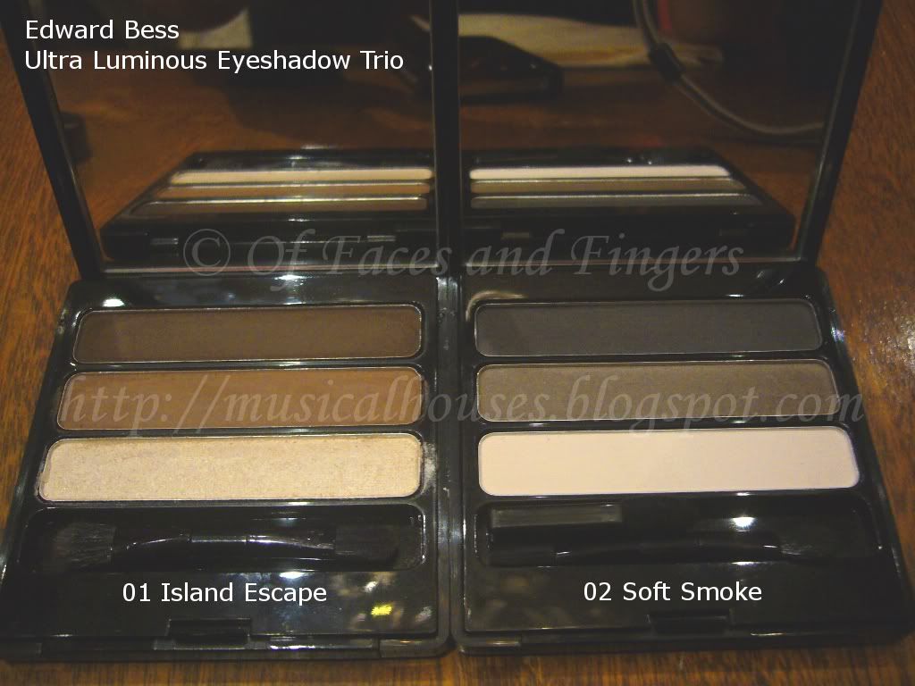
Edward Bess Ultra Luminous Eyeshadow Storm 7 is a brown-based taupe. Honestly, compared to the rest of the taupes on my arm, it looks a little blah. But since it leans brown, it's less likely to pull purple or grey on warm-toned girls. Pigmentation was sheer, and not the best, but still buildable. Texture was also decent. I'm not going to say too much about this since I just reviewed it in the last post.

Stila Cloud is a taupe that pulls purple and grey, and has a frosty finish that makes it look silver, like how the L'Oreal Electrified taupe looks silver due to the frost finish. I actually should feature this sometime, I have had this eyeshadow since I first became a makeup junkie years ago and it's still with me...Brings back all the nostalgic times when Stila eyeshadows came in little paper pots, and when collecting Stila eyeshadows was the "in" thing of the day. Anyway, this one is cooler-toned that some of the other taupes, and is more purply-grey than some of the other more brown-based ones. It also has frosty shimmer, which some may like and some may not.

So here you go, eight of my lighter-coloured taupes! As a taupe junkie, I love all of these shades and I think they are all different enough to own all, although I'm sure not everyone would agree with me. They're almost like my babies! I hope this post was useful for some of you who wanted a comparison between some taupe eyeshadows.

Edward Bess Storm Eyeshadow: Taupe of the Day EOTD!

Thursday, June 30, 2011

4 comments
*Rings alarm bells* TAUPE ALERT, EVERYONE! TAUPE ALERT! And it's a brand spankin' shiny new taupe to boot! Edward Bess has just released two new shades to his Ultra Luminous Eyeshadow range (just so you know, I've swatched the Edward Bess eyeshadows before), and one of them is a taupe! *Starts hyperventilating* As a taupe lover through and through, you can't imagine how excited I was. I was positively, eagerly, holding my breath for this to come in the mail.

So here it is. Behold, everyone, the newest taupe to my already burgeoning taupe eyeshadow collection. Edward Bess Storm.


Although the colour name is Storm, Edward Bess's rendering of this colour isn't exactly stormy (lame pun, I know). In fact, it's positively tame. The colour is neutral, and light - in fact, it's exactly the kind of eyeshadow colour you could wear to any office.

The eyeshadow packaging puzzled me a bit. I hadn't realized that Edward Bess had changed the packaging for his Ultra Luminous Eyeshadows, but unlike the other previous eyeshadows I swatched, Storm didn't have the brand name imprinted on the eyeshadow surface. And the eyeshadow pan was round, not square. And the material of the casing seemed different. Still, the packaging retained the chic black exterior, and comes in an expensive-looking box, and a luxe looking velvet pouch.

edward bess storm eyeshadow 2


The eyeshadow itself seemed surprisingly light in terms of pigmentation. Granted, this is a lighter colour, not so much a taupe like MAC's Satin Taupe, but more like Bourjois's Brun Nylon. In other words, a light, beige-ish kind of taupe. I found this lack of pigmentation a little bit disappointing, because previously when I swatched Edward Bess's Luminious Eyeshadow range, I found the colours to be very pigmented. Perhaps these shades are meant to be sheer for Spring/Summer. Here's a swatch of the eyeshadow.

edward bess storm eyeshadow swatch

Here's an EOTD (Eye of the Day) with Storm on. Here I used it on my lid. To contour the look a little more, I paired it with the darker shade in another eyeshadow duo I've featured before, the L'Oreal's Sassy HIP Duo. The L'Oreal HIP shade is just a little bit in the contour area.

edward bess storm eyeshadow eotd 1


As you can see, it's a lighter, browner, beige-ier kind of taupe, perfect for conservative offices. It also has a hint of shimmer, although I do think Storm has more shimmer than the shades I previously swatched in the rest of the Edward Bess eyeshadows. Still, this is manageable shimmer, not OTT, and quite pretty, too.

edward bess storm eyeshadow eotd 2


I quite like this shade, and for me this is something wearable that I could definitely see getting heavy usage in my stash. It's just that if you were expecting a deep, dark taupe, this isn't it. Come to think of it, I should swatch this with some of the other taupes in my eyeshadow collection, and see if there are any similar taupes out there.

edward bess storm eyeshadow eotd 3


So, would I recommend this? Well, if you are NC/NW25 and above, I'm not sure if this shadow, being a light shade, will show up on you. It would probably be used as a base, or an all-over lid shade in that case, so if you want it for that reason, great, but if not, it may disappoint you. Also, if you are looking for a shadow with strong pigmentation, this may not be for you. But if you want a simple, wearable taupe, then this could be worth checking out.

(Product was sent for review. Review is my complete and honest opinion. I am not affiliated with/compensated by the company.)

Edward Bess Platinum Concealer Swatches

Thursday, October 21, 2010

3 comments
It's been awhile since I blogged about Edward Bess, but I found these in lying around in my computer, so I've dutifully uploaded them for all of you who were interested in seeing concealer swatches from the line. These come in stick form (with a metallic tube that clicks shut easily - nifty eh?), and are actually quite pigmented, and don't feel too cakey or oily going on. I'd be all over these, because I like the packaging, the pigmentation, and the texture, but the expensive price is a kicker. I guess Edward knows that beauty doesn't come cheap!

The only thing I can say about this is that the colour selection is pitiful. I guess that's to be expected with only four shades in the line. Please excuse the lousy indoor lighting in the swatches. It was the best I could do.

Edward Bess Platinum Concealer Swatches

L - R: Ivory Nude, Soft Beige, Warm Amber, Natural Tan

Ivory Nude is your "light cool-toned pink beige". If you're fair and cooltoned (NW20 maybe?) you might want this.

Soft Beige is probably the shade I'd pick, and I'm NC20. It's your "pale yellow beige". Apparently this is their best-selling colour, and it's obvious why. This is probably the shade that would suit most of us, since I can imagine Ivory Nude might be too pink for some people.

Warm Amber is the generic "dark tan" kind of colour. It leans warm in undertone, but not too warm.

Natural Tan is also leans warm, but is a good few shades darker than Soft Beige. Probably a guesstimate match might be NC30 or so (I'm not that good with MAC shades, so this is just my rough estimate!)

Other than the colour selection, I think these are pretty good. These are actually quite well-pigmented. They're not 100% opaque on first swipe, but I think with a couple of swipes you could cover most flaws and blemishes. If you don't have anything major to cover, a little of this will go a long way.

Edward Bess Blush Imperiale Swatches!

Tuesday, August 10, 2010

6 comments
Edward Bess calls his makeup a well-edited set of colours, and I do believe he's right. While his small line up of shades consists of neutral colours, it does seem that within that small number of shades he has managed to produce colours that would suit as many people as possible. Case in point: the powder blushes.

Like the rest of his range, the Blush Imperiale doesn't come in many shades - here, it comes in three - but I do think that the colours are very pretty and neutral, and perfect for adding that extra pop of colour to a look.

Edward Bess Blush Imperiale

The photo quality isn't as great as it could be, because these were taken at the Edward Bess/Zuneta launch, and it was all indoors. But fortunately I think the swatches turned out marginally better.

The packaging on these blushes are pretty awesome - fully functional while still remaining portable and compact. The case has a mirror, a brush for on-the-go application, and feels and looks luxe, but isn't chunky or oversized. Pretty and practical all at once.

These blushes aren't as smooth as the eyeshadows and powder bronzers - for some reason they're just a tad less finely-milled - but they're still of pretty good quality, and they retain the good pigmentation that the powder products in his line have. All the blushes are matte, which make them good for work environments - it's not fun to have distracting cheek shimmer that seems to be magnified in indoors lighting!

Once again, pardon the crappy picture quality of the swatches:

Edward Bess Blush Imperiale

01 Soft Orchid is going to be a hit among the fairer girls. This is a neutral medium pink, that isn't too bright, too pastel, too cool-toned, or too warm-toned. I like this. It's pretty universally flattering if it shows up on you.

02 Desert Bloom is a neutral midtone pinky-brown. Very universally flattering, it's a sister to other famous neutral pinky-brown shades, like MAC's Blushbaby, or Bobbi Brown's Slopes. And like Blushbaby and Slopes, it looks really blah and muddy in the pan, but it goes on beautifully.

03 Morrocan Rose is a neutral midtone rose. I know I'll be using the words "universally flattering" yet again (I seriously need to expand my vocabulary!), but this colour is just that. This one would be great for the darker ladies, but with careful application, fair girls can wear this one as well for a pop of colour on the cheeks. I'm torn between Desert Bloom and Morrocan Rose - both are my favourites, and it's hard to pick just one.

As with much of Edward Bess' line, the neutral shades and lack of gratuitous shimmer make this one great for anyone who wants easy-to-wear, go-with-anything shades and quality neutrals. If you're a newbie or someone who has to wear work-appropriate shades, the shade range is excellent and worth checking out.

Edward Bess Ultra Luminous Eyeshadow Trio Swatches!

Tuesday, July 20, 2010

3 comments
Edward Bess blew me away with his single eyeshadows, which I wrote about in this post HERE, and his eyeshadow trios are exactly the same as the singles in terms of pigmentation and texture. These are awesomely luxurious. Often, especially for drugstore brands, the singles are often much better than the trios, but this is not the case with these.

There are only two colours for this, one that's composed of browns that would be more suitable warmer skintones, and one that's composed of greys, which would probably look better on cooler skintones. But both sets of shades are quite lovely, and quite neutral.

Here's a picture of them in their packaging:

Edward Bess Ultra Luminous Eyeshadow Trio

I apologize for the blurred swatches, these were taken under low and dim light at the Edward Bess Zuneta launch (which I wrote about HERE), and these were the best photos I could take. I promise all the other swatches are much better than these! I'm just putting them up anyway, because who knows, they might help someone.

Here's 01 Island Escape:


A really pretty trio of neutral browns that go with anything. I like this, it's basic, but it's really well done.

Here's 02 Soft Smoke:

Edward Bess Eyeshadow Trio

Another set of pretty, but basic neutrals. I like this though, I feel it has a bit more interest than Island Escape. The grey in the middle has this tinge of green to it, that I feel is pretty interesting. I'm sure part of it is the crappy lighting, and part of it is just my olive undertones making everything pull green, but I do think there is a hint of green to the colour - just maybe not as much as the photo suggests. I also like that the black in the trio is a soft, smokey black, not a harsh straight-up black.

Just like the single eyeshadows, the meanest thing I can say about Edward Bess' trios is that the colour combinations are kind of boring - who hasn't seen a brown trio, or a trio of greys? But that said, I don't find any other fault with these, the pigmentation and texture are good, and the shadows have a smooth fine shimmer that is not too obvious and totally appropriate for work. If you're looking for good basics, this may be a bit pricey, but it's worth taking a look at.

Linkwithin

Related Posts Plugin for WordPress, Blogger...