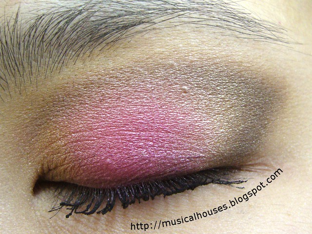
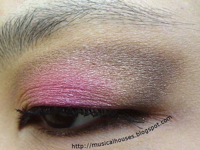
For this look, I used the neutral shades from my Sleek Storm Palette, and the bright pink was from the Sleek Curacao Palette. You know I'm generally a big fan of Sleek Makeup's products, so I don't have anything bad to say about their eyeshadow palettes (their mascara though, was kind of a let down for me). They were pretty easy to blend and looked good on, and even photographed well. Usually eyeshadow colours can turn out weird on the camera, but for these, I barely had to do any photo-editing at all, other than tweaking the brightness (it was an overcast day).

My concept behind this eye look was just to have a pop of bright pink in the middle of the lid area, surrounded by neutral golds and browns. So I actually did a neutral eye with just the gold and brown first, and then placed the pink in the middle of the eye lid. After that, I blended out the shades, and I was done.

Although this was more of an experiment than anything else, I'm actually quite pleasantly surprised by how much I liked it. I feel like this look of blending brights and nudes together is a very easy way to make bright and neon shades wearable. I don't think I would wear hot pink eyeshadow out, but I would actually wear this combination out. It would be pretty great for someone trying out brights for the first time.


Love the pink!
ReplyDeleteThe 2 seem pretty harmoniously put together :) Nice touch. I might give it a go with another bright color to see how it turns out. Thanks for the tutorial :)
ReplyDeleteI really love the color placement! I love the outer v and outer lid and how you blended everything. Pretty!
ReplyDeleteReally, really love this!!
ReplyDeleteI love the colors and blending! This is beautiful.
ReplyDelete