Tuesday, August 31, 2010

Eyeko Chi Chi Polish and Punk Polish Swatches!

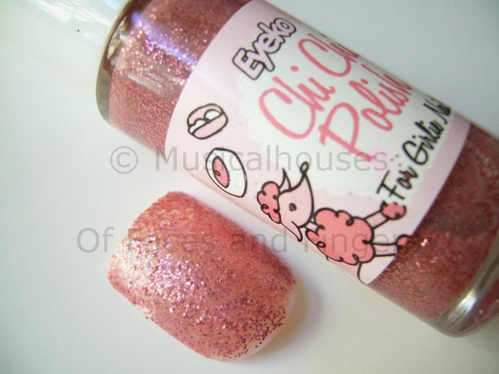
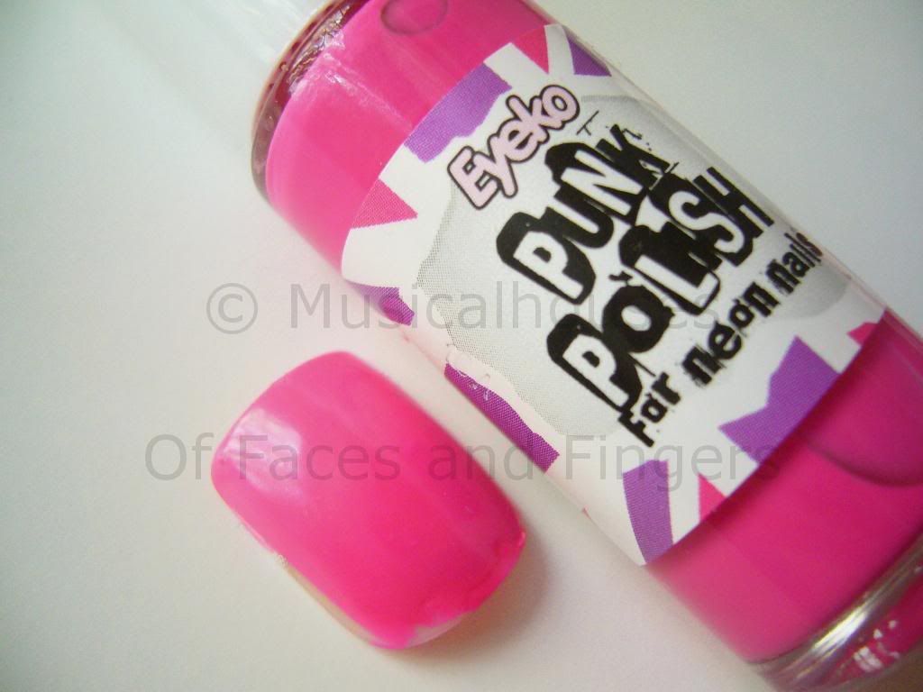
Eyeko has launched two new shades, Chi Chi Polish and Punk Polish. One's a glitter and one's a neon, but they're both pink! Punk Polish is a hot neon pink creme, while Chi Chi is a rose pink glitter in a clear base.

Eyeko Chi Chi Punk Polish

You know I'm a huge fan of swatching, but unfortunately, it so happens that I happen to already have done my nails, complete with nail stickers and bling, and it would have been difficult to remove all that to swatch two polishes. (What, you mean you haven't seen my nail bling yet? See my nail bling here. And follow me on Twitter so you don't miss my future exploits!:P ) So I swatched them on some false nails I had lying around instead. I hope you guys don't mind, I promise that real nail swatches will be up soon!

Here is Chi Chi Polish for Girly Nails:

Eyeko Chi Chi Polish

This is a not-too-dense glitter in clear base, and this was 3 coats. You'll probably need 3-4 coats for full opacity. This would probably work well for layering, because the glitter won't obscure the colour below it. As a standalone colour it's pretty, but you'll need to put more coats on. I personally love this colour, it's sweet and girly but it still packs a punch due to the glitter. It's not too boring.

Here's Punk Polish, for Neon Nails:

Eyeko Punk Polish

This is a hot pink neon shade. It's not retina-searing neon, but it's still a pretty bright hot pink nevertheless. This is a creme and it is nicely opaque in two coats. Otherwise, there's not much I can say - the pictures do all the talking, really :)

Application-wise, both of these were the usual Eyeko quality - that is to say, the texture is a bit thicker than some of the other polishes out there, but they apply quite well. And they're pretty good value for the price, too, so these are worth checking out if you like any of the colours.

(This product was sent to me for review. I am not affiliated with or compensated by the company. This review is my honest and complete opinion.)

Monday, August 30, 2010

Zoya Spooning: Weirdest Ad Ever

Update: Apparently the "Spoons" idea is a LOT more boring than any of us thought. It's basically swatches of a nail polish on a fake nail that you can order. Yes, really. It's supposed to help you never order the wrong colour ever again, because you can hold the fake nail up to your real nail and see it against your skin. And this fake nail swatch is all yours for 50 cents. Is that lame or what? There are bloggers aplenty who swatch with awesome colour accuracy, and anyone can paint polish on a fake nail and sell it for less than 50 cents. They can even buy up new collections and swatch them all and sell them for less than a buck! Sorry Zoya, I'm not excited by this at all.


(Picture from MUA)


If you haven't already heard, Zoya plans to introduce this product called "spooning" on 1st September. Apparently they thought mystery was the best publicity, so they put out a rather cryptic ad on Youtube, with an overenthusiastic girl gushing about how "spooning is amazing" - without telling us what spooning is, of course. They're keeping us in suspense til the official launch date.

Personally, I don't like the ad. I know the whole suspense thing can be a valuable asset in a marketing campaign, but I don't think the Spooning ad got it quite right. After I watched the video, I was left frowning and scratching my head, instead of feeling intrigued and curious. And the acting kind of annoyed me a little, and it didn't add to the sense of mystery, either. I mean, if you want to be mysterious, why have an overly perky girl shilling your product? They don't quite go together, somehow.

That said, I suppose that me blogging about it means that as far as this blog is concerned, Zoya has probably done it's job (i.e. gotten people like me to talk about it). But seriously, this has gotta be the weirdest ad ever for a nail polish product. And not in a good way.


Of course, as you might imagine, what spooning exactly is has been speculated about, to some extent. Guesses I've heard are the option to franken your own polish, by mixing "spoons" of Zoya's current polishes together, or maybe a sample system by which you can order "spoons" or trial sizes of polishes before getting the full sized ones. These both sound reasonable to me. I really like the frankening idea, though! I'm hoping it will mean that we can mix our own polishes from Zoya's current stock online, and then order it just like any other colour.

What do you think of the ad? Sufficiently intriguing, or just confusing? Any guesses as to what "spooning" is?

Sunday, August 29, 2010

GOSH Eyeshadow Quartet Swatches: Vanity Pastels and Modest Liberty

While passing by Superdrug (I swear I wasn't getting makeup! :P ) I noticed that GOSH had put out two new eyeshadow palettes, called Eyeshadow Quartets. They aren't the Eyeshadow Quattros in round packaging. These ones had four small round eyeshadow pans in a square casing, and they actually looked similar to the Stila Montmartre and Marrakesh quads that were put out awhile back.

These quartets come in two shades - one consists of pastels, called Vanity Pastels, and the other one (which I actually like a lot) is called Modesthttp://www.blogger.com/home?pli=1 Liberty, and is a set of neutrals - one of which is a TAUPE! And if you are a taupe lover like me, this will make you happy. *Does a taupe dance*

Here is Modest Liberty. I'm starting of with this because THERE IS A TAUPE. I've even thoughtfully swatched a similar GOSH Single Eyeshadow, 14 Grey Brown, next to it, because I know you'll be wondering if it's a dupe for the single eyeshadow:

GOSH Modest Liberty

L - R: 14 Grey Brown, Modest Liberty

I really love this one, it's something I'll absolutely wear. It consists of a taupe (hellooo taupe!), a light pink, a light yellow, and a gunmetal grey. All the shadows are shimmery, but not overly so, and I think the shimmer is pretty much wearable. Pigmentation on this one started off a tad sheer but was easily buildable, as evidenced by the swatches.

And unfortunately, Grey Brown isn't a dupe for the taupe in Modest Liberty. It's more purple and brown based, whereas the taupe in Modest Liberty is more grey. Also, the taupe in Modest Liberty is a shade lighter, and doesn't have any of the sparkle of Grey Brown. Personally, I prefer Grey Brown, but I think the Modest Liberty quad is really pretty too.

Here's Vanity Pastels:

GOSH Vanity Pastels

This one has a pastel blue-green, a pastel lilac purple, a pastel pink, and a pastel off-white vanilla colour.

As you can tell from my lack of enthusiam, this one I found a little more meh. Not because I hate pastels, but because compared to Modest Liberty, Vanity Pastels is weaker in pigmentation. I mean, it's not terrible, but it's not as great as the other quad. And it doesn't have a taupe.

Quality-wise, these are different from the usual GOSH Single Eyeshadows, which are domed and slightly harder in texture. This one is more like the GOSH Trios and Quattros, with a similar soft texture and medium but buildable pigmentation. If you liked those, these quartets would worth trying as well. The only thing is that compared to the relatively large size of the Quattros, these are a little tinier in size.

Saturday, August 28, 2010

Beauty Blog Link Love

Rae reviews a gorgeously packaged mascara that smells like blueberries (no, we're not kidding!) over at theNotice.

Tammerly from Pink Diva's Beauty Spot was GHD's guest at Little Joe Woman fashion luncheon which was also sponsored by Lancome.

IHeartCosmetics reviews the famous Liz Earle Cleanse and Polish .

The Pink Sith tries to put as many non sequitur references that she can into her review of Make Up For Ever HD Microfinish Blush. See if she has finally gone too far.

Madame B Fatale swatches some Australian Mineral Shadows by Kylies Professional.

Jellyminx creates an affordable autumn inspired eye look perfect for the dreary weather the UK has had recently!!

Urban Decay announce The Black Palette and Lipglossiping has the photos! This one's for the rock chick inside each of us!

Cindy from Prime Beauty is finally leading the semi-"charmed" life she thinks she deserves by wearing the newest Three Custom Color Specialist lipstick. Find out how you can get yours as a GWP!

What's in the vanity drawers at The Gloss Menagerie? Come have a look at Alyson's makeup organization.

Beautywoome takes you through the no-chip manicure paces.

It wasn't easy, but Glitter Geek actually listed her top 10 products for Summer 2010. See any of your own favourites?

Jeweled Thumb reviews a face paint by Models Own as a blush and discovers it works!

Want to learn how to self-apply individual false eyelashes at home? Mz. More of The Glamorous Gleam has a video tutorial!

Hot Beauty Health shares how to get short, curly hairstyles like celebs!

The Lip Print makes a change and crosses over to the light side .

Retrodiva explores eight autumn beauty trends sure to be popular this year.

Want Chanel Paradoxal but don't like it's price? Musicalhouses shows you Paradoxal's (much) cheaper little sister!

Friday, August 27, 2010

Illamasqua Jo'mina and China Glaze Sci Fi KOTD: Purple and Silver

Illamasqua released Jo'mina (is it Jomina or Jo'mina?) some months ago, with the Body Electrics collection, and out of all the three nail polishes in the collection, Jo'mina was the hot favourite. I snagged it for 50% off because it wasn't "in season" anymore (sigh, I guess you know autumn is coming when the Spring/Summer collections start going on sale). But you know me, and you know I don't give a hoot about what's trendy or not - I wear what I like, regardless of season. And a 50% discount is timeless :P

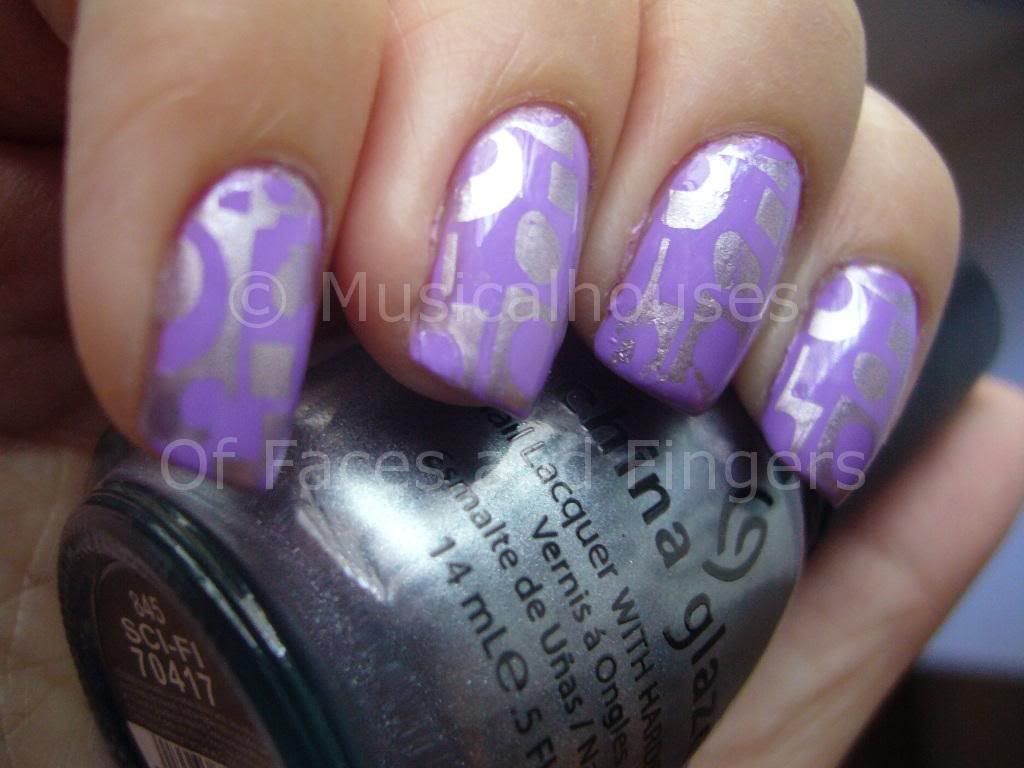
Here it is in sunlight. I think this was the most colour-accurate I could it to be, but it's still not quite there. The base for the konad was Jo'mina, while China Glaze Sci Fi was used as the design. The konad plate was M65. Man, my fingers look fat.


Jo'mina is a gorgeous beautiful bright lilac purple. I'm not sure quite how to describe it, and unfortunately, my photographs aren't that colour-accurate because it's also really hard to photograph! It keeps turning out a lot more blue than in photos. I took a gazillion photos, and they all turned out blue-purple. And I tried colour-editing it, but with my limited photo-editing skills, there was only so much I could do. I'm sorry I couldn't get a more accurate portrayal of this, so just try to imagine this as being a lot more red-based purple instead of a blue-based violet, okay?

Illamasqua Jomina China Glaze Sci Fi

I've read a lot about how Jo'mina was a total PITA to apply, so I was totally prepared to struggle with this one when applying it. To be fair, it isn't the best, but it wasn't as bad as I thought it would be either. I used two coats for all my photos. To be fair they were thick-ish coats, so if you used thinner coats you might need more. Still, I didn't get as much pulling, tugging, or unevenness as I expected. Weird right?

China Glaze Sci Fi is awesome to apply and opaque in just one coat, which makes it perfect for konading. Of course, that's evident from these pictures!

Jomina ChG Sci Fi

I really love this KOTD. I mean, I love purple, and I love chromes, so combining them makes me a very happy girl!

Thursday, August 26, 2010

PAM Junior Makeup Artists Competition

I feel really bad about not having a "proper" post up (on a related note, I HANDED IN MY DISSERTATION TODAY! WOOHOO! Yeah so that's why I didn't post today), but I promise I'll have one tomorrow, if Blogger stops being so PMS-y. Anyway, today must be news day or something, because this is the second time I'm posting news!

Makeup-provisions.com is a UK-based seller of makeup supplies for professionals, and they have just opened their "Student" section of their site, HERE. In conjunction with the opening of the student section, they have launched a Junior Makeup Artist Competition, and the prize is £500 worth of makeup, affiliate prizes, and a chance to join the pros on a film set. Pretty cool, eh?

I thought I'd give you guys a heads-up in case anyone wants to take part. The full details can be accessed HERE. If you're taking part, good luck!

St Tropez Gift Set: On Sale for 7 Days Only!


(Picture from St Tropez website)


I usually tend to post more deals for my US girls than for my UK-based ones, but that's because we don't usually get the awesome sales (how dare they neglect us!). But St Tropez hasn't forgotten about our need to indulge for less!

Their Festival Gift Bronzing Set is on sale, and contains Everyday Perfect Legs (150ml), Bronzing Powder and a powder brush for the price of £35 – this means you save over £10! It's on sale for 7 (yes SEVEN) days only (it expires Tuesday 31st August 2010), so head on to check it out on the St Tropez Website if you want one, stat!

Wednesday, August 25, 2010

Urban Decay on Hautelook Now!

My US girls are always lucky - Urban Decay is going to be on sale at Hautelook today! The sale is up to 75% off, so if anyone is interested, check it out HERE.

Tuesday, August 24, 2010

Chanel Paradoxal's Cheaper Little Sister: Asos Paints by Ciate Sienna

Not all of us can afford to drop our hard-earned money on Chanel's new "must-have" shade, Paradoxal. While there aren't any dupes that I know of as of now, there are a couple of colours that are pretty close, especially in terms of base colour. If you're not exacting about finding a dupe, you can definitely find a similar colour at a lower price.

Today's "Get-The-Chanel-Paradoxal-Look-For-Cheap" shade is none other than Asos Paints by Ciate, in the shade Sienna. It's a creme, so it doesn't have any of that shimmer Paradoxal has, but the base shade is similar - it's one of those purply-grey taupey mushroomy colours that are so in fashion right now. These taupey mouse-y colours seem to be fast establishing themselves as the new neutral shades - I mean first there were greiges, then there was Chanel Particuliere and the like, and now there's this purply-grey shade. And that's all right by me, because I love them all.

But obviously you're not interested in my colour preferences. You wanted to see Sienna. So here it is under sunlight:


The ASOS Paints by Ciate range is sort of like the UK's version of Sephora by OPI. These polishes are exclusive to ASOS, have a different packaging from the usual Ciate polishes, and are sold jointly under the Ciate and Asos name.

As you can tell, Sienna is my favourite of the bunch. It's an awesome purply-grey-brown, that leans strongly on the purple and grey. I don't think there's much brown in this, if any at all. And it's a delicious creme. Photos cant seem to do it justice, because this one looks grey in some photos, and purple in others.

Here's another shot, this time indoors:

Asos paints by Ciate Sienna

These shots were two coats, but the polish is very opaque and pigmented and really only needed one coat. I did two because the first coat was uneven. These have a similar consistency to Eyeko polishes - a bit on the thick side, but very opaque - so if you prefer a thinner texture, a couple of drops of thinner will do the trick.

So, obviously Sienna isn't a dupe for Paradoxal, although I'd say the base colour is definitely close enough. It's a good choice if you want to spend less money (it retails for 6GBP and can be found on sale occasionally), or if you want a version of Paradoxal without the shimmer, or if you are one of those people on whom Chanel polishes seem to chip easily, and you want something that will last longer. But even without the Paradoxal comparisons, I do think Sienna is a colour worth owning in it's own right.

Monday, August 23, 2010

Fall 2010 Makeup Trends: Chanel's "Paint Print" Eye: Hate it or Love it?

One of the awesome things about being a blogger, as opposed to a beauty magazine, is that I don't have to wax lyrical over every beauty or fashion trend that comes out. If I think it's ugly, I can say it, and there's nothing you can do about it! Neener neener!

As you might know, I don't follow fashion trends, whether it's clothes, makeup, or nail polish - I'm a "I'll-wear-what-I-like-dammit" kind of girl. Besides, most Autumn/Winter 2010 makeup trends seen on the runway have been nothing out of the ordinary so far (dark lips, check, smokey eyes, check). But this one surprised me, so I just had to show it to all of you.

Apparently Chanel decided to reproduce the print on their new bags on their models' eyes. Hence making for some really strange-looking eye makeup.

(Image from Style.com)


Of course, the fashion press calls it visionary and inspiring, and I guess it is visionary - the concept of taking a print from a bag or an article of clothing and attempting to reproduce it as makeup is not a common one. So I guess Chanel scores points for originality. (If you want to, you can read more about it HERE.)

But I just can't feel the look on this one. I don't know about you, but to me it just looks like messily-applied eyeshadow. All the way up to the temples and eyebrows. It looks like a five-year-old attempted to apply mascara on the model. (It isn't, of course. It's eyeliner and pigment, carefully applied with brushstrokes.) While I kind of think the concept of transferring prints is cool, and while I like the print on the bag (white bags with a black bottom? Very practical!), I don't really like how it looks as makeup on a person's face. I mean, I know beauty on the runway is usually about putting on a show and creating some drama, and thus highly exaggerated, and us mere mortals are supposed to use it as "inspiration" and reinterpret it for everyday wear, but I'll be darned if I know how to be "inspired" by this one. I don't really think the fashion powers that be meant for us to do our makeup that way, in any case. I think they meant for us to look at the eyes, and then buy the bags, since the print eye was a mimic of the print on the bag. But as a makeup junkie, you know I like to look at everything in the context of makeup. And in the context of makeup, it just looks weird.

Maybe it just means that if I accidentally get mascara on my eyelid, I'll just claim that I'm on the cutting edge of beauty! Thanks Chanel, for saving me the 2mins I would otherwise spend wiping mascara off my eyelid.

I guess I kind of love it as an artistic endeavour, but hate it as an actual makeup look. What about the rest of you? Hate it or love it?

Sunday, August 22, 2010

An Introduction to UK Nail Polish Brands on Turtle Beauty!

So I'm guest-posting again. Cydonian Makeup is on hiatus this week, so she has asked me to write a guest post for her, focusing on UK-based nail polish brands. As you know, I'm really nice :P so I've agreed. The result is my post on UK Nail Polish 101! If you'd like to get a not-that-quick overview of some of the most popular UK nail polish brands, check out my post HERE.

Saturday, August 21, 2010

NOTD: Maybelline Banana Puddin': Pretty, but a PITA

I have a complicated relationship with yellow nail polish. I like how it looks like on others, but I've been too scared to actually try it out on myself. So everytime I consider picking yellow as a mani colour, my brain goes through this thought process: Wear yellow - Don't wear yellow - Wear yellow - Don't wear yellow - etc ad infinitum. Yeah as you can tell, I'm a deep thinker. :P

I decided to finally suck up the courage to actually try out a yellow, because I figured if I hated it on me, I need never look back, and I can finally stop vacillating over whether I should wear yellow or not. So I picked out a pastel yellow that didn't have too many warm tones in it - I figure it would ease me into the yellow shock I might have. And after scouring around, I found Maybelline Banana Puddin'.

Here is Banana Puddin' on me, taken outdoors in natural light. I actually think it's as pretty as pastel yellow can get, although it's definitely not everyone's cup of tea (I'm still trying to decide if it's mine or not):

Maybelline Banana Puddin

Banana Puddin' is a colour that has long been discontinued (thanks, Maybelline), and apparently it's a HTF (hard to find) colour, and a pretty coveted one at that. Apparently it's desirability stems from the fact that it's a wearable yellow for cooler skintones. Warmer yellows can often make cooler skintones appear very ruddy and red, giving a "lobster hands" effect, but unfortunately most yellows are warm, so a cool yellow is hard to find.

I do think Banana Puddin' is wearable enough for cooler skintones. Of course it's still not going to be a colour everyone will like, but if you are going to wear yellow, this is probably one of the more wearable ones around. It's also a soft pastel yellow, as opposed to neon highlighter yellow, so it doesn't draw too much attention to itself. It's a good start if you're going to be trying yellow for the first time.

Maybelline Banana Puddin

Here it is in indoor lights. You can see it's more yellow indoors.

While it's a pretty yellow, it was a total PITA to apply. Yellows in general do tend to be hard to apply though, so it was no surprise to me. Still, it's a pain when you're doing your mani, because it was sheer and streaky. These pictures show 4 coats. Yes, FOUR FREAKING COATS. If you are skilled and apply thicker coats that are even, you might get away with three, but I suspect most people are going to use four. I dinged my mani so many times while waiting for it to dry, because four not-that-thin coats is obviously going to dry slowly.

Unfortunately, my attempt to finally decide whether I liked yellow or not wasn't very successful, as even after trying Banana Puddin', I still feel ambivalent about yellow. I don't know how I feel about it, and the lousy application isn't helping. What do you think? Would you wear yellow?

Friday, August 20, 2010

All About the Kawaii at Zuneta Today!

As an Asian girl, I have the prerogative to be as kawaii as I want. Like, puke-inducing kawaii. Hey, I grew up with Sailor Moon, Hello Kitty, and I even had a tamagotchi - what did you expect? I even had friends who followed those sappy Korean dramas (and I'm proud to say I never caught on to the Bae Yong-Joon craze...darn you, Winter Sonata and all your sappy spinoffs).


But this doesn't mean that kawaii can't be practical. If you want to see kawaii that is not puke-inducing and practical, check out my guest post at Zuneta now!

Thursday, August 19, 2010

Liz Earle Botanical Shine Haircare Range: Launching in September!

After six years in the making, Liz Earle is finally bringing their much-requested haircare range to their customers, and with its awesome formulation and decent prices, it looks set to be a hit. The line consists of a Botanical Shine Shampoo for all hair types, and three Botanical Shine Conditioners - one each for oily, normal and dry hair.


So customers wanted a haircare range. Liz Earle launched a haircare range. But, I hear you ask, why would it take six years? Apparently making a shampoo with natural ingredients that performs the way your customers want is difficult, in all kinds of ways that as consumers we'd never think about.

Take for example the foamy lather that's created when you shampoo your hair. Most shampoos use SLS and SLES to create the lather, and most natural shampoos that didn't use either of those ingredients don't lather very well. However, due to customer feedback, Liz Earle wanted a natural shampoo that would lather, and thus the epic search for a wash active started. In the end they found a natural derivative of coconut, that was better for scalps that had sulphate sensitivity. And it really lathers very well too, and foams up as nicely as it's non-natural shampoo counterparts. Check this one out!

Liz Earle Shampoo

And just in case you're wondering, yes I did actually shampoo my hand at the Liz Earle event and take a photo of the lather for you guys to verify their claims of awesome lathering. So I totally embarrassed myself for a photo on my blog. Are you appreciative yet? :P

Liz Earle also had to search for a natural ingredient that would make hair smoother and shinier, and in the end they settled on apple and orange extracts. Hence the name Botanical Shine - because the range shines your hair using botanical ingredients! Then when the formulation was done, there was the fragrance, which also had to be created from natural ingredients. After trying out numerous fragrances, they finally settled on a blend of 8 essential oils, with carrot seed, vanilla and lemon oil among the components.

So what's in the shampoos and conditioners that Liz Earle are putting out? If you're like me, and you're interested in knowing what the raw ingredients look like, I have a few photos of some of the key ingredients.

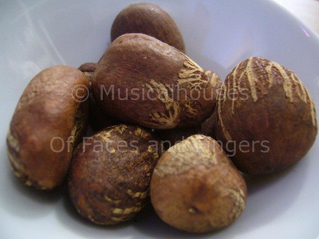
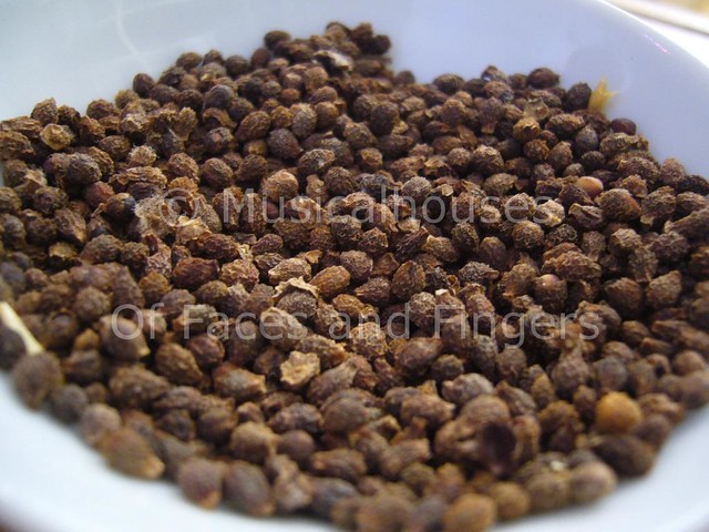
The conditioners have yangu oil, which is derived from the yangu nut. I had no idea what yangu nuts looked like before, but now I do! And so do you!


The shampoo and conditioner for dry hair both have shea butter, derived from shea nuts. Despite hearing so much about shea butter (I mean, every other drugstore brand has something shea butter now), I've never actually seen a shea seed.

Shea Seed

The conditioner for normal hair has meadowfoam seed oil. Okay, now I'm going to admit my ignorance, but I've never seen meadowfoam in real life before. Hey, I spent all my life in cities, I have an excuse! :P


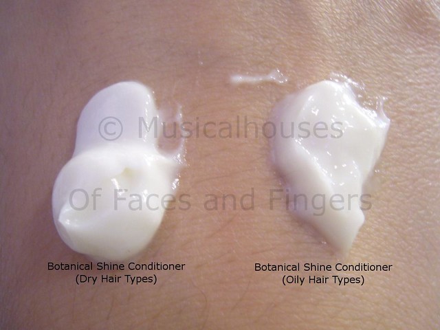
What I really liked was that by tailoring the ingredients that went into each of the conditioners, they really created conditioners that suited each hair type. As you can see from the photo below, I have a small blob of both the conditioners for dry and oily hair types next to each other. I'm not sure how apparent it is from the photo, but the dry conditioner is a lot more creamy and thicker in formula, but the conditioner for oily hair is a lot more liquid, almost like a lotion in feel. (And yes, I did put blobs of conditioner on my hand and take photos of them - do you know how hard it is to photograph blobs of stuff? LOL)

Liz Earle Conditioner

Regardless of whether you actually end up liking the Liz Earle haircare range, you certainly can't deny that they do put a lot of thought into what goes into their shampoos, and there is much attention paid to ingredients and details here. I also was happy to know that ingredients like yangu oil and blue seakale are harvested in a socially responsible and sustainable manner. The yangu seeds are are collected by forest tribe community groups in Kenya, and the money goes back to them, which gives a source of income to the local people collecting them, most of whom are women, and in turn helps to preserve the trees and their ecosystem. That's pretty awesome, and I could really tell that they had a passion, not just for ingredients and formulating products, but also for the community from which these ingredients are sourced.

The shampoos come in plastic tubes with flip-tops at the bottom, and you get 200ml of product for a very reasonable £7.50. They are available from 2 September at Liz Earle stores, and will be available nationally at John Lewis from 6 September. If you're interested in finding out more, you can check out the Liz Earle Website, their Twitter page, or Facebook page.

(I was invited to a press event. I am not affiliated with or compensated by the company.)

Tuesday, August 17, 2010

Burt's Bees Lip Balm: New Acai Berry and Mango Butter Flavours!

I'm a huge fan of Burt's Bees. I used their Radiance Eye Creme, and I'm a huge, huge, huge (and did I say huge?) fan of their Lemon Butter Cuticle Cream. So of course when I got wind that they were launching two new yummy flavours of lipbalm in early September, I just had to check it out!

The two new flavous are the Nourishing Lip Balm with Mango Butter, and the Rejuvenating Lip Balm with Acai Berry. The difference between the two is that the Mango Butter lip balm is supposed to be more emollient and moisturizing, and the Acai Berry one is supposed to leave lips feeling soft and rejuvenated.

Burts Bees Acai Mango

These come in the usual Burt's Bees packaging - you get the usual 4.25g of product in each tube. The Mango Butter lipbalm has a yellow cap, while the Acai Berry one has a purple cap. Part of the reason why I really like these is because of the simple but effective packaging - they come with a hygienic seal, the caps are sturdy enough that they don't come off the tubes in your bag, and the swivel up tube makes it handy for application on the go without getting your fingers dirty. Much better than potted balms, or those skinny tubes with tiny lids that crack easily or fall off.

The balms themselves are clear and colourless. They go on transparent, and don't leave a weird white film on your lips like some balms do. These also have a REALLY nice smell! I love the fruity scent - the mango one has a tropical mango smell, and the acai berry one has a sweet berry scent. The scent of the mango one is a bit less strong and sweet, so for people who have issues with scent and are deciding between the two, the mango one might be better. Both of these are definitely scented though, and you can still smell them after the initial application, but not after some time has elapsed. But I actually like the fruity scent, and it didn't irritate either my nose or my sensitive lips.

Burts Bees Acai Mango Lipbalm

Okay, so the Burt's Bees balms score on packaging, and scent. How about actual performance? I'm glad to say I wasn't disappointed. I have sensitive lips, and many balms I've tried before I disliked. Some balms, like the Korres lip butters, had a weird plastic-like feel and just sat on top of my lips without actually moisturizing them. Others just felt waxy, but not moisturizing. And some of them, like Carmex, had this weird minty tingling feel that made my lips feel like they were burning!

Fortunately the Burt's Bees version is none of this thing. No weird menthol-stinging sensation, and no weird plastic-feel that just sits on top of the lips. There is a slight waxy residue, but I'm glad to say that it's quite minimal, and most of the balm actually seems to sink into my lips as opposed to sitting on top of them. The top three ingredients for both the Acai Berry and the Mango Butter version are sunflower seed oil, coconut oil, and then beeswax in that order, so that wasn't a surprise.

These come out in early September, so if you are like me and feel like most lipbalms just sit on top of your lips instead of penetrating them, then these are worth looking out for, especially given the cheap price of £3.49. For the price, this is probably one of the better lipbalms you could buy, and I could definitely think of a lot of pricier balms that don't work as well.

(This product was provided to me for review. I am not affiliated with or compensated by the company. This review is my complete and honest opinion.)

Monday, August 16, 2010

Breaking News: MAC Decides Not to Ship Rodarte Collection!

The end to the whole MAC-Rodarte saga has come. In my previous posts HERE and HERE, I talked first about how and why the collection was in bad taste (in my opinion at least), and in the second post, I talked about what concrete steps we can take to help the women of Juarez. I thought the controversy died down when MAC said they would donate all proceeds to charities to help the women of Juarez, but MAC has gone one step further.

MAC has just posted on their Facebook wall about half an hour ago that they would not be shipping out the Rodarte Collection.

Here is the text of the Facebook wall post:

M·A·C Decides Not to Ship M·A·C Rodarte Makeup Collection Out of Respect for Women & Girls of Juárez and their Families
by MAC Cosmetics on Monday, August 16, 2010 at 5:27pm

This decision will not impact M·A·C 's commitment to donate all of its projected profits from the collection to benefit the women and girls of Juarez.

Out of respect for the people of Mexico, the women and girls of Juarez and their families, as well as our M·A·C Mexican staff and colleagues, M·A·C has made the decision not to ship the M·A·C Rodarte limited edition makeup collection. This decision will have no impact on M·A·C's commitment to donate all of its projected global profits from this collection to local and international groups that work to improve the lives of the women and girls of Juarez. We are currently conducting due diligence to ensure we donate to organizations with a proven record of directly supporting the women and girls of Juarez.

M·A·C and Rodarte are deeply and sincerely sorry and we apologize to everyone we offended. We have listened very closely to the feedback of concerned global citizens. We are doing our very best to right this wrong. The essence of M·A·C is to give back and care for the community and Rodarte is committed to using creativity for positive social change. We are grateful for the opportunity to use what we have learned to raise awareness on this important issue.


Click HERE to see the actual Facebook note that MAC put up on it's wall.

I was satisfied when MAC offered to donate all proceeds to charities, because they would then no longer be profiting from the controversy they caused, and most of the controversy died down after they announced that. So this is a step I certainly didn't anticipate! While I am happy they are pulling the collection, I hope this pulling of the collection doesn't result in them donating any less!

Hai, my name is Drama, I iz refuze to die!
(Image from the Independent, credited to MAC)
(Can you tell I'm weary of being slammed for expressing my own opinions on this issue?)


At the same time, (being a girl with a major in Economics and a masters in Management), a side of me cynically wonders if MAC just plans to repackage the items, rename them, and re-release them in another collection. If this is the case, it would leave a bad taste in my mouth, because it would seem like they are still trying to make money off these items. Bear in mind that the collection was slated to launch in September, so these collection items would already have been manufactured a long time before, and if they weren't sold, it would mean a dip in MAC's profits.

I can't help but wonder if this is their way of still trying to turn a profit from these items by re-selling them under another name. Furthermore, in place of the planned launch of the collection that would see all profits go to charity, MAC would now just donate an arbitrary amount to charity. From what I've been told, MAC is donating the "projected profits" from the collection, and when it comes to projecting profits from such a controversial collection, your guess is as good as mine. The exact amount to donate would then just be a number of MAC's choosing, and this makes me feel uncomfortable.

If this is what they are going to do, re-sell the products under another name and make money from them, while just choosing an arbitrary amount to give to charity (anyone remember the $100,000 they initially offered?), then I just hope that they donate a decent amount (not just $100,000!). However at the same time I do see how pulling the entire collection altogether is more considerate for MAC employees with Mexican ties or heritage - how is a MAC salesgirl with Mexican relatives going to sell this collection at the counter? It would be tough for her, and I imagine she'd rather not have to sell the collection altogether.

So I guess my feelings on this issue are somewhat ambivalent. I'm happy they're not shipping the collection, but I do have concerns about how much they'll be donating to charity. What are your thoughts on the issue?

Sunday, August 15, 2010

NOTD: The My-Toilet-Overflowed-And-Ruined-My-Mani Edition

One fateful day, my housemate and I decided we would paint our nails together. She wanted to borrow my Orly Luxe (which for some reason, out of all the colours in my stash, is her favourite), and I wanted to borrow her YSL and Anna Sui. It seemed like a good idea.

My mani was the most awesome combo ever - or at least, it sure did feel like it then. I used YSL Black Tulipe #34 as the base (or at least I THINK that was what I used - she didn't know what colour it was, and she didn't keep the box so unfortunately I had no way of verifying the colour name, since YSL puts the name of their polishes on the box, not the bottle. But it looks pretty identical to other swatches I've seen). I then layered Anna Sui Nail Color in 020. I have no idea what that is - it must be discontinued or Asia-only or something, since I can't seem to find any other swatches of it, and it isn't listed on the Anna Sui website. Lastly, I sealed in the glitter bits with two layers of topcoat, since they were rather large and I wanted a smooth finish.

Anyway, there I was, luxuriating in the sheer gorgeousness of my mani - hey it's purple, and blingy, and you know I love my purples, and I love them with a bit of bling! And because this mani was a whopping 6 coats (1 base coat, 2 YSL Black Tulipe, 1 Anna Sui 020, 2 top coats), I felt sure it would last forever, because I mean, 6 coats takes a longer while to wear down, right? So I would be able to be absolutely blingtastic for longer! Woohoo!

Sadly, it was ruined the very next day. I went to sleep, happy with my mani, and the next thing I knew, I was woken up at 8am by my housemates, and found that somehow, in the morning, our toilet bowl had overflowed and dirty water had soaked the entire lower floor of our apartment, which housed all our bedrooms and bathrooms. The floor was literally flooded with crapwater. We called the landlord, and he called the plumber, but in true British fashion, they said they would arrive anytime between 9am and 6pm. At that point I just wanted to scream. This is an emergency plumbing service, not Fedex package delivery!

So while my housemates and I waited for the plumbers (who arrived very punctually at 5pm), we spent our day vacuuming out the dirty water from our apartment, and hoping that the toilet bowl wouldn't flood anymore (hah! Murphy's law seems to love situations like this, doesn't it?). We were literally carrying pails of crapwater. It was that bad. It was beyond bad. It was gross, smelly, and just...UGH. If you were following me on Twitter, you would have been subject to my updates on this - I think I must have complained a lot, because some user called "Carpet Cleaning Tips" started following me, LOL!

And after the plumbers had left, we spent the rest of the day cleaning up after the mess. I had to shampoo my darn carpet twice to get rid of the smell, and I think I used up a good third of a bottle of carpet cleaner. At some point I was so desperate I was just pouring carpet cleaning solution into the carpet. At that point, my carpet was clean, but it was still wet. As of now, my carpet is still slowly air-drying, so it's damp and squelchy, but at least it doesn't stink. Sigh.

So what did this really gross story have anything to do with YSL, Anna Sui, or my mani? Well, this is because the two days of maniacal cleaning, carrying, and generally getting my hands wet all the time took its very sad toll on my mani. By the end of it, there was immense tipwear, and there were chips, and my cuticles were dry and red.

And you can take a look for yourself at the damage all this manual labour did to my nails. This is the "better" nail that suffered less damage. To be fair, I think I was relatively fortunate - it could have been much worse:

YSL Black Tulipe

Can you see the major tipwear? Yes, that's how much work my poor hands were subject to. I think my housemates must have thought I was crazy, because while everyone was complaining about the smell and the work, I was moaning, "This is so going to ruin my mani!" But you know how it is...it's always the manis you like best that get ruined in the most horrid fashion. I wouldn't have felt so bad about it if it was a crappy colour I didn't like.

Anyway, YSL Black Tulipe (hopefully my sleuthing was on the mark and I got the name right) is a decently pigmented 2-coater. The first coat was a little bit streaky, but it came out just fine with a second coat. I also love the colour - it's a gorgeous medium-dark purple plum creme that is deep in colour, but not deep enough to be classed as a vampy shade. It isn't that unique, however, and does remind me a lot of another colour I've worn before, Nails Inc Dover Street Market, in this post.

Anna Sui 020 is absolutely gorgeous. Normally I'm not that much of a fan of glitter-in-clear-base variants, but I'm making an exception for this one because it just stands out with it's two types of glitter, making it a lot more interesting than most glitters. There is the more obvious glitter, composed of sparse round discs of silver glitter, and then there are also smaller glitter squares that are gold in colour. I actually really like the fact that they combined gold and silver in this polish, so it can be layered over virtually any colour without looking "off". Neat, huh? It applied pretty nicely, but as it usually happens with glitter polishes I had to work a little bit to get the glitter to spread out more evenly, otherwise it tends to clump together in one spot.

YSL Black Tulipe Anna Sui 020

Here's a shot of my nails with the Anna Sui bottle, in case anyone here happens to be an expert and can help me track down exactly what range/series this came from. I'd really love more info on this colour - and need I say I'd love my own bottle too? :P I really love this combination of purple and glitter - it looks vaguely cosmic, like a purple alien sky filled with stars.

One of the things I noticed about the Anna Sui polish in particular is that it's scented with a fruity scent. It smells like lychee to me (and my housemate agrees). Even after applying 2 coats of topcoat on top of it, after the nail polish smell has worn off, I can still smell lychee on my fingertips. It kind of makes me want to sniff my fingers more. For people who are unfamiliar with lychee (since it's not really easily found in the West), I've come across the smell being described as a rose scent. I personally think lychee is a better description, but I can how it smells like rose if you've never eaten/smelled lychee before. In any case, it's a sweet fruity smell.

Rats, typing that just made me feel like eating lychee all of a sudden. Anyway, that was my NOTD of awesomeness that got ruined by the toilet. The toilet needs to DIE. But I'm glad that all it did to my NOTD was wear it down quickly. It really could have been worse - at least I didn't break a nail!

"Like" Models Own on Facebook and Get 50% Off!


Models Own is currently having a drive to increase the number of people who "Like" their facebook page. If 10,000 people "like" their page on Facebook by 31 August, they'll send all their "Like"-ers a code for 50% off! So if you fancy a 50% off sale, head on to the Models Own Facebook page and click the "Like" button! It might be a teensy bit of a stretch (currently somewhere around 6000+ people are liking the page) to get 10,000 people by the end of this month, but we've got nothing to lose by trying, so why not?

And if you're planning your sale haul (already!), I highly recommend the lipglosses and nail polishes. That, and they have some great eyeshadow shades.

Saturday, August 14, 2010

Beauty Blog Link Love

Phyrra shows you Meow's Friday the 13th Collection, just in time for Friday the 13th!

Louise wonders about the Thierry Mugler wisdom of Womanity.

Lismarie from Beauty Crazed opens up Pandora's Box - Pandora's Makeup Box that is!

Take a look at swatches of Revlon's Super Lustrous Lipglosses and see what Sophie thinks of them.

The fish pedicure has come to London via Aqua Sheko and Beautywoome tries it out.

Lipglossiping has the scoop on the NARS Christmas Bento Box Lip Set that EVERYONE will want, but that at £95, few will be able to justify!

Krasey Beauty swatches her entire collection of Make Up For Ever eyeshadows, for all the world to see!

Retrodiva discovers a mascara that's almost identical to her beloved Max Factor 2000 Calorie Extreme Lash Plumper. Find out which one it is!

Life changing products are few and far between, so when Glitter Geek finally found a solution to her oily skin, she just can't get enough of it!

Want soft skin, smooth legs and shiny hair? Cindy at Prime Beauty has your solution--find out what ten must-have beauty products are in her shower.

Broke your nail and don't know what to do? Musicalhouses will show you how to fix your nail with a DIY nail wrap!

Rachel's been finding possible Liz Earle alternatives.. is Soap and Glory's Hot Cloth Cleanser "the one"?

Jeweled Thumb reviews a miniature blush from a brand that doesn't seem to get quite enough love (PS she loves it!)

Are you looking for some everyday nude lip products? Check out Spiced Beauty's top 3!

Jolie Laide Girl falls in love forever and its with the creamy Make Up Forever Aqua Creams.

***


Finally, over to theNotice for Rae's Silicone Giveaway, which includes a lustrous hair lotion, a Canada-exclusive powder, and a bit of Urban Decay!

Friday, August 13, 2010

Edward Bess Bronzer Swatches on Zuneta!

Remember Edward Bess? I'm sure you do - when his makeup range was launched in the UK, it caused quite the hubbub. And for good reason too - the colours are pretty, wearable, and neutral, and the quality is excellent. One of the standouts in his range are his bronzers. And since it's summer, 'tis the season for bronzer!

I know you're going to want to see swatches, so head on over to The Zuneta Blog to check out my guest post!

Edward Bess Ultra Luminous Bronzer

Thursday, August 12, 2010

Budget Beauty EOTD and LOTD: Beauty21's 3-for-£10

Much as I can be a sucker for anything pretty, packaged, and pricey, I do love discovering gems that aren't expensive, primarily because as a student on a limited budget, I'd have to starve myself for a month before I could even bear to entertain the thought of buying a Chanel eyeshadow. I have to admit, with my makeup obsession, I'd be tempted to do that, but I know that with my lousy sense of self-control (hence my immense stash of makeup and nail polish), I wouldn't even be able to starve myself for 5 minutes. So I usually attempt the cheapskate tactic of buying drugstore instead. Fortunately, there are plenty of awesome but inexpensive items out there to keep a girl on the budget happy.

Enter Beauty21, a cheap and cheerful online retailer that also dispenses advice on the side. In addition to being a retailer, they have an "Ask the Expert" section, courtesy of established makeup artist Sara Hill (an actual makeup artist! Not some badly-informed customer service personnel like some other companies *coughMACcough*), and they also have some interesting articles on their site. And shipping is cheap - local shipping within the UK is a mere £1.50, and overseas shipping is £4. That's a serious bonus for me - being a major cheapskate, I can't tell you how many times I've passed over a deal because I didn't want to pay shipping!

And since I've just admitted to being an I-want-that-deal-but-I-don't-wanna-pay-shipping cheapskate, my favourite section in the entire store is OF COURSE the 3 for £10 section (located HERE), encompassing a range of drugstore brands that contains a good array of drugstore products from staple brands (Rimmel, Maybelline, Bourjois, Sally Hansen), covering pretty much all the basics - lipglosses, eyeshadows, mascara, blush, and some nail treatments. I like it; it works out to be cheaper than waiting for the items to go on sale at Superdrug, and you get to mix and match across different brands, which rarely happens during drugstore sales. Some of the items are still in stores (like the Sally Hansen nail treatments, so if you're a regular user of any one of those it's probably cheaper to buy three at a go and stock up), and some of the items aren't carried in drugstores anymore, which is pretty cool if you like finding things you can't easily get in stores.

And since I wanted to prove that beauty doesn't have to cost a bomb, here's a demonstration of what you can get for your £10 in Beauty21's 3-for-£10 section:


I know! Isn't that adorable? It's a pocket-sized eyeshadow duo by the staple brand of European drugstores, Bourjois. This is the Petite Guide de Style Perfect Harmony Shadow and Contour palette. It contains two coordinated colours that you can use in a variety of ways to make your eyes pop. I got the colour 16, Crazy Baby.

Isn't that cute? I know you're going to want to see a picture of the inside of this little palette too, so here you are:

Bourjois Crazy Baby

This duo consists of a shimmery vanilla colour and a forest-y ivy green colour. Isn't it pretty?

And it even comes with a tiny little mirror. I'm not sure how useful a mirror if this size is, but gosh it's cute:


That's only one out of three items though. The next item I got was Rimmel's Extra Super Lash Mascara:

Rimmel Extra Super Lash

And here is a close-up of the brush. This is your typical mascara brush with a tapered end:

Rimmel Extra Super Lash Brush

And for the last item, my personal favourite, Rimmel Stay Glossy Lipgloss in Mauve Addiction. You know I love mauvey, rosy lipgloss shades, so this is definitely up my alley:
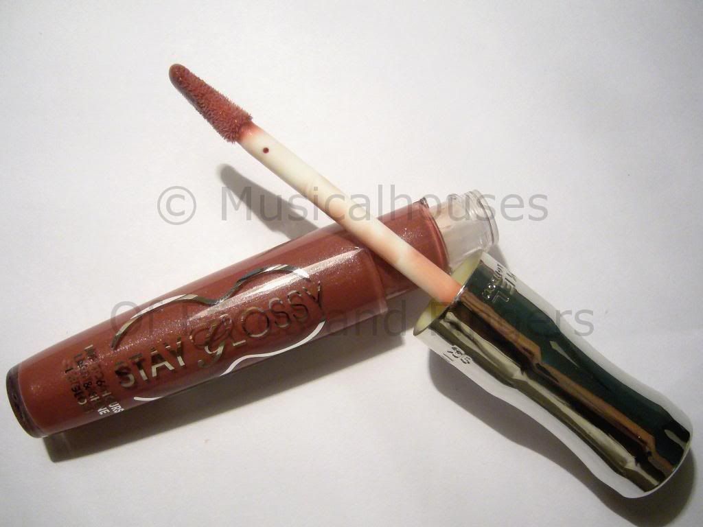
Rimmel Mauve Addiction

And a look at the brush. This brush is pretty interesting, and I don't think I've seen a brush like this one yet. It's a modified doefoot applicator, where both sides of the applicator can be used to apply the gloss to your lips, instead of just one side like your typical doefoot. I think that's kinda cool.
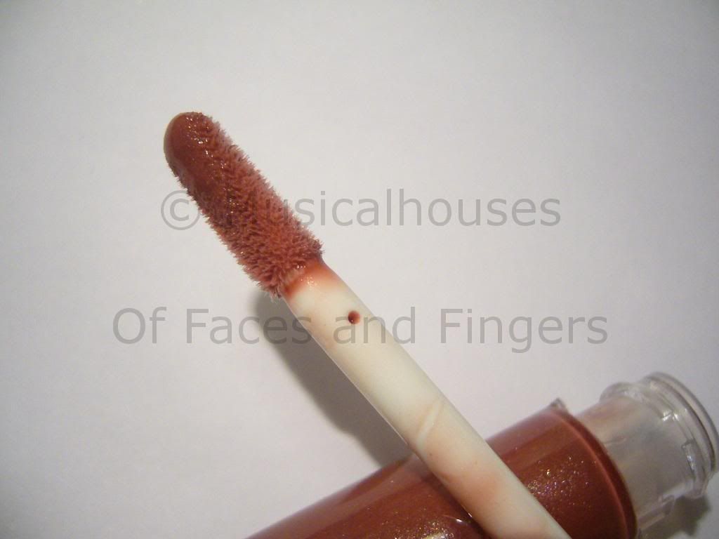


That photograph shows just one side of the applicator. The other side is also similarly slanted to allow you to apply lipgloss with both sides, instead of one. Nothing groundbreaking, but pretty nifty. Then again, doefoot applicators are my favourite, so I'm biased.

Of course, it would be immensely cruel of me to post pictures of these items and not show you how they look once applied. So, I did an EOTD and an LOTD using the products above!

Here's my EOTD. I have to admit I cheated on this one, and supplemented it with a brown shade from the Sleek iDivine Safari Palette. But you get the idea:


The highlight and lid shades were from the Bourjois Crazy Baby duo, the crease/contour colour is a shimmery dark brown from the Sleek Safari Palette (for those of you who want to know exactly which shade it is, it's the shade all the way at the bottom right corner). And then I lined with Stila Smudgepot in Jade. The mascara is Rimmel Extra Super Lash.

Not too shabby eh? I did find that the Bourjois duo was not particularly pigmented - it was decent, but required a couple of layers for the colour to be true to pan. The shimmery vanilla shade was also less pigmented than the ivy green shade, but it's nothing that is too difficult to work with. I did notice that the instructions said you can use the shades wet, though, so perhaps if foiled they might be more vibrant, but I didn't try them on wet. These were all worn dry. I really should try out the ivy green wet though, it looks like it could be gorgeous when wet.

The mascara was just okay for me. I wore it a few times, and I think it's better at adding length than it is at adding volume. It was decent, but not spectacular. I think it might work best on girls who have lashes that are numerous but short. Of course, mascara is very user-dependent, and one person's holy grail can be another person's trash bin item (case in point: Maybelline Full n'Soft mascara. It's universally loved, but did jack squat for me). It does generally seem to get good reviews, though, which is why I tried it in the first place. *Mutters* Stupid wimpy Asian lashes...Makes finding a mascara so hard...*Kicks a rock* The consistency of this mascara is also on the wetter side, so I do think this will get better with more use as it dries up slightly and takes on a more creamy consistency.

Wear time on both items was pretty good. I wore this EOTD out for one day, and at the end of the day I experienced neither smudging nor creasing, and only slight fading. The mascara stayed put and didn't smudge. They actually fared better than I expected!

Anyway, on to the lipgloss! I somehow knew I would love this by just looking at the picture on Beauty21's website, and what do you know, I was right! Do I have lipgloss telepathy or what?

First, here's a picture of my naked lips, just so you can see how beautiful the lipgloss is and really appreciate it on me:


So now that I've made you suffer by looking at my naked lips, here is what Mauve Addiction looks like on:
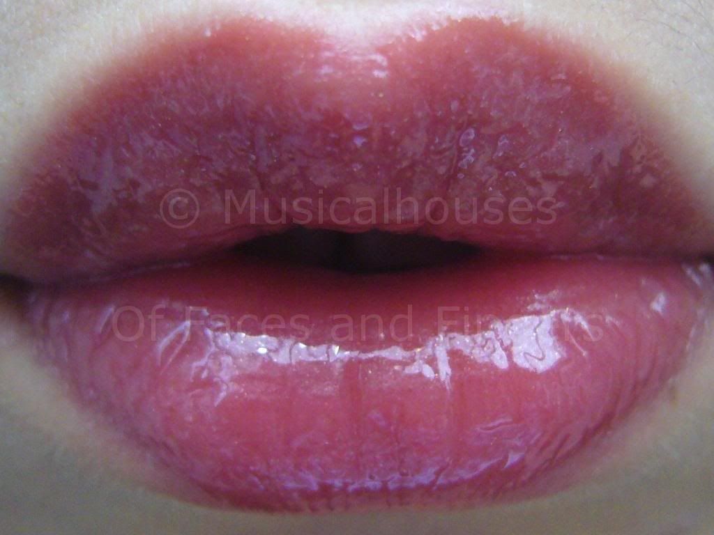
Rimmel Mauve Addiction

Isn't it a beauty? I totally hearts this. It's a beautiful glossy wearable shade of mauve. When Rimmel called these Stay Glossy, they weren't kidding - these are really glossy! I can imagine these looking totally awesome with matte makeup everywhere else - the glossiness of the lips will contrast the matte makeup nicely. And I generally hate glitter in my lip products with a passion, but the glitter in this one doesn't show up much at all, so I think it's still work-appropriate. I also really like the formula of the lipglosses - they are similar to the Revlon Super Lustrous lipglosses, but slightly more tacky, which is a plus for me, because I do find the Revlons a little bit too "wet" for my liking, and wears off a little too fast. But they're similar enough, so if you liked the Super Lustrous range, you'd probably like this too.

In terms of weartime, these were pretty good, as far as lipglosses of this nature get. They didn't last past a meal (but then again I've yet to find one that does), but they definitely lasted longer than the Super Lustrous did on me, and they basically stayed on as long as I didn't eat. I really like this gloss, and the Nude Signature colour looks really pretty too...

For £10, I feel this isn't bad at all. It's almost a complete look - all we're missing is the blush. What do you think? Good value for £10?

(The three featured products were sent to me for review. I am not paid for this review. This review is my full and honest opinion.)
Tuesday, August 10, 2010

Edward Bess Blush Imperiale Swatches!

Edward Bess calls his makeup a well-edited set of colours, and I do believe he's right. While his small line up of shades consists of neutral colours, it does seem that within that small number of shades he has managed to produce colours that would suit as many people as possible. Case in point: the powder blushes.

Like the rest of his range, the Blush Imperiale doesn't come in many shades - here, it comes in three - but I do think that the colours are very pretty and neutral, and perfect for adding that extra pop of colour to a look.

Edward Bess Blush Imperiale

The photo quality isn't as great as it could be, because these were taken at the Edward Bess/Zuneta launch, and it was all indoors. But fortunately I think the swatches turned out marginally better.

The packaging on these blushes are pretty awesome - fully functional while still remaining portable and compact. The case has a mirror, a brush for on-the-go application, and feels and looks luxe, but isn't chunky or oversized. Pretty and practical all at once.

These blushes aren't as smooth as the eyeshadows and powder bronzers - for some reason they're just a tad less finely-milled - but they're still of pretty good quality, and they retain the good pigmentation that the powder products in his line have. All the blushes are matte, which make them good for work environments - it's not fun to have distracting cheek shimmer that seems to be magnified in indoors lighting!

Once again, pardon the crappy picture quality of the swatches:

Edward Bess Blush Imperiale

01 Soft Orchid is going to be a hit among the fairer girls. This is a neutral medium pink, that isn't too bright, too pastel, too cool-toned, or too warm-toned. I like this. It's pretty universally flattering if it shows up on you.

02 Desert Bloom is a neutral midtone pinky-brown. Very universally flattering, it's a sister to other famous neutral pinky-brown shades, like MAC's Blushbaby, or Bobbi Brown's Slopes. And like Blushbaby and Slopes, it looks really blah and muddy in the pan, but it goes on beautifully.

03 Morrocan Rose is a neutral midtone rose. I know I'll be using the words "universally flattering" yet again (I seriously need to expand my vocabulary!), but this colour is just that. This one would be great for the darker ladies, but with careful application, fair girls can wear this one as well for a pop of colour on the cheeks. I'm torn between Desert Bloom and Morrocan Rose - both are my favourites, and it's hard to pick just one.

As with much of Edward Bess' line, the neutral shades and lack of gratuitous shimmer make this one great for anyone who wants easy-to-wear, go-with-anything shades and quality neutrals. If you're a newbie or someone who has to wear work-appropriate shades, the shade range is excellent and worth checking out.

Sunday, August 8, 2010

NOTD: Happy National Day Singapore - Sorry I Ruined Your Present

Part of the reason why I don't do Youtube videos is because I don't think many people would understand my English accent easily. I'm not American, and thus widely understandable (thank you MTV and Hollywood), and I'm not British, and thus slightly less comprehensible but still forgivable on account of having a cute and adorable accent. (Yes, I've come across many a non-Brit who think the Brit accent is cute. Believe it! :P ) Instead, I'm from a tiny country in Asia, called Singapore. And though English is the default language I use (I study, think, work, curse, and converse with just about everyone I know in English), I seriously doubt anyone outside of Southeast Asia would be able to understand my accent with ease, despite my fluency in the language. And although three years of living in Chicago have given me the ability to quite passably imitate an American accent, well...I don't wanna, even if it's just on Youtube. I'd feel like I was selling out, somehow. I mean, after all, how you talk is a part of who you are, right?

Anyway, I'm telling you this because my NOTD (Nail of the Day) has something to do with my native Singapore! This is because it's a Singapore-themed mani! You see, 9th of August is Singapore's National Day - the Singaporean equivalent of America's 4th of July, so it's a meaningful date in Singapore's history. And, it's a public holiday, which makes it awesome! :P

So, to display my love for my country (and for public holidays, LOL), I thought I'd base my NOTD on the Singapore flag, step out of my comfort zone, and try some freehand nail painting for the first time.

This is what the Singapore flag looks like:


You'd think it would be easy, right? I mean, the Singaporean flag doesn't have 50 stars and 13 stripes, and it doesn't have a red-on-white-on-blue Union Jack. It consists of two colours, and a handful of geometric shapes. So, I thought, it should be easy! This would be the perfect way to try out freehand nail art for the first time!

Well, turns out I suck at freehand nail art. That, and also, one should not begin a mani at 12.30am in the morning. This is the proof:

Singapore National Day Mani

Yeah, well, I know it sucks. Sorry Singapore, but I tried my best. I mean, the moon looks like a 5-year-old drew it on for me, and those squidges of nail polish are supposed to be stars, and I blurred whatever design was there because I didn't wait long enough before putting on a topcoat (hey, I did say I started my mani at 12.30am!). Still, happy birthday, I guess. It's the thought that counts, right? Right? *Crickets chirp*

For the base I used Eyeko Saucy Polish. That polish is really pigmented and thick. It's opaque in 1 coat, and I think I should konad with it next time. For the really horribly drawn on crescent moon and pseudo-stars, I used LA Colors Art Deco white art polish, which I'm ambivalent about. While I have no problems itself with the polish formula, which is thick, viscous, and dries quickly, thus making it ideal for nail art, I don't really like the brush. The bristles are a bit too long and thus hard to control. And I'm saying that because I actually mean it, and not because I'm trying to make up excuses for my sorry NOTD. :P

Singapore National Day Mani

Well, what can I say, except maybe please don't laugh at me? I know it's bad. Oh well, at least I got the colours right.

Saturday, August 7, 2010

The Perfect Red Lip: Uncovered at Zuneta Today!

See this kick-ass red lipstick swatch? Do you want to see it on my lips? Do you want to know what it is?

If you're curious, head on over to Zuneta Blog right now to see my guest post featuring this kick-ass red lipstick! CLICK HERE to view my blogpost! I promise you won't be disappointed - I mean, it's an awesome red lipstick!

Thursday, August 5, 2010

Glowy FOTD and Reveiw: Eyeko Extra Glow Cream

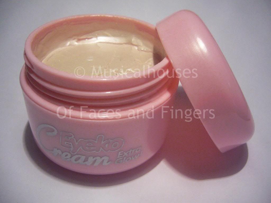
Eyeko has just released a limited edition highlighter cream, called the Extra Glow Cream. This is distinct from their current cream highlighter (called Eyeko Cream) because it is a light pink cream with silver shimmer (instead of gold like most highighting creams), so it works better for cool-toned ladies.

Eyeko Glow Cream

The cream comes in a cute little pink plastic pot and it has a white lid (not shown in the photo below) inside the pot to prevent the product from leaking. It's a pretty huge pot, like around the size of a face cream, so you know you'll be getting your money's worth!

The cream itself has a slightly harder consistency, it's not runny or liquid, but more of a solid, along the lines of a cream blush as opposed to a face cream. I actually like the more solid consistency, it make it easier to pick up the right amount with a stippling brush.

Eyeko Extra Glow Cream

The colour itself is a very light beige-pink with fine silver shimmer in the pot, but when applied, the colour doesn't show very much, and just becomes an off-white silver shimmer. Unless you use copious amounts of this, the base colour isn't going to show up on you. And although Eyeko has marketed this to the cool-toned girls, I feel because the colour just ends up being off-white shimmer, I think warm-toned girls can wear this too, because you can't really tell the colour of the shimmer once it's applied. It just looks like a sheen on.

The swatch below shows the cream used in natural light, both blended out, and unblended:

Eyeko Extra Glow Cream

I actually quite like this cream. I tried it in outdoors light and in indoors light, and although I thought the shimmer particles were larger than I'd like, it actually wore very well, even indoors. You can see the shimmer indoors, but it's not too much. I think given the inexpensive price, this is actually worth the money - you won't get huge disco-ball glitter chunks on your cheeks, the shimmer is much finer than that. It's still not as fine as the really top-end brands (Becca and Smashbox come to mind for awesome shimmer products), but it works pretty well and is a LOT cheaper.

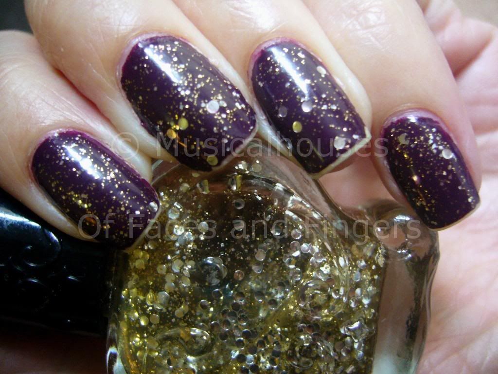
Here's an FOTD I did using the cream on my cheeks. I dedicded to pair it with Illamasqua's Sin blush (another one of those colours that looks scary in the pan but beautiful on), because it's a matte colour, and I thought it would showcase the blush colour and the highlighting effect of the shimmer nicely. It's taken in natural light, and like I said, it looked a lot more natural and subtle than I thought it would be.

Eyeko Extra Glow Cream

Here's a break down for the FOTD:

Eyes:
LORAC Persuasion
Covergirl Lashblast mascara
GOSH Velvet Touch Eyeliner in Metallic Brass (outer lower lashline)

Face:
MAC Studio Finish Concealer NC20 (undereye area only)
MAC Select Cover Up Concealer NC20 (spot application on face)
Agnes B Radiant Loose Face Powder Lumiere D'aurore mixed with some CS Silica Powder
Illamasqua Sin
Eyeko Extra Glow Cream (on cheeks, applied over Sin)

Lips:
Lancome Juicy Tubes in Beach Plum

I've said before that I don't use foundation, just concealer and loose powder to set. I know a lot of girls don't feel confident wearing cream products over powder, but as this FOTD shows, it's perfectly possible (I'm wearing the Eyeko Cream over Illamasqua Sin, which is a powder blush, and my Agnes B face powder). The trick is to use a stippling brush, like the MAC 187 or 188. Here I'm using my Flirt Feather Dust-Her! brush. Using the brush, lightly stipple the cream product onto your face with light tapping or bouncing motions, and don't rub or drag the brush too much. With this technique, you don't disturb the layers of powder underneath (well, you do disturb them, but minimally). Hopefully this helps someone out there! :)

(This product was sent to me for review. I am not compensated by or affiliated with the company. This review represents my complete and honest opinion.)
Wednesday, August 4, 2010

Just for Fun: Is it True that We Eat 7lbs of Lipstick in Our Lives?

I'm sure you've heard this before: women consume 4 - 9lbs (or 1.8 - 4kg) of lipstick in their lifetime. This urban legend has been popularized on sites like this one and that one. Depending on which exact sites you've been reading, your estimates will vary, although the mean number seems to tend to 7lbs (3.2kg).

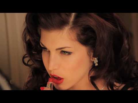
(Screenshot from the Lipstick Lover video...You know, that one on Youtube)

Now that's a lot of lipstick, and I was wondering how true it was, so I decided to do a couple of calculations to see if I could verify it.

The typical lipstick is around 0.12oz (or 3.4 grams) of net weight. Some brands weight more, some brands, like MAC, weigh less (MAC weighs 0.1oz/3g). 1lb is 16 oz, so there would be 1/0.12=133.33 lipsticks required to make up the weight of a pound.

So, in order for us to eat 7lbs of lipstick in our lives, that would mean we eat 133.33*7=933.31 lipsticks over the course of our lives.

I don't think anyone - even the most hardcore makeup fanatic - has 933 lipsticks though. Heck, I'm a makeup fanatic with a specialty in lipgloss and lipsticks, and my stash of lip products freaks civillians out, but I don't even have 933 lipsticks! (I wouldn't mind, though, hehe.)

So how much lipstick do we actually eat in a lifetime? I decided to do more math.

Assume a lipstick lasts 8 months with daily use. (This is from my own personal experience. Yes, I've actually used up a lipstick!) And assume you start wearing makeup at 16, and wear it until you're 80. So that gives you 64 years of lipstick-wearing. And each lipstick lasts 8 months, and for simplicity's sake, let's assume you wear lipstick everyday, applied once in the morning. So, that means you'll have 768 months of lipstick wearing, which translates into 96 lipsticks over the course of your entire life. And 96 lipsticks will weigh a total of 96*0.12=11.52oz, or just 326 grams of lipstick over your entire life.

Wow. That's a lot less than the "conservative" estimates of 4lbs. Even if you reapply your lipstick twice a day (say once after lunch and once after dinner), that would still make it only 11.52*3=34.56oz, or 979grams of lipstick over your entire life! In fact, to get it to match the average 7lbs estimate, you'd have to reapply your lipstick 10 times every day. Even if you take into account the fact that kids these days start wearing makeup at ages younger than 16, the amount of lipstick they wear isn't going to near the 7lbs estimate. So it's really all a myth.

The strange thing is I've actually seen this touted as "fact" in some respectable beauty publications, which in turn makes you wonder if they check their facts at all. But anyway, I just thought was fun to actually verify what I've been hearing to see if it was really true.