So, being the obsessive swatcher I am, I basically spent two hours swatching all the 41 shades that were launching here in Singapore, both for myself, as well as for you guys! (You might have seen some of this on my snapchat - I'm musicalhouses there too.) I'm told the eyeshadows are reformulated as well, although to be honest during the swatching session, I couldn't really tell that much of a difference. Which is just as well, because the old textures were already great as they were.
I'm swatching the first 3 rows of the shades laid out above, and the last 3 rows will be in part 2. So, if you're into bright shades, these are all swatched in this post! I swatched these in indoor lighting, and I've done my best to get them as colour-accurate as can be, and I do think the swatches turned out decently! Anyway, without further ado, let's get down to swatching!
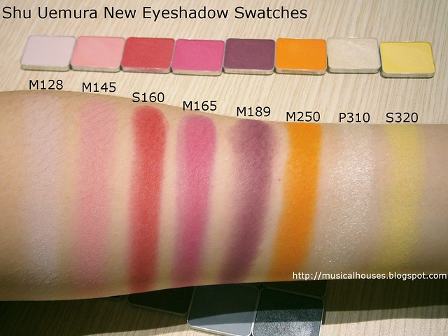
M128 is a matte pale, pastel petal pink. Very sweet and girly.
M145 is more of a matte peachy-pink shade, leaning towards the pink side. This is a couple of shades deeper than M128.
S160 is a flaming red shade, leaning slightly warm.
M165 is a bright pink matte. I kind of want to say this is magenta, but it's not quite purple enough, and a little more complex than that.
M189 is a deep purple shade that leans quite pink. Sort of if an eggplant shade was lightened a little and had some pink thrown in.
M250 is a tangerine orange shade, and leans warm.
P310 is going to be a popular shade for base all-over lid colours. It's a light pearly beige. The shimmer is visible in this one, but more subtle than the ME (Metallic) finish shades.
S320 is a very interesting pale lemon yellow shade. I've seen yellows in other brands, and typically they're warm egg yolk-type yellows, but this is paler and cooler. This is a good yellow for cooler-toned girls who might find the warmer version too clashing on their skintone.
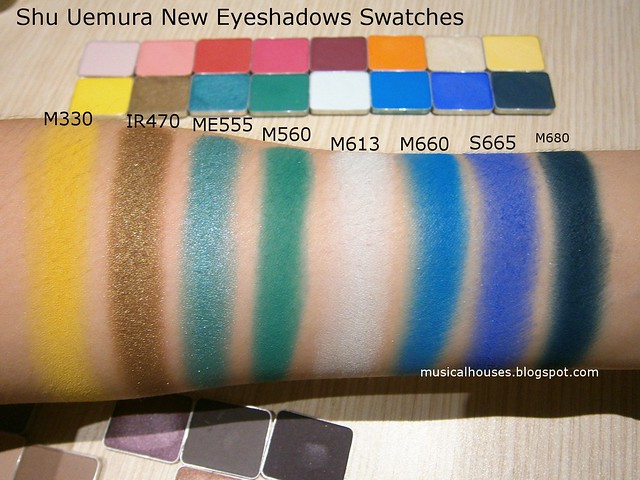
M330 is a sunshine yellow, warmer and slightly deeper than S320.
IR470 is a gorgeous neutral olive brown shade with a very nice shimmery finish. This would look good on a variety of undertones and skin shades, and is a great neutral colour that still has a bit of a pop to it.
ME555 is a teal blue with a metallic shimmery finish. Very lovely if you're into blue shades!
M560 is a matte green that leans pretty blue. This is a cool-toned shade, but would look great on a variety of skintones.
M613 looks like it's nearly white on me, but it's actually a pale, pale blue-green shade, a cross between a pale tiffany blue and mint. Very pretty if you like pastels!
M660 is a bright blue shade, with a nice matte finish.
M665 is also a bright blue matte shade, but this one leans cooler than M660. M660 and M665 are great examples of "cool vs warm" shades, because they are very similar, in that they are both blues with similar depth of colour. But M660 leans more warm, but M665 leans more cool. In the pan they look really alike, but I think my swatches brought out the difference in undertone between the shades.
M680 is a gorgeous deep, deep blue-green that's almost blackened, but not quite.
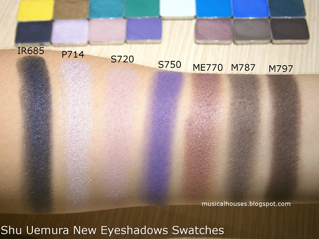
IR685 is a lovely black shade with blue sparkle and shimmer, sort of like a night sky.
P714 is a shimmery pastel lavender shade, and really lovely for lighter skintones.
S720 is also a pale lavender shade, but a shade darker than P714, and with a matte finish.
S750 is a periwinkle purple shade that's a cross between purple and blue.
ME770 is a lovely dusty purple shade with the sliiightest hint of brown, and is another great neutral shade with a pop of colour. It remains firmly in the purple family, though.
M787 is a matte deep grey. It's not black though, and clearly visibly grey, even in indoor lighting.
M797 is also a matte deep grey, but this one is more blackened than M787.
For the uninitiated, the shade finishes are denoted by their names - M stands for Matte, ME for Metallic, IR for Iridescent, P for Pearl, and S for Satin. Generally ME shades have the most shimmery finish, followed by P shades and IR shades, followed by S shades (which are pretty close to matte, in my opinion), and lastly, with no shimmer at all, the M shades.
The textures of these when swatched were great, and so was the pigmentation. I really liked that even the light pastel shades had good pigmentation or were buildable with a few swipes - definitely none of that chalky, unpigmented textures we sometimes get with lighter pastel shades. These are sold in individual pans, with single or palette casing sold separately.





I agree, the texture is awesome and same with the pigmentation. This is really something worth checking out.
ReplyDeleteThank you so much for swatching these! What a gift you've given us! The color samples on the Shu websites, both US and JA are not accurate. I've worn Shu almost exclusively for decades; the matte (and even the Satin) shadows are the perfect product for super sensitive eyes, and Shu perfected the creamy but baked micro mineralized product long before any other company did. Over the years I've tried all the best, and Shu Uemura ranks at the top IMO. We're now back in the USA from Asia - She is hard to find and the US website has such limited product choices. These swatches are a huge help for ordering from Japan. Thank you again!
ReplyDelete