Holographic Zebra Stripes Nail Art with GOSH Holographic

Thursday, May 31, 2012

10 comments
One of my favourite polishes of all time has to be GOSH Holographic. This was one of the first holographic polishes I ever got (before OPI had their DS line and even before China Glaze had their holos, I think), and it's still, in my opinion, anyway, one of the best. The last time I used this little baby was waaay back in 2009, where I raved about how GOSH Holographic was so awesome, so I thought I'd bring this little baby out for a spin!

Three years down the road, I'm still loving this polish! GOSH Holographic is a classic silver linear holo, and it's now discontinued (although rumour is that GOSH may be bringing it out again this Summer - I don't know, it's just a rumour I heard, and dates I've seen range from June to August). I was lucky to get mine from a Superdrug before it was discontinued, so I didn't have to pay ripoff eBay prices. In my last post I featured GOSH Holographic all by itself, so this time I decided to get fancy and do some konading.


I used Wet n Wild Black for the black zebra stripes, and the konad plate was M57 (although the M57 plate is so famous I bet some of you guys can recognize the plate from the pattern). For some reason, though, I really couldn't get the right lighting to take the photos (no direct sunlight), so I ended up having to make do with crappy indoor lighting. Sorry folks. My original GOSH Holographic post probably has better pictures, I'm ashamed to admit.

GOSH holographic zebra stripes konad 2


Anyway, GOSH Holographic can be tricky to apply, but I generally use 2 - 3 coats for this, letting each layer (base coat as well as each individual layer of polish) dry fully before applying the next layer. I think this is key to not having GOSH Holographic clump up on your fingernails. I've read blog reviews expressing lots of frustration at the lipstick, and I feel a lot of the frustration is due to not letting each coat dry fully. My old GOSH Holographic post also went into some detail on how to apply this pollish, so I won't belabour the details, but suffice it to say - let each coat dry fully before applying the next coat, and you'll get a great holographic finish. Some bloggers advocating using the GOSH base coat to make this apply better, but for me, either way, it doesn't make a difference, as other base coats work well as long as they're left to dry fully before applying the polish.

GOSH Holographic zebra stripes konad 3


Like all holos, this chipped on me fast - think the next 1-2 days. Holos never last on me, which is a pity, because I really love them. Anyway, this is a gorgeous little colour that is just so worth it. I know my photos suck, but I hope you get the idea of the sheer awesomeness of this polish. I really hope GOSH brings this colour out again, so more of us can have it!

Recent Hauls (aka Stuff I Instagrammed)

Tuesday, May 29, 2012

6 comments
If you follow me on Twitter, or follow me on Instagram, you would have seen a lot of hauling over the past couple of weeks! This is because I was in the USA during that period of time, and of course I had to hit up the local Walgreens and CVS to get my drugstore makeup fix!

Being a budget kinda shopper, I really just targeted things that were on sale. In addition to Walgreens and CVS, I also looked at the Marshalls, Nordstrom Rack, and Ross stores around the area. Sometimes the makeup is really banged up in those stores, but you do get some good buys. Seriously. You gotta dig to get to the gold, I guess.

Anyway, here are my Instagrammed shots of my hauls. This is the first haul. Basically it was just stuff that was on sale - which happened to be Covergirl (I finally got that Covergirl Tapestry Taupe eyeshadow, which is one of those cult products, although lesser known since it's not a fancy brand), and Essence of Beauty (those red-and-black things are the EOB Crease Brushes, which I've reviewed before on my blog. I think they re-packaged it or something.) and a bunch of other stuff. I shop makeup like I shop clothes - I just make a beeline for the stuff that's on sale, and work from there. Yeah, I'm cheap like that.

Oh oh, and I'm so happy that I got some of the Sally Hansen Gem Crush nail polishes. I don't know what's wrong with Sally Hansen, but outside of the US, their product range is really, really, really dull. Here in Asia, all they have is a bunch of pinks, sheers, nail treatment products, base coats and top coats and stuff like that. Even the more "wild" colours we get in Asia aren't that exciting, e.g. shimmery forest green. All the exciting launches in the past few years (e.g. the HD nail polishes) never make it out of the USA. I had to go to extreme lengths to get my botles of Opulent Cloud, Mystic Lilac, and my HD DVD and HD Spectrum. I mean, come on Sally, not all of us here in Asia like to wear pinks and sheers, you know. I'm dying for more colour over here! Bring in the holos! The duochromes! The good stuff! But I digress. I was happy to get these, because I'm pretty sure I'll never see them here in Asia.


And here is the second haul. I finally, FINALLY, managed to get my hands on one of those legendary Wet n' Wild #666 lipliner pencils. When I was living in Chicago, my local WAGS was always out of stock of these babies for all 3 whole years that I was there. Seriously, it must have been a conspiracy or something. I never got my hands on these in Chicago, but for some reason the #666 pencils are a lot more plentiful in California. Sheesh. You West coast guys get all the good stuff. Come to think of it, even the Marshalls and Nordstrom Racks had better make up here in the Bay area than in Chicago. In Chicago the downtown Nordies Rack mostly had really dug into Stila and Smashbox (on occasion you would get Trish McEvoy and Shu Uemura in tiny quantities). You guys get Urban Decay. Wrapped up in plastic so noone can dig their grimy fingers into them. Life's not fair, really.

Also, I got some more Sally Hansen Gem Crush nail polishes. I felt like getting more of them, but some of them looked kinda similar to colours I already have, or were just colours I wouldn't wear, or looked less exciting (e.g. pale pink glitter - yawn). Anyway, I got a couple more colours, so yay me.


Also, while I was at a Tanger Outlet mall, I got this baby! Lancome Le 54 nail polish - yes the name is Le 54 (no idea what it means - French for "The 54", maybe? Who knows what these fancy French names mean) and it was a polish from Lancome's Spring 2011 collection. It's a sheer light purple sheer (photo makes it look darker than it is IRL) with exciting dark blue glitter. Fantastic. I would wear this alone or layered, and I'm thinking maybe a jelly or glitter sandwich may be perfect with this shade, non? It would be tres chic!


Annd this! I know, you guys in the USA have had it for ages. But I finally got a hold of Revlon Scandalous! This is a dupe for Deborah Lippmann's Bad Romance, so I'm excited to get my paws on this, since Lippmanns are usually beyond my budget. I like dupes! I was trying to find Revlon Whimsical too, but I checked in every single Walgreens and CVS, and they didn't have it.


Anyway, this was what I instagrammed. I actually bought more than that (I got an elf eyeshadow palette, and a couple of Essie polishes, also from 2011 Spring, but at the awesome price of US$3+ per polish, as well as some clothes and shoes - but this isn't a clothes/shoes blog, is it?), but I haven't gotten around to instagramming any of them yet, because I had to do other less important non-makeup related things, like sightseeing, traveling, and actually spending time with my family (I know, I know, how dare I have a life outside of this blog). But here's the whole shebang, all the beauty-related stuff (makeup, skincare, nail polish) that my mum and I hauled over the past 2 weeks. No clothes, shoes, or bags. I got most of the makeup and nail polish, my mum got most of the skincare. Good times!


And apologies for the craptastic picture quality, these were really taken with my iPhone on the fly. And on my tiny iPhone screen, these sure looked a lot better. Shucks. Anyway, you'll be seeing some of the new stuff around the blog, with better photos and actual reviews soon, and I hope you'll like it - I can't wait to share them with you!

Feature in Pure Beauty Magazine May 2012!

Sunday, May 27, 2012

7 comments
Have you seen Pure Beauty's Magazine's May 2012 issue yet? In their "Caught in the Web" section (on page 61), they feature a blogger every month, and this month, yours truly is in there. In this issue I have a short column where I write a little bit about why I blog, how I blog, as well as a little bit of some of my blogging highlights!


Basically this is a little bit of a behind-the-scenes peek into my blogging, and my attitudes to blogging. They don't really change too much, if you read another recent feature the same themes come through, pretty much. Man, I guess I do sound like a one-track record, huh? Maybe I should mix it up a tad :)

Anyway, to see the feature, go to the Pure Beauty's Magazine's May 2012 issue on page 61. I don't know if anyone's interested in reading a little bit more about behind-the-scenes stuff, but if you do, here's a quick and easy way to find out a little bit more about what goes on behid the blog!

Everyday Neutral Brown Eye Look

Thursday, May 24, 2012

7 comments
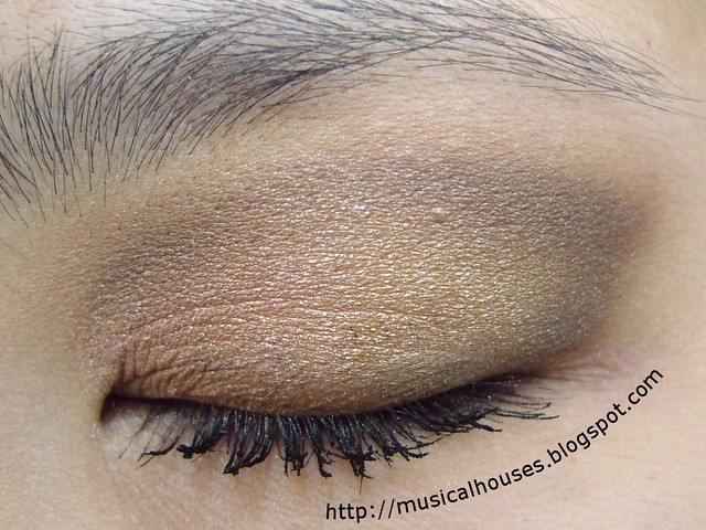
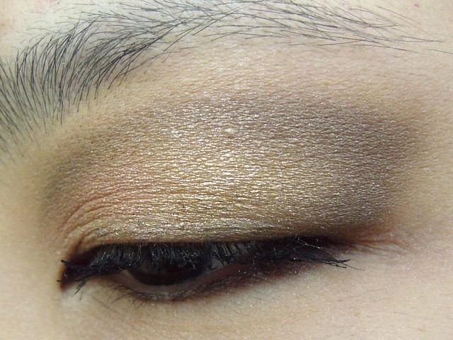
Here's a quick post for today, on a quick and easy neutral eye look, with brown eyeshadow. No waxing lyrical about themes or inspiration, this was really just an everyday look.


Nothing much to say here, except that it's basic, boring brown. I used two browns, an antique gold brown for the lid area and a deeper brown for the contour, and blended them out. And viola - a simple look I could wear out.

neutral brown eye look 2


I don't know why all the neutral looks I do look so blah online. Perhaps its because compared to all the bright looks, which seem so vibrant on-screen, a look full of browns just looks so tame and muddy by comparison. I feel like all these neutrals look better in person than in photo, somehow.

neutral brown eye look 3


Anyway, that's it for today. Short and sweet!

MUFE Aqua Liners Swatches Part 2 of 2

Tuesday, May 22, 2012

6 comments
Alright, here's the second and last instalment of MUFE's Aqua Liners, which claim to be waterproof and sweatproof. I daresay that these probably live up to their claim - removing them after swatching was a huge, huge pain. Apparently the entire Aqua line was developed for underwater ballerinas, too, so I guess if underwater ballerinas are using them, they have to work, right?

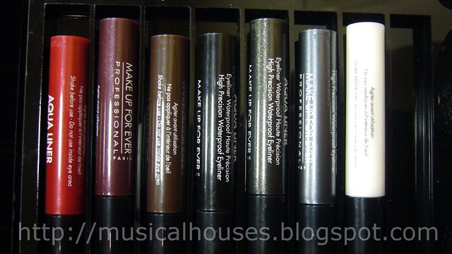
Anyway, here is the full range of the MUFE Aqua Liners.


And these are the ones being swatched today. All of these are neutral and worksafe, except for one.

mufe aqua liner part 2


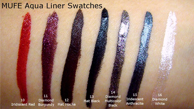
And, here are swatches!

mufe aqua liner swatches 2


10 Iridescent Red is - well, a shimmery iridescent red. This is like, primary fire-engine red.
11 Diamond Burgundy is a deep reddish-purple shade with sparkle and shimmer.
12 Mat Mocha is one of the few creme shades with no shimmer or glitter, this is a pretty dark brown.
13 Mat Black is a deep black. No shimmer or sparkle.
14 Diamond Multicolour Black doesn't really look black to me (or at least not next to Mat Black anyway) - to me, because of all the shimmer and glitter this has, it looks more like a sparkly glittery almost-black grey. Pretty, this one is.
15 Iridescent Anthracite is a deep shimmery grey colour, and I'm not sure if I wouldn't think it was black when applied on the eyes.
16 Diamond White is a nice sparkly white. This one seemed to be somewhat sheerer than the rest - it's not white-out type of white. I'm thinking it would look AWESOME layered over another colour of liner.

Tribal Nail Art: Summer Colours and Geometric Shapes

Sunday, May 20, 2012

2 comments
One of this Spring/Summer's trends is the tribal print, combined with eye-catching, bright colours. While I'm not actually a fan of wearing tribal print, I thought that it would be awesome to do a tribal-inspired mani on my nails. I've also been seeing a few tribal-inspired nail looks too, so I thought I'd join the club.


Let me show you a few photos that were indicative of the trend that inspired this nail art. The tribal feel is acheived by a mix of bright colours and geometric prints.


(Source)


Here, less geometric shapes, but bright colours nonetheless!


(Source)


For this look, I was really going for the bright shades and geometric shapes feel. The base is Essie Fondola Gondola, the green bit is Nails Inc Spring Mews (which I've used in an NOTD before), while the coral shade is Eyeko Coral (which, if you don't know yet, makes a fantastic pedi colour for summer. The gold lines were done with Orly Luxe, which has to be my favourite gold polish ever, because I keep raving about it.

tribal nail art summer colours 1


All this was done freehand. I simply painted Essie Fondola Godola, then I painted Nails Inc Spring Mews and Eyeko Coral at an angle to get the geometric shapes. I then painted over the lines with Orly Luxe, and painted in a small triangle with Luxe as well. It isn't the neatest nail art around, but it was quite fast to do, and if I probably had a bit more control the lines would turn out neater. Oh well, nail art isn't exactly my strongest suite. You can see I really messed up the gold lines badly.

tribal nail art summer colours 2


I liked the combination of colours - so gorgeous and summery and girly, as I liked the geometric shapes, but I think it was marred by my own crappy application.

tribal nail art summer colours 3


What about you guys? Have you tried a tribal-inspired manicure yet? Tell me!

MUFE Aqua Liners Swatches Part 1 of 2

Friday, May 18, 2012

7 comments
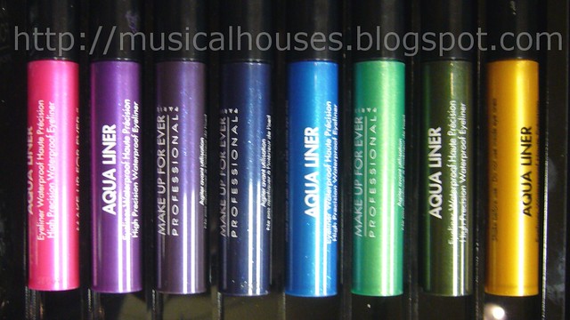
MUFE Aqua Liners are part of the MUFE Aqua range, and these were created with underwater ballerinas in mind, to give them makeup that they could go swimming in. Thus, the MUFE Aqua range (Aqua Liners, Aqua Creams, etc) are supposed to be waterproof, budgeproof, and sweat proof. I can totally attest to the efficacy of these - they were super hard to remove once they were on my arm.


There are 15 shades altogether, each with a name and number. These are the 8 shades I've swatched today for you guys.

mufe aqua liners part 1


And here they are swatched!

mufe aqua liners swatch 1


1 Diamond Gold is a nice metallic yellow gold.
3 Iridescent Emerald Green doesn't look emerald to me at all, but kinda olive-ish. Very nice and a universal shade though.
4 Diamond Lagoon Green - OMG turquoise eyeliner! Hot hot hot. And this one is nice and metallic and bright, but not neon-loud, if you know what I mean.
5 Diamond Turqouise Blue - wait this isn't turquoise to me. I'd call this bright, bright sky blue with a metallic finish.
6 Iridescent Navy Blue is a nice metallic deep blue. Pretty.
7 Diamond Black Purple is a deepened metallic purple. This is a great alternative to black, if you want something with colour but also something that retains the intensity of black.
8 Iridescent Electric Purple is a nice metallic violet purple. I actually think this is quite wearable.
9 Iridescent Fuschia - holy hot pink! That's all I can say.

Apivita Lip Care Blackcurrant: Tinted Lipbalm Never Was This Good

Wednesday, May 16, 2012

3 comments
I'm quite prone to dry lips from time to time, a legacy of ye olde days a few years back when I was taking medication to alleviate my chronic acne. Anyway, this means that I'm always on the search for my perfect lip balm. And my perfect lip balm would be moisturizing and feel good on the lips without being too waxy, and better still if it has a hint of colour to it too. And it should be in stick or tube form - I hate digging my fingers into a pot.

The Apivita Lip Care with Blackcurrant just happens to fit the bill nicely. Apivita is a natural skincare brand from Greece, and their product offerings are pretty impressive. Apivita is a brand that focuses on natural products, and while I tend to be rather skeptical about companies that that brand themselves as "natural" too liberally, I do feel like Apivita is one of the more genuinely natural brands around, based on the products I've tried so far.


The first thing I like about the Apivita Lip Care is the packaging - it's in a sturdy stick form that makes it easy to carry around (I've had it in my bag for a few weeks and no mishaps yet). And the tube colour matches the colour of the lipbalm inside! How cute is that?

apivita lip care blackcurrant 1


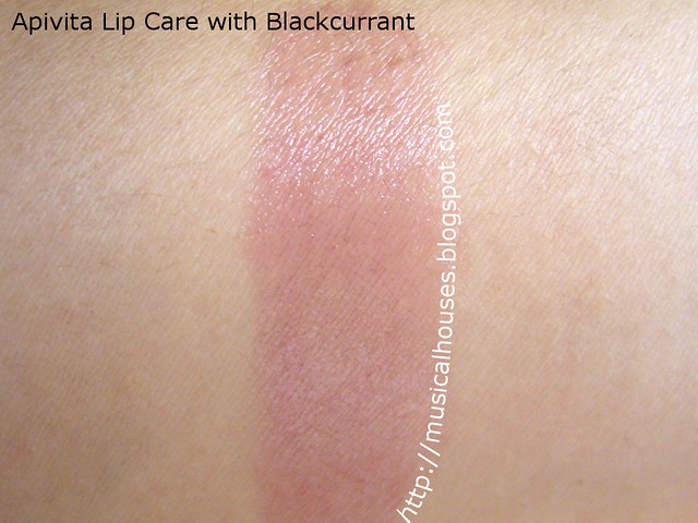
Also, for a makeup junkie like me, the colour is important too. The Apivita Lip Care looks really dark in the tube, but because the colour is so sheer, you get the barest hint of colour. So don't worry if the colour doesn't look like your cup of tea at first glance - pigmentation is qutie light, so even the colour-shy can wear this, as you can see in the swatch below.

apivita lip care blackcurrant swatch


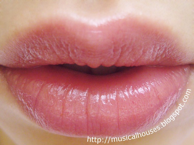
Okay, great. So the packaging is great and sturdy, and the colour is very wearable. Now of course, comes the most important part - the actual performance of the lipbalm on my lips. Its got a bunch of plant oils, including castor seed oil, cocoa butter, and olive oil, so although there are some waxes in there, it feels great on my lips too. Not too waxy or anything. The oils in the Apivita Lip Care also give the product a good slip, so you don't get any feelings of stickiness either. Here's a swatch of the Apivita Lip Care on my lips - you can see the colour translates into just the barest hint of colour and shine on my lips. Very natural looking.

apivita lip care blackcurrant swatch lip


All in all, I really like the Apivita Lip Care, and it's now a staple in my bag. It helps to alleviate dry lips, and is cosmetically very elegant too. If you're looking for a natural lip balm that is emollient and effective, with just a hint of colour, this is a good bet. Apivita is available at the Apivita website.

(Product was sent for review. Review is my complete and honest opinion. I am not affiliated with/compensated by the company.)

Syrup Manicure and Sparkles: China Glaze Beauty and the Beach and Fairydust

Monday, May 14, 2012

2 comments
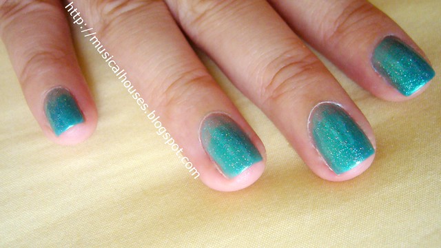
I tried my hand at the syrup manicure the other day. I liked colour, but I didn't really like how the manicure itself turned out. I think I kinda sucked at the gradiation. So of course I did what anyone covering up for a failed syrup gradient manicure did - I put glitter over it! Here's the final look.


The syrup manicure uses just one colour, typically a very sheer jelly, in order to get the gradient effect, in contrast to other gradient manicures that use two colours. The sheer jelly shade would then be applied in successive coats to give the gradient effect. For this look, I used China Glaze Beauty and the Beach, which I bought like, in a haul a long time back, but haven't used til now (shame, I know). Anyway, I thought that since it was such a sheer jelly shade, it would be perfect for the syrup manicure.

In order to get the gradient effect, I started off with a coat of Beauty and the Beach all over the nail. I then applied a second coat of Beauty and the beach from three-quarters of the nail, and a third coat from halfway up the nail. The last coat was applied just to the top quarter of the nail, nearest the tip. That created the gradient look.

china glaze beauty and the beach fairydust syrup manicure 1


Sadly, I wasn't very pleased with how the gradient turned out. I felt like the gradient was too sudden, and wasn't very "gradient"-like. Anyway, I decided to salvage it by adding glitter on top. I mean, glitter makes every manicure look better, right? So on went a coat of China Glaze Fairy Dust. Muahaha, now with my tips all covered with glitter (holo glitter, no less!) noone's going to notice that the syrup gradient isn't done right! How smart am I, seriously?

china glaze beauty and the beach fairydust syrup manicure 2


Anyway, if I had done the syrup manicure bit properly, I think I would have liked this a lot more. Although China Glaze Beauty and the Beach is annoyingly sheer, when layered it has a gorgeous lit-from-within glowy shimmer that I love. And of course, its annoyingly sheer nature makes it perfect for the syrup manicure. I also like China Glaze Fairydust - I swear, this polish just looks good over anything.

china glaze beauty and the beach fairydust syrup manicure 3


So there you have it - my failed attempt at a syrup manicure, and an equally fail attempt to cover it with glitter. Maybe next time I should do a few practice nails before jumping into these things. But for now, this is perfect for the spring and summer seasons - bright, happy, and tropical.

Strawberry Inspired Red, Yellow Green Eye Look

Saturday, May 12, 2012

9 comments
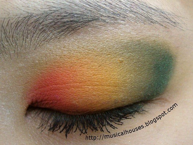
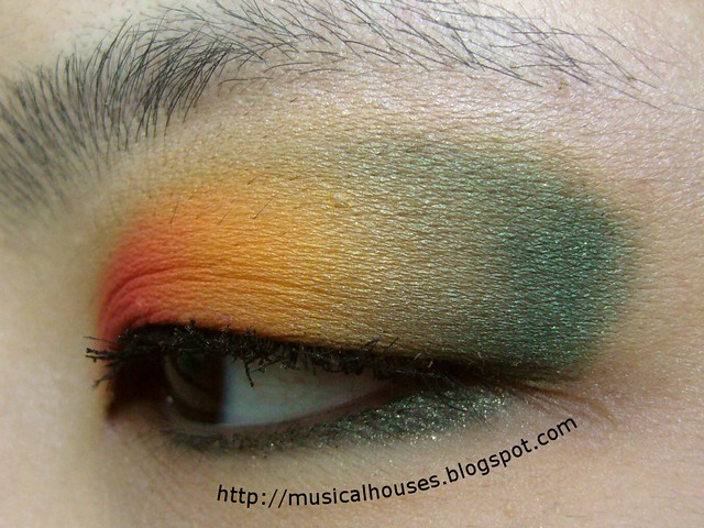
I love strawberries, and it's strawberry season! So I decided to do an eye look using strawberry colours. Here's how the look turned out.


The eye look was really just three colours - red, yellow, and green, all the colours I associate with strawberries. It was a simple enough eye look to achieve - red on the inner lid, yellow on the middle lid, and green in the contour area.

strawberry eye look 1


I can't remember what colours I used, but chances are, they are probably from my Sleek palettes. Usually if I do a bright look, I tend to reach for my Sleek palettes, that's how good they are. Come to think of it, I can't remember what mascara I used either, much to my chagrin - that was one of the few mascaras that didn't look clumpy on me. Rats. The eyeliner was my trusty Stila Jade Smudge Pot.

strawberry eye look 2


All in all, I really liked this look. It's too abstract to really look like a strawberry, of course, but I like how fun and happy it looks. I probably wouldn't think of a colour combination like that myself, but I gotta say, the colour schemes and pairings found in nature are so pretty!

Apivita Cleansing Milk for Face and Eyes: Truly Gentle Makeup Remover

Thursday, May 10, 2012

1 comment
Apivita is a Greek-based skincare brand, with a focus on natural and holistic skincare. They're sort of like Greece's answer to Liz Earle. I've tried a few products from Apivita so far, and I have to say, they have all been very impressive indeed.

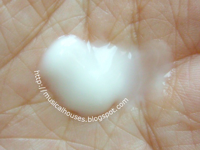
One of the products I like a lot is the Cleansing Milk for Face and Eyes. It functions as both a makeup remover and a cleanser. The product is packaged in a squeeze tube with a screw cap. I like this form of packaging, a lot less likely for contamination to happen.


The Cleansing Milk itself is a very liquid-like, milky fluid. Although it contains some plant-derived oils (almond oil and olive oil being chief among them), it doesn't feel particularly oily, like most oil cleansers are. It has a pleasant scent that isn't overpowering. The one I tried was the 3 in 1 Cleansing Milk for Face and Eyes with Chamomile and Honey.

I've been using this both as a cleanser and as a makeup remover. Both ways, it works well. I've actually been very impresses by how it removes light makeup and cleanses my skin well while still being very gentle. I'd definitely recommend this if you have sensitive skin.

apivita cleansing milk face eye


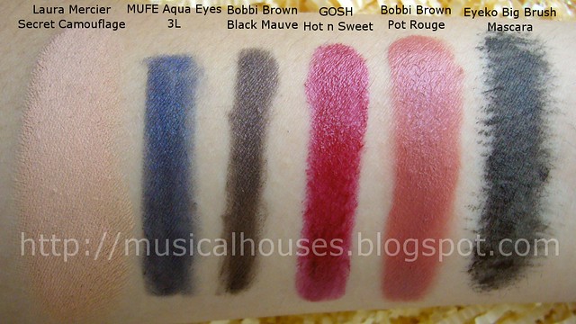
I decided to show you guys a little demonstration of how the product works. Here on my arm, I've lined up a few products that would really test the ability of a makeup remover - my Laura Mercier concealer, MUFE eyeliner, Bobbi Brown gel eyeliner (yes, so you have two kinds of eyeliner), GOSH lipstick, and waterproof mascara.

apivita cleansing milk test 1


I used a bit of the Cleansing Milk, and first rubbed it into the skin. After rubbing for awhile, I rinsed with water. And here are the results!

I know, it's not a perfect removal, but it's still pretty darn impressive. When I first tried this out, I was thinking, "This cleanser is so gentle, it's surely going to suck at removing makeup," but it did surprisingly well. The waterproof mascara and concealer were gone, and almost all the eyeliners were gone too. The only thing that remained behind a little more was the lipstick. I think that to improve performance, I could have massaged the Cleansing Milk in a little longer to really let it break down the makeup. But if you're wearing light makeup, this would be more than adequate.

apivita cleansing milk test 2


A last thing I'd like to note about the ingredients list is that while the product does indeed have essential oils, which may irritate some sensitive skin (including mine), fortunately most of these oils (sweet almond, olive, etc) seemed to be just fine on my skin. I guess the selection of oils was well-chosen.

All in all, I can say that I am indeed impressed with the Apivita Cleansing Milk. I think it's really good at cleaning while remaining gentle on the skin. If you are looking for a gentle makeup remover with good removal power, or looking for a natural alternative to skincare, this is a brand you can go for. And it's pretty affordable too, at €14.60 for 250ml (that's a good amount of face wash). Anyway, Apivita website has a list of prices and other products, should you feel like checking them out.

(Product was sent for review. Review is my complete and honest opinion. I am not affiliated with/compensated by the company.)

Girly Nail Art: Spring/Summer Stripes and Pearls

Tuesday, May 8, 2012

7 comments
I wanted to do a nail art inspired by some of the Spring/Summer colours I've been seeing around. I'm not very much into fashion in terms of clothes (the way I've got it figured - you either look good in a piece of clothing or you don't, and if you don't, no point wearing it just because it's trendy because you'll just look silly), but I do like appropriating colours I see on the runway and incorporating them into my nail art. After all, isn't there that quote along the lines of "Good artists borrow, great artists steal"? Here is my nail art then, inspired by the fashion runways.


Anyway, let me show you a few of the photos I was looking at that inspired my current nail art. Basically, girliness and sweetness with a little pop of colour.

(Source: Style)


So I tried to use a similar theme - girly, but with a bit of brightness thrown in - as a base for today's nail art. And I liked the pink-and-green combi, too, so I used that colour scheme as well. And because it wouldn't be nail art without any bling, I threw in some pearls for good measure. And that was it, really.

spring nail art stripes pearls 1


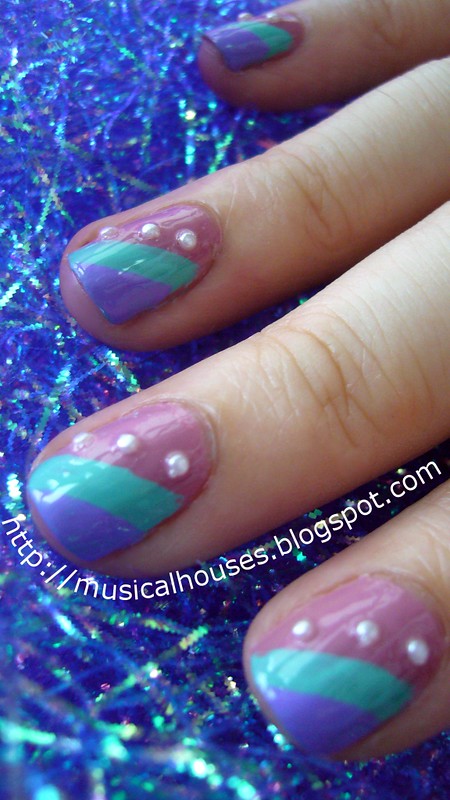
Okay, so not exactly like Prada on the runway. But I quite like it. For the pink base, I used Nails Inc Bruton Street, one of my favourites in terms of the perfect soft neutral pink. The green (or more accurately, aqua) is China Glaze's For Audrey, which I've already done an NOTD with before. The purple is Illamasqua Jo'mina, also a previously featured polish.

spring nail art stripes pearls 3


This was all done freehand, hence the messy lines. I just painted the pink first, then the green, then the purple. I originally wanted to cover them up with some striping tape, as I like to do when my nail art is messy, but I figured, well, maybe not this time. So yes, you get to see my messsy lines in full glory. The pearls were added last, followed by topcoat.

spring nail art stripes pearls 2


So there you have it! My runway-inpired girly nail art for Spring/Summer this year. It's pretty easy to do, if you have a steady hand (obviously I don't so it's not that easy for me), and I really liked the addition of the pearls - it really makes it just that little bit girlier.

Sleek Ultra Mattes Brights Palette Swatches + Review!

Sunday, May 6, 2012

7 comments
Sleek has finally given in to consumer requests for an all-matte eyeshadow palette, and released not one, but two, matte i-Divine eyeshadow palettes. Since the i-Divine palettes were always one of their most popular products, I'm sure these will be a big hit too. The two palettes consist of a Deep Palette, full of dark neutrals, and a Brights Palette, which is, of course, full of Brights. The one I have is the Ultra Matte Bright Palette.


I'm sure most of us are pretty familiar with how the Sleek i-Divine Palettes look, so I'm not going to rehash the details. I'll go straight to talking about the colours and quality. Colour-wise, it's a bright palette with enough shades to cater to your every need - there's pinks, greens, blues, oranges, yellows - but at the same time, there are also three more neutral shades, Floss, Crete, and Pow! And can I say how glad I am that this time there isn't a matte black? It seems to me that almost every Sleek palette I've come across inevitably has a black shade sitting in a corner, so I'm glad to see that this is a little break from the black. Here's a shot of the Sleek Ultra Matte Bright Palette, with the colour names for each colour. And lastly, this is a very on-trend palette, too, colour-wise, containing over half of the upcoming Fall Season 2012 colours, too. So yes, although it is a palette that looks like a Spring/Summer palette (brights of course being very Summer-y), it'll also be relevant well into Fall.
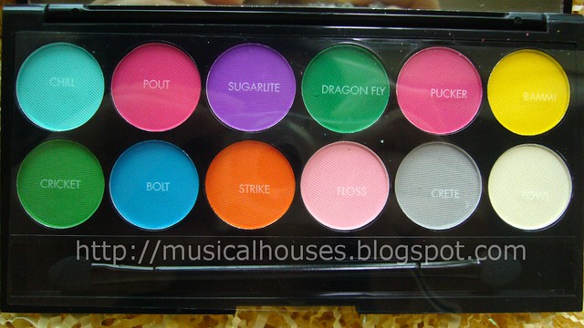
sleek ultra matte brights palette names


Top row, L-R: Chill, Pout, Sugarlite, Dragonfly, Pucker, Bamm!
Bottom row, L-R: Cricket, Bolt, Strike, Floss, Crete, Pow!

Quality-wise, I found the pigmentation to be generally very good, as per Sleek Makeup's general quality. There are only a couple of shades I felt were slightly lacking in pigmentation. In terms of texture, these are much like the other matte shades in other Sleek palettes, meaning they're a little harder than the shimmer shades. Depending on your preference, this is a good or a bad thing - bad because the texture is harder, good because the shadows are less prone to crumbling and disintegrating. I personally love soft shadows, but as long as the pigmentation and staying power are good I can live with most textures.

Here's a closer look at the shades in the Sleek Ultra Mattes Brights Palette, this time without the plastic cover.
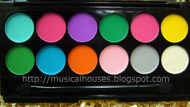
sleek ultra matte brights palette close


Top row, L-R: Chill, Pout, Sugarlite, Dragonfly, Pucker, Bamm!
Bottom row, L-R: Cricket, Bolt, Strike, Floss, Crete, Pow!

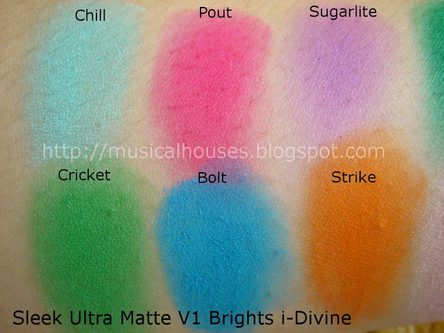
And of course, what we've all been waiting for. Swatches! Let's start with the first half of the palette, consisting of the left half of the palette, along with my commentary on the shades. All shades, of course, are matte.
sleek ultra matte brights palette swatches 1


Top row, L-R: Chill, Pout, Sugarlite
Bottom row, L-R: Cricket, Bolt, Strike

Chill is a very nice aqua shade, that's like the eyeshadow version of China Glaze For Audrey. I like it, mainly because I also like For Audrey. Matching tips and peepers, anyone?

Pout is a hot pink matte shade. This shade is almost neon-looking. Very cool.

Sugarlite is a medium purple shade. This is one of the shades that is a bit o a dud. The pigmentation wasn't as great, although the purple was cool.

Cricket is a bright, grassy green - the kind MAC would probably call "yellow green".

Bolt is a bright cobalt blue. I really like how this looks.

Strike is a bright straight up orange. Also another colour wheel type colour.

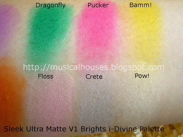
Now for the second half of the palette. This consists of the shades on the right.
sleek ultra matte brights palette swatches 2


Top row, L-R: Dragonfly, Pucker, Bamm!
Bottom row, L-R: Floss, Crete, Pow!

Dragonfly is a bright secondary green, the kind you see on colour wheels. A good basic green.

Pucker is another hot pink shade. To be honest, I'm not sure what's the difference between this and Pout, since on my skin they look the same. In the pan though, Pucker more pink and less red than Pout, but only by a hair.

Bamm! is a bright canary yellow. Not the strongest pigmentation in the palette, but it's still a vibrant shade.

Floss is a light neutral pastel pink, and is one of the three neutral shades in the palette. It's a little less pigmented than some of the really bright shades.

Crete is a very light, whitened concrete grey. Another very nice neutral. Like Floss, pigmentation on this one is also a little less than the brights.

Pow! is a white that's medium in pigmentation. Not much to say, it's a basic white everyone can use.

Lastly, here is the whole palette crammed into my arm:

sleek ultra matte brights palette swatches


Top row, L-R: Chill, Pout, Sugarlite, Dragonfly, Pucker, Bamm!
Bottom row, L-R: Cricket, Bolt, Strike, Floss, Crete, Pow!

Some of the colours may look a little familiar, and that's because I do think some of the shades are similar to that in other palettes - although most are quite unique. In particular, I thought the shade Chill looked like the shade Blue Hawaiian in the Sleek Curacao Palette. And similarly, I thought Sugarlite looked a bit like Purple Haze. I'm not certain though, and I'll probably need to swatch them side by side to be sure.

sleek ultra matte brights palette 1


So, do you need the Sleek Ultra Matte Bright Palette? If you like brights, or want a palette of vibrant shades to jazz up your collection, and don't already have similar shades, then this is for you. On the other hand, if you don't like matte shades, or dislike brights, then I guess you may not like it as much. For the price, though, this is a good palette that is value-for-money. These will be available from 9th May onwards at Superdrug stores in the UK, and online at Sleek Makeup website.

(Product was sent for review. Review is my complete and honest opinion. I am not affiliated with/compensated by the company.)

Linkwithin

Related Posts Plugin for WordPress, Blogger...